Design Handoff Checklist: From Prototype to Development
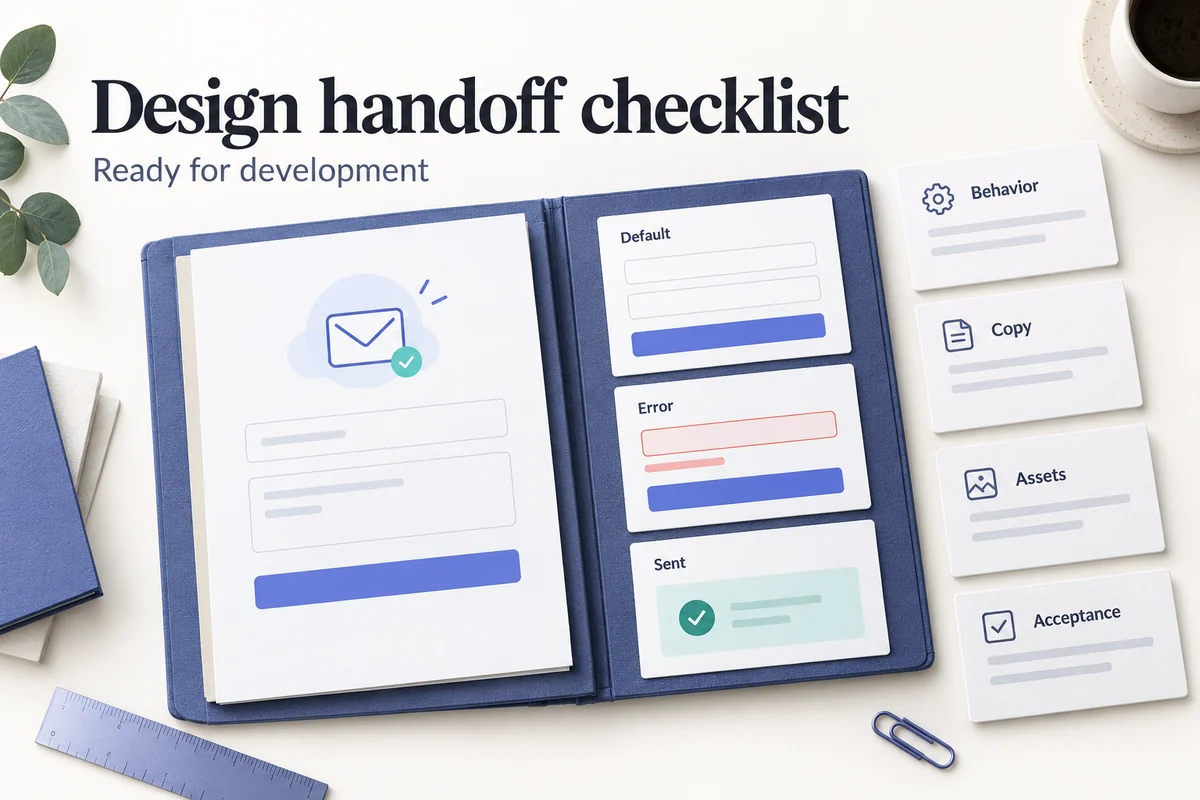
A design handoff is ready when a developer can explain what to build, a tester can explain how to check it, and the team can identify who owns the unresolved decisions. A polished screen is only part of that agreement. Missing error states, uncertain permissions, and contradictory copy are the gaps that a design handoff checklist should uncover.
Run a design handoff checklist before implementation questions are closed.
This checklist follows a prototype into development through seven review areas. A team-invitation dialog provides the worked example: an owner enters an email address, chooses a role, sends an invitation, and recovers if it fails. The example requirements below are proposed design decisions, not claims about an existing Mockitt team-management feature. For instructions on the product's inspection controls, use the separate Mockitt design handoff guide.
What a complete handoff should answer
Before sharing a link, ask five questions: what user outcome does this flow support; which screens and states are included; what happens off the happy path; which behavior is demonstrated versus merely assumed; and who makes decisions after development starts? Label an unknown answer instead of filling it with a guess.
Organize the package in three layers. Product explains goals, scope, and acceptance criteria. Interaction explains states, transitions, validation, and recovery. Implementation holds assets, tokens, accessibility notes, data dependencies, and technical constraints. A prototype can connect the layers visually, but it should not silently become the only specification.
Phase 1: Confirm scope and acceptance criteria
- Write the intended user outcome in one sentence.
- Name entry points and completion states.
- Connect important screens to a requirement or user story.
- Mark exclusions, including future ideas visible elsewhere in the file.
- Describe acceptance in observable terms.
For the example, the goal is “a workspace owner can invite one teammate with a chosen role and understand whether the invitation was sent.” Bulk invitations and changing an existing member's role are excluded. Those boundaries prevent a developer from interpreting every possible team-management action as part of the ticket.
Replace vague instructions with inspectable behavior. “Make the empty state friendly” becomes “when no invitations are pending, explain the state and offer an Invite teammate action.” Product can approve the behavior while design refines the tone and visual hierarchy.
| Context | Action | Expected result |
|---|---|---|
| An owner opens Team with no pending invitations. | Starts an invitation. | The form has a labeled email field, an explicit role choice, and a way to cancel. |
| The entered address is not in the accepted format. | Attempts to send. | The form identifies the email error in text; the entered address remains available to edit. |
| The request succeeds. | Completes submission. | The confirmation identifies the invited address and role; the pending list reflects the result. |
| The request fails or its outcome is uncertain. | Attempts to recover. | The UI does not claim success; the message explains the known state and gives the agreed recovery action. |
A timeout is not automatically proof that nothing happened on the server. Ask engineering how the interface can determine whether an invitation exists before specifying “send again.” This is a concrete technical decision to resolve during handoff, not something a success-state mockup can answer.
Phase 2: Mark the prototype paths and version
Name scenarios by outcome rather than “Screen 12.” Give reviewers a starting point for “invite a teammate,” “correct an address,” and “recover from a failed request.” Include the main path and the important alternative paths. If the prototype simulates submission or cannot model a particular response, put the expected production rule alongside it.
The Mockitt interactive prototyping workspace supports linking screens, previewing paths, and gathering comments. Prepare the relevant states and walk the shared version with development. Record a readable version label, such as “Team invite v2 — recovery states added,” and a short change log with the reason and affected requirement.
Designate which reference is approved for implementation. If the working prototype remains editable, keep an agreed snapshot or version reference that your team can reliably recover. A link to a constantly changing file is useful for collaboration, but it does not by itself describe what was approved last week.
Phase 3: Specify states, content, and rules
For task-critical components, consider default, focus, hover, pressed, disabled, loading, success, empty, error, and permission-restricted states. Not every component needs all of them, and not every state needs its own full-page screenshot. Each relevant state needs a trigger, a visible behavior, and an implementation reference.
| State | Rule to hand off | Question to close |
|---|---|---|
| Invalid email | Retain the input and display a text explanation next to the field. Do not rely on a red border alone. | When does validation appear: submission, blur, or both? |
| Submitting | Show progress and prevent accidental duplicate requests through the agreed interaction behavior. | Can the user cancel, and what happens if they close the dialog? |
| Already invited | Identify the existing invitation and present the action product and engineering have agreed. | Should the user resend, inspect the pending entry, or choose another address? |
| Request failed | Keep entered information. Explain what is known about the invitation and how to recover. | Can the client safely retry, or must it check the current server state? |
| Permission changed | Explain that the action is unavailable and provide an appropriate next step. | What happens if the user's role changes while the dialog is open? |
Include real or representative copy, not only short placeholders. Test a long address, a multiline explanation, an unfamiliar role name, and text expansion for supported locales. State whether text wraps, truncates, scrolls, or changes position. Resolve inconsistent labels—“Send” in the prototype and “Create” in the ticket may signal different assumptions about the same action.
The table records proposed behavior; the implemented service must still enforce permissions and request rules. A disabled button is not access control, and a loading animation is not evidence that duplicate requests are prevented.
Phase 4: Package assets and visual decisions
Provide the asset source, intended use, dimensions, usage rights, and fallback where needed. Name icons by meaning, distinguish decorative images from informative ones, and supply appropriate alternative text. Reference existing color, spacing, typography, radius, and elevation tokens instead of copying slightly different values into every ticket.
Inspection can answer the size or color of a selected element; it does not explain why the element appears or how it behaves. Keep those rules in the specification. In the official Mockitt help example below, the selected element has measurements and a code/properties panel. The documented controls are a useful reference for inspecting the visual layer; check the current workspace interface before following an older screenshot literally.
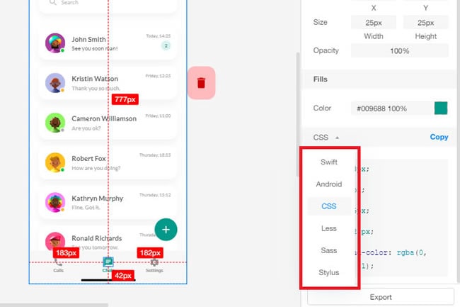
Use a small asset manifest for the example: role icon → shared icon source; error icon → decorative beside readable error text; button → existing primary-button component; confirmation copy → approved content record. If a value differs from the design system, document the exception and its owner. Otherwise a one-off adjustment may become an unintended new standard.
Phase 5: Document responsive and accessibility behavior
Show how the flow works at narrow and wide widths, and describe what happens between them. For the invitation dialog, decide whether it becomes a full-width panel on a small screen, how its content scrolls, and whether the action area can obscure the focused field. Include long content and increased text size in the review.
- Keyboard and focus: specify entry focus, logical navigation, visible focus, and where focus returns when the dialog closes.
- Labels and errors: identify controls clearly and describe input errors in text, consistent with W3C's error identification guidance.
- Pointer targets: document intended dimensions and spacing. WCAG 2.2 target-size guidance sets a 24-by-24 CSS-pixel minimum with specified exceptions; it is not a blanket rule that every visible icon must be that size.
- Announcements and semantics: specify how validation, progress, and confirmation should be exposed to assistive technology, then verify in code.
A prototype helps the team plan these behaviors; it does not certify accessibility. Where the prototype cannot express real keyboard, semantic, or screen-reader behavior, assign a working-implementation check. Bring a developer or accessibility specialist into decisions involving a complex or third-party component before the package is considered ready.
Phase 6: Align technical constraints and dependencies
List the data sources, authentication states, permissions, analytics events, and external services that change what users see. Distinguish fixed demonstration data from a real dependency. For the invitation example, agree how to handle an address that already belongs to a member, an expired invitation, a network interruption, and a role the current user cannot assign.
Keep unresolved decisions visible in a small log: question, options, owner, required decision point, and resolution. A comment attached to one screen may start the conversation, but a rule shared across several flows needs a durable reference. If the team uses a requirements-to-prototype matrix, link the decision to the affected requirement rather than copying the discussion into several files.
Generated or exported output is also a dependency to inspect. A design-to-code workflow may provide a starting artifact, but check the result against the same behavior, accessibility, and integration requirements. Visual similarity is not implementation acceptance.
Phase 7: Review together and record readiness
Schedule a short walkthrough with product, design, and development, allowing enough time for the complexity of the flow. Start with the outcome, follow each scenario, and deliberately visit a failure or empty state. Ask development which decisions cannot be inferred; ask product to confirm the exclusions. End with named owners and the next decision for each open item.
Use three readiness states instead of an ambiguous “approved”: ready means the agreed scope can be implemented; ready with tracked follow-up means a nonblocking issue has an owner and a due point; not ready means an unresolved decision changes the behavior, architecture, or verification. The team must agree which issues are actually nonblocking.
After implementation begins, compare the built flow with the agreed version and acceptance criteria. If a technical constraint changes the design, update the source decision and affected states together. Record what changed instead of leaving a misleading “final” prototype beside different production behavior.
Design handoff checklist template
| Review area | Evidence to attach | Who confirms? |
|---|---|---|
| Outcome and scope | User goal, scenarios, exclusions, acceptance criteria. | Product and design. |
| Prototype map | Entry points, alternative paths, approved version, change log. | Design and development. |
| States and content | Validation, loading, success, error, empty, permission and recovery rules. | Design, content owner and development. |
| Assets and tokens | Sources, dimensions, rights, semantic names, component references. | Design and development. |
| Responsive and accessibility | Layout rules, keyboard/focus behavior, semantics and implementation test tasks. | Design, development and relevant specialist. |
| Dependencies | Data, service, permission and request assumptions; open-decision log. | Engineering and product. |
| Verification | Test owner, acceptance cases, review date and readiness decision. | Product, development and QA. |
The checklist is complete when each relevant row has evidence or an explicit, owned exception. Start with one real flow and walk its failure state together; that discussion usually reveals more than another page of unspecified screen dimensions.
Design handoff questions
Is a design handoff the same as a specification?
No. A specification is one artifact; handoff is the working agreement and package that helps the team implement it. Requirements, interactions, visual decisions, and technical constraints remain linked records with clear owners.
How detailed should annotations be?
Annotate decisions that could reasonably lead to different implementations. Avoid explaining an established component's obvious appearance, but document an exceptional state, validation rule, permission boundary, or content behavior.
When should development join?
Before the final walkthrough when the design depends on uncertain data, permissions, responsive behavior, or complex components. The checklist should capture earlier decisions, not reveal every constraint for the first time.
What if the prototype cannot represent a technical state?
Describe the expected behavior, identify the responsible component or service, and create a verification task. Mark the simulation honestly so reviewers do not confuse a clickable demonstration with a working integration.