
A UI color palette is a set of colors chosen to work together across an interface. It needs to do more than look attractive as isolated swatches: the colors must distinguish text, surfaces, actions and states while keeping content readable. A palette’s association with a mood or brand can help set a direction, but it does not guarantee how every user will feel or behave.
Start with the relationships between hues, then test the selected colors in real components. In Mockitt’s online UI design workspace, place the palette beside the screen that uses it so a team can compare the swatches with the actual labels, controls and backgrounds. A pleasing color wheel combination may still fail when a pale label sits on a pale button.
This guide covers six familiar palette structures and five practical checks for applying them. Keep palette selection separate from claims about conversion or universal color psychology. The useful output is a set of named interface roles and tested foreground/background pairs that another designer can reuse consistently.
What are the different types of color palettes?
Choose a palette with the product’s content, brand and user task in mind. The color wheel is a starting aid rather than a test of usability. Prepare a typical screen, a dense screen and an error state before committing to a scheme. Those examples reveal whether the palette contains the range of lightness and emphasis the interface needs.
The following six structures describe relationships between hues. None automatically provides accessible contrast, semantic status colors or all the neutral tones required by an interface.
1. Monochromatic Palette
A monochromatic palette uses one hue with variations in lightness and saturation. The original red scale below illustrates a progression from pale to dark. This can create a coherent starting range, but adjacent swatches may be too similar to distinguish text, borders and selected states.

In traditional color terminology, a tint adds white, a shade adds black and a tone adds gray. Digital color controls offer several ways to vary the appearance, so do not assume equal numeric steps produce equal perceptual differences. Inspect the actual combinations at the size used in the interface.
A one-hue scheme can simplify a brand palette, but it is not impossible to use incorrectly. Reserve distinct roles for text, backgrounds and actions, and test their contrast. If an error or warning needs another hue, introduce it deliberately and combine it with a label or symbol. Consistency matters more than preserving a rigid one-color rule.
2. Analogous Palette
An analogous palette uses neighboring hues on a color wheel, often starting with a small group of three. The close relationship can give a cohesive appearance without making every object the same hue.
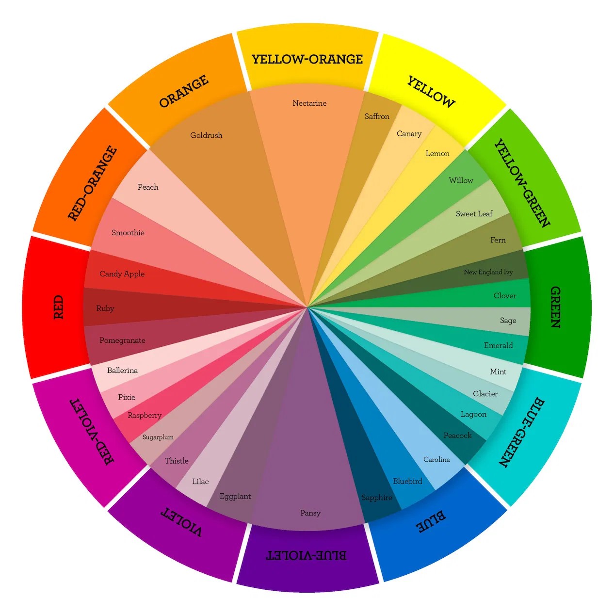
For example, green, blue-green and blue provide an analogous starting point. You can vary their lightness and saturation to make quieter surfaces and stronger accents. Names such as Mint or Lagoon are descriptive labels, not precise color definitions; record actual values and usage roles when handing off the palette.
One hue can provide the main accent while its neighbors support illustrations or secondary details. This is a composition choice, not an industry requirement to use exactly one dominant hue and two accents. Make sure adjacent colors remain distinguishable where they communicate different categories.
3. Complementary Palette
Complementary hues sit opposite each other on a chosen color wheel. Their contrast can create a strong accent relationship, but hue difference alone does not establish text contrast. Check the foreground and background values together rather than assuming opposite positions guarantee readability.
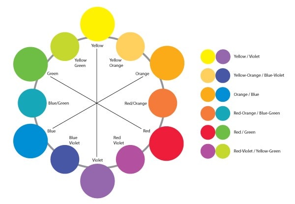
Use complementary accents selectively when two elements need separation, such as a main action and a supporting illustration. Avoid assigning opposing colors to every paragraph, card and control. A busy interface can result even when each pair is theoretically complementary. Neutral surfaces often give the accents room to do their work.
4. Triadic Palette
A triadic palette starts with three hues spaced around the color wheel. The geometry describes the relationship; it does not mean that all three need equal visual weight.
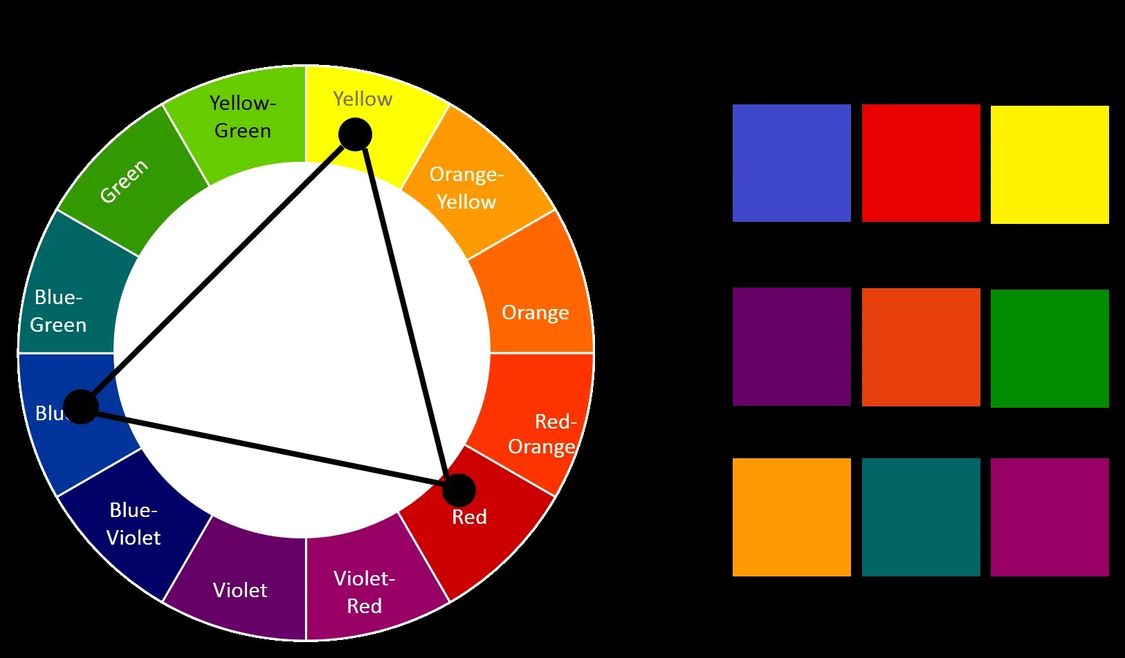
Choose which hue supports the primary action and which are reserved for secondary graphics or categories. Then build lighter and darker variants for the roles that need them. If all three are highly saturated and appear in equal amounts, they may compete with the content.
Test the triad in a real screen before adding more colors. If the scheme makes priorities unclear, reduce the number of simultaneous accents or use quieter variants. Changing the application is often more useful than abandoning the entire palette.
5. Split-Complementary Palette
A split-complementary palette starts with one hue and the two hues beside its complement. It retains a contrast relationship while avoiding a direct opposite pair.
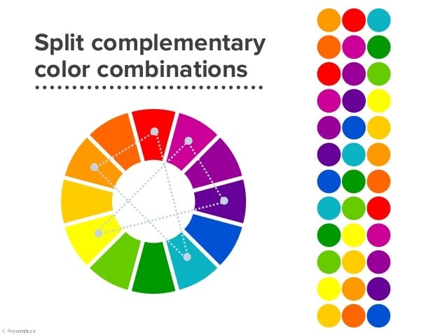
Choose the main hue, locate its opposite on the wheel and then select one neighbor on each side of that opposite. The original diagram below shows several such combinations.
Map the resulting hues to specific jobs rather than rotating them arbitrarily between screens. A color used for a selected item on one screen should not mean an error on another. Evaluate the scheme with realistic text and controls; the wheel does not answer whether a small icon will remain visible.
6. Tetradic Palette
A tetradic palette contains four hues arranged as two complementary pairs. The pairs can form a rectangle on a color wheel; a square is one particular arrangement, not a requirement for every tetradic scheme.
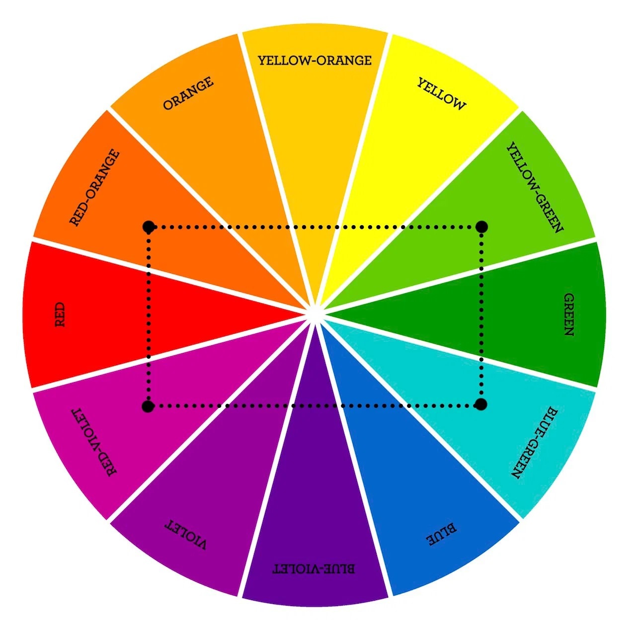
Four hues provide more options, but the interface does not need to use all four at equal strength. Establish neutral backgrounds and text first, then assign accent roles. Keep a record of which combinations are approved so extra choice does not become inconsistent emphasis.
Five Checks Before Applying a UI Palette
The six structures help select related colors. The next step is turning those choices into consistent interface color rules. Use the five checks below to test the palette against content, readable contrast and meaningful state changes.
1. Establish Hierarchy in Grayscale
A grayscale draft can reveal whether spacing, grouping and type already communicate the screen’s priorities. It is a useful exercise, not a rule that every project must begin without color. Identify the main action and reading order before relying on a bright accent to create all the hierarchy.

Give text, surfaces and separators distinct roles. Check a dense screen as well as a simple hero section, because labels, helper text and tables introduce combinations that an isolated mockup can miss.
Choose neutral values according to their use. Gray text on a white surface can be too faint, and pure black text is not automatically unsuitable. Measure important combinations using the W3C text-contrast guidance; distinguish ordinary text, large text and the relevant exceptions instead of judging contrast only by eye.
2. Limit Competing Accents, Not Necessary Roles
A compact set of accent hues is easier to apply consistently, but an interface is not required to contain exactly three colors. Text, disabled states, focus indicators, borders and errors may need additional values. Count purposeful roles rather than treating every tint as an unwanted new color.
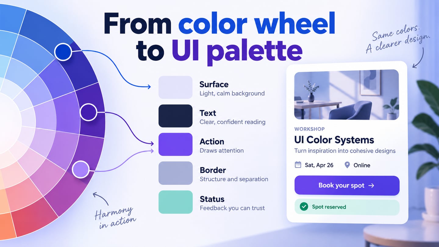
Name the values by purpose where possible: surface, text, action, border and warning. Pair each colored background with an appropriate foreground. A light theme and a dark theme may use different values for the same role rather than blindly inverting every color.
3. Treat 60–30–10 as a Composition Heuristic
 An example of visual proportion, not a requirement for UI color percentages.
The 60–30–10 idea describes a visual balance between a dominant color, a secondary color and an accent. It can prompt a useful discussion about emphasis, but it is not an accessibility standard or a requirement that every screen’s pixels fit those percentages.
A content-heavy settings screen and a promotional hero naturally use different proportions. Do not reduce a necessary warning or inflate decorative color simply to satisfy a ratio. Judge whether the main action is clear and the information remains readable; the interior-design photo below illustrates visual proportion rather than a measured UI rule.
4. Check Color Meaning in Context
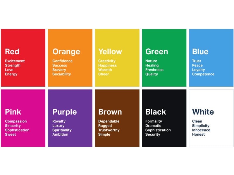 Color associations vary by context; this chart does not predict every user’s response.
Colors can acquire associations through culture, brand and prior experience, but the association chart below is not a universal behavioral prediction. Red may signal an error in one interface and serve as a brand color in another. Explain important states in words and maintain a consistent local convention.
The product category can influence the visual direction without dictating it. A nature-themed service may use greens, yet its error messages and selection controls still need explicit roles. Ask whether an accent supports the reader’s task rather than assuming it creates a particular emotion.
The W3C guidance on use of color is especially relevant when state or meaning depends on a hue. Add labels, symbols or another visual cue so a person does not need to distinguish two colors to understand the result.
5. Use Nature as Inspiration, Then Test the Result
A landscape, flower or material can suggest a useful palette, but an attractive photograph does not automatically provide readable UI combinations. Sample a small set of candidate colors, adapt their values and apply them to actual components. A pale sky color might work as a surface while needing a much darker foreground for text.
Keep the inspiration separate from the finished role definitions. A palette becomes useful to a team when someone can tell where each color belongs, how it behaves in different states and which combinations still require revision.
Apply a Palette in Mockitt
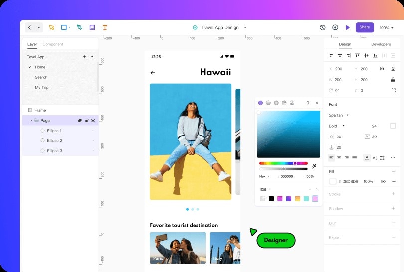
Use the design workspace to place your chosen swatches beside a representative screen. Create a small set of reusable cards or controls, assign their colors by role and inspect them together. This makes accidental differences visible before the same components are repeated across the product.
For a workshop-booking screen, start with a warm neutral surface, dark text and an indigo Book workshop action. Add a Sold out card with an explicit label and a Join waitlist action. Keep the unavailable state readable rather than fading the entire card until its date and title disappear. Compare the available and sold-out cards beside the role swatches.
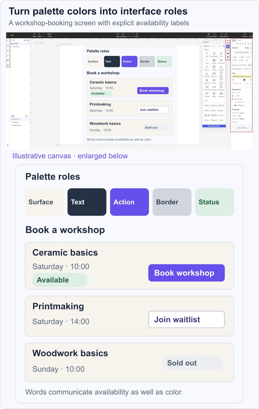
Review the palette with a long workshop title, a selected option and a validation message. Check the label on each actual background, the distinction between a status and an action, and the visibility of keyboard focus. The example is a proposed visual system; verify the implemented colors and behavior before claiming accessibility conformance.
Store the decisions with the design system or component guidance that the team maintains. The names should survive a future brand-color change: action-primary is a more durable role than purple-button when several values may eventually serve that purpose.
Use the workspace features to keep those decisions visible:
- Collaboration: ask reviewers to identify the main action and interpret the sold-out state. Separate personal color preference from evidence that the information is hard to read or understand.
- Vector editing: create simple icons and shapes where they support the message. A warning symbol can reinforce its label, but elaborate decoration should not compete with the workshop information.
- Properties and styles: inspect the colors on the selected elements and document the approved values. The retained historical editor image shows color controls; it does not establish that every current panel has the same position.
- Reusable widgets and components help apply the same roles consistently. Check repeated instances after an update instead of assuming every pasted object remains connected to the shared decision.
Conclusion
A useful UI palette combines a coherent hue relationship with clear interface roles. The six schemes provide starting points, while content, contrast and state meaning determine whether the result works in a real screen.
Review the palette in the situations that are easiest to miss: long labels, unavailable options, focus indicators and error messages. Keep the approved combinations and their uses with the design so implementation does not have to infer them from a decorative swatch strip.
For the workshop example, the palette has succeeded when someone can identify the available session, distinguish the sold-out state and find the appropriate next action. Use the prototype review to uncover those questions, then verify the actual interface with the relevant accessibility checks.