Microinteractions are small interactions built around a specific task, such as saving an item, checking an input or showing that a request is in progress. Their purpose is to make the result of an action understandable. Animation can contribute, but a useful microinteraction does not need elaborate motion.
Keep people informed about what the interface is doing and what they can do next. A successful interaction reduces uncertainty rather than trying to keep someone using an application for its own sake.
Part 1: What Are Microinteractions?
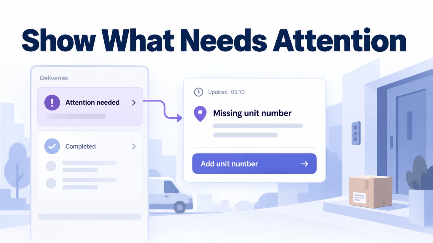
Consider a notification arriving on your phone. The change in state may be communicated with a message, an icon or another signal. The appropriate feedback depends on the task and the person’s settings; there is no single part of a screen that always deserves attention.
A useful way to examine the interaction is to ask what triggers it, what rules govern its behavior, what feedback appears and what changes on repeated use. This helps separate a deliberate response from decorative movement.
For example, saving an article has a trigger—the Save action—and a result that must be communicated. “Saving” means the request is still in progress, while “Saved” should appear only after success. A thumbnail or an attractive title alone is not a microinteraction.
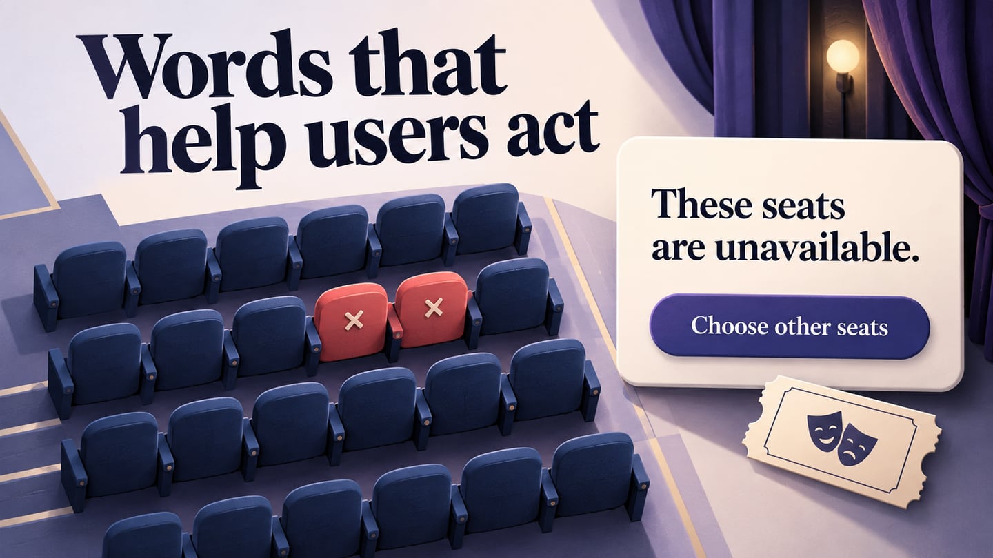
Microinteractions in UX support a small, identifiable task. Choose feedback that is clear in context, including what happens when the action fails. An effect that attracts attention but obscures the result works against that purpose.
Part 2: Microinteraction Examples
An incorrect passcode can trigger a vibration, a visual change and a message. The exact response varies by device and settings. The important design question is whether the person understands that the attempt failed and what they can do next.
A row of passcode dots may shake, but motion should not be the only explanation. Provide an understandable text response and account for people who do not perceive color, sound or movement in the same way.
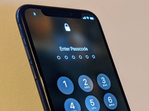
Multiple signals can reinforce one another when they convey the same result. They can also become distracting. Match their intensity to the consequence of the action rather than assume more feedback is always better.
Consider repeated attempts too. If the service temporarily limits further attempts, explain the available next step without exposing unnecessary account information. A prototype can show that state; the implemented authentication system must enforce it.
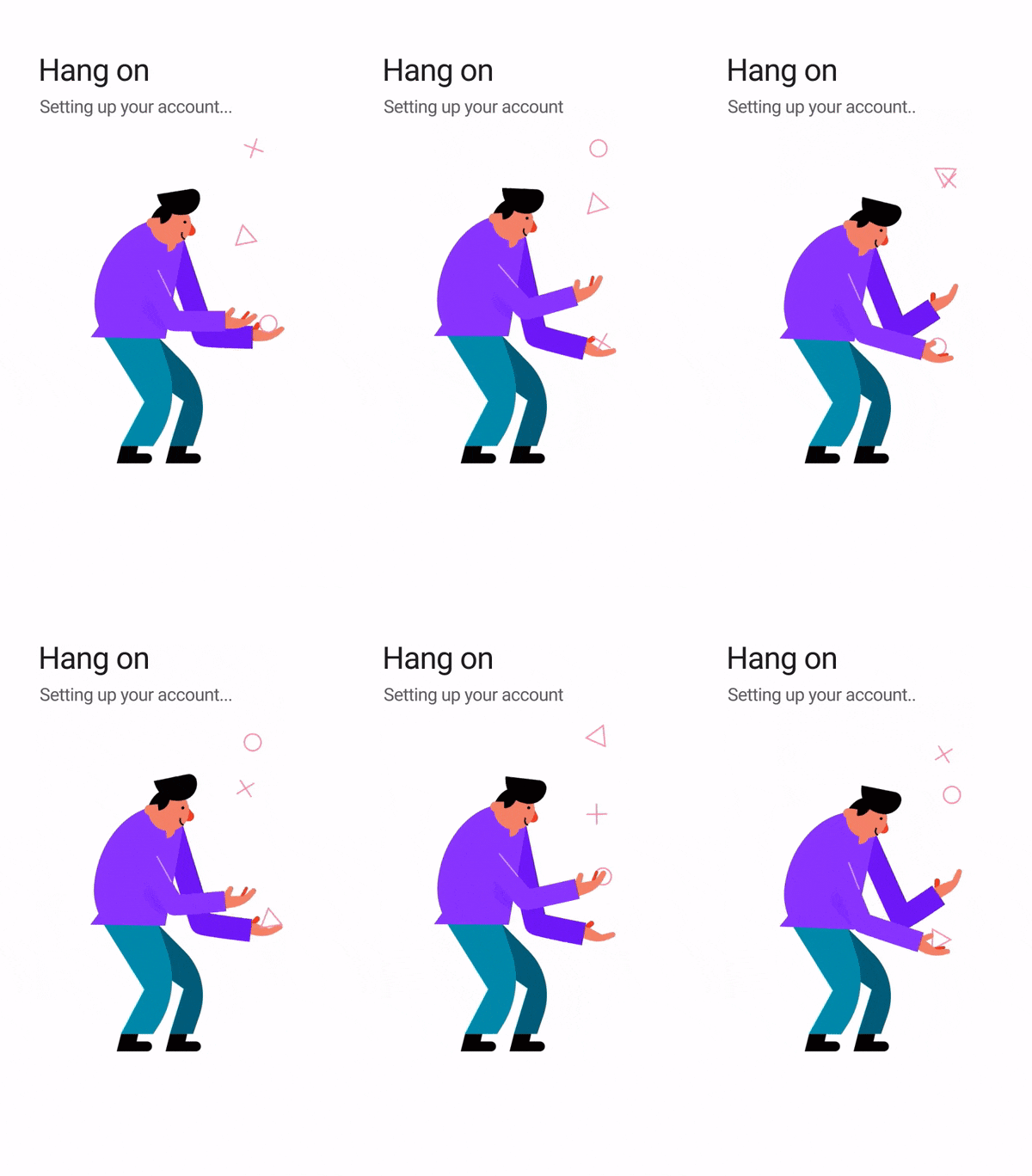
A loading indicator tells someone a request is still being processed. Use an indeterminate indicator when the system cannot measure progress, rather than inventing a percentage. For a longer task, explain whether the person can leave the screen or cancel without losing work.
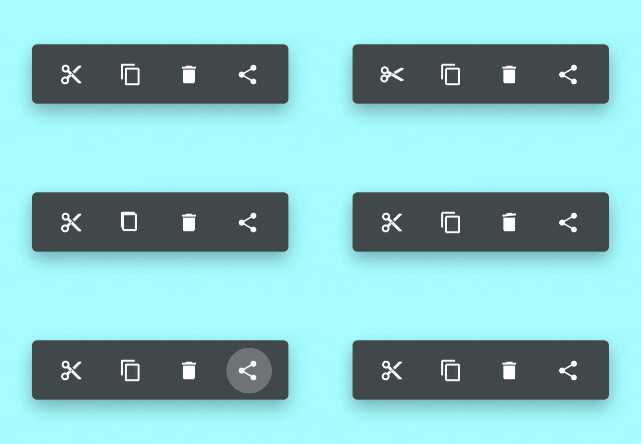
Icons such as Cut or Delete identify actions. The microinteraction includes what happens when that action is taken: an item changes, a confirmation appears or an undo option becomes available. A familiar icon alone does not communicate that an operation succeeded.
Check the full action-and-response sequence, including keyboard use and reduced-motion preferences. W3C’s guidance on interaction-triggered animation explains why nonessential motion needs care. A simpler state change may communicate the result just as clearly.
Part 3: How to Prototype Microinteractions
Use Mockitt to represent screens and states for review. You can explore the sequence before implementing the service behind it. Visual fidelity and interactivity are separate decisions: a simple wireframe can still demonstrate an action and its response.
The following steps use a save-to-reading-list action. The retained screenshots illustrate earlier Mockitt controls, so exact positions may differ in your current workspace. Focus on the intended behavior rather than reproducing a particular old panel.
Step 1: Open Your Workspace
Sign in to your Mockitt workspace and create or open a design project. Use a sample article and synthetic account information for the prototype. No real credentials or saved reading history are needed to review this interaction.
Step 2: Create a Prototype
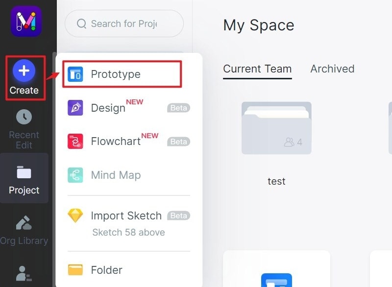
Create a prototype project and name the screen for the task, such as Article details. Add the states that reviewers need to inspect: unsaved, saving, saved and failed. Keeping them named makes the behavior easier to discuss.
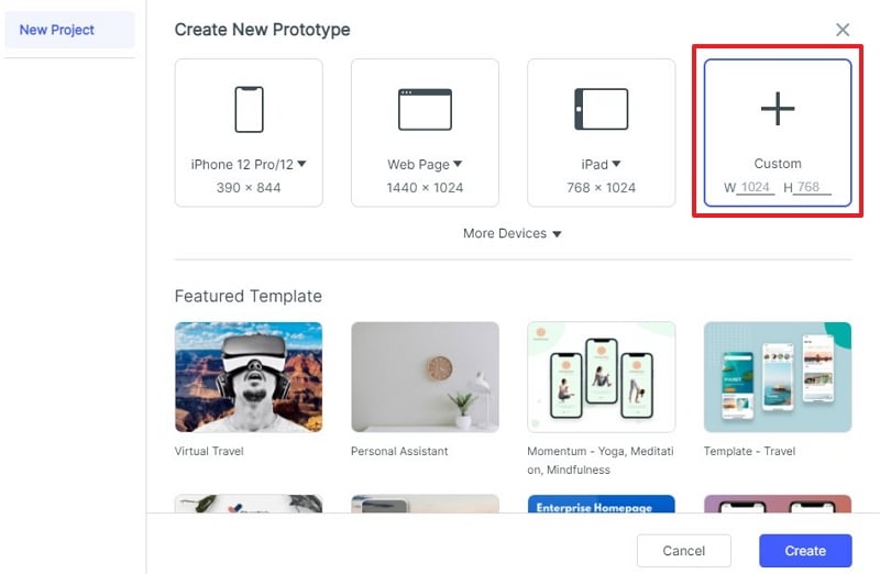
Step 3: Choose the Canvas Size
Choose a canvas size appropriate to the target device and check the narrowest supported layout. Allow room for longer status labels and text enlargement so the button does not change width unexpectedly or hide the message.
Step 4: Design the States
Add the article details and a clearly labeled save action using widgets. Keep the surrounding content consistent across the states so reviewers can focus on what changes.
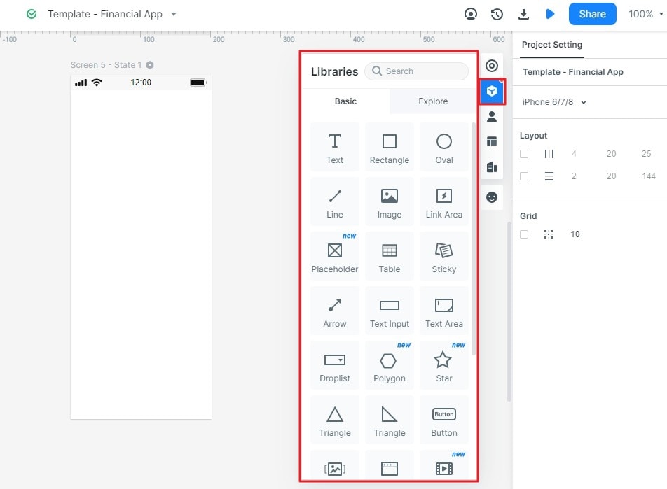
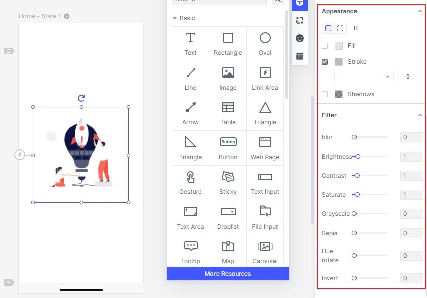
Adjust type, spacing and contrast, then specify which parts of the control can change. A bookmark symbol can reinforce the label, but should not be the only distinction between saving, success and failure.
Step 5: Make Your Design Interactive
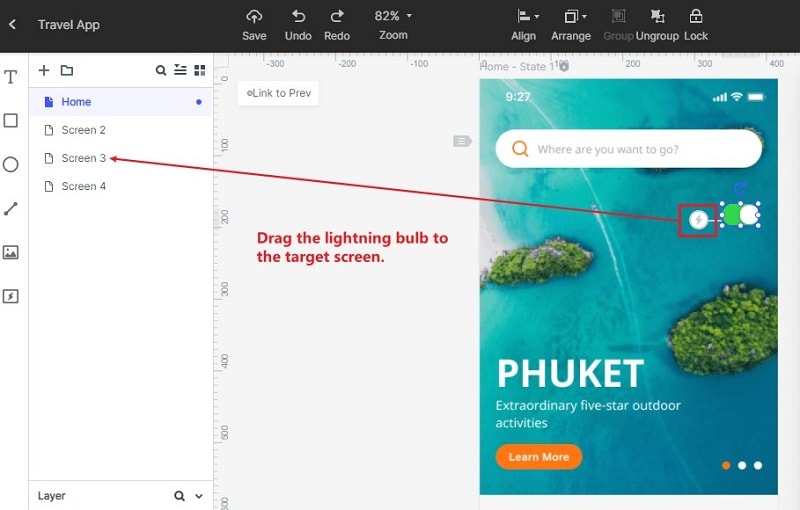
For a reading-list example, connect Save to reading list to a Saving state, then show Saved with an Undo action. Add a separate Could not save state with Retry. These are designed examples of possible responses, not evidence of a working storage service.
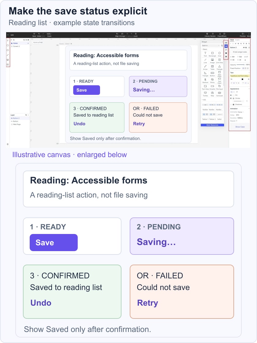
Use the linking and state controls available in your project to demonstrate each path. Explain what happens if the user presses Save repeatedly or leaves while a request is pending. A transition should help communicate the state change; it should not delay access to the result.
Step 6: Preview, Review and Share
Preview the design and ask a reviewer to save the article, then recover from a failed save. Check whether they can tell which result has occurred without being coached. Also review the sequence without decorative animation.
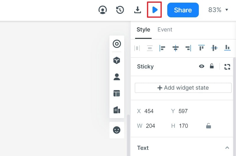
Share the prototype with the implementation team and include rules for pending requests, repeated actions, retry and undo. A clickable review can reveal ambiguity but does not validate network handling or assistive-technology behavior in production.
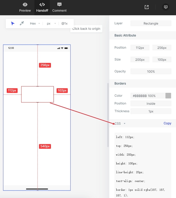
Use the available inspection and handoff features to communicate layout and visual details. Developers still need to implement the state logic, accessible feedback and service responses. Do not treat generated style information as a complete working application.