What Is the Daily UI Design Challenge?
Daily UI is a prompt-based design challenge. Its official website describes 100 interface challenges delivered Monday–Friday, with free enrollment. The prompts provide a starting point; the learning comes from how you frame the task, make decisions, seek feedback and revise. A Mockitt design workspace can help organize the screens and states you create during that practice.
The challenge should be distinguished from individual designers' personal 100-day projects, including work previously associated with Paul Flavius Nechita. Those projects can offer inspiration, but the official program's schedule is the source for what participants should expect. One hundred prompts does not necessarily mean one hundred consecutive calendar days.
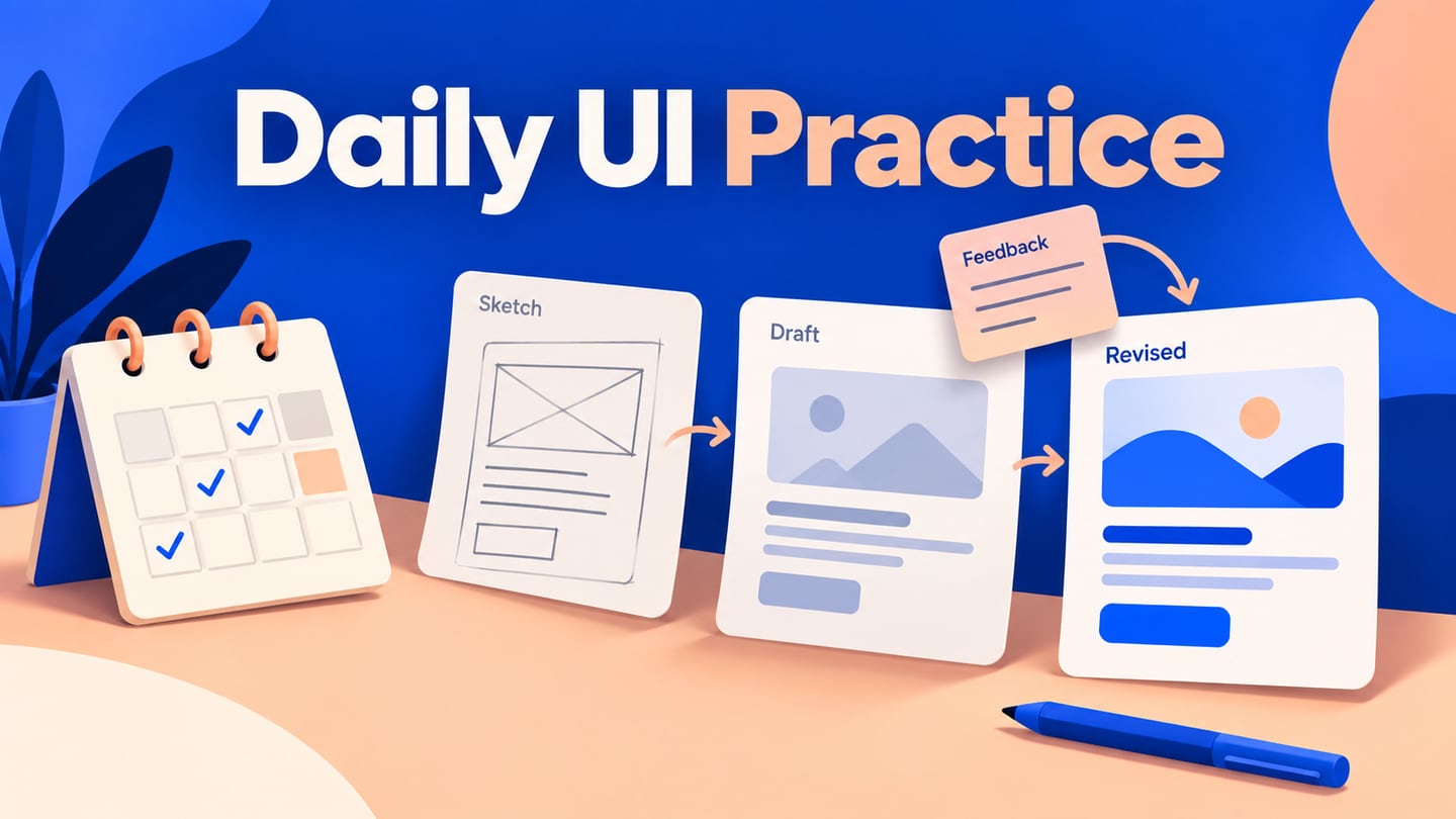
 Original Daily UI topic artwork; check the official program for its current schedule.
What to know before starting the Daily UI challenge
Set a learning goal you can review. You might focus on clearer forms, consistent spacing or explaining the state after an action. Choose a sustainable amount of work for each prompt and leave room to revisit earlier designs. Completing a sequence of screens is useful practice, but the count alone does not demonstrate research skill, accessibility or readiness for a particular job.
Other designers' published exercises can reveal different interpretations of the same prompt. Compare the task, content and decisions behind a design rather than only collecting attractive images. A polished gallery usually does not show every constraint, discarded option or revision, so it is not a complete account of the work involved.
Use a small practice record: prompt, intended user, task, constraint, one design decision and one question to review. This turns an open-ended challenge into something you can learn from. It also gives you material for explaining your reasoning later without borrowing another author's experience or presenting an exercise as client work.
 Original supporting illustration retained from the article.
Define the content and structure before drawing
Familiar prompts such as sign-up, login, a 404 page or a payment form may seem easy to begin. Less familiar prompts—a vehicle interface, dashboard or article page—often need more preparation. In either case, start by writing what the person needs to do and which information makes that possible. Sketch the hierarchy before choosing colors. Decide what appears in the initial state, what changes after an action and what happens if information is missing. This can prevent time spent polishing a screen whose purpose is still unclear.
For a password-reset exercise, define the task as requesting access help without exposing whether an account exists. Draw an Email address field and Send reset link action, then a response state: If an account exists, a reset link is on its way. Add Back to sign in. The canvas below is a design exercise, not a working authentication service.
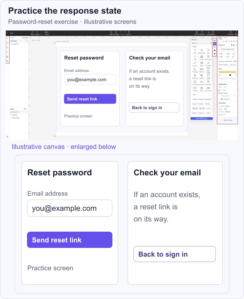
Review both states together. Is the label still visible when the field contains text? Does the response explain the next step without revealing account membership? What should happen when the format is invalid? You can note that missing state as the next revision instead of claiming that two attractive screens complete the whole flow.
Keep controls recognizable
A Daily UI exercise is still a graphical interface when its prompt asks someone to act. Apply clear hierarchy and recognizable controls and use labels that describe the result. A distinctive visual style should not hide the task. Check the design at the intended size, including longer content and a visible focus or selection state. Some prompts, such as a logo or background pattern, are more graphic than interactive; identify that difference rather than forcing every exercise into the same screen format.
Make good use of online resources
Use existing images, icons and components when their license and intended use permit it. Keep a note of sources and attribution requirements, and avoid copying another designer's finished screen. For a shopping cart or product detail exercise, select enough realistic content to expose layout problems. A perfectly sized placeholder can conceal issues that appear with a long title, a missing image or an unavailable item. Reuse components to practice consistency, then adapt them deliberately when the task calls for a different behavior.
Observe interfaces in context
Look closely at spacing, typography, image choices, shadow and corner treatment, but also observe what the interface helps a person do. How does it explain a disabled action? What remains visible after a field is filled? How does the page recover from an error? Record a specific pattern and the problem it addresses. Then decide whether that pattern fits your exercise. Observation is more useful when it leads to a reasoned choice than when it becomes an unstructured search for inspiration.
Review progress through decisions and revisions
Revisit earlier work after you have completed several prompts. Look for a concrete improvement: a clearer label, a more consistent hierarchy or a better response state. Write down why you would change it now. Dissatisfaction alone is not evidence of progress; being able to identify and explain a useful revision gives you something to act on. Keep an earlier version beside the revision so that the change remains visible.
A challenge should fit a sustainable routine. Set a stopping point for each exercise and avoid judging your entire ability against a curated gallery. If a prompt reveals a skill gap, choose one aspect to practice rather than adding every possible feature. A missed day or a simpler screen does not erase the value of careful work. Feedback and revision can be more useful than an unbroken streak.
Use Mockitt to organize a UI practice exercise
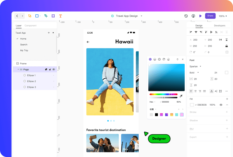 Legacy Mockitt design-workspace example; exact current controls may differ.
Mockitt provides a workspace for creating interface layouts with design elements and components. For a practice exercise, organize the initial screen and its related states together so that a reviewer can follow the idea. Keep the task description nearby and label which parts are illustrative. The original travel-app screenshot below is a legacy workspace example; it is not evidence that the current editor has exactly the same controls or that the exercise was tested with users.
Use the screen size and review context relevant to your prompt. A design canvas can represent different layouts, but drawing a screen does not prove native support for a device or a functioning application. Instead of treating a list of device brands as a compatibility guarantee, define the situations you intend to consider:
- A compact phone viewport for a short, focused task
- A tablet layout where the extra width serves a clear purpose
- A small display with only the essential information visible
- A larger display viewed at an appropriate distance
- A desktop layout with keyboard and pointer use in mind
- An alternative input or access requirement relevant to the task
- The actual shared-preview environment available to the reviewer
Prepare a reviewable version and confirm that the intended person can open it with the appropriate access. Explain what kind of feedback you need: comprehension of the task, hierarchy, wording or a particular state. A shared design makes discussion possible, but it does not automatically make the exercise collaborative or improve the outcome. Record the feedback and decide which change addresses the question you set at the start.
Ask for focused feedback
Use comments or a separate review note to attach feedback to a specific part of the design. Ask one concrete question, such as whether the response after submitting a form is understandable. Check the available sharing permissions in the current product before inviting someone. Do not assume that every reviewer has the same editing or commenting access.
Make the review easy to access
Tell reviewers which version to inspect and what they need to open it. Browser-based review can reduce the need to exchange repeated image exports, but access still depends on the product, account permissions and the reviewer's environment. Check the link yourself and keep the request short.
If the review happens asynchronously, include the task, the question and enough context to interpret the design. Keep decisions in one place so that feedback is not lost across messages and screenshots. A record of why you accepted or rejected a suggestion is valuable practice material in its own right.
Conclusion
You do not need a polished portfolio before beginning a practice challenge. Choose a prompt, define a task, make a deliberate design decision and review the result. After a set of exercises, select the work that best demonstrates your reasoning and revise it. Present it honestly as practice, including its assumptions and limits.
If the program's pace or prompts do not fit your goals, adapt the routine or choose another practice brief. The aim is not to collect screens indefinitely. Keep asking what you learned, what evidence would improve the design and which skill you want to practice next.