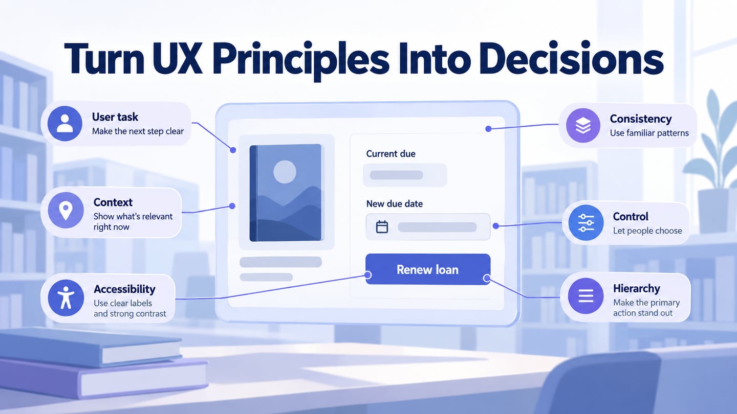
UX design principles help you ask better questions about an interface. They do not guarantee that every person will accept a design. Apply them to a task, then use an interactive prototype or another suitable method to examine the decisions that remain uncertain. The six principles below connect broad ideas to practical review questions.
Six Principles to Use During a UX Review
1. Focus on end-users
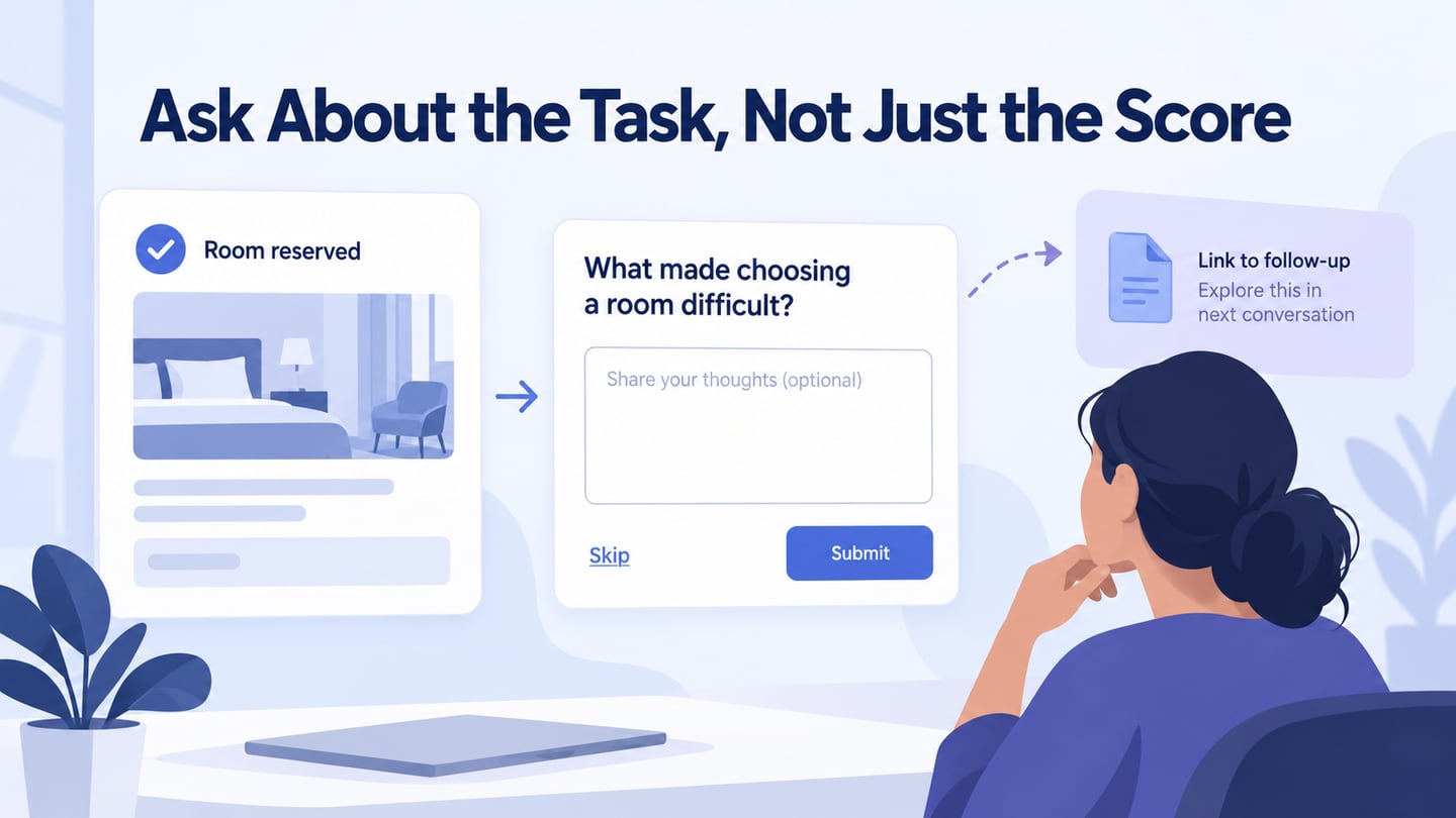
Begin with what people need to accomplish and the difficulties they encounter. Learn about the task through appropriate research, rather than assuming the design team represents the audience. Include the relevant participants and conditions early enough to change the proposal. For a library service, the task may be renewing one loan before its due date, not admiring a new account dashboard.
2. Consistency is critical
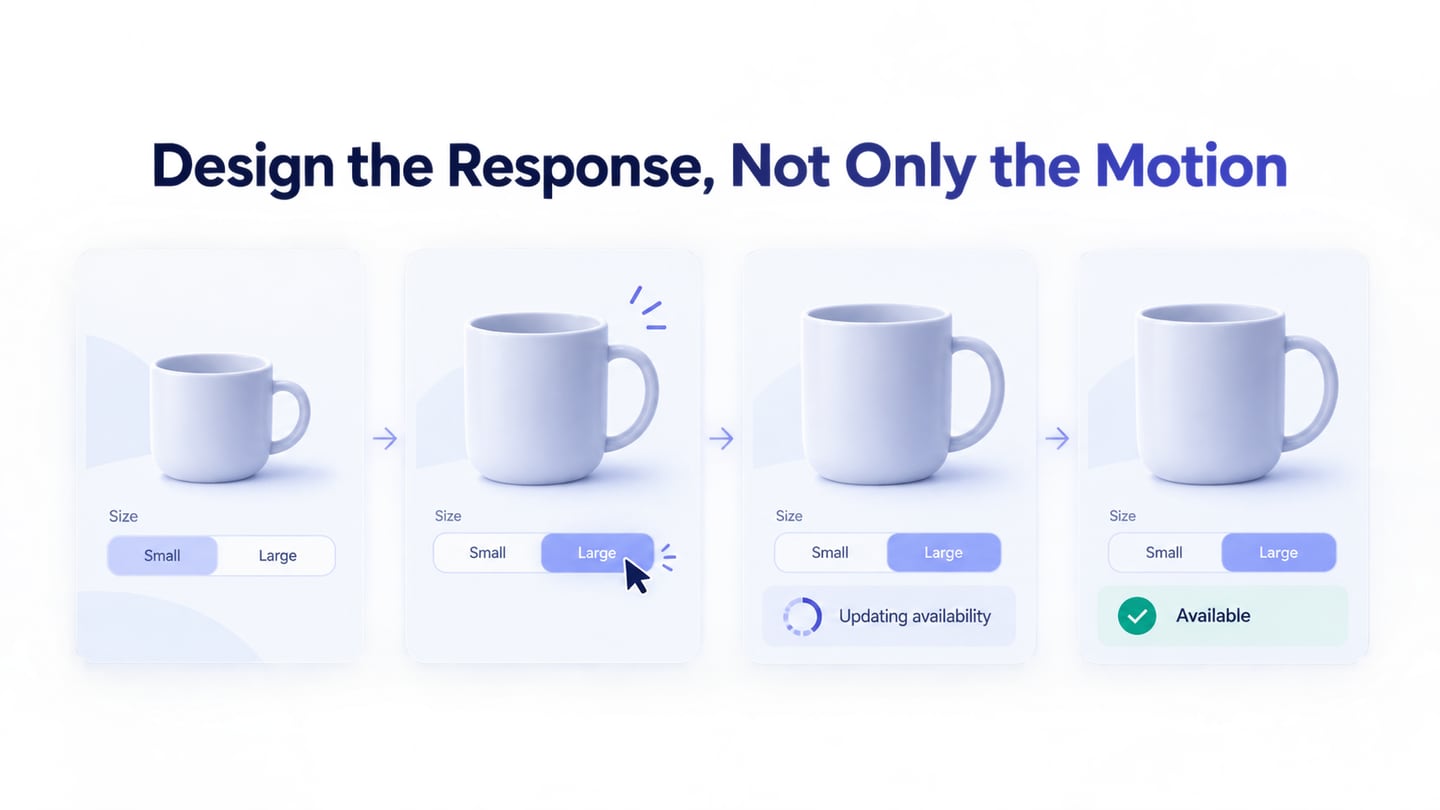
Keep the meaning of repeated labels and controls consistent, while respecting platform conventions. Consistency does not require every page to look identical or justify copying a successful competitor. If Renew loan means requesting a new due date, do not use the same label for simply opening the book’s details. Nielsen Norman Group’s usability heuristics provide a useful reference for evaluating consistency and user control; they remain guidance to interpret in context.
3. Context is critical
Consider where and how the task happens: device, connection, interruptions, language, prior experience and assistive technology. Your own reaction to the design is not a substitute for observing relevant users. A survey can collect reported experiences; contextual observation reveals different evidence. For the library task, test long book titles, enlarged text, and a session that has expired before confirmation.
4. Give users more control
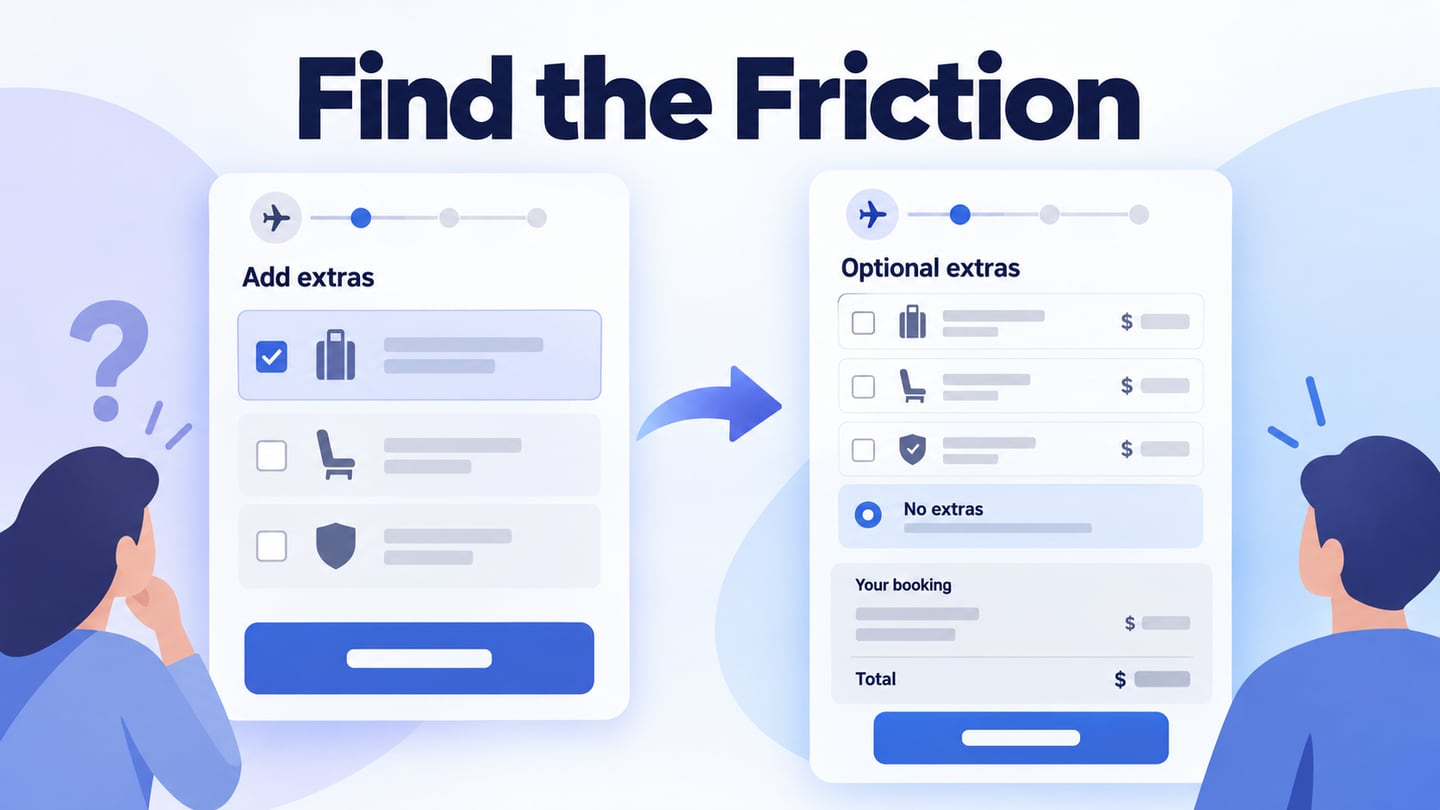
Let people review, change or leave a decision when that is appropriate. Make consequences explicit before a consequential action, and avoid presenting a reversible choice as permanent. More controls are not automatically better: the person needs the right control at the right moment. In a renewal flow, keeping the existing due date should be understandable without submitting a change first.
5. Design for Accessibility
Accessibility involves how people with disabilities perceive, understand and operate the interface. Clear visual design helps, but keyboard access, semantics, focus, contrast and assistive-technology behaviour also matter. The W3C guidance on accessibility and usability recommends combining standards with involvement of users with disabilities. A visual prototype can identify requirements; it cannot establish that the implemented service meets them.
6. Hierarchy
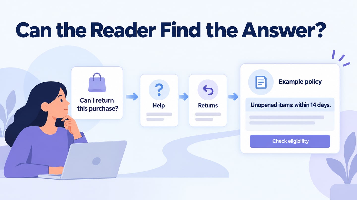
Use information structure and visual hierarchy together. Organize content around the questions people need answered, then use meaningful headings, spacing and emphasis to show those relationships. A sitemap describes page organization; a screen hierarchy helps someone distinguish the selected item, the decision and its supporting details. Check both rather than assuming a logical diagram guarantees a usable screen.
Apply the principles to a library renewal
For a fictional library service, review a loan renewal for The Woodland Guide. Show the current due date, 12 October, and the proposed due date, 26 October. The action says Renew loan, while Keep current due date leaves the existing record unchanged. These are sample dates and rules for the exercise.
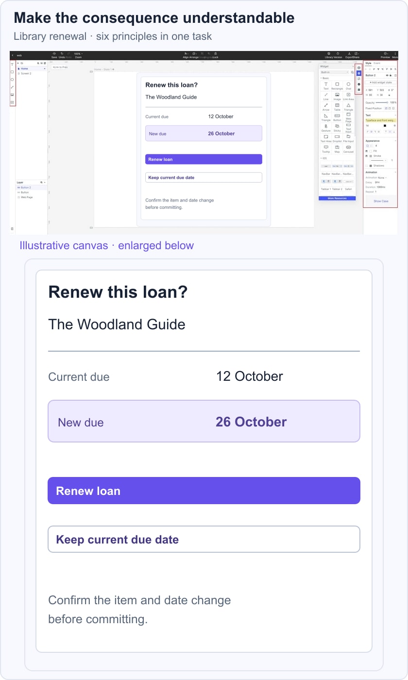
Ask a reviewer to extend the loan and explain the expected result before committing. Observe whether they identify the right book and distinguish the current date from the proposed one. Keep the two dates visually grouped, use the same action wording throughout, and provide a way to leave without changing anything.
Then examine an exception: the renewal is unavailable because another borrower has reserved the book. State the reason and the existing return date; do not leave a disabled button as the only explanation. Record which principle led to each decision and what evidence still needs to be collected.
Prototype the Decisions in Mockitt
Mockitt can help you represent selected screens and interactions for review. Define the task first, then build enough of the flow to inspect the important decision. Separate what the prototype demonstrates from rules or systems that are only simulated.

Create the initial layout in a supported workspace and add the relevant states. Earlier guide screenshots illustrate the visual editing process; exact panel labels can differ. A shared prototype supports discussion, but it does not remove the need for research preparation or implementation testing.
Reuse components where their meaning is consistent, and give variants clear names. In the library example, the available and unavailable renewal states should share recognizable context while explaining different outcomes. Keep annotations for requirements that cannot be demonstrated directly.
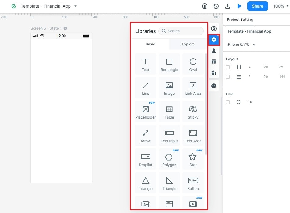
Preview the flow, share it with the appropriate reviewers, and collect observations against the original task. Record the change, the reason for it, and the uncertainty that remains. Principles are most useful when they improve a decision you can explain, rather than serve as labels applied after the design is finished.