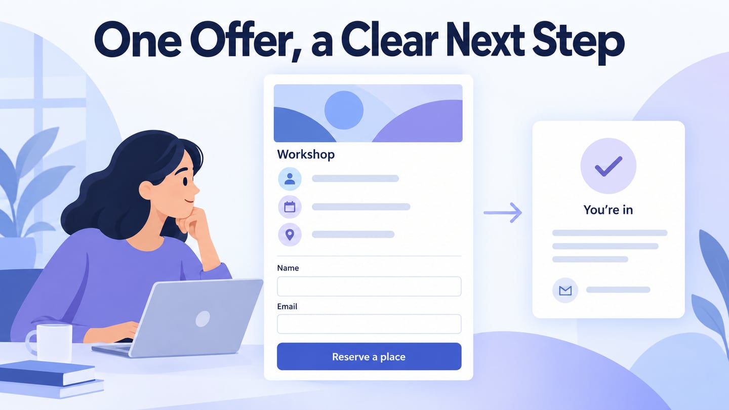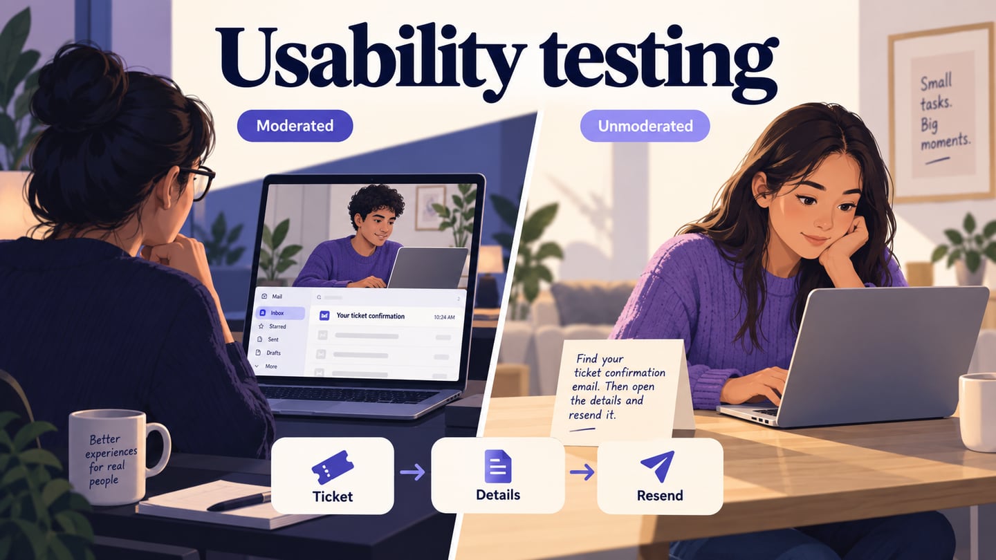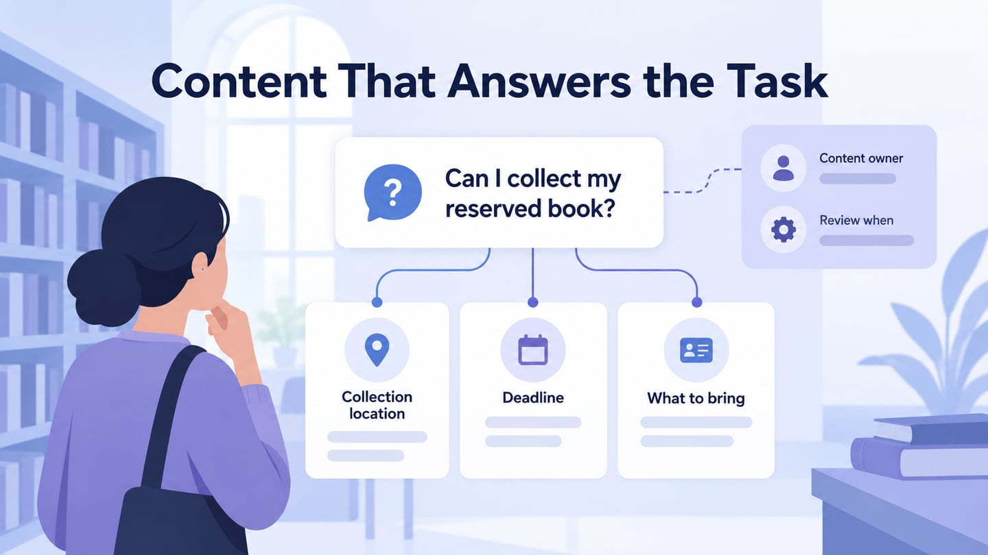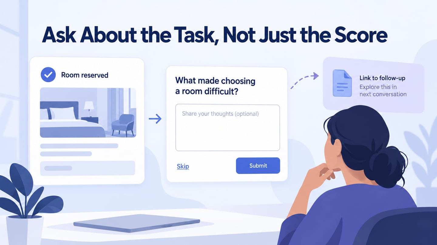
Landing page UX is about helping a particular visitor understand an offer and make an informed next-step decision. A page does not automatically turn every visitor into a lead, and more submissions are not necessarily better if people misunderstood the offer. Use a prototype of the complete landing-page journey to review the message, action, and result together. The original five principles below provide a useful framework when applied to a concrete audience and task.
Top 5 Principles for Good Landing Page UX
Start with the visitor’s reason for arriving. Record the question they expect the page to answer, what they need to know before acting, and what should happen afterward. Then use these principles to find gaps in that journey.
1. Simplicity
Simplicity means making the decision clear, not removing all detail. Group the offer, relevant conditions, supporting information, and action so the reader can understand their relationship. Remove redundant promotions and competing tasks, but keep necessary information such as eligibility or what the person will receive. There is no universal ratio of unnecessary to necessary links that makes a page effective; judge each element by its role in the task.
2. Think First about the User
Consider the audience’s context, questions, and constraints before selecting the visual treatment. Someone evaluating a team product may need to know who it is for and how a demonstration works, while someone downloading a guide needs to know its subject and format. Review the full path on relevant devices, including forms and errors. A responsive layout helps presentation, but it does not resolve an unclear offer.
3. Use Visuals to Explain the Offer
A useful image or short demonstration can explain what the visitor is considering. It should support the message rather than merely attract attention. Keep the main information readable without waiting for media to load, and do not present illustrative screens as proof of real customer results. Visual polish can support credibility, but unsupported badges or invented figures undermine it.
4. Avoid Distractions
Reduce elements that pull people into unrelated tasks, such as repeated promotions or a carousel that obscures important content. Do not remove necessary policy, contact, or explanatory information simply to keep a person on the page. A visitor may need that information to make a sound decision. The goal is understandable choice, not trapping the reader in a conversion path.
5. Make your CTAs and Links Recognizable
The action label should explain the next step. “Request a demo” and “Create an account” are different commitments, even if both lead to a form. Keep links recognizable and their destinations consistent with their wording. Check that a person can describe what will happen before activating the control.
Test the promise and the next step together
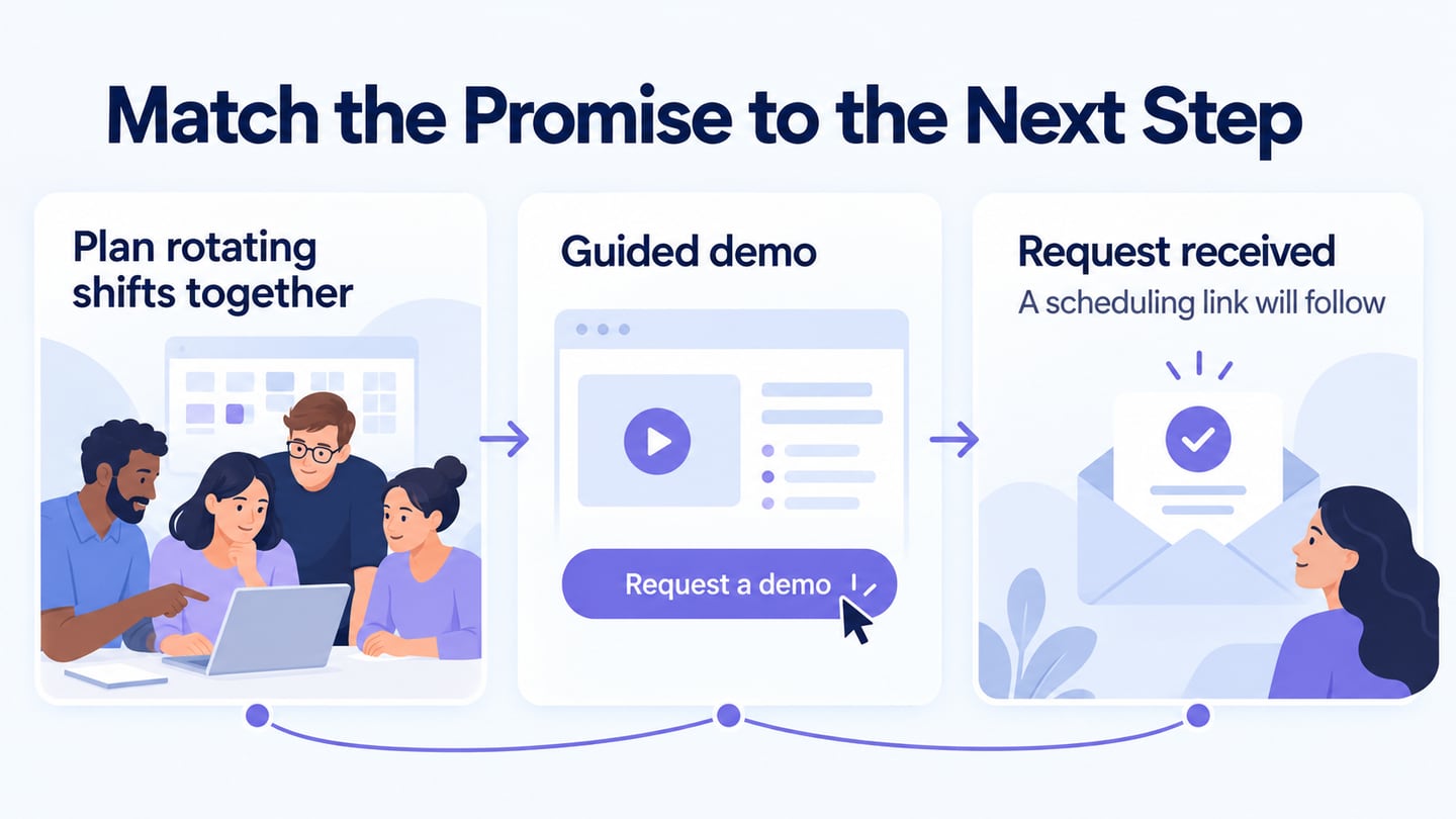
For an illustrative team-scheduling service, start with the promise “Plan rotating shifts together.” The landing page explains that the visitor can see the workflow in a guided demo. Its action says “Request a demo,” and the confirmation explains how the person will choose a time. None of these states should imply that submitting the form immediately creates a working account.
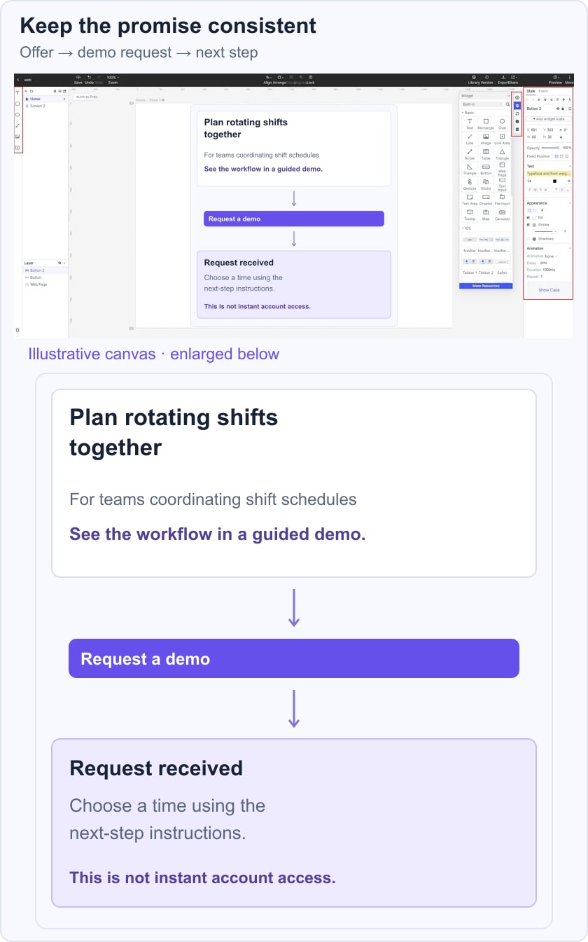
Ask a reviewer what the service is for, who the demo suits, and what they expect after submitting. If they expect immediate access, revise the wording or flow where that expectation arose. Also review a missing-field error and a failed submission so the visitor is not shown an unearned success message. This is an illustrative review task, not a report of measured conversion results.
Use Mockitt to Review the Landing-Page Journey
Mockitt can connect the offer, form, error, and confirmation states for a design discussion. Use that prototype to expose unclear expectations and missing steps before implementation. It does not establish that a form is connected to a live service or that a visual change improves conversion.
Reuse suitable components for fields and actions, but adapt the content to the audience. A template may supply layout structure; it cannot decide what information people need or which promises the service can fulfill. The retained screenshots come from an earlier Mockitt guide and explain the workflow, while current panel names may differ.
Use state changes to explain progress and feedback. Decorative animation should not hide the offer, move a control unexpectedly, or delay the next action. Include static or reduced-motion behaviour where appropriate in the implementation notes.
Features of Mockitt
- Share the relevant screens with collaborators and collect feedback about the same task.
- Use suitable assets and templates as starting material, checking their assumptions.
- Build recognizable controls with clear labels and states.
- Represent transitions and feedback that help explain what changed.
- Preview relevant desktop and mobile arrangements, including the form states.
- Provide developers with the behaviour, content, and service assumptions needed for implementation.
How to Create Landing Page UX Design
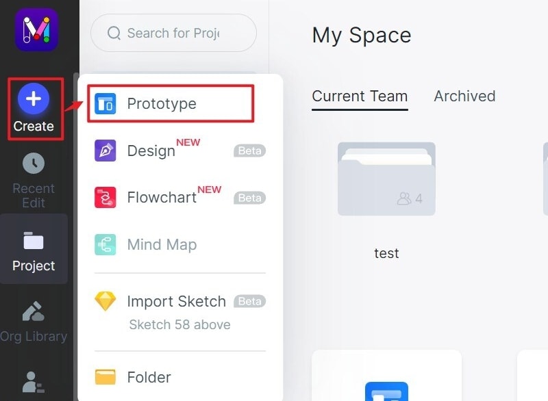
Step 1. Create a New Project
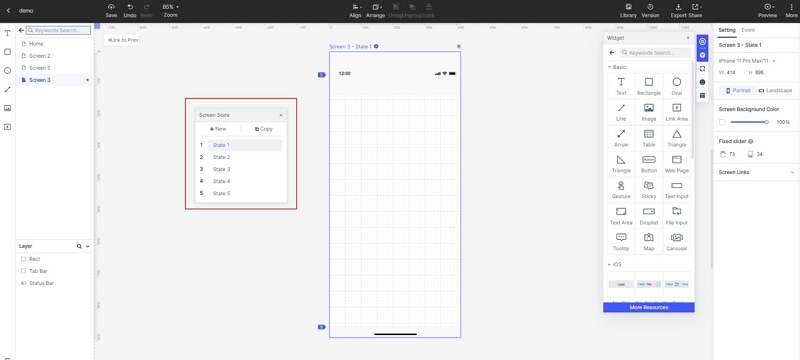
Create a project named for the landing-page task and prepare its key states. Include the page as the visitor first sees it, the form, a validation problem, a recoverable submission failure, and the confirmation. Choose the important screen sizes and record the visitor’s starting context.
Step 2. Design the Landing Page
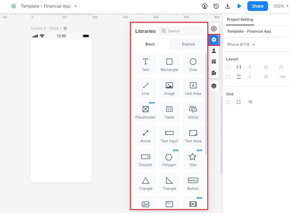
- Add Widgets and Icons
Arrange the offer, decision details, form, and action using relevant components. Keep field labels visible and request only information needed for the task. W3C’s forms guidance provides a useful basis for clear labels, instructions, and manageable input. Avoid replacing those essentials with placeholder-only fields.
- Add Links between Screens
Connect each action to the appropriate state. A valid request should reach confirmation only after the intended success condition. An error should identify the issue and provide a recovery route while preserving useful input. Do not route all form choices to the same success screen, because that hides important questions.
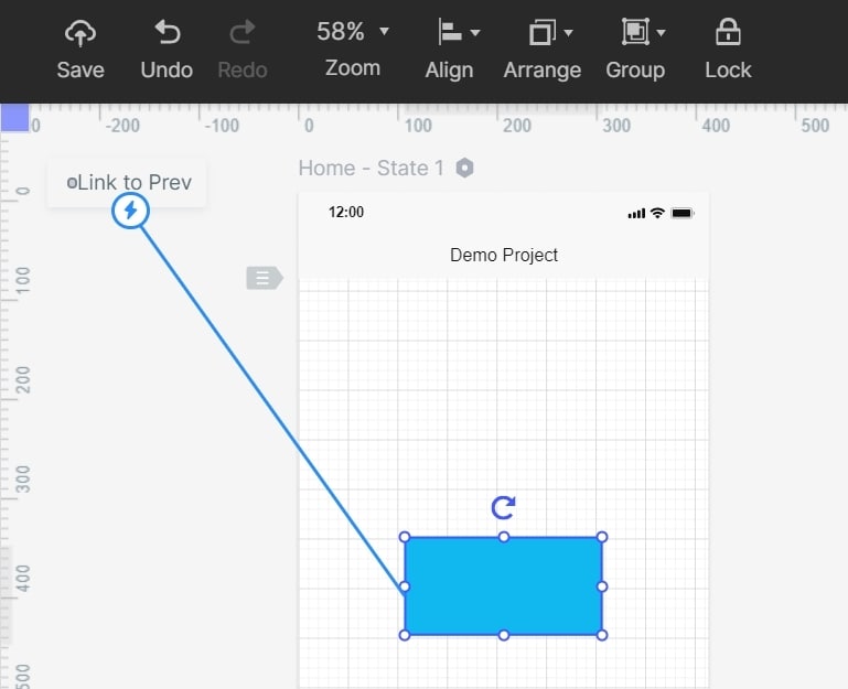
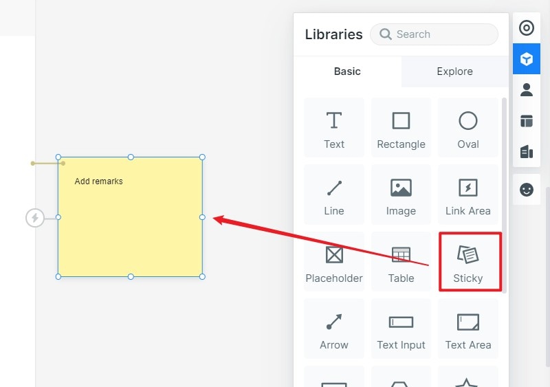
- Add Notes
Add notes for assumptions about the service, required fields, privacy information, and follow-up process. Identify who must confirm each point. Keep internal review notes separate from the messages a visitor will see.
- Create Interactive Animation
Use an appropriate pending state while the request is being processed, then show success or failure. Do not invent a progress percentage when no underlying progress measurement exists. Describe the intended behaviour and verify it against the actual service during implementation.
Step 3. Preview your Design
Preview the journey with a realistic task. Ask someone to explain the offer, complete the form, and describe the next step. Observe hesitation and misunderstandings rather than relying only on whether they like the page. Review the same questions on a narrow screen and with longer text.
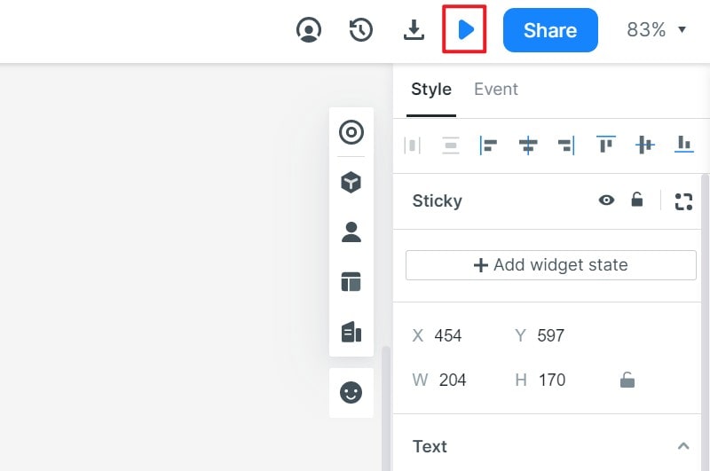
Step 4. Share the Design
Share the prototype using suitable permissions and request feedback from content, design, development, and the team responsible for the follow-up process. Access rules depend on the workspace configuration; do not assume every shared design is publicly viewable without an account.
Evaluate the released journey with the right evidence
After implementation, check that the form actually submits, the confirmation is accurate, and promised follow-up happens. Verify accessibility and performance in the working page. A design review cannot establish those outcomes on its own.
When assessing results, distinguish visits, valid submissions, qualified requests, and completed follow-up. Investigate where people encounter problems before attributing an outcome to a headline or button. A controlled comparison may help evaluate a change, but a before-and-after count without context does not prove causation.
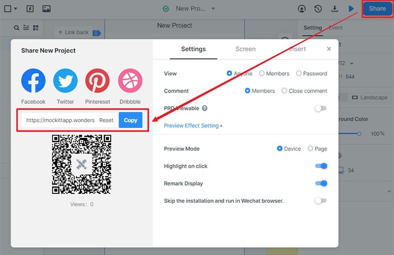 Historical guide capture; use the sharing address and permissions generated by your current workspace.