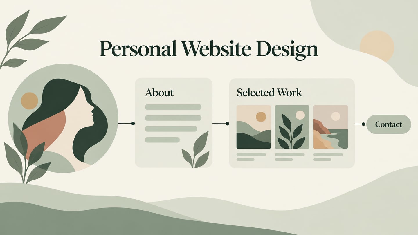
A personal website should help someone understand who you are, see evidence of your work and find an appropriate way to contact you. The layout can be expressive, but those three jobs need to remain clear. Plan your personal website in Mockitt to explore their hierarchy before committing to a theme or building the pages.
Start with the intended visitor. A potential collaborator may want a concise introduction and selected projects; a researcher may need publications and a CV; a client may need examples of the work you offer. The same personal story can require a different structure for each audience.
The five references below show different approaches to that structure. The retained screenshots document earlier designs, so use them to study the visible decisions rather than as current biographies. Keep the principle that fits your purpose and create a layout around your own material.
Five Personal Website Design Examples
These examples range from a sparse introduction to a resume, a discipline-led visual identity and a narrative portfolio. Each offers a different way to connect an individual with their work. Consider how quickly your intended visitor can move from the introduction to the supporting detail.
1. Gary Sheng
The retained Gary Sheng hero uses a photograph, his name and very little additional text. The photograph gives the page a personal point of focus while the concise introduction avoids competing messages. This is a useful approach when the next section or route can supply the detailed background.
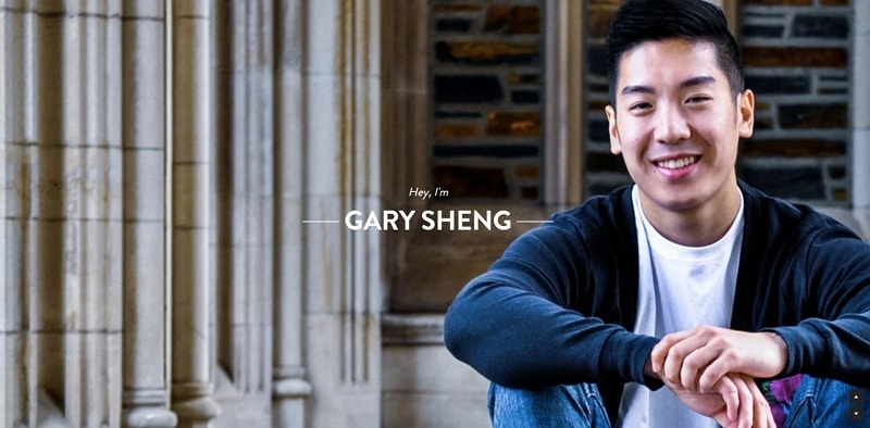
A short homepage and a separate writing area can keep a personal introduction focused. The current Gary Sheng site now presents a different structure, so the earlier layout should not be treated as a current two-page specification. The design decision to consider is how much context the homepage needs before linking to deeper material.
Keep a brief description of your work beside selected evidence. A visitor should not need to infer your role from a decorative graphic or a list of employers. Choose a few relevant links, explain what they lead to and give the most useful next step enough visual weight.
For a writing section, a clear list of titles can be more helpful than a dense wall of thumbnails. Include the context needed to choose an article, such as its subject or date. Keep the return route to the personal introduction easy to find.
2. Raf Derolez
Raf Derolez's reference emphasizes a compact introduction, graphic expression and a direct contact route. His current personal site identifies him as a design engineer and provides an About page and contact links. The useful lesson is to make the person and their work understandable before asking visitors to explore a more expressive presentation.
A small number of sections can work well when they have clear roles. Let the homepage introduce your focus, use About for additional context and direct a selected-work route to representative projects. Add another section when it answers a real question rather than to make the navigation look more substantial.
Graphic cues can give those sections character, but their labels should carry the meaning. Keep the contact action explicit and choose a destination that matches the wording, such as an email link or contact page. Do not promise a visitor response or assume that a striking icon will explain the action on its own.
A dark background can support a distinctive identity when text, controls and work samples remain easy to read. Review the actual content against that background instead of treating a dark theme as the source of the site's effectiveness.
3. Pascal van Gemert
Pascal van Gemert's retained resume design places a profile, portrait and personal details beside a right-hand section menu. Profile, Experiences, Abilities, Projects and Contact give visitors a map of the content. This makes the resume's structure visible without forcing the introduction to contain everything.
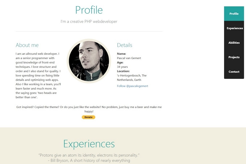
The light background and darker navigation create a clear division between reading and moving through the page. The colored section headings help establish the sequence. If you use a similar one-page structure, review how those destinations remain available on a narrow screen and whether the active section is understandable.
Select details that support your purpose rather than publishing every piece of personal information. Keep the work history and project evidence relevant and maintain them over time. The historical screenshot's age and location fields are part of that old design, not facts to copy into a new page.
4. Brandon Johnson
Brandon Johnson's retained design labels him as a planetary scientist and connects that identity with a large planetary landscape and distinctive split-name typography. His official website provides research and publication context. The visual subject therefore relates to the work rather than functioning as an unrelated background.
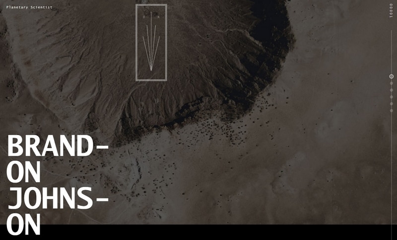
An expressive introduction still needs a readable route to the substance. For a research-oriented website, that might mean research topics, selected publications, a CV and contact information. Make those destinations understandable even to a visitor who does not know the field.
Layered backgrounds and large display lettering need careful spacing and contrast. Review them with the real name and headings at different widths; a dramatic composition should not make the words difficult to identify. Give detailed work a quieter reading area when the introduction is visually dense.
5. Quinton Harris
Quinton Harris's retained example connects a biography with a collection of visual work. The dark section contains a short narrative above several framed project images. This is a story-led approach: the writing supplies context for the work, and the images give visitors something concrete to explore.
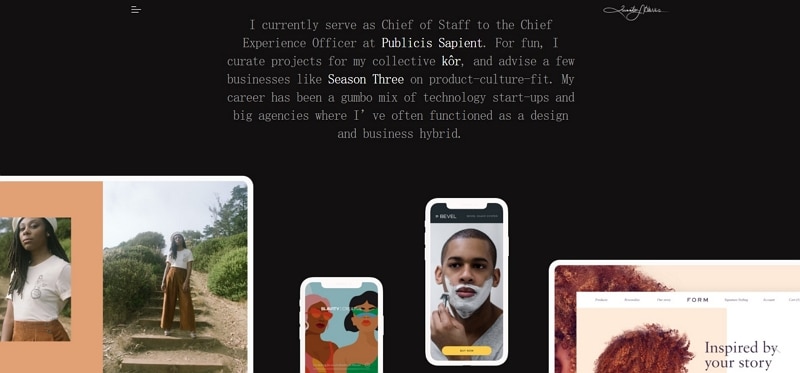
Organize those chapters around meaningful changes, interests or projects rather than a long sequence of decorative panels. Explain the role you played in a project and what a visitor will find when opening it. A contact action belongs after enough context to help someone decide whether to get in touch.
Keep links between a biography, resume and portfolio purposeful. Label the destination and avoid sending visitors through several sites simply to find one piece of information. If an artwork portfolio is central to your identity, give individual works enough detail instead of treating every image as interchangeable decoration.
Review Your Personal Website in Mockitt
Mockitt can help you arrange the introduction, selected work and contact route before implementing the site. Use realistic content and connect the screens you expect a visitor to follow. Review the resulting hierarchy with someone who does not already know your work.

Use the workspace to make these design decisions visible:
- Keep the project organized with clear screen names and the saving and sharing options available to your account. Maintain the source content you will need for implementation.
- Adapt a suitable starting layout to your biography and work samples. A template should support the material rather than dictate what you say about yourself.
- Use text, image and navigation widgets to represent the actual content. Repeat the same navigation where it helps people stay oriented.
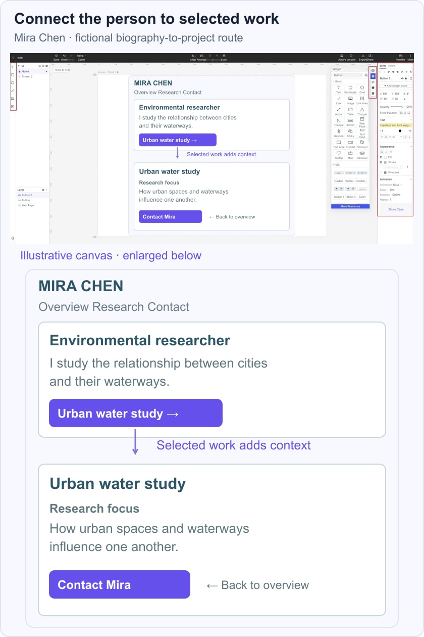
- Connect each selected-work control to the relevant detail view and provide a clear way to return. Record the intended destination of any external link.
- Preview the introduction, work and contact sequence at the intended reading size. Revise unclear wording or missing context before building the live pages.
In the fictional Mira Chen example, the overview introduces an environmental researcher and links to an Urban water study. The detail panel explains the study's focus and provides a contact route. Review whether a visitor can connect the short biography with relevant work without relying on invented credentials or a long list of unsupported claims.
After the structure is agreed, use the personal website setup guide for the separate domain, hosting and implementation decisions. Test the published site's links, media and narrow-width layout; a prototype review is one part of that process.