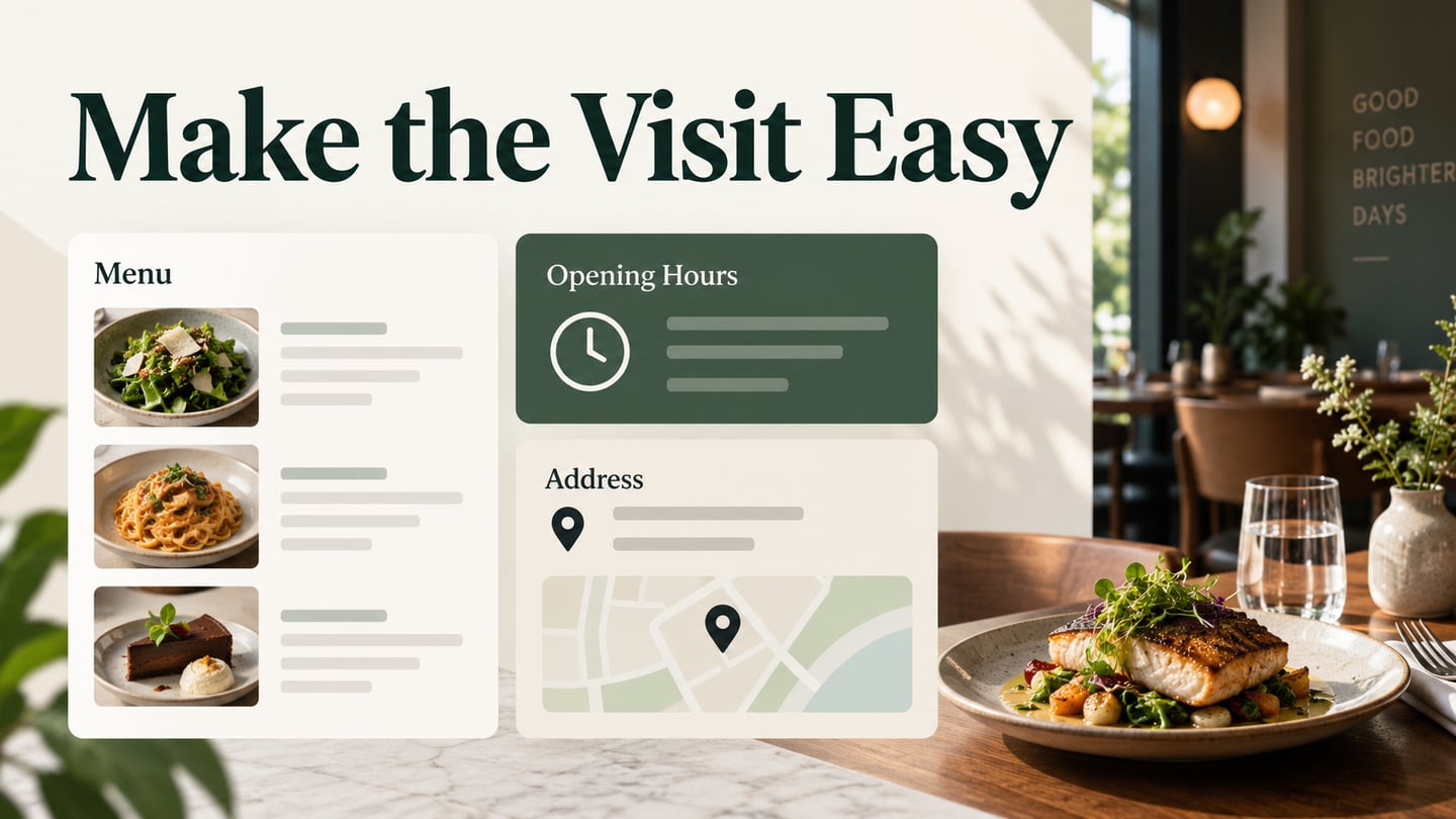
Restaurant website design should make a visit easy to plan. Food and interior photography can establish the atmosphere, but a prospective guest still needs the menu, opening hours, location and a clear reservation or contact route. Use Mockitt’s design workspace to arrange those tasks and review the information before building the site.
The nine examples below preserve useful lessons from earlier restaurant sites. Their layouts are historical references, with a current status note where it matters. Study how each design connects atmosphere with practical information, then adapt the pattern to the restaurant’s actual service and booking arrangements.
Nine Restaurant Website Design Examples
For each example, identify three things: the information visible at arrival, the route to the menu and the next step for visiting. A distinctive visual identity is useful when these tasks remain understandable. Check the same priorities on a phone, including long dish names, readable hours and an address that can be copied.
If the design uses animated food photography or transitions, keep the menu, hours and contact route available independently. Review a quiet presentation as well as the animated version, and check the controls on a touch screen. Motion should support orientation instead of delaying the information needed to plan a visit.
1. Bresca
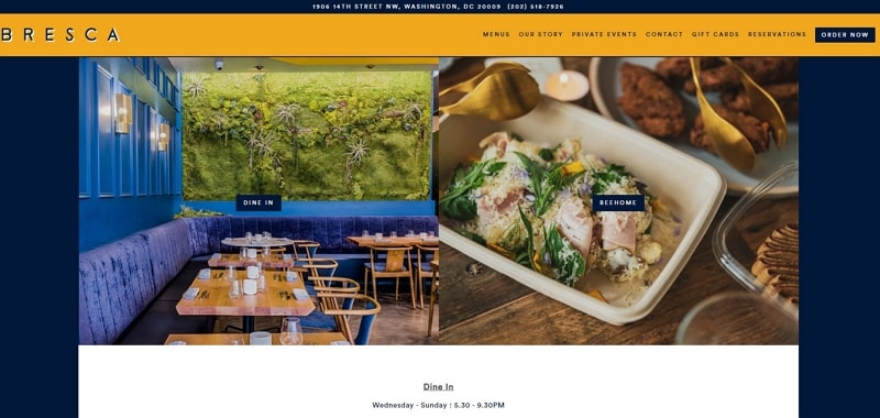
Bresca connects its restaurant identity with clear practical routes. In the retained design, the header gives location and phone details while navigation exposes menus and reservations. Food and interior photographs help explain the setting without carrying the whole task. The lesson is to keep useful contact information close to the restaurant name and avoid making a large image the only entry point. When an action leads to a reservation service, its label should explain that destination and the implemented link should be checked directly.
2. Sono
Sono’s official website provides menu, reservation and contact routes, including information about dining and private events. A compact one-page design can work for a restaurant with a small amount of stable information, but the structure should follow the content. If menus, events and locations need separate pages, give each a clear destination. Put hours, address and relevant arrival details where a guest can find them without opening every menu category. Avoid relying on an image-only menu when the same information needs to be read and searched.
3. El Burro
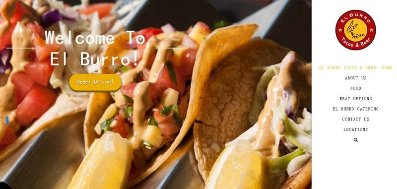
El Burro’s preserved design uses a vivid identity and food imagery to communicate its Mexican street-food character. The practical lesson is to coordinate that expressive style with a readable menu and clear visit information. A slideshow may introduce several dishes or venues, but its controls and text need to remain distinguishable from the photographs. Keep the restaurant’s name and navigation stable as images change. The captured style can inspire a composition; security, loading and responsive behavior must be checked on the implemented site rather than inferred from a picture.
4. Protein Bar & Kitchen
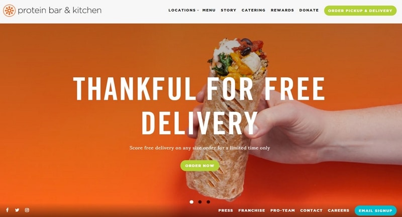
Protein Bar & Kitchen’s example combines bold color and food imagery with location and ordering routes. For a restaurant operating in several places, the selected location can affect the menu, hours and order destination. Make that selection visible and explain when it is required. A promotional carousel should not displace the practical route for someone who already knows what they want. If a campaign introduces a particular dish, send its action to relevant information rather than making the visitor restart at a generic homepage.
5. Quay
Quay remains a historical reference: the restaurant’s official farewell notice confirms that it closed on 15 February 2026. The useful design principle in this example is a restrained composition that gives dining imagery, menu information and a visit action room to breathe. For any restaurant, the website must reflect its actual operating status. When a venue closes, replace an obsolete booking route with a clear notice and relevant contact or account information, rather than allowing a visitor to follow a dead end.
6. Quince
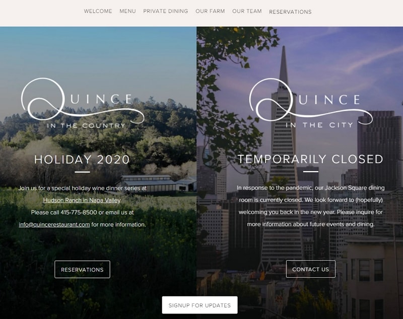
Quince’s captured homepage combines restaurant photography with routes for menus, private dining, the team and reservations. These categories distinguish the standard dining visit from a group-event enquiry or background information. Keep that distinction in the labels and destination pages. A private-dining visitor may need capacity and enquiry details, while someone planning a regular meal needs the menu and booking route. The same brand styling can unite both tasks without forcing them through an identical form or page sequence.
7. Easy Bistro & Bar
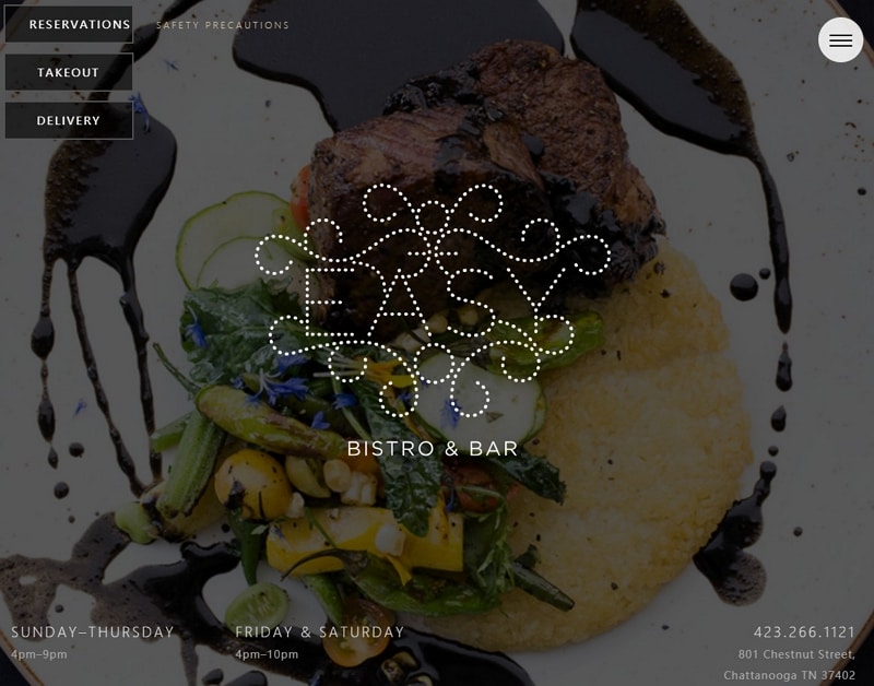
Easy Bistro & Bar gives a photograph most of the opening screen while keeping Reservations and the menu control in separate upper corners. The retained design also places hours and address information in the footer. This shows how a photographic introduction can coexist with practical navigation. On a phone, check whether the menu control is recognizable and whether the reservation action remains readable against every image. Consider an additional direct route to visit details so readers do not have to discover the footer to find an address.
8. Au Cheval
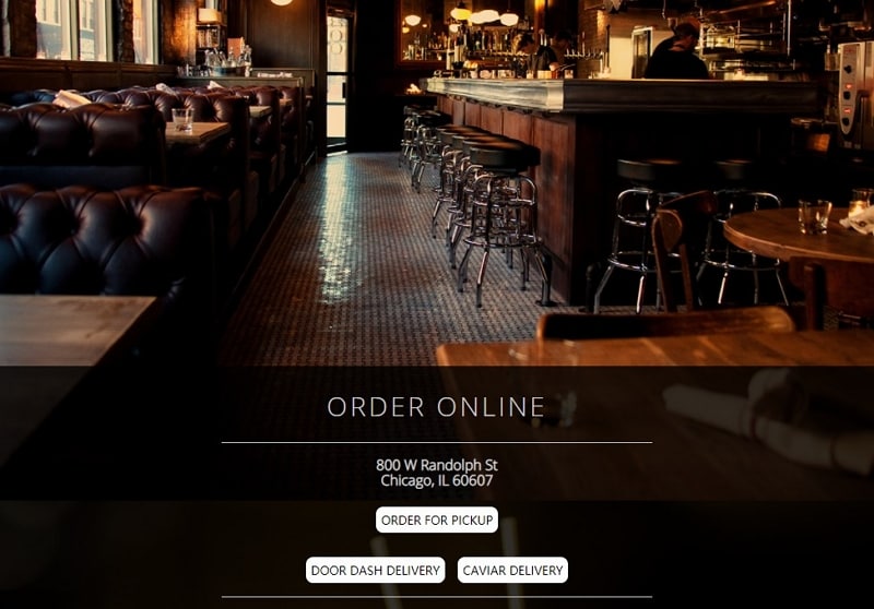
Au Cheval’s full-screen photography gives the setting a strong presence, with navigation grouped in the upper corner. The design lesson is to make the route beyond the photograph easy to recognize. A small menu icon needs a sufficient target and an understandable label; the expanded menu should expose the tasks guests need. Check how the image crops at different widths, keeping text away from busy details. If there is more than one location, make the selected restaurant clear before displaying its hours or visit information.
9. Moxhe
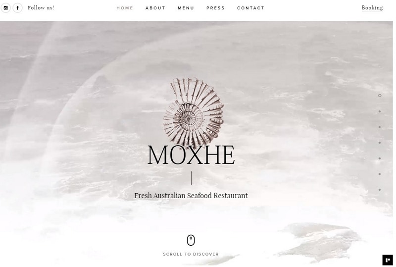
Moxhe’s preserved seafood-restaurant design uses moving imagery and a close visual focus to introduce the food. Navigation gives the visitor routes to the menu, contact details and booking. Treat the moving introduction as supplementary: the name, location and next step should remain understandable when it is paused or unavailable. Provide usable controls and a still presentation when appropriate. A strong food image can establish character, while a concise description and an explicit menu route help someone decide whether to continue.
Prototype the Menu, Hours and Visit Route
For the fictional Juniper Table restaurant, the core task is to read the menu, check opening hours and find the address. Begin with the information a guest needs, then decide where the reservation action leads. Keep this website-navigation task separate from a detailed booking-system interaction.

Build and Review the Essential Views
A restaurant app design may include a longer ordering or booking flow. For this website example, focus the prototype on the public information and the handoff to the restaurant’s chosen reservation destination.
- Use reusable menu and visit components
Create a menu section with readable dish names and descriptions. Use a consistent structure so the team can review a longer item name without changing the whole layout. Add prices or dietary information only when the restaurant supplies and verifies them. Keep the content in editable text instead of relying on a decorative menu photograph.
- Keep the practical routes visible
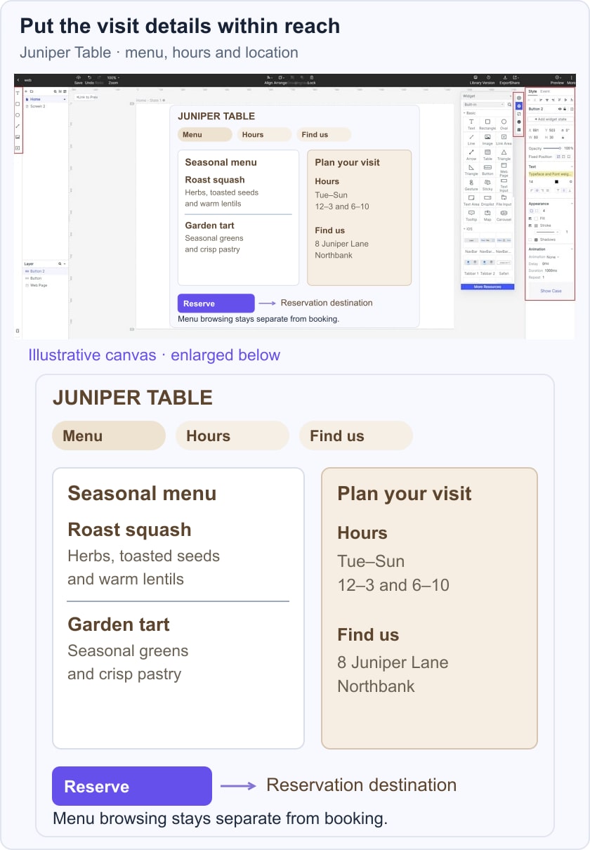
Arrange Menu, Hours and Find us as distinct choices. In the illustrative Juniper Table layout, a menu view sits beside a compact visit panel containing the address and opening hours. Reserve remains a separate action leading to the reservation destination. The composition keeps browsing the menu and planning the visit connected without introducing a date-and-time booking form.
- Preview and share the route
Ask another person to find the menu, explain when the restaurant opens and locate the address. Share the prototype for desktop and phone review, checking that the action labels remain clear when content stacks vertically. Record missing or ambiguous information as a content issue rather than trying to solve it with a stronger color or larger image.
- Adapt the starting layout to the restaurant
A template can supply a useful arrangement, but replace its sample sections with the restaurant’s actual offer. A small bistro, a multi-location brand and a private-dining venue may need different priorities. Keep the visual identity coherent while allowing the content to determine the navigation.
Before launch, check the real reservation destination, phone and map links, opening hours and menu content. Review keyboard navigation, text contrast and mobile layout in the implementation. Give the restaurant a clear way to maintain these details so a good-looking page continues to be useful after its first publication.