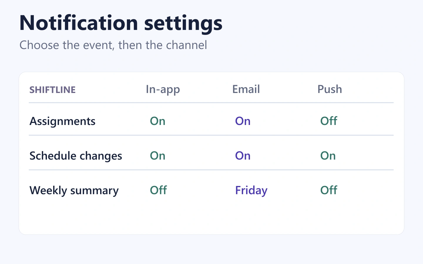
Notification settings should let people choose the messages they receive, where they receive them, and how often they arrive. Organize the page around recognizable topics, separate delivery channels from message frequency, and make the saved state clear. If device settings block push notifications, explain that separately from the person’s preferences inside your app.
A single “Notifications on” switch rarely describes all of those decisions. You can prototype the settings and feedback states in Mockitt before implementing delivery rules. This guide uses a fictional team-scheduling app, Shiftline, to show how the controls can fit together without becoming a wall of switches.
Start with the messages, not the switches
List the messages your product actually sends and the reason someone might want each one. In Shiftline, an employee may need to know about a new assignment, a schedule change, or a weekly overview. Those topics make more sense to the employee than internal labels such as “event type 12” or “workflow notification.”
For each topic, separate three questions: what is the message about, which channel can deliver it, and when should it arrive? In-app, email, and push are channels. Immediately and weekly are timing choices. Mixing these dimensions in one menu makes it difficult to predict the result.
| Topic in the example | Useful choice | What the description explains |
|---|---|---|
| New assignments | Email and push options | Let me know when a manager assigns a shift to me. |
| Schedule changes | Email and push options | Let me know when the time or location of one of my shifts changes. |
| Weekly schedule summary | Email on or off, with a delivery day | Send an overview of my upcoming schedule once a week. |
This table is an illustrative product model, not a claim about a real scheduling service. The important decision is that each control has a meaningful outcome. Do not offer a push option for a topic that your system can only deliver by email.
Some products also have account or service messages that cannot be configured on the same page. Identify those messages specifically and explain their delivery behavior. A vague “essential notifications” label is not enough, and a preference-screen design should not be treated as a substitute for a reviewed messaging policy.
Use a topic-first layout that works on a phone
On a wide screen, a topic-by-channel table can make the model easy to scan. The rows name the messages; the columns name the channels. Use clear column labels and enough space that a checkbox can be associated with its row and channel without guesswork.
On a phone, that same matrix may become cramped. Turn each topic into a small section with its description and available channel controls beneath it. “Schedule changes” can show Email and Push on separate labeled rows. The meaning stays the same even though the layout changes.
Do not hide channel names behind icons alone. An envelope might mean email, but a bell could mean push, an in-app inbox, or all notifications. Use text for the decision and icons only as supporting cues.
The broader settings-page design guide covers how to organize a settings area. For notification preferences, prioritize finding a topic and understanding its outcome over fitting every control above the fold.
Work through one realistic preference change
Consider an employee who wants fewer interruptions. They still want immediate schedule changes, but they would rather receive routine assignment information by email. They also want a weekly summary on Friday.
- Open Notification settings. Show the current saved choices, not a set of recommended defaults that overwrites them.
- Change New assignments. Keep Email on and turn Push off. The schedule-change choices remain untouched.
- Enable the weekly summary. Reveal the delivery-day choice and select Friday. Explain the applicable time zone if the product offers a delivery time.
- Save the changes. Show that the request is in progress, then confirm when it succeeds.
- Return later. The page should display the same saved choices, making it possible to verify or reverse the decision.
The outcome is specific: assignment push messages stop, schedule-change push messages remain enabled, and a Friday email summary is selected. A general success message is less useful if the user cannot also see those choices reflected in the controls.
Keep bulk controls honest. If you add “Turn off optional email,” describe which topics it affects. Do not silently change push settings, required service messages, or another account. A broad control can save effort, but it should not conceal its scope.
Choose immediate saving or an explicit Save action
Immediate saving can work for an isolated switch whose effect is easy to understand. An explicit Save action can work better when someone is making several related choices. Either model needs visible failure behavior.
In the Shiftline example, a Save changes button commits the entire set. Before saving, the controls represent a draft. During the request, the button communicates progress and prevents a second identical submission. After success, the page shows the saved choices and a concise confirmation.
| State | What the user should understand | Possible copy |
|---|---|---|
| Unsaved changes | The draft differs from the current preferences. | Save changes |
| Saving | The request is still in progress. | Saving changes… |
| Saved | The requested preferences were accepted. | Notification settings saved. |
| Save failed | The draft has not become the saved preference. | We couldn’t save your changes. Try again. |
After a failure, keep the person’s draft selections available so they do not have to reconstruct them. Do not display a success toast merely because the button was clicked. If an immediate-save switch fails, either restore the saved value with an explanation or clearly mark the unsaved choice; leaving the switch silently in the new position is misleading.
For more detail on persistence feedback, see saving states and recovery. The same distinction between a requested change and a saved change applies even when the content is a preference instead of a document.
Separate app preferences from device permission
A user can select Push in the app while their device prevents notifications from appearing. These are separate controls. The app preference describes which messages the person wants; the device permission determines whether that delivery route is available.
Android’s notification-channel documentation explains that users can control channel behavior in system settings. Your app’s settings screen should not imply it can override a device-level choice.
If the app can reliably detect that push delivery is disabled, show a message near the affected controls: “Push notifications are off in your device settings.” Provide an appropriate route to the system settings when supported. Keep email controls usable, because a blocked push route does not mean every channel is unavailable.
Do not repeatedly prompt someone who has declined permission. Let them choose to open the relevant settings when they want to change that decision. If the app cannot determine the current device state, avoid stating that push is definitely enabled. Design the unknown state rather than treating missing information as permission.
After returning from device settings, refresh the permission status. A stale warning that remains after notifications have been enabled creates a different kind of confusion. The prototype should include this return path, even if its state change is simulated.
Explain frequency, quiet periods, and account scope
A weekly summary needs more than an on/off label if users can choose when it arrives. Show the day and, when relevant, the time zone. If a product offers quiet hours, explain whether messages are delayed, collected into a digest, or omitted. “Mute until tomorrow” and “Send tomorrow’s digest” do not promise the same outcome.
Use a clear hierarchy for exceptions. For example, a user might want to pause optional push messages for an evening while keeping schedule changes enabled. If the product supports that distinction, show it explicitly. If it does not, do not draw a more flexible screen than the delivery system can honor.
Also make the scope visible in products with several teams or workspaces. “Your notification settings for the Downtown team” is different from “Your account notification settings.” Changing one team should not unexpectedly change every team, and switching accounts should not carry an unsaved draft into the wrong context.
Prototype choices, saving, and blocked delivery together
Create the preference page in Mockitt with real labels and a small number of topics. Build a second state with assignment push turned off and the Friday summary selected. Add the saving, saved, and failed-save states, plus a separate version with device push blocked.
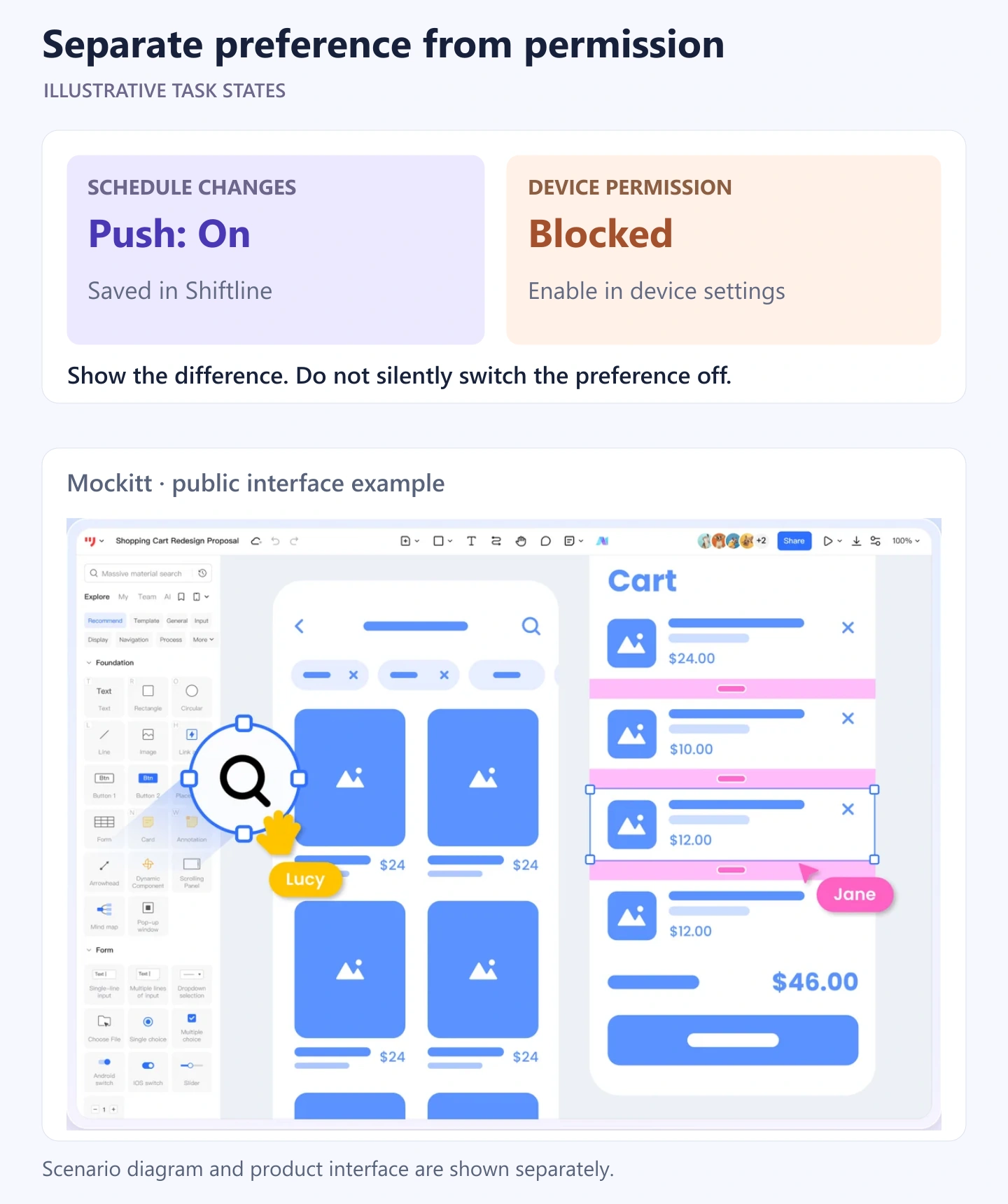
Connect a short review path: make the three changes, experience a save failure, retry, and return to the saved page. Then show the blocked-device state and ask what the person expects to receive. A reviewer should be able to explain the outcome without reading a technical specification.
Keep the notification preview itself separate from its preferences. The notification UI guide addresses how an alert appears; this screen controls whether and how it arrives. Together, the two flows should use consistent topic names.
A prototype can expose ambiguous labels, confusing scope, and misleading save feedback. It does not prove that email or push delivery works. Carry the selected topics, channel rules, persistence behavior, and device-permission states into implementation testing so the actual messages match the control people thought they were setting.