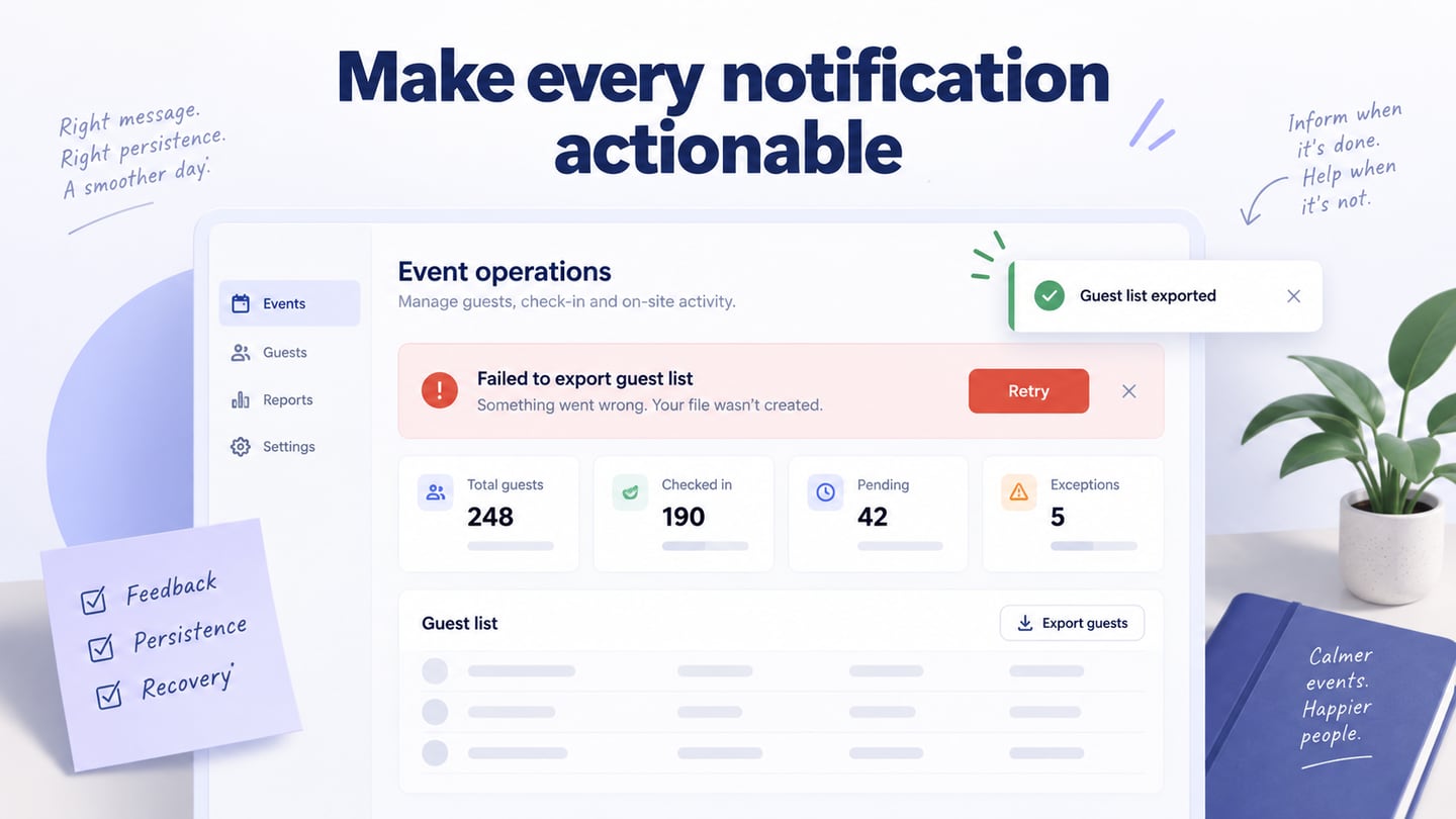
A useful notification UI tells someone what changed, whether it needs attention, and what they can do next. An email alert outside an app is one example; an in-app banner, toast or notification tray serves a different context. Do not assume that every message needs an interruption. Choose its location, persistence, wording and actions according to the consequence of missing it, then use icons and color to reinforce that meaning. For messages that users can opt into, design notification settings by topic and channel separately from the messages themselves, including how preferences are saved and how device permissions affect delivery.
A Workspace for Prototyping Notification Behavior
Use Mockitt’s interactive prototyping workspace to represent the dashboard, its notification tray and the screen reached from a message. A linked design lets reviewers examine the message in the context of their task rather than as an isolated card. It also makes different outcomes visible: an export that is still running should not use the same wording or treatment as one that has failed. A prototype demonstrates the intended interface, not a live push-delivery service.
Screen states and reusable widgets help keep recurring messages consistent while you compare alternatives. Define a small message anatomy: a short status label, the object affected, a useful next action when needed and a dismiss control when dismissal is safe. Use reusable interface components for the same structure across the dashboard. The historical captures below illustrate project creation, widgets, links and preview; control locations may differ in the current workspace.
How to Create Notification Dashboard UI Design
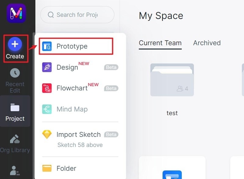
Step 1: Create a new project
- Create a project for the dashboard and choose a screen size suitable for the intended device. Name the project after the workflow, such as Workshop guest list, so reviewers understand the task. Begin with the dashboard’s normal state before adding interruptions; without that baseline, it is difficult to judge whether an alert obscures important work.
- Name the screens by outcome, for example Exporting, Export failed and Export complete. Keep the same underlying selection across these screens. A person should be able to tell whether their chosen guests remain selected after an error instead of guessing whether they must start again.
Step 2: Design the Message and Its States
- Add the dashboard controls, message text and relevant icons from the available widgets. For each message, state what happened before styling it. “Export failed” is more useful than “Oops” on its own; “Retry export” describes the next action. Keep success, warning and error labels visible instead of relying on green, amber and red alone.
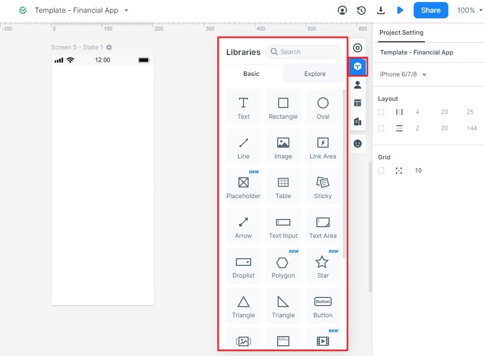
- Connect the initiating control to a pending state and then to separate success and failure outcomes. Link a Retry control back to the pending screen. Define what opening a notification does: it might reveal a particular record rather than return the user to an unrelated dashboard home screen.
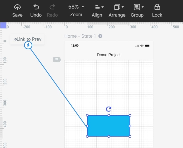
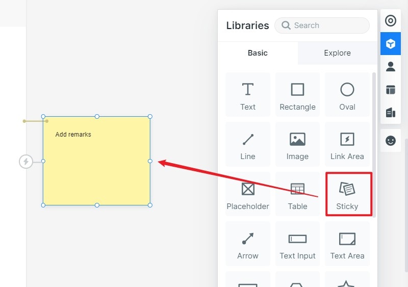
- Add a design note for behavior that a static screen cannot prove: whether the message persists, when it is announced, what dismissing it changes and where it can be found again. Reading a notification, dismissing it and resolving its underlying issue are separate events; avoid treating all three as the same action.
- Use states to show changes without requiring animation. If motion helps identify a newly arrived message, keep it restrained and ensure the meaning remains available when motion is reduced. Specify the relevant keyboard and announcement behavior for implementation review.
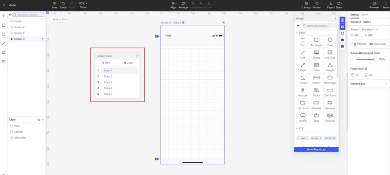
Step 3: Preview the Notification Flow
- Preview the normal, pending, failure and success screens in sequence. Check whether the user can still identify their original task and whether an action leads somewhere useful. A transient success toast may be enough when the completed result is visible elsewhere. A failure that blocks progress generally needs a persistent explanation and recovery path.
For a workshop dashboard, prepare three linked screens for exporting a guest list: Exporting guest list, Export failed with Retry, and Guest list exported with View file. Keep the selected guests visible in the failed state. Ask a reviewer to explain what is safe to do next and whether dismissing the message would resolve the problem. This exposes ambiguities that a collection of polished notification cards would miss.
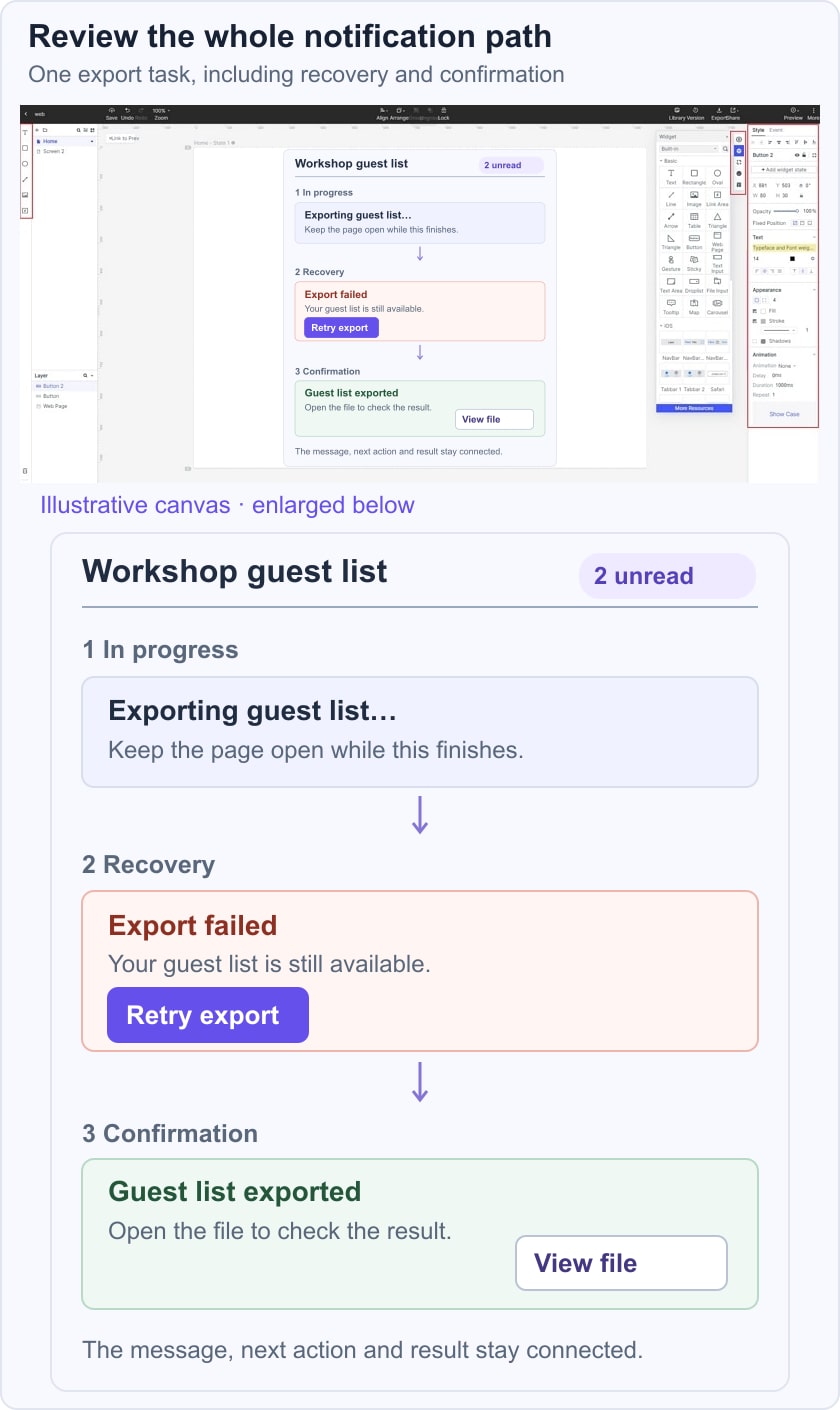
The W3C status-message guidance explains how applicable updates need to be available to assistive technology without taking focus. Record that requirement alongside the visual design, then test it in the implemented interface. A screenshot cannot establish announcement timing or keyboard access.
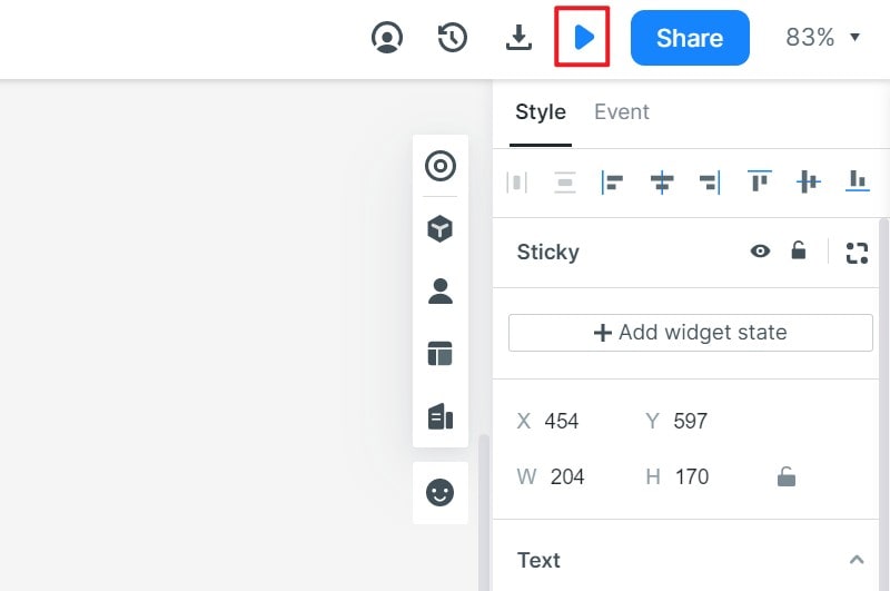
Step 4: Share the Design for a Focused Review
- Share the current prototype with appropriate permissions and ask reviewers to attempt the export, encounter the failure and recover. Use a focused design review to separate questions about wording, visual emphasis and system behavior. Record the chosen message lifetime and destination with the approved screen; comments on a picture alone can leave those decisions unresolved.
Five Notification Patterns to Evaluate
Flash message - Success & Error
The historical Flash message – Success & Error reference, attributed to Venturix Studio, illustrates the value of distinguishing a completed action from a failed one. Keep that distinction, but evaluate the wording as well as the visual treatment. “Saved” should refer to a confirmed result; an error should identify the affected action and offer a useful next step. Neither a cheerful icon nor a polished card establishes that a notification is understandable. For a dashboard export, success can point to the file while failure keeps the selection and offers a retry.
Toast Messages + Notifications
The Toast Messages + Notifications reference, attributed to Dario Figueroa, uses compact feedback that leaves the main task visible. Toasts can suit low-risk confirmations when the result remains discoverable, such as an item visibly appearing in a list. Do not make every error disappear after the same timer. A message that contains an essential recovery action needs enough persistence for the person to find and use it. Decide where the information goes after dismissal and whether several incoming messages could obscure one another.
DailyUI#11
The DailyUI#11 Flash Message reference, attributed to Maddy Fréville, pairs a short success or error message with a prominent icon. A compact card can be easy to scan, but “Oops” is only a tone choice, not a diagnosis. Follow it with the task-specific problem and recovery action. When reviewing the design, cover the icon and color temporarily: the remaining text should still explain the outcome. This is especially useful when the same notification appears in a narrow mobile viewport.
Alert Message Rebound
Alert Message Rebound – Version 2, attributed to Miguel Marques, separates success, information, warning and error. Use these as semantic roles rather than four mandatory interruption levels. A warning may describe a consequence before someone commits an action; an error describes a problem that has already occurred. Keep the meanings of your status colors consistent, and combine them with text and symbols. Also distinguish severity from unread state: a new message is not automatically an urgent one.
Plain & Warm Flash Messages
Plain & Warm Flash Messages, attributed to Yuki Yoshinaga, contrasts restrained and warmer visual treatments for completed, warning and failed states. A softer palette can change the tone without changing what the message means. Check contrast and readability in the actual surrounding dashboard rather than judging the card on a blank background. Use the same action label and message hierarchy when comparing themes so the visual choice does not conceal a behavioral difference. For the workshop example, the important outcome is that a reviewer understands the failed export and can retry without losing the selection.