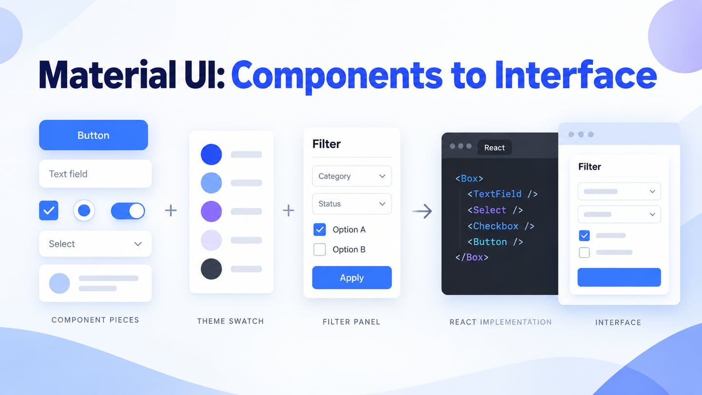
What Exactly Is Material UI?
Material UI is an open-source React component library maintained by MUI. It implements Google’s Material Design 2, according to the Material UI overview; it is not the Material Design specification itself or a native Android/iOS design app. A Mockitt UI design can help you plan the interface and states before a developer implements them with the appropriate components.
The library provides reusable interface building blocks with configurable behavior and styling. It can reduce the amount of repeated component work, but a developer still needs to understand React, state, accessibility, and the application’s data. Begin with a small screen and the documentation for its components rather than treating a library as a complete website.
The following four areas explain how components, their APIs, themes, and styling work together. Keep the design intent separate from the implementation mechanism so the team can discuss both clearly.

What Can You Do with Material-UI?
Material UI supplies implementation components, not just a collection of static design assets. Decide which controls the task needs, what states they have, and how they fit the product’s visual language. This is part of UI development, even when the starting screen was designed in a visual editor.
- Website components
- API components
- Themes
- Styles
Website Components
Components cover common interface needs such as buttons, inputs, navigation, layout, feedback, and data display. Choose the component that matches the task, then test its behavior in context. The MUI X Data Grid belongs to the separate MUI X package family: its Community package is MIT-licensed, while Pro and Premium features require commercial licenses. Do not assume every advanced grid feature is part of the core Material UI package.
Component APIs
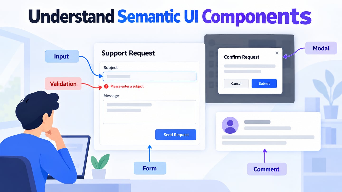
A component API documents the props, callbacks, slots, and other supported ways to configure that component. It is not another edition of the design system. For example, a form control needs a clear label, a value, and appropriate error behavior; the API helps a developer connect those requirements to the application. Read the documentation for the installed library version before relying on a particular option.
Themes
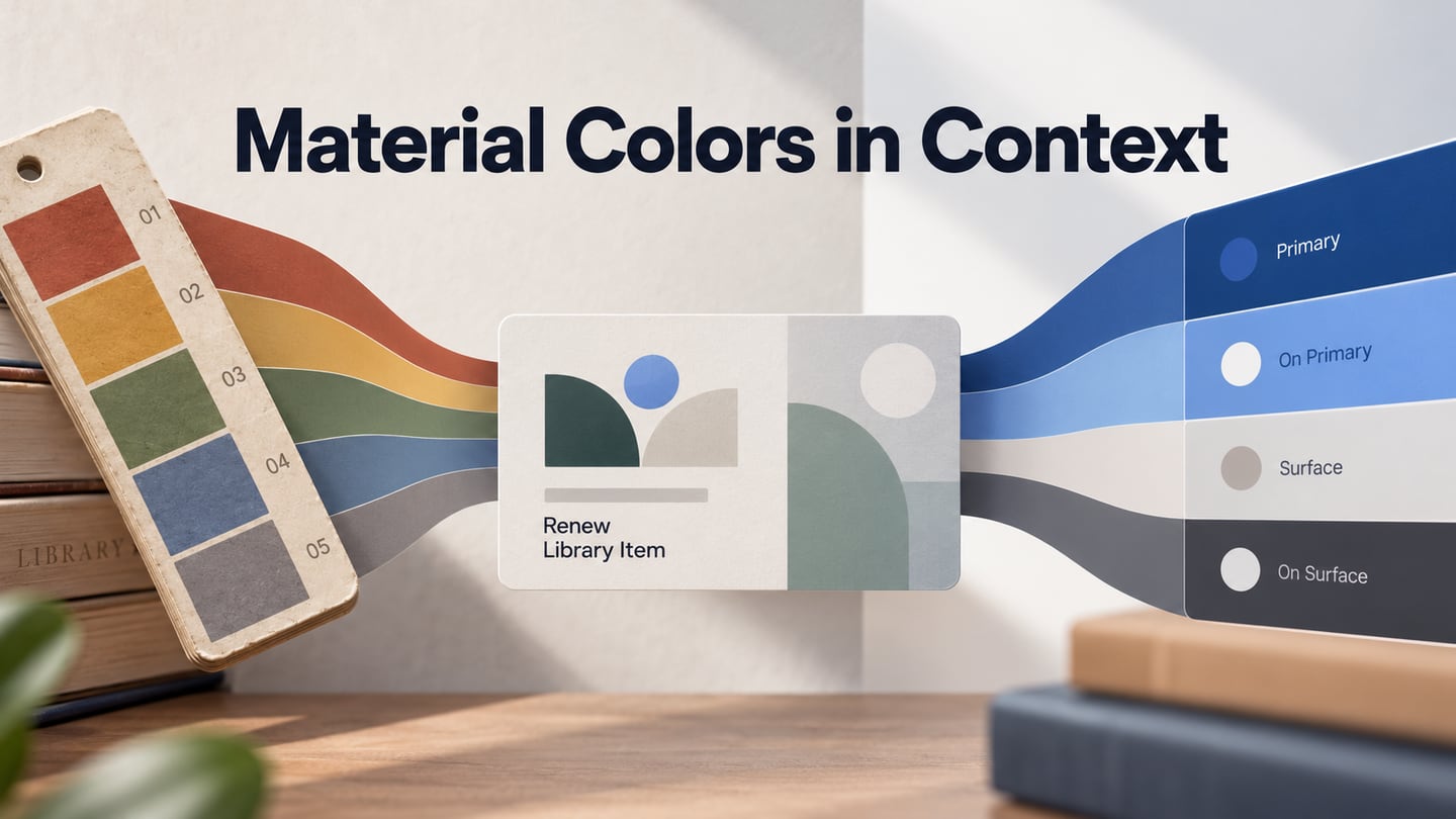
Material UI theming lets a team configure shared choices such as palette and typography, and apply a theme through ThemeProvider. Use those shared choices to keep related components consistent, then check the rendered result. A brand color does not automatically provide enough contrast, and a larger default font may change wrapping and control height. Theme decisions should be tested with real content rather than treated as decoration added at the end.
Styles
Styling controls the appearance of a component or layout. Choose a consistent approach for local adjustments and shared theme rules, and document exceptions. “Basic,” “advanced,” and “API” are not three versions of a website design. Avoid overriding a component so heavily that its intended states, focus indicators, or responsive behavior become unclear.
Together, components, APIs, themes, and styling give a developer a foundation for a React interface. They do not decide which information belongs on a screen or whether the flow meets a user’s need. Those questions still require design and evaluation.
Plan the Interface and Handoff in Mockitt
Use Mockitt to make the design intention reviewable before implementation. Arrange the screens and relevant states, share the prototype, and collect feedback about the task. This complements a React component library rather than replacing one. A successful design review does not guarantee conversion, production performance, or accessibility compliance.
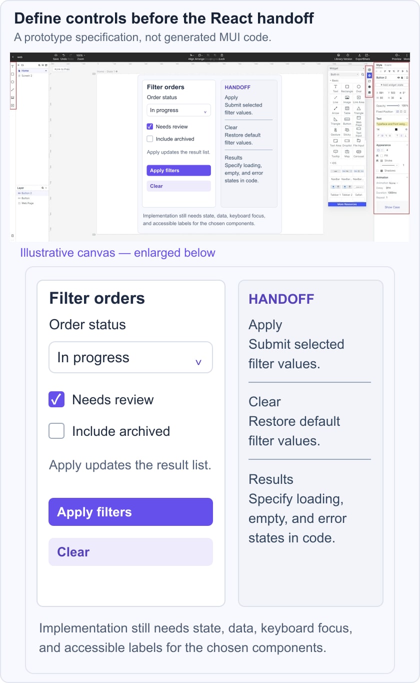
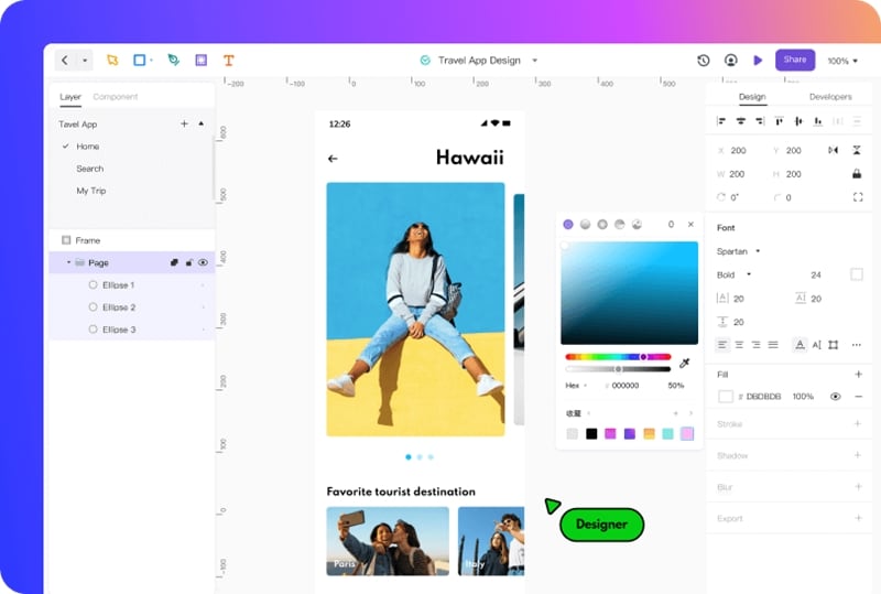
For an order-filter drawer, define the choices, default values, and Apply and Clear behavior before styling it. A checkbox, select, and button may correspond to implementation components, but their labels and state rules belong to the product. The historical editor image shows the design workspace; it does not demonstrate automatic export of Material UI code.
Functionalities of Mockitt app
- Use templates as starting points, then replace sample content and controls with the ones required by the task.
- Represent interactions and transitions where they help explain a change of state.
- Arrange interface elements visually and review how they fit together.
- Provide developers with the design, assets, labels, and behavior notes needed for implementation.
- Collaborate with teammates and collect feedback on the interface and its states.
For the filter example, specify whether choices apply immediately or only after Apply, what Clear resets, and how the drawer closes. Add the empty-result and loading cases to the handoff notes even if the first prototype focuses on the main path. The developer should not have to infer these rules from an attractive default screen.
The example below pairs an order-filter drawer with three explicit notes: Apply submits the selected filters, Clear restores the defaults, and the result list needs a loading state. Its sample order labels are illustrative. The composition describes interface intent; a React implementation must still manage state, data requests, keyboard focus, and accessible names.
The community (library) in Mockitt
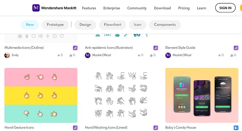
A design-asset library can provide widgets, icons, and templates to adapt to a prototype. The historical community screenshot below shows an earlier collection and branding; it is not a current catalog or a guarantee that a particular asset is available. Check the source, usage terms, and suitability of an asset before putting it into a project.
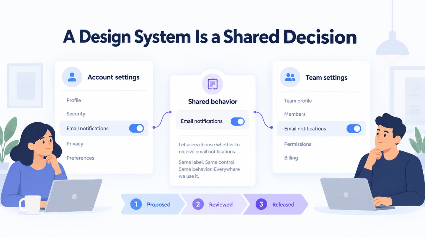
Mockitt design assets and Material UI components serve different stages of the work. One helps communicate a design visually; the other supplies React implementation components. Compare them by role rather than by an unsupported count of icons or templates. A visual resemblance between a prototype control and a component does not prove that they have the same behavior.
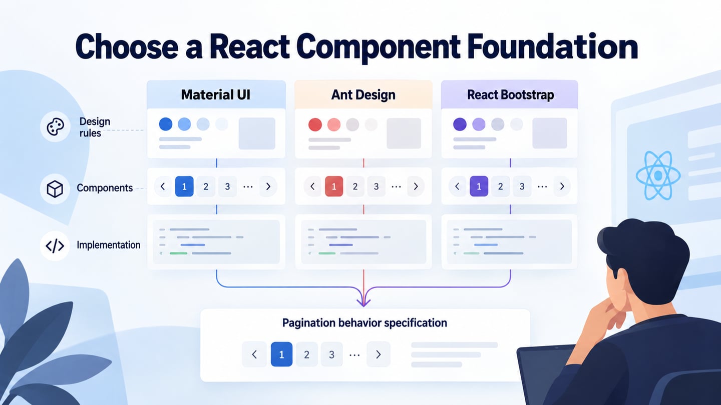
Reuse a design asset when it matches the interaction, and adapt it when it does not. Keep terminology consistent across the design and the code handoff: labels, selected values, error messages, and reset behavior are more useful than an asset count. The Ant Design component guide offers another implementation-library reference when a team is considering a different React component system.
Conclusion
Material UI can support a React interface with reusable components and theme configuration. Mockitt can help the team review the intended screens and states before that implementation. Start with the task, document component behavior, and apply UI design principles consistently. Verify the resulting application rather than assuming that either a library or a prototype makes it complete.