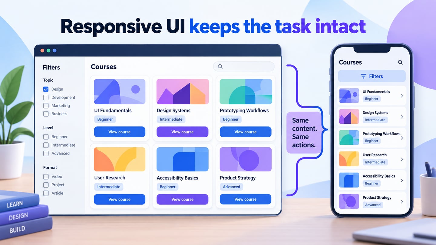
Responsive UI design keeps an interface usable as the available space changes. It is more than shrinking a desktop screen: text may wrap, columns may reorganize and navigation may need another form. Use Mockitt’s UI design tools to plan those alternatives and explain them to your team, then verify the responsive behavior in the implemented browser experience.
What Is Responsive UI Design?
Responsive UI design adapts a layout to its available space and relevant display conditions while preserving access to the content and tasks. Screen width matters, but so do long text, enlarged type, orientation and input conditions. The three principles below describe the implementation approach; a prototype helps communicate the intended results rather than proving the code works.
Fluid grids use flexible sizing and constraints so content can share the available width. Columns do not have to retain an identical percentage at every size: a sidebar and content area may become a single column when they no longer fit. Base the change on the content’s needs rather than a list of specific device names.
Flexible images and other media should fit their containers while preserving their intended proportions. Avoid forcing both width and height to unrelated values, which can stretch a picture. Decide when an image should fit fully or be intentionally cropped, and identify the important subject before allowing a crop.
Media queries allow styles to respond to conditions such as viewport width. They do not simply identify a device model. Choose breakpoints where the content or controls need to change. MDN’s responsive design guide explains how these techniques work together.
Use a Design Workspace to Plan Responsive Behavior
Mockitt can help you organize screens, reusable elements and interactive prototype paths for review. Create representative wide and narrow layouts, use realistic content and annotate the rules that connect them. Check current plan limits before starting a project; access to a design workspace does not imply that every feature or team workflow is unlimited.
 The retained guide image shows an earlier Mockitt interface; the catalogue example below explains the responsive layout decisions.
Linking screens lets a reviewer inspect a task, such as opening filters and viewing results. It does not turn those screens into a finished website or guarantee that intermediate widths reflow correctly. Keep the design decisions separate from the implementation evidence: developers still need to build layout rules, keyboard behavior and accessible controls.
The deliverable should show what stays consistent and what changes. Record content order, image behavior, navigation choices and exceptional cases. A pair of polished screenshots without those decisions leaves the developer to guess how the interface behaves between the shown sizes.
How to Plan a Responsive UI in Mockitt
Use the five-stage workflow below to develop and review a responsive proposal. The retained screenshots show an earlier Mockitt interface, so control positions and labels may differ in the current workspace.
Start with the same task at more than one width. For a mobile interface, also account for short viewing sessions, touch and an on-screen keyboard. Do not remove an essential capability merely because it requires a different arrangement.
Step 1: Create a Project and Define the Viewports
- Open your Mockitt workspace and create a project for the task you will review.
- Choose a blank starting point or a relevant template, then name the project so reviewers recognize its purpose.
- Create representative wide and narrow screens with the same realistic content.
- Record the intended viewport sizes and the reason for the layout change; these examples are review cases, not the only sizes the final interface must support.
Step 2: Arrange Content and Reusable Elements
Use available widgets, icons and text elements to establish the layout. Begin with content order and hierarchy before decorative detail.
For a learning catalogue, use Design foundations and Writing clear interfaces as two course cards. The wide view has Topic and Level filters beside the results. In the narrow view, put a Filters control above a single column, with the same titles and View course actions. Show an overlay with Beginner selected and Apply filters. The task and information stay available even though their arrangement changes.
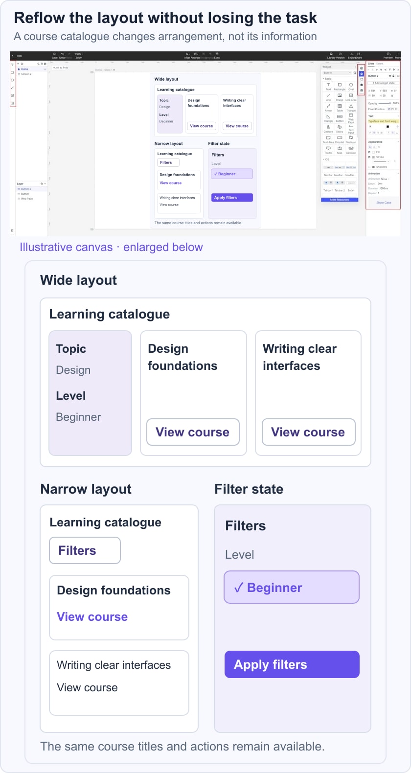
- Locate the available asset and widget panels in your current workspace. Their arrangement may differ from the historical guide image.
- Use a simple set of text, shape and control elements to establish the first screen.
- Choose icons only when they clarify an action; a Filters label should remain understandable without depending on the symbol alone.
- Add the required elements to the canvas, then replace placeholder copy with actual-length text.
- Arrange cards according to the chosen width. Avoid simply scaling the complete desktop composition until the text becomes too small.
- Adjust spacing, type and control sizes, keeping related information together as lines wrap.
- Save repeated card or control treatments for reuse so the two layouts remain consistent.
- Include a long course title and a missing-image state in the reusable examples. These cases reveal layout assumptions that short sample text can hide.
Step 3: Link the Task Across Screens
- Link Filters to the filter state, Apply filters to the results and View course to a detail screen. Record the selected values and explain whether they remain after a return action.
- Show the relevant loading, empty or error state separately when it affects the task. Do not assume that a link to a file or media URL implements a live data source, working form or responsive website.
Step 4: Reuse Assets and Document State
- Keep recurring controls consistent with the button design rules used across the project. Review labels and focus treatment as well as visual appearance.
- Use screen variants or available widget states to communicate selected filters, an open panel and the resulting list. Annotate which changes respond to width and which respond to a user action; those are different types of behavior.
Step 5: Preview, Review and Hand Off
- Preview the linked task at the intended sizes. Check long labels, empty results and the return path. Then test the implemented page between those sizes, with enlarged text and with keyboard navigation; a prototype alone cannot establish browser accessibility.
Share the Design and Its Rules
- Share the prototype with the appropriate review permissions and ask colleagues to complete the catalogue task. Check that they can open filters, select a level and find the same course at both widths. Review scrolling and anchor behavior when a panel or header stays fixed.
- Hand off the layout rules, state changes and unresolved questions with the design. Use the W3C reflow guidance to review avoidable two-dimensional scrolling and loss of information. The final check belongs in the working page with real content, not only in screenshots.
A responsive design is ready for implementation when the team understands both the visible layouts and the rules between them. Preserve the same course information, keep controls available, maintain image proportions and make exceptions explicit. That is a more useful handoff than promising support for every device based on two static frames.