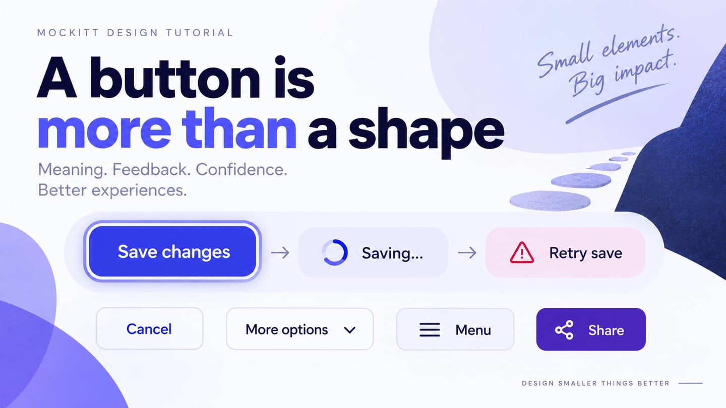
Buttons let people act on an interface: save a change, open a menu, retry a failed request or share a resource. A clear button communicates its action before activation and provides understandable feedback afterward. Its label, emphasis, target size and states work together; a bright rectangle alone is not enough. Use Mockitt’s UI design workspace to compare these decisions in the surrounding screen. The five types below are common patterns, not a ranking of universally better shapes.
- Part 1: Five button types and their uses
- Part 2: Design and review buttons in Mockitt
- Part 3: Create and test the button states
Five UI Button Types and When to Use Them
1. Call-to-Action Button
A call-to-action button emphasizes the next meaningful action, such as Save changes, Request a demo or Add to cart. Its prominence should match its role in the current task. Several equally strong primary buttons can compete for attention. State the outcome in the label rather than relying on vague wording such as Continue when the consequence matters. A marketing CTA that navigates to another page may be implemented as a link styled like a button; appearance and semantic behavior are separate decisions.
2. Text Button
A text button uses its label and interaction states without a prominent filled background. It can suit a lower-emphasis action, such as Cancel beside Save changes, but still needs a discoverable hit area and visible focus. Do not confuse it with a text link: links navigate, while buttons perform actions. Underlining, color and placement should follow a consistent convention so a reader can predict what activating the control will do.
3. Dropdown or Menu Button
A menu button reveals a set of actions, such as Rename, Duplicate and Archive. Give it a useful label, indicate its expanded state and define how the menu opens, closes and receives keyboard focus. Do not hide the only essential action in an unlabeled icon. A select control for choosing a form value is a different pattern from a menu of commands.
4. Menu Toggle
The three-line hamburger symbol commonly opens navigation, but familiarity is not universal. A visible Menu label can clarify its purpose. Specify the open and closed states, a clear way to close the panel and where focus goes when it closes. Saving screen space is useful only if people can still find the destinations they need. Consider the surrounding navigation and available width instead of choosing a hidden menu automatically.
5. Share Button
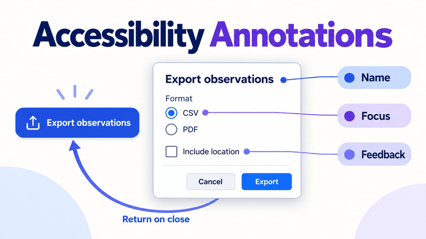
A Share button may open a link-sharing dialog, copy a link or call the device’s sharing interface. Its behavior should be explicit, especially when access permissions determine who can view the resource. Copy link does not mean the recipient has access, and a button should not imply that a social post was sent when it only opened another service. Show a clear result and a recoverable error when the operation fails. If the sharing panel is modal, the modal dialog UX guide explains how to choose the surface, manage keyboard focus and return people to the action that opened it.
Reference context: the original collection discussed common button patterns. The behavior guidance here follows the W3C button and menu-button patterns linked below.
Design and Review Buttons in Mockitt
Mockitt can represent a button inside the screen it affects, with linked screens or states for the resulting interaction. Design the control as part of a task rather than as a detached style sample. A prototype can show the intended save, cancel or retry sequence without implementing the underlying request. Use the following workspace capabilities for that review.
 Earlier workspace example; the task-specific button states are illustrated separately.
Asset library: start with available shapes, labels or button widgets and adapt them to your component rules. Check padding, alignment and the longest expected label instead of assuming the default widget is appropriate for every task.
Design: build the default and alternate states using the same reusable component structure. Keep the label readable when the button grows for localization or enlarged text. If using an existing design file, inspect the import rather than assuming all behavior transfers.
Presentation and review: connect the button to a visible outcome and share the flow with reviewers. Decide whether click hints are useful for a guided demonstration or would conceal a discoverability problem in a task-based review.
Handoff: document the action, available states, focus treatment, loading behavior and error recovery with the visual specifications. A handoff checklist helps distinguish what the drawing demonstrates from behavior developers still need to implement.
Browser editing: use the supported workspace to arrange the button alongside the fields or content it affects. Review the design at the intended viewport sizes.
Collaboration: ask reviewers to comment on a specific action and state. Confirm current project access and plan options rather than assuming all collaboration features are available to every account.
How to Create and Review UI Buttons
Step 1: Create a New Project
Choose the relevant viewport and prepare a narrow version when the product also supports mobile. Target size includes the interactive area, not only the visible icon or text.
Create a blank project or start from a suitable template in the current workspace. Name the project after the task, such as Team settings, and keep the button inside that realistic screen.
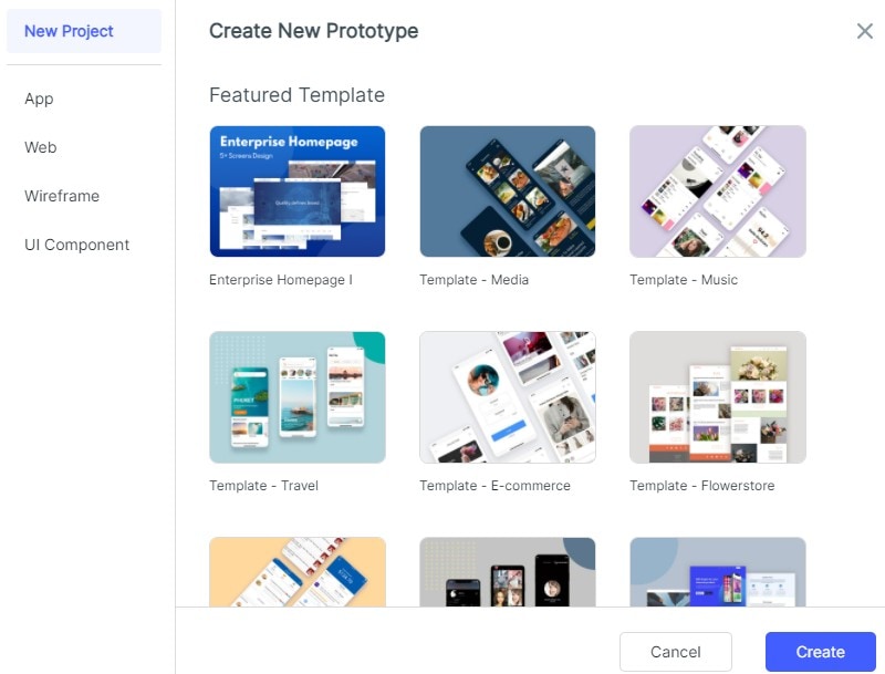
Set up the fields and actions before decorating the button. Identify the primary action and give secondary actions less emphasis without making them hard to find.
When changing the screen size, inspect the button row again. A long label may need more width or a stacked layout; do not squeeze the text until it becomes unreadable.
Step 2: Design the Button and Its States
- Add Widgets and Icons
Add the label and shape or a suitable button widget from the available library. Use a clear action phrase and enough internal space for the text.
Keep icons optional unless they communicate a specific action. If a control is icon-only, specify its accessible name and make its purpose clear in context, using a tooltip only for supplementary information.
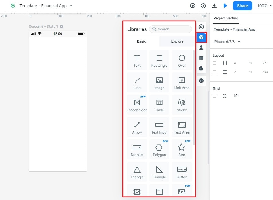
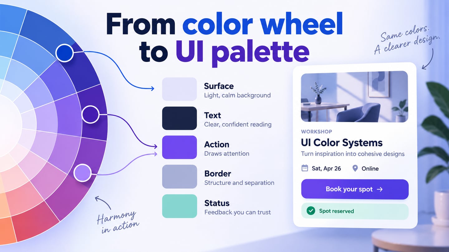
Adjust the properties of the selected object to set its size, colors and typography. Check the contrast of the label and visible boundaries against their actual backgrounds.
Save or reuse the button component where the workspace supports it so repeated instances follow the same visual rules. Record exceptions rather than silently changing similar controls.
- Add Links between Screens
- Connect the button to the target screen or state and choose the relevant interaction. For Save changes, model both a successful response and a failure, rather than linking every activation directly to success. When a control updates immediately, distinguish the pending change from a confirmed result and show what happens if the request is rejected.
- Inspect the destination after connecting it. A cancel action should lead to the intended previous state, and a retry should preserve the information the person already entered.
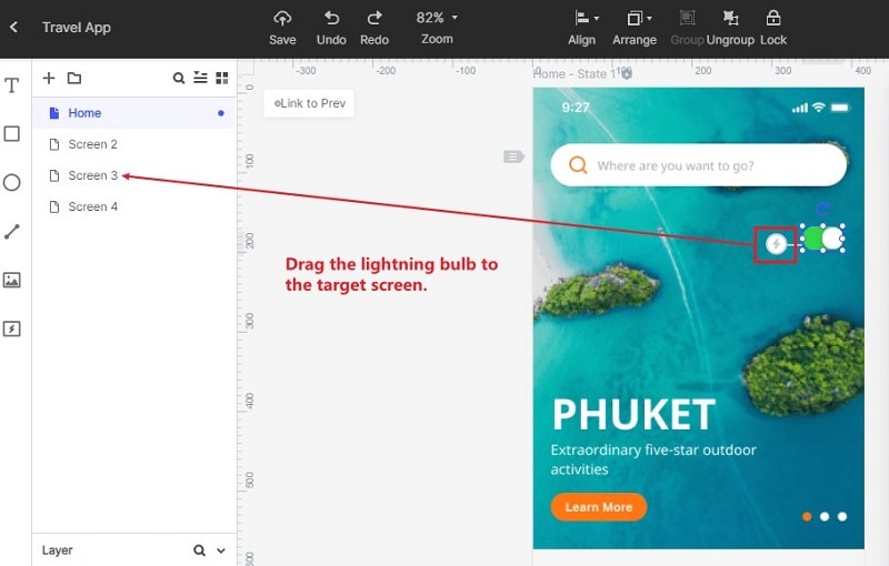
Keep reusable instances consistent:
- Define the shared button structure and its allowed states.
- Reuse it across screens, allowing deliberate differences such as a destructive action.
- When changing the shared structure, inspect existing instances for clipped labels or incorrect emphasis.
- To Add Notes:
- Use a design note near the relevant state to explain behavior that the picture cannot establish.
- Specify whether another activation is allowed while a request is pending and what happens if it fails.
- Keep the note available to reviewers and the implementation team; avoid putting technical instructions in the end user’s button label.
- Represent State Changes
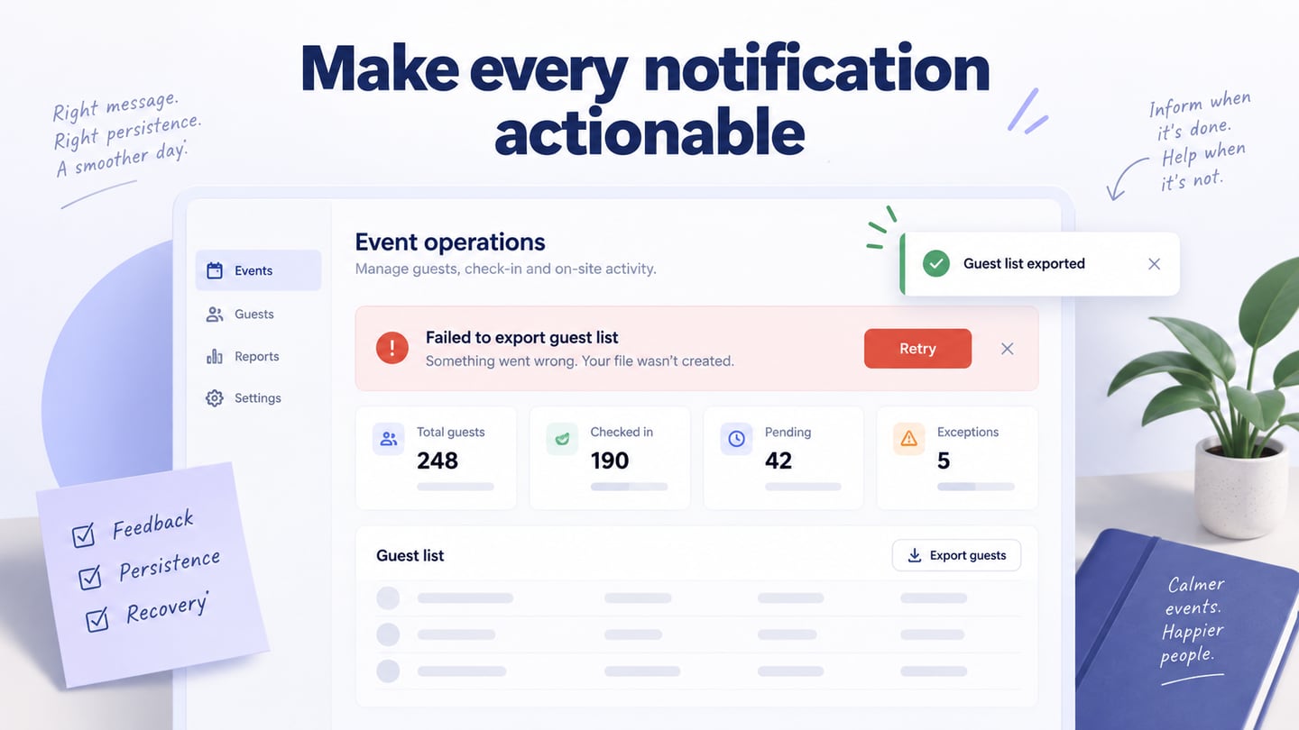
Prepare distinct default, focus, pressed, loading and unavailable states as appropriate. A disabled-looking button needs a clear reason in the surrounding interface; it should not be the only way to discover a missing required field. A loading label must not claim completion before the operation is confirmed.
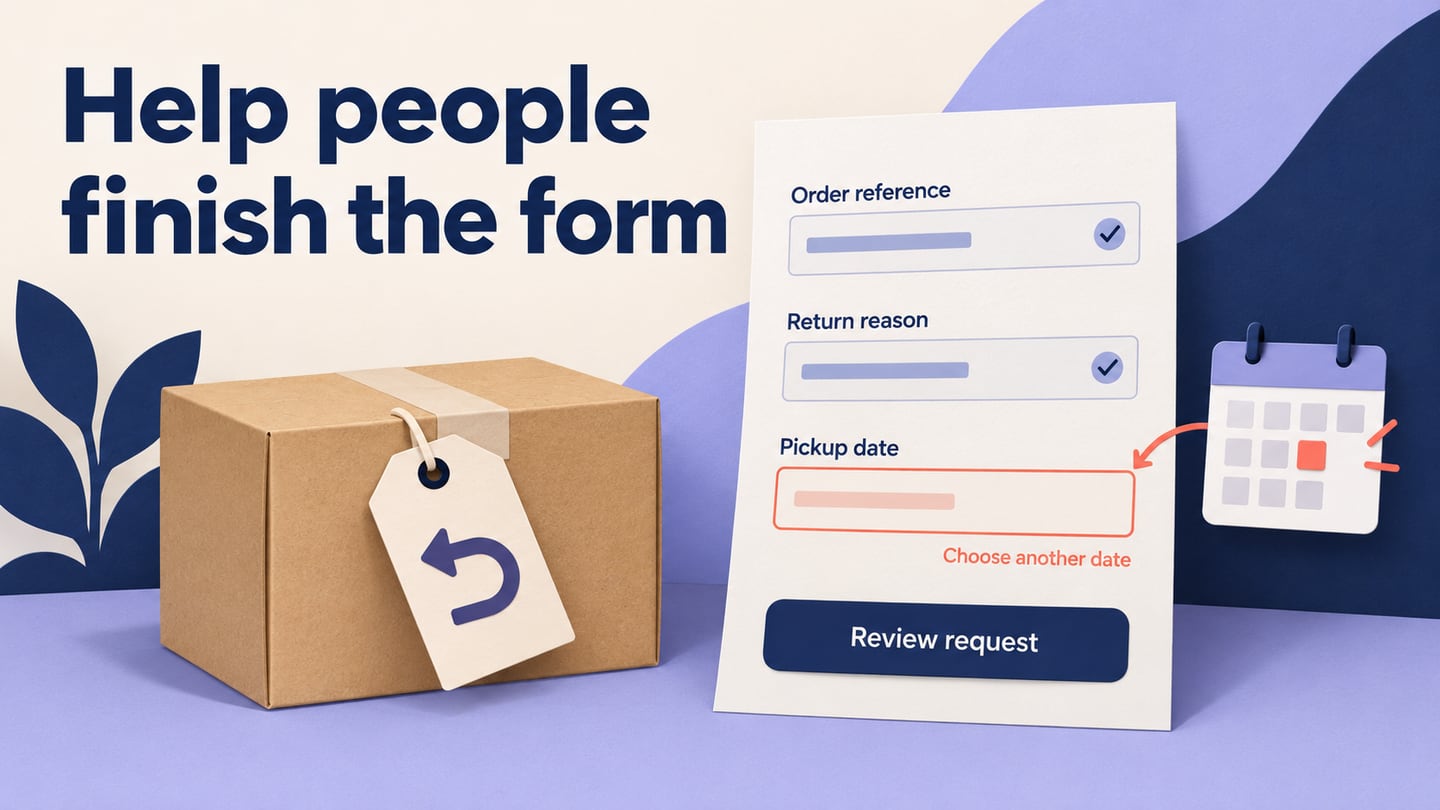
For a team-settings form, start with Save changes beside a secondary Cancel action. Create a keyboard-focus variant with a visible outline, a Saving state and a failed state that keeps the edited team name and offers Retry save. On success, show Saved as status text next to the form. Ask a reviewer to identify which values were retained after failure and what Cancel would discard.
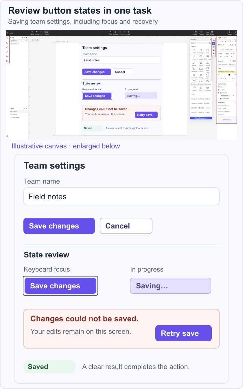
Connect the prepared states for review:
- Start with the default screen and duplicate only the changes needed for a pending or failed outcome.
- Keep the same values in the failed state so the recovery path is easy to inspect.
- Link the intended actions and review their target states. Use animation only when it helps explain the transition.
Step 3: Preview the UI Design Button
Preview the whole task on a desktop viewport:
- Start the preview and activate each visible action.
- Check the destination, label wrapping and the relationship between primary and secondary actions.
- Review at the intended display size; a full-screen presentation alone can hide cramped controls.
Then review a narrow viewport:
- Open the supported prototype-sharing link on the intended test device.
- Check whether adjacent controls remain distinguishable and whether long labels fit without overlap.
- Use the browser review flow; the old standalone-player instruction is not required for this walkthrough.
Confirm implementation behavior separately from the visual prototype.
- Use the W3C button pattern to review the accessible name and keyboard activation behavior.
- Check focus visibility and target spacing in the implemented interface. WCAG target-size guidance includes minimum size and spacing exceptions; it is not a substitute for testing the actual controls.
- Review task usability with realistic input instead of treating a successful click-through as proof of production accessibility.
Step 4: Share the Button
- Share the current prototype version using the supported workspace controls.
- Ask reviewers to save a change, cancel another one and recover from the failed state.
- Check the sharing permissions before sending the link and keep synthetic data in the example.
- Record the chosen labels, state changes and unresolved engineering decisions with the approved version.