A prototype critique checklist helps a team review task flow, content, interaction states, accessibility risks, and handoff evidence in a consistent order. Start with one realistic user task, walk through success and failure paths, and record each problem with its impact, owner, and next action. The output should be a short list of decisions, not a collection of personal preferences.
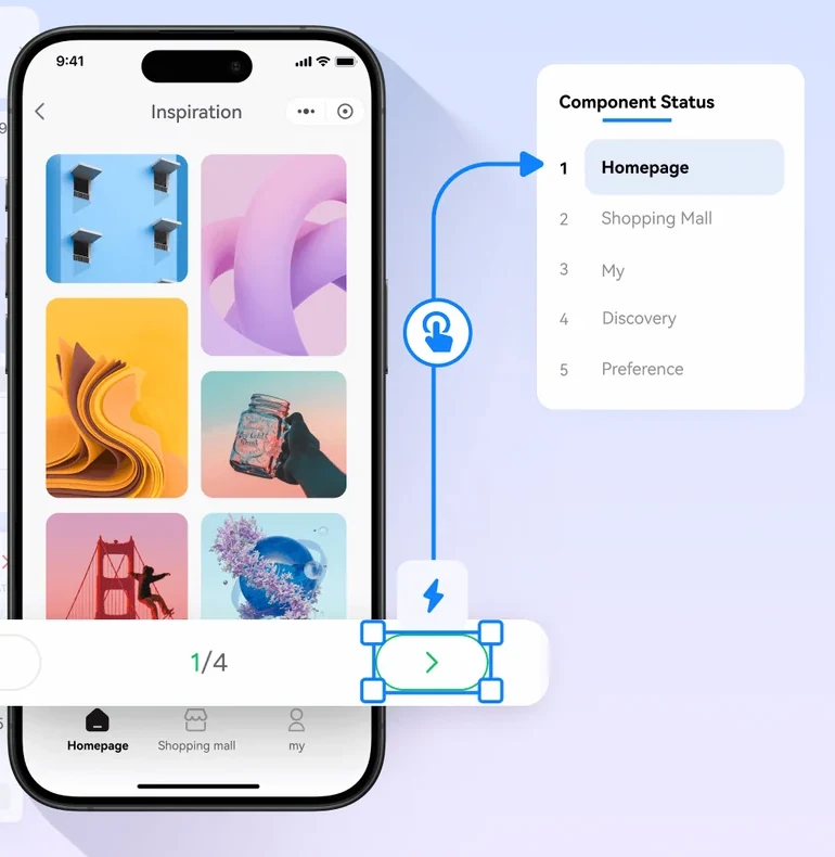
For a connected-screen review, prepare the task in Mockitt’s prototyping workspace and give everyone the same entry point. A rough prototype can support a useful critique when reviewers know what it demonstrates and what is still simulated.
Set the critique boundary
Write the task and the decision at the top of the review. For example: “Can a first-time customer request a return and understand what happens next?” State the device, start screen, prototype limits, and questions that are out of scope.
Make the task specific enough to expose a design decision: “Return one damaged item from a two-item order, choose a refund, and find the next step.” This reveals more than “Explore the returns screens.” Reviewers now know that item selection, refund information, and confirmation matter; redesigning the account dashboard does not.
- User and situation: a customer using a phone who has never returned an item before.
- Starting information: an order with two items, a delivery date, and a visible return option.
- Decision needed: whether the flow is coherent enough to put in front of research participants.
- Prototype limits: no payment processing, real inventory checks, or actual return submission.
- Out of scope: warehouse operations, visual rebranding, and unapproved return-policy changes.
Identify the decision owner before the session. Otherwise, a critique can end with several reasonable suggestions and no agreement about which one to pursue.
Prototype critique checklist
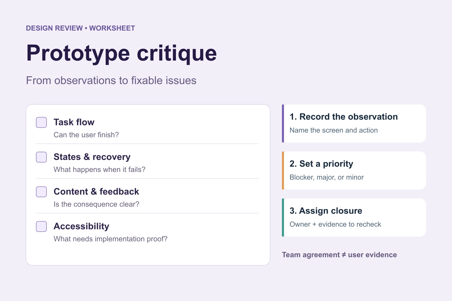
Use the five areas below as the review order. Inspect the task first: polishing a button is premature if the customer cannot find the right item to return.
| Review area | Ask | Evidence |
|---|---|---|
| Task flow | Can the reviewer reach the intended outcome? | Start, decision, success, and return states |
| Content | Do labels explain the action and consequence? | Realistic copy, empty, validation, and error states |
| Interaction | Does each trigger produce visible feedback? | Link, state, focus, and recovery behaviour |
| Accessibility | Can keyboard, touch, and assistive technology users understand the route? | Focus order, labels, contrast, and motion notes to verify in implementation |
| Handoff | Can another person tell what is simulated? | State notes, assets, decision owner, and open constraints |
Task flow: trace the whole route
- Can someone find the starting action without being told its screen location?
- Does every required choice have enough information to make it?
- Can the person go back and change an answer without unexpectedly losing earlier choices?
- Does the final screen explain what happened and what to do next?
- Are there dead ends, unavailable actions, or links that silently reset the task?
Walk the normal path once, then change one condition. In the return example, select the wrong item and go back. Check that the correct item, reason, and refund choice remain consistent after the correction.
Content and feedback: make consequences understandable
Read button labels, instructions, and messages without relying on the designer’s narration. “Submit” may leave the consequence unclear; “Request return” describes the action more directly. Use realistic product names and amounts where the decision depends on them, with clearly fictional data in the demonstration.
- Does each field have a meaningful label and an explanation when the requested information is ambiguous?
- Can the customer identify a problem and understand how to fix it?
- Does a pending state explain that an action is in progress?
- Does failure preserve information the customer should not have to enter again?
- Are eligibility, refund destination, and next steps presented before they affect a decision?
Do not invent return-policy details to fill the screen. Mark unresolved policy copy in the review record and assign it to the appropriate owner.
Accessibility and handoff: separate visible design from implementation
Review the planned focus order, visible focus treatment, labels, text contrast, target sizes, and use of motion. Do not communicate an error through color alone. W3C’s guidance on identifying input errors and visible keyboard focus provides useful implementation requirements to discuss with developers.
A screen prototype can reveal missing error text or an unclear focus sequence, but it does not establish that the shipped interface has correct semantics, screen-reader output, or keyboard behaviour. Record which checks the prototype supports and which require testing in the implementation.
Handoff notes should identify the states, triggers, recovery rules, and unresolved questions. “Error screen included” is insufficient if nobody knows when it appears or what happens to the selected item afterward.
Run the review
- Give each reviewer the same task and entry point. Share the prototype version and the decision you need before collecting feedback.
- Let one person trace the route while another records observations. Ask reviewers to note the screen, action, and resulting state.
- Tag each issue as a task risk, content question, implementation constraint, or preference. Keep observations separate from proposed solutions.
- Agree on the smallest change that tests the risk. A clearer confirmation message may answer the question without rebuilding the flow.
- Assign an owner and a follow-up date. State the evidence that will let the team close the issue.
For the meeting structure and time allocation, use a design review meeting agenda. Keep the critique focused on the prototype rather than turning it into a status update.
Example: turn a return-flow critique into actionable records
The following is an illustrative review record, not a reported user test. It shows how the same checklist can turn vague feedback into changes that another person can verify.
| Observation | Impact and priority | Owner and next action | Close when |
|---|---|---|---|
| Changing the selected item leaves the previous item’s return reason selected. | High: the request can contain inconsistent information. | Designer: define whether to clear or reconfirm the reason. | The revised route handles the item change consistently. |
| A failed submission offers no retry or way back. | Blocker for this review: the recovery route cannot be evaluated. | Designer and developer: agree on a recoverable failure state. | Reviewers can retry or return without losing the request. |
| The confirmation says “Done” without explaining the next step. | Medium: the customer may not know whether to ship the item. | Content owner: add the approved instruction and destination. | The confirmation explains the outcome and next action. |
| Two reviewers prefer different icon styles. | Low unless recognition or consistency is affected. | Designer: check the existing component convention. | The choice follows that convention or has a documented reason. |
Use priority labels consistently within your team. Reserve “blocker” for an issue that prevents the intended task or meaningful evaluation. Rate the consequence, not how strongly someone argues for a change; the labels above are examples, not universal severity rules.
For each entry, capture: screen → action → observed result → expected result → impact → owner → next evidence. Keep speculative problems labelled as questions until there is evidence to resolve them.
What a critique can and cannot decide
A critique can identify inconsistencies, missing states, unclear decisions, and implementation questions. Team agreement cannot establish that customers will understand the flow. A designer who knows the intended route can miss an obstacle that a first-time customer encounters.
Send unresolved questions about comprehension or behaviour to usability testing with relevant participants. If you need to compare performance across versions, prepare a usability benchmarking plan with consistent tasks and measures. Do not turn critique votes into success rates or treat an untested prototype as validated.
What a useful outcome looks like
End with a decision such as “Clarify the confirmation, add the failed-submission recovery route, and review the revised path before participant sessions.” Keep the issue log attached to the relevant prototype version so later reviewers know what was changed.
The review is ready to close when important risks have owners, the next evidence is clear, and the decision owner can explain what proceeds and what remains unresolved. A concise decision log is more valuable than an unprioritized list of comments.