Good filter UX helps people narrow a list while keeping track of what changed. Show the conditions currently applied, distinguish unfinished selections from active filters, and let people remove one condition without starting over. On a phone, make the result of closing, canceling, or applying a filter panel predictable.
The difficult part is not drawing a row of checkboxes. It is deciding what the result list means after each action. You can use Mockitt to prototype the filter and result states before connecting a production search service. This guide uses a fictional equipment-rental catalog to work through those decisions.
Keep filtering, sorting, and search distinct
A filter excludes items that do not match a condition. Sorting changes the order of the remaining items. Search matches a query against searchable information. A catalog might combine all three: search for “camera,” filter to equipment available downtown, then sort the matches by daily price.
These controls can share a toolbar without sharing an unclear label. Put the query in a search field, show filters as named conditions, and label the order control “Sort by.” Changing the sort order should not silently remove a location filter. Clearing filters should not erase the query unless the action explicitly says it resets the whole search.
For a broader treatment of queries and result presentation, see the search UI design guide. This article focuses on the steps after someone decides to narrow a result set.
Choose filters that reflect a real decision
Start with the attributes people need to make a choice. Our fictional rental catalog has equipment type, pickup location, availability date, and camera resolution. Color is not useful for this task, even if the underlying database has a color field. An administrative attribute does not automatically deserve a customer-facing control.
Give each group a concrete name. “Pickup location” tells people what the condition affects; “Location” might mean where equipment was manufactured or where it can be delivered. Explain unusual values beside the group instead of making every option carry a paragraph.
| Catalog question | Useful control | Behavior to specify |
|---|---|---|
| What kind of equipment? | Type checkboxes | Selecting Cameras and Audio includes either type. |
| Where will I collect it? | Pickup location | A Downtown selection applies across the chosen types. |
| When do I need it? | Availability date | The label and result summary use the same date. |
| What camera capability is required? | Resolution options | Only show this group when it is relevant to the chosen equipment. |
Decide whether people can select several values within a group. In this example, Cameras or Audio broadens the type selection, while Downtown and November 12 narrow the results across different groups. Write that rule in the handoff. Do not make readers learn it through surprising result counts.
Choose live updates or an Apply action
Live filtering works well when an update is quick, the results remain visible, and changing one option does not disrupt the next selection. People can see whether a condition was useful as they choose it. Keep the filter controls in place during loading so a refresh does not move the option someone was about to select.
An Apply action is useful when people need to combine several conditions before seeing a result, especially inside a mobile panel that covers the list. It separates the working selection from the currently applied selection. That separation must exist in the interaction model, not just in the button label.
PatternFly’s filter guidance distinguishes ways to choose filters and display active selections. Treat those patterns as starting points; select the behavior that fits the visibility and update cost of your own result list.
| Action in an Apply-based panel | Recommended behavior for this example |
|---|---|
| Open Filters | Start with the currently applied values. |
| Change a checkbox | Update the draft selection; leave the result list unchanged. |
| Apply filters | Commit the draft, close the panel, and update the list. |
| Cancel or close | Discard changes made since opening and keep the applied values. |
| Clear inside the panel | Clear the draft. The change takes effect only after Apply. |
This is one coherent policy, not the only acceptable policy. If your product keeps draft changes after closing, explain that behavior and test whether people expect it. Avoid a panel whose close icon saves changes while its Cancel button discards them without a clear reason.
A worked example: find a camera for a specific day
Suppose someone needs a camera they can pick up downtown on November 12. The following counts are invented for the design example; they are not product inventory or measured conversion results.
- Start with the catalog. The list shows all equipment, a search field, a Filters button, and the current sort order.
- Choose three conditions. Inside the mobile panel, select Cameras, Downtown, and November 12. Keep them visible while the user reviews the selection.
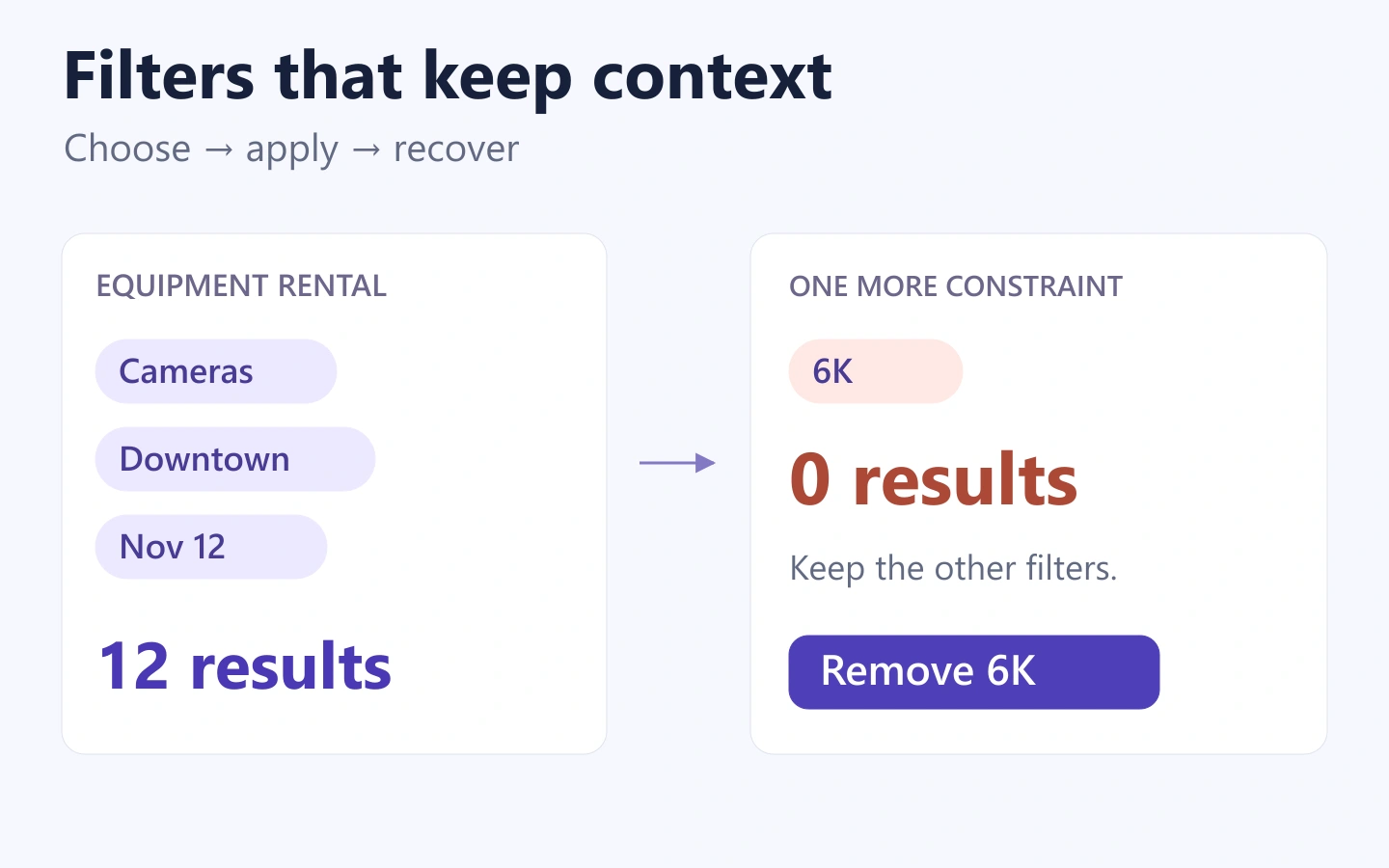
- Apply the selection. Return to a list labeled “12 results.” Above it, show removable labels for Cameras, Downtown, and November 12.
- Add a specific requirement. The user opens Filters again and selects 6K resolution. Applying this combination produces no matches.
- Recover without losing the task. Offer a clear way to remove 6K while retaining the type, location, and date. The previous 12 matching cameras return.
The final step is why applied selections matter. “No cameras found” alone leaves people wondering whether the catalog is empty, the service failed, or one condition is too restrictive. “No cameras match these filters” is more precise. A nearby “Remove 6K” action makes the next move explicit without silently weakening the search.
A separate no-result state should also preserve the current conditions. Do not replace an empty list with unrelated recommendations that appear to satisfy the original filters.
Make applied selections easy to understand and remove
Place active conditions near the result count so people can explain why they are seeing this list. A label such as “Pickup: Downtown” is clearer than “Downtown” when several groups contain similar values. If the label can be removed, give the action an accessible name that identifies the condition, such as “Remove Downtown pickup filter.”
Keep three actions distinct: remove one value, clear one group, and clear all filters. A person who changes their date should not have to reselect equipment type and pickup location. If the interface has a compact summary such as “Filters (3),” define whether the number counts groups or selected values and use the same convention throughout.
Option counts also need a definition. “Cameras (12)” might describe all cameras in the catalog or cameras matching the other current conditions. Either can be useful, but switching between those meanings creates false expectations. If a preview count is still loading, do not show an old number as if it describes the new draft selection.
Keep mobile filtering connected to the results
A mobile panel needs a clear title, a visible way out, and enough room to operate its controls. Keep the Apply action reachable without forcing people to scroll through every group again. Long filter groups may need their own search or an expandable list, but the selected values should remain discoverable.
When the panel closes, return people to the results rather than the top of an unrelated page. Preserve useful context when they open an item and then go back: the query, applied conditions, sort order, and their place in the list. Otherwise, a comparison task turns into repeated setup.
Do not treat a narrow viewport as permission to remove an essential filter. If desktop visitors can restrict pickup location, mobile visitors need an equivalent path. The arrangement can change while the meaning stays consistent.
Prototype the state changes before polishing the controls
In Mockitt, lay out the catalog and its filter panel as related screens or states. Build the example with a small, fixed set of fictional equipment cards. You do not need a real inventory connection to review whether the controls and result messages make sense.
Connect the initial list to the open panel, the selected draft, the 12-result list, and the no-result combination. Add the return route that removes only 6K. Keep the other three condition labels unchanged across those screens. This makes a missing or accidentally cleared selection visible during review.
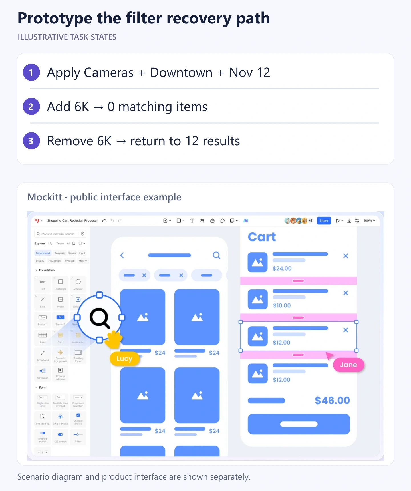
Ask a reviewer to find a downtown camera for November 12, add the resolution requirement, and recover from the empty result. Watch whether they can tell which conditions are active and what Cancel will do. A clickable prototype can reveal those misunderstandings; query correctness, network behavior, and assistive-technology support still need checks in the implemented product.
The useful deliverable is a small set of connected states plus clear rules for applying and removing conditions. That gives developers something more concrete than “add filters,” and gives the team a shared explanation for every result the user sees.