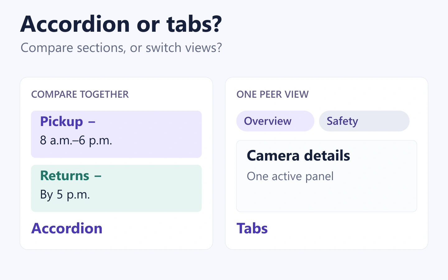
Use tabs when people switch among a few related views and usually need one at a time. Use an accordion when people choose which sections to open and may need more than one visible. Use ordinary headings when most readers need most of the content. Neither tabs nor accordions automatically make a crowded page easier to use.
The choice depends on what people need to read together, not which component looks cleaner. In Mockitt’s UI design workspace, you can lay out the same content in different arrangements before deciding which behavior to prototype. Below, a fictional camera-rental page shows how the decision changes with the task.
What changes when you use tabs or an accordion?
A tabbed interface shows a selected panel and hides its peer panels. Tabs make the available views visible in one place, but people must switch views to read hidden material. An accordion places a control next to each section and expands that section in the page. Some accordions allow several sections to remain open; others allow only one.
That last detail matters. A single-open accordion can create the same comparison problem as tabs: opening Returns closes Pickup, even though a customer needs both. Decide whether multiple sections can stay open before treating “accordion” as a complete specification.
| Reader need | A useful starting point | What to watch for |
|---|---|---|
| Switch between a few peer views | Tabs | Labels must describe each view; important content is hidden until selected. |
| Open only the relevant sections | Accordion | Collapsed labels must give enough information to choose. |
| Compare two sections | Multiple-open accordion or visible sections | A single-open pattern forces people to remember hidden details. |
| Read everything in order | Headings and normal page flow | Do not add repeated opening and closing to a reading task. |
| Complete a sequence of required steps | A form flow with explicit progression | Tabs can imply that steps are optional or freely interchangeable. |
GOV.UK’s tabs guidance describes tabs as a way to display related sections one at a time. Its accordion guidance emphasizes choosing relevant sections and checking whether hiding content helps. Neither pattern removes the need to understand how readers use the information.
Compare the same reservation content
Imagine a rental page for a compact camera kit. It contains an overview, pickup instructions, return instructions, and safety information. The customer’s immediate task is to decide whether they can collect and return the kit around their work schedule.
Keep the essential reservation facts outside the hidden panels: the selected dates, pickup location, price summary, deposit explanation, and booking action. A customer should not need to discover a hidden section to understand a condition that changes the reservation decision.
Version A: four tabs
The page has Overview, Pickup, Returns, and Safety tabs. Overview is selected initially. Selecting Pickup shows the collection window and desk location. Selecting Returns replaces that information with the return deadline and drop-off instructions.
This works if visitors usually need one section at a time and already understand the labels. It becomes less convenient when someone needs to compare the pickup window with the return deadline. They have to switch repeatedly or remember a detail that is no longer visible.
Do not compensate by repeating the entire reservation policy in every panel. That creates inconsistent copies to maintain. Instead, reconsider which facts belong in the always-visible summary and whether the comparison task deserves a different layout.
Version B: independently expandable sections
The same page presents Pickup, Returns, and Safety as expandable sections below the visible overview. A customer opens Pickup and Returns together. The two schedules can now be compared by scrolling, without changing the open state of either section.
This version also creates a trade-off: opening every section produces a longer page. That is not necessarily a failure. If the content is readable and the headings are clear, scrolling may be easier than repeatedly switching panels. An optional “Expand all” action can help when readers genuinely need the full policy, but it should not be added just because another website has one.
Version C: no hiding
If each section is only a sentence or two, headings may be the strongest option. “Pickup: 8 a.m.–6 p.m.” and “Return by: 5 p.m. on your final day” could fit comfortably in the same visible block. Hiding a tiny amount of content can add more interaction than it saves.
For this fictional task, visible essential facts plus a multiple-open accordion for longer instructions is a defensible starting point. It is a design recommendation for the example, not a claim that a usability study proved it outperformed tabs.
Fix labels and content before changing the component
“Details,” “Information,” and “More” do little to distinguish neighboring sections. Use labels that let people predict what they will find. On the rental page, “Pickup” and “Returns” are more useful than “Before” and “After.”
Do not split a paragraph in half simply to populate two panels. Each section should make sense when opened on its own. Conversely, information that people must combine should stay close enough to compare. If one section repeatedly says “see the previous tab,” the grouping may be working against the reader.
Also distinguish content groups from separate destinations. A page-level tab interface and a website’s main navigation can look similar while behaving differently. The navigation design guide covers the broader task paths; this choice concerns related material within one context.
When hiding secondary detail is appropriate, use it deliberately. The progressive disclosure guide explains the wider strategy. An accordion is one possible expression of that strategy, not an instruction to collapse every long page.
Plan the narrow-screen version explicitly
A desktop row of tabs can become awkward when labels wrap or extend beyond the viewport. Shorten labels only when the meaning survives. A partially visible last tab may suggest horizontal scrolling, but it does not guarantee that every reader will discover it.
One option is to retain tabs with a deliberate narrow-screen layout. Another is to present the sections vertically. If the interface changes from tabs to an accordion, specify how the selected panel maps to an open section and what happens to a reader’s position. Do not let a layout change unexpectedly hide the content someone was reading.
Check realistic text instead of “Tab 1” and “Tab 2.” Include a long equipment name, two-line instructions, a large text setting, and the actual action labels. A design that works only with the shortest labels is not ready to hand off.
Keep the reservation action separate from the expand controls. A person opening Returns should not accidentally submit a booking. Avoid nesting small interactive targets inside the label used to expand the section unless their behavior is clearly defined and implemented accessibly.
Include behavior in the handoff, not just appearance
Tabs and accordions have different keyboard expectations. The W3C tabs pattern uses arrow keys to move among tabs, with activation behavior depending on the implementation. The accordion pattern uses header buttons that can expand or collapse their associated panels.
In the design notes, identify the selected tab or expanded section, the visible focus treatment, and the relationship between a control and its content. Hidden panels must not leave invisible interactive elements in an unexpected keyboard path. A screenshot of the selected color does not describe these requirements.
For a tab panel that takes time to load, discuss whether activation should wait for Enter or Space rather than starting a fetch whenever keyboard focus moves. For an accordion, specify whether closing a section is allowed and whether opening one closes another. These are product behaviors with real consequences for navigation.
A clickable design can demonstrate the intended states, but the implemented component still needs keyboard and assistive-technology testing. Do not label a visual prototype accessible solely because it includes a focus outline.
Build a small, fair comparison in Mockitt
Make two copies of the reservation layout and keep the content, type size, and primary action consistent. In one, show the tab states. In the other, show Pickup open, Returns open, and both open together. Using the same content makes it easier to see the effect of the interaction pattern.
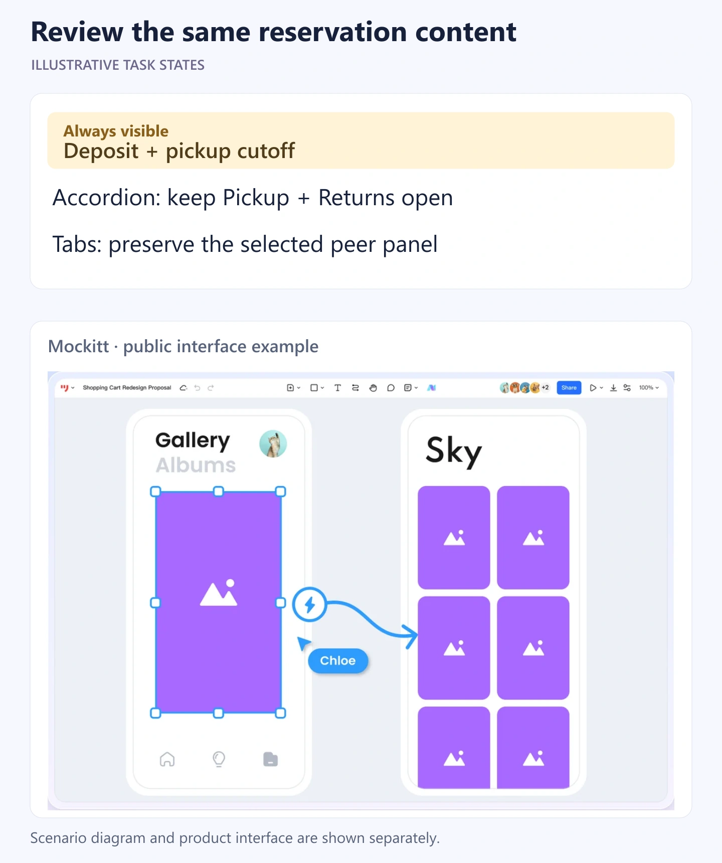
Ask someone to find the pickup window, then decide whether they can return the kit after work. Observe where they look, whether they reopen a section, and whether they miss a condition that matters. Do not tell them to “click the Returns tab”; that gives away the navigation decision you want to examine.
Use the result to refine the grouping. If people need every section, keep more information visible. If they confidently choose one view and stay there, tabs may fit. If they open two or three relevant sections, preserve that flexibility. The best choice is the one that supports the reading task with the least unnecessary remembering and switching.