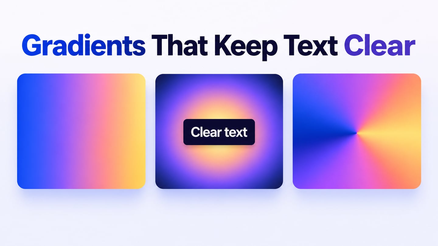
A gradient is a gradual transition between colors or tones. It can suggest light, depth or direction, but it should support the interface rather than compete with its content. In Mockitt’s UI design workspace, review a gradient with the actual heading, controls and mobile layout that will sit on it. This guide explains the main types and how to use them without losing readability.
Gradient Definition: What is a Gradient?
A gradient blends values across an area, using color stops to define the colors and their positions. It may move between light and dark versions of one hue or between different hues. A solid fill has no such transition; neither treatment is inherently better for every design task.

Source: 99Designs
A gradient can add a sense of depth, but it does not automatically highlight the right content. If a bright region sits behind a small label, it may make that label harder to read. Choose the direction and stops in relation to the foreground, then inspect both the lightest and darkest parts.
What are some Common Types of Gradients?
These common gradient types describe different ways of arranging the transition. Some names come from particular graphics tools rather than a single universal set of controls.
1. Linear Gradient
A linear gradient changes color along a straight axis. The axis can run horizontally, vertically or at an angle, and it can contain more than two color stops. A short transition between adjacent stops can create a visible band; greater spacing usually makes that change more gradual.

Source: Vectr
2. Radial Gradient
A radial gradient changes outward from a center point in a circular or elliptical shape. The center can be offset rather than placed in the exact middle. This can suggest a glow or direct attention toward an area, provided the foreground remains legible.
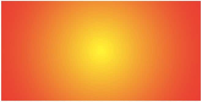
Source: Stack Exchange
3. Corner Gradient
A corner gradient places strong color influence near one or more corners. Depending on the tool, this may be a diagonal linear blend or a composition of several gradients. Treat the name as a description of the result and check how the chosen tool produces it.

Source: Twitter
4. Diamond Gradient
A diamond gradient spreads the transition in a diamond-shaped pattern. It is familiar in some raster-editing tools but is not a separate basic CSS gradient function. If reproducing a design for the web, agree with the developer whether it should be built with layers or supplied as an image.
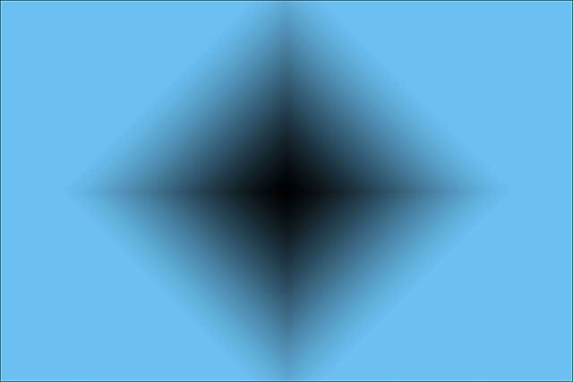
Source: Photoshop Essentials
5. Other Gradients
An angular or conic gradient changes color around a center point, following an angle. It is not limited to a 180-degree transition. MDN’s gradient guide distinguishes the linear, radial and conic functions available in CSS.
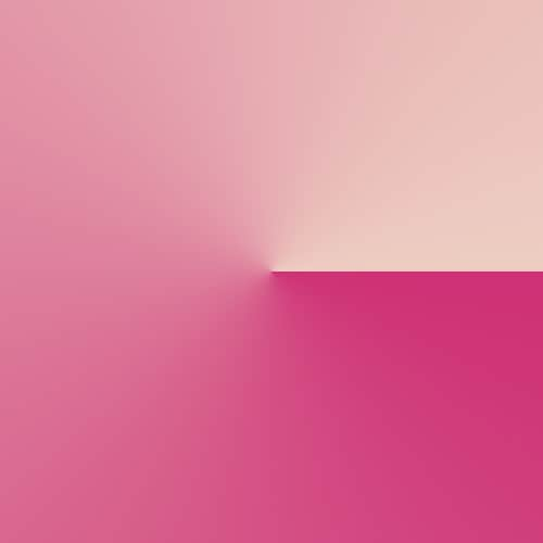
Source: Pinterest
A reflected gradient mirrors a color transition across an axis; it does not require reflecting the underlying photograph or interface. The grayscale example below shows this mirrored tonal effect. The terms available in a graphics editor may differ from those used in a browser implementation.
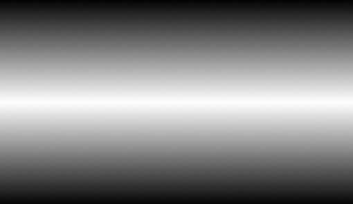
Source: Design Shack
How to Implement Gradients in Your Designs
A gradient can be useful in a banner, a background or a small accent. Start with one role and compare it with a solid-fill version. If the gradient adds no useful emphasis or atmosphere, a simpler treatment may make the interface easier to maintain.
1. To convey sentiments or emotions
Color associations vary with context, audience and surrounding imagery. A blue-to-green blend can support a particular visual direction, but it cannot guarantee trust, calm or an emotional response. Use your brand’s established palette and review the result with the intended audience.
The preserved comparison below contrasts a restrained natural-looking blend with a more saturated combination. It is one design judgment, not a universal “do and don’t” rule. A vivid palette can suit an entertainment campaign while overwhelming a dense account-management screen.
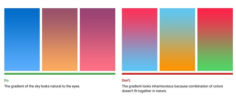
Source: UX Planet
2. To depict different dimensions
Light-to-dark changes can suggest depth or illumination. Decide where the implied light comes from, then keep that direction consistent with nearby shadows and surfaces. Adding several unrelated gradients can make the page harder to scan.
The blue-and-purple example below shows a soft diagonal transition. Its effect comes from the relationship between color and lightness, not from the colors being neutral. Compare that decorative use with a flatter surface when text or controls need to remain prominent.

Source: UI Download
3. Making the Overall UI more Alive
A subtle gradient can give a simple surface more visual variation. Keep the treatment subordinate to the information hierarchy: the primary action should still be recognizable, and borders or focus indicators should not disappear into the background.
The retained Instagram illustration shows a historical explanation of layered gradient construction. It is a useful visual reference, not a current brand specification or a claim that layering two gradients is required for every logo.
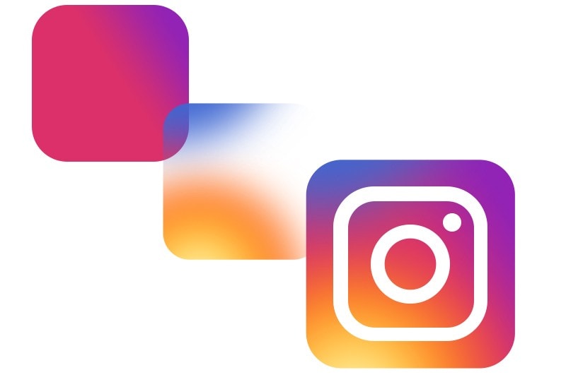
Source: Codeburst
Expert Tips to Make the Most of Gradients
Use the following checks to choose colors and evaluate the result in a real interface.
- Look out for inspiration
Natural scenes can suggest transitions in hue and lightness: a sunset, a shadow on sand or a reflection on water. Extract a small palette, then adapt it for the interface. A photograph that looks harmonious does not ensure that text over the same colors will have adequate contrast.

Source: UX Planet
- Use only the color stops you need
Two color stops are often sufficient. Add a third when it solves a specific problem, such as controlling the middle of a transition or keeping a muddy intermediate color out of a text area. More stops are not a measure of design skill. The preserved dark blue example demonstrates a controlled transition rather than a requirement to use three colors.
Source: Fx Factory
- Try some professional tools
Use Mockitt to place the treatment in context with the surrounding screen. Review a version with real headings, buttons and secondary text, then compare a narrow layout. Check the tool’s current controls before promising a particular gradient type; a visual example does not establish that every editor has the same options.
For a music-event hero, place a light heading over a blue-to-violet background and inspect where the brightest patch crosses the letters. If that area becomes hard to read, try a dark backing panel behind the copy or move the decorative transition away from it. Keep the ticket button separate from the decoration so the next action remains easy to find.
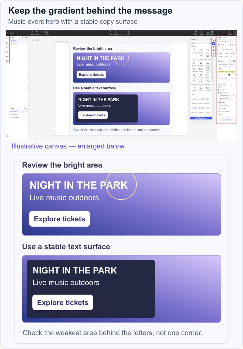
Measure the foreground/background combinations at the weakest part of the text area; do not sample only the darkest corner. WCAG’s text contrast guidance applies to text on gradients as well as flat colors. Recheck after changing the crop or screen width, because the color beneath a letter may change.

Begin with the transition’s purpose, then select its shape, colors and stops. Test readability with real content before reusing it across the interface. A monochromatic palette can keep tonal variation restrained, while neighboring hues offer a different starting point for the blend.