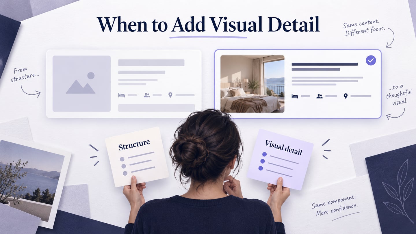
A wireframe primarily explains structure and information priority; a mockup develops the intended visual treatment. A prototype explores behavior and can use either low-detail wireframes or polished screens. The practical question is not which artifact is “better,” but whether the next decision needs more visual detail. This guide focuses on moving from a wireframe to a mockup without hiding unresolved structure problems.
Where a prototype fits in this decision
A prototype represents enough of an experience to explore or test a question. It may be a rough paper sequence, linked wireframes, detailed screens, or a coded simulation. It does not have to resemble the finished product closely. Visual fidelity and interaction are separate dimensions: a polished mockup can be static, and a plain wireframe can be interactive.
The original article described several prototype categories. For interface work, it is more useful to consider what a prototype explores and how it will be used. The following distinctions avoid treating every prototype as a nearly finished application.
1. Behavior-focused prototypes
Use these when a question depends on what happens after an action. For a lodging search, reviewers may need to change a filter, select a result, and return without losing their choices. Model enough behavior to examine that question; do not imply that real inventory or payment services are connected.
2. Appearance-focused explorations
Use a detailed mockup or visual study to compare hierarchy, typography, imagery, and state styling. It can help people discuss what an interface will look like, but a static visual does not show how a task behaves.
3. Limited-scope prototypes
A prototype can represent only the uncertain part of a product, such as a search-result card and its expanded details. State what is included and what is simulated so reviewers do not assume the rest of the application has been designed.
4. Throwaway Prototypes.
A throwaway prototype is built to learn from and then discarded. Keep the useful findings and decisions even when the artifact will not be developed further. Quick sketches can be appropriate when the structure is still uncertain.
5. Evolutionary Prototypes.
An evolutionary prototype is intended to develop further, but that intention does not establish production readiness. Teams must still assess code quality, accessibility, data handling, security, and testing before reusing it in a released product.
What a wireframe should resolve
A wireframe shows the arrangement of content, controls, and related information. It may be drawn by hand or created digitally. Restrained styling keeps attention on the structure, but use meaningful labels and realistic content where they affect the decision. Figma’s comparison of wireframes and mockups similarly distinguishes structural planning from visual presentation.
Teams use fidelity terms differently, so explain the detail level rather than relying on the label alone. The original three levels below are useful as descriptions of increasing detail, not mandatory phases every project must complete.
1. Low Fidelity Wireframes.
A low-detail wireframe shows the main regions and actions. For a lodging result, it might reserve space for an image, property name, price context, and a details action. It is enough to compare competing arrangements before styling them.
2. Mid Fidelity Wireframes.
A more detailed wireframe uses realistic labels, spacing, and content priority. Include a long property name, rate unit, and relevant conditions so the review exposes layout pressure. Use type weight deliberately to distinguish important information without pretending the visual design is final.
3. High Fidelity Wireframes.
A highly detailed wireframe may specify precise spacing and content. Once typography, imagery, and colors are being reviewed as the intended appearance, “mockup” is often a clearer description. Adding detail does not make a screen interactive; adding links does not automatically make it high fidelity.
Decide whether the structure is ready for a mockup
Use the same lodging-search result card for the comparison. First check whether the card includes the information a person needs to select a property: name, relevant image, rate context, and a clear next action. If reviewers cannot tell whether the displayed amount is per night or for the stay, fix the information before polishing the color palette.
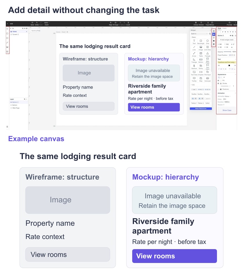
Move to a mockup when the next questions concern visual hierarchy, readability, image treatment, spacing, and recognizable states. You may still return to the wireframe when realistic content reveals a structural problem. This is a review decision, not a one-way approval gate.
What a mockup adds to the wireframe
A UI mockup develops the intended typography, color, imagery, spacing, and component appearance. In the lodging card, it can show whether the price stands out appropriately, a long name wraps well, and the selected or unavailable state remains understandable. Check contrast and relevant accessibility criteria rather than choosing colors only for visual appeal. A static image cannot verify keyboard or screen-reader behavior.
The original list below describes ways of creating a mockup, not three mutually exclusive kinds of interface. Choose the method according to editability, reuse, review needs, and the next team’s work.
1. Graphics-based visual studies
A graphics editor can explore composition and imagery. Check whether it also supports the reusable components, state management, and handoff your team needs. A flattened image may communicate appearance well while leaving later editing difficult.
2. Interface-design and mockup tools
An interface-design tool can keep text, controls, and reusable components editable. For the lodging example, use the same component for normal, long-content, selected, and missing-image states. Review whether changes remain consistent across the instances.
3. Coded visual mockups
A coded mockup can use real browser layout and text rendering, which may help evaluate responsive behavior. It also requires development effort and can create misleading expectations of completion. Mark any simulated data or actions, and assess implementation quality separately before reusing the code.
Keep structure, visuals, and behavior connected in Mockitt
Use Mockitt to arrange the initial screen, develop the visual detail needed for review, and connect the relevant task when behavior matters. Keep the same content and task across versions so a comparison reflects a design choice rather than different examples. A shared tool can connect the artifacts, but each review still needs a clear question.
For the lodging card, carry these decisions through the workflow:
- Content: preserve the rate context, property name, and selection action from the wireframe when styling the mockup.
- Review access: share the relevant version with appropriate permissions and explain which parts are static or simulated.
- Components: reuse the card while checking long text, missing imagery, and selected or unavailable states.
- Feedback: distinguish a structural objection from a visual preference or a behavior issue, and assign the decision to an owner.
- Handoff: link approved content, states, responsive expectations, and unresolved questions. Developers must still implement and verify the real interaction and data behavior.
Choose a wireframe when the team needs to decide what belongs on the screen and how it is organized. Choose a mockup when the next decision needs the intended visual treatment. Add a prototype when the answer depends on actions and outcomes. These artifacts can evolve together; their usefulness comes from the question they resolve, not from appearing more finished.