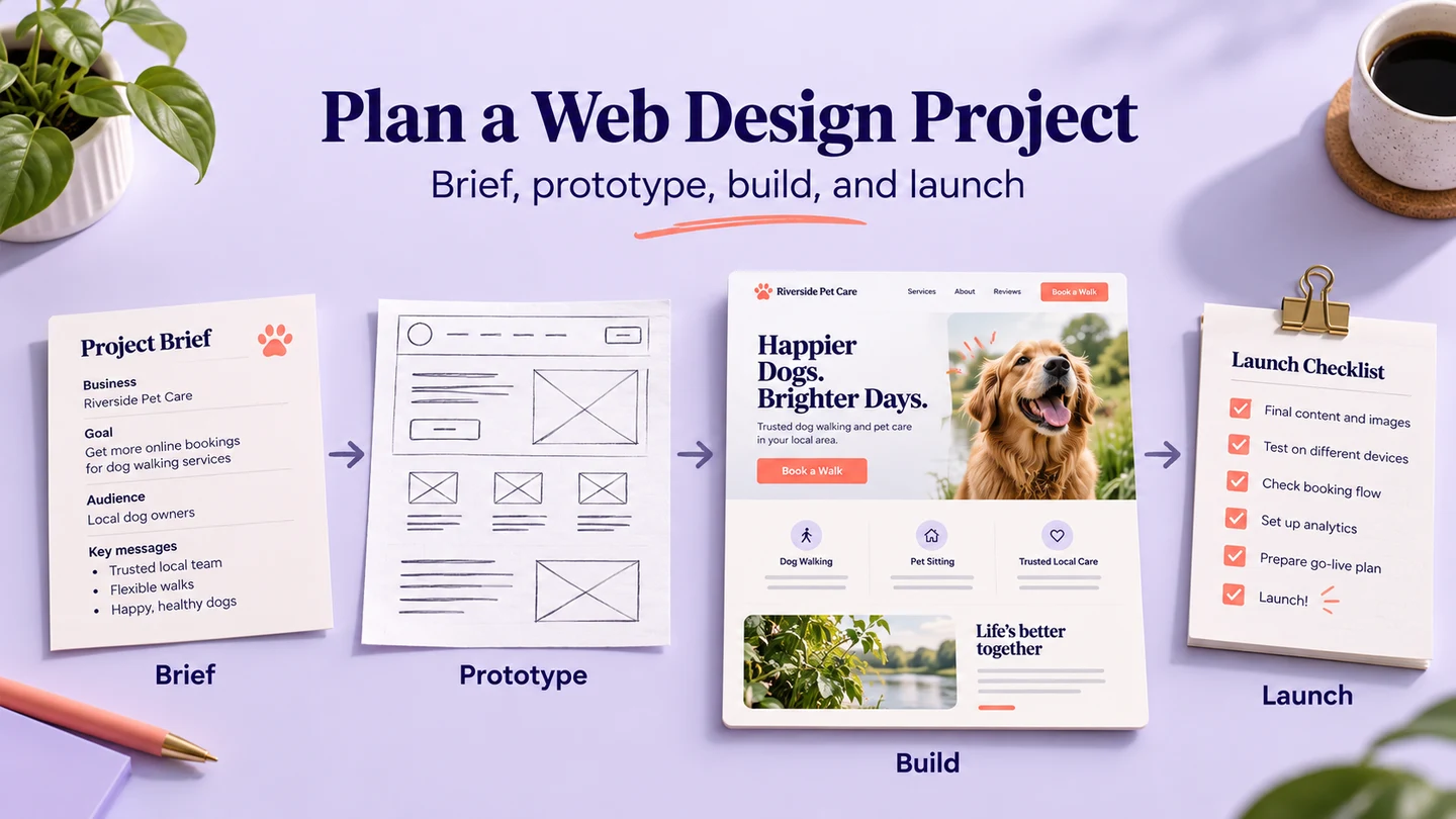
Manage a web design project around an agreed user task and a reviewable deliverable. Define the story, identify the audience's problem, use familiar interaction patterns, plan performance and choices, and specify how the layout changes on smaller screens. These five decisions give the team something more useful to review than whether a page looks impressive.
Looking good should not be the only goal of web design project management. Add purpose, business objectives and an understanding of the customer. A visually polished website can still fail to explain its offer, help someone complete a task or recover from an error. Agree on the outcome before choosing vivid images, sliders or a color scheme.
For example, a coworking business might need visitors to compare spaces and request a tour. The design team can review that journey in Mockitt's website prototyping workspace before developers connect it to availability, booking and email services. The prototype makes the proposed experience visible; those services remain separate implementation work.
A collaboration design tool for your website
Mockitt supports interface design, linked prototype screens and shared review. For a website project, the useful role is to keep the proposed pages and interactions available to the people making design decisions. Give reviewers a specific task, such as finding a suitable space and submitting a tour request, instead of asking them to comment on every screen at once.

1. Choose representative layouts
You can start a design from a blank canvas or adapt a suitable template. Set a representative viewport, then arrange the content and controls for the task. Selecting a phone size does not automatically make every component or the finished website responsive. Prepare the layout changes the project needs and record their intended behavior.
2. Give contributors clear responsibilities
Two minds can be better than one when the responsibilities are clear. One designer may work on components while another reviews content and a developer checks implementation constraints. Keep decisions attached to the relevant screen and assign one person to resolve conflicting feedback. Collaboration does not remove the need for an owner or an agreed review deadline.
3. Review the prototype before implementation
A clickable prototype lets the team inspect the proposed journey before development. It can reveal a missing confirmation, confusing label or dead-end screen. It does not establish the performance, security or reliability of a live website. Those require checks on the implemented service.
For the tour-request example, connect a space list, a detail page, a request form and a confirmation. Add an unavailable-time state so the team can review what happens when the visitor cannot get the first choice. Use fictional names and example times rather than real bookings.
Make the review decision explicit: can a visitor identify the space, choose a reasonable time and understand that the request still needs confirmation? The following five tips turn that question into a practical project plan.
Five tips for web design projects
1. Tell a story that supports the task
Your website is a story you share with your customers. Like a useful introduction to a business, it should explain who the service is for, what it offers and what the visitor can do next. The design needs to help people understand the message, rather than compete with it.
Always create a design that helps users understand and recognize the message you are sending. A distinctive visual style can support that understanding, but novelty alone is not the project's outcome.

Image source: Pixabay

It is about creating a balance between design and content. Neither should overshadow the other; each should help the reader understand the offer. Different businesses have different definitions of success, so agree on that definition with the project team.
For the coworking site, the story might move from “find a place that suits your team” to space details, facilities and a tour request. Write the essential content before polishing the layout: location, capacity, accessibility information, what the tour includes and when the visitor can expect a reply. This helps avoid a late “this is not what I was looking for” conversation.
2. Solve a problem for your audience
The client's business goal and the visitor's problem are related, but they are not identical. A business may want more inquiries; a visitor needs to know whether a space fits the team's practical requirements. Describe both so the website does more than ask for contact details.
For an ecommerce store, the problem could be finding a suitable product and understanding its total cost. For a coworking space, parking, accessible entry, meeting-room availability or a quiet environment may influence the decision. Identify the needs through research rather than assuming one attractive perk matters to everyone.

Image source: Freepik

Turn the problem into a task the team can observe: “Find a space for six people near the station, then request a tour.” Review whether the page supplies enough information to make that choice. If capacity or location is unclear, another decorative image will not resolve the problem.
Agree on a small set of deliverables before the work expands. For this example, a useful division is:
| Deliverable | Owner | Review decision |
|---|---|---|
| Audience need and tour-request scope | Product or client lead | Which visitor task must the first release support? |
| Space information and form wording | Content owner | Can someone make a choice without a sales explanation? |
| Linked wide and narrow layouts | Designer | Are the task and unavailable-time recovery understandable? |
| Booking, validation and email behavior | Developer | What does the working service do after a request? |
| Acceptance decision and remaining issues | Named project lead | What is ready, what must change, and who owns the next action? |
3. Use familiar patterns deliberately
The urge to present something new can lead a team to discard useful conventions. A recognizable menu, descriptive search field and clear link back to the homepage reduce the amount a visitor must learn. There is no universal rule that every logo or action must occupy one exact position.
Consistency matters within the journey. Use the same term for a tour request on the space page, form and confirmation. Keep a route back to the selected space. If a label or location changes, the visitor should not need to guess whether it is the same action.
Innovate where it solves a problem, then review the effect. A new presentation of facilities might help someone compare spaces; an unlabeled icon replacing the main action may make that task harder. Record the uncertainty and observe relevant people attempting the task, using a prototype usability testing plan when participant research is needed.
Do not call every team review an A/B test. An expert review, a moderated prototype session and an experiment with a working site answer different questions. Choose the method around the decision and available evidence.
4. Plan performance and useful choices
Performance belongs in the project brief. A design with large images, many fonts and elaborate animations can create implementation costs. Agree on which media supports the task and how it will behave while loading; a prototype preview cannot measure the finished site's speed.
Google's Core Web Vitals guidance separates loading, interaction responsiveness and visual stability. Use these as implementation review concerns alongside the visitor's task. A page that loads quickly but shifts the form while someone is using it still needs attention.
Image source: Freepik

Choices also need structure. More options do not automatically make a design worse, and removing necessary options can make the task impossible. Group related choices, use clear labels and reveal detailed options when they become relevant. Do not treat a shopping experiment or Hick's law as proof that every website needs one button or a fixed number of menu items.
On the tour form, ask for information needed to arrange the visit. Separate required details from optional questions. If no time is available, explain the next action rather than clearing the form. In the review, check whether the visitor can tell that no booking has been made and can continue without re-entering everything.
5. Specify responsive behavior
A responsive website adapts its layout to available space. Mockitt can help the team plan representative layouts and review their interactions; developers still need to implement and test those rules in the browser. See the responsive web design workflow for a layout-specification example.
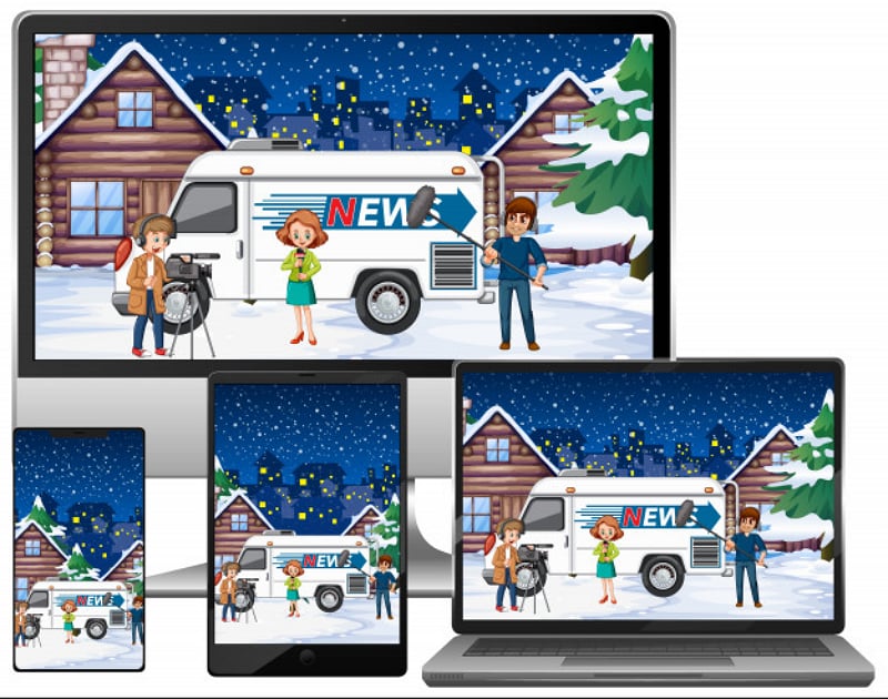
Image source: Freepik

For the coworking site, a wide space-detail layout may place photographs beside facilities; a narrow layout can stack them while keeping the tour action easy to find. Include realistic long names and form errors. Specify what happens to navigation and which information must stay beside the decision it supports.
Close each review with the current design version, the decision made, unresolved issues, owners and the next check. Treat new requests as scope decisions with a cost and an owner rather than silently adding them to the original deadline. The result is a website project whose design, content and implementation move toward the same visitor outcome.