Prototype Usability Testing Plan: Tasks, Metrics, and a Template
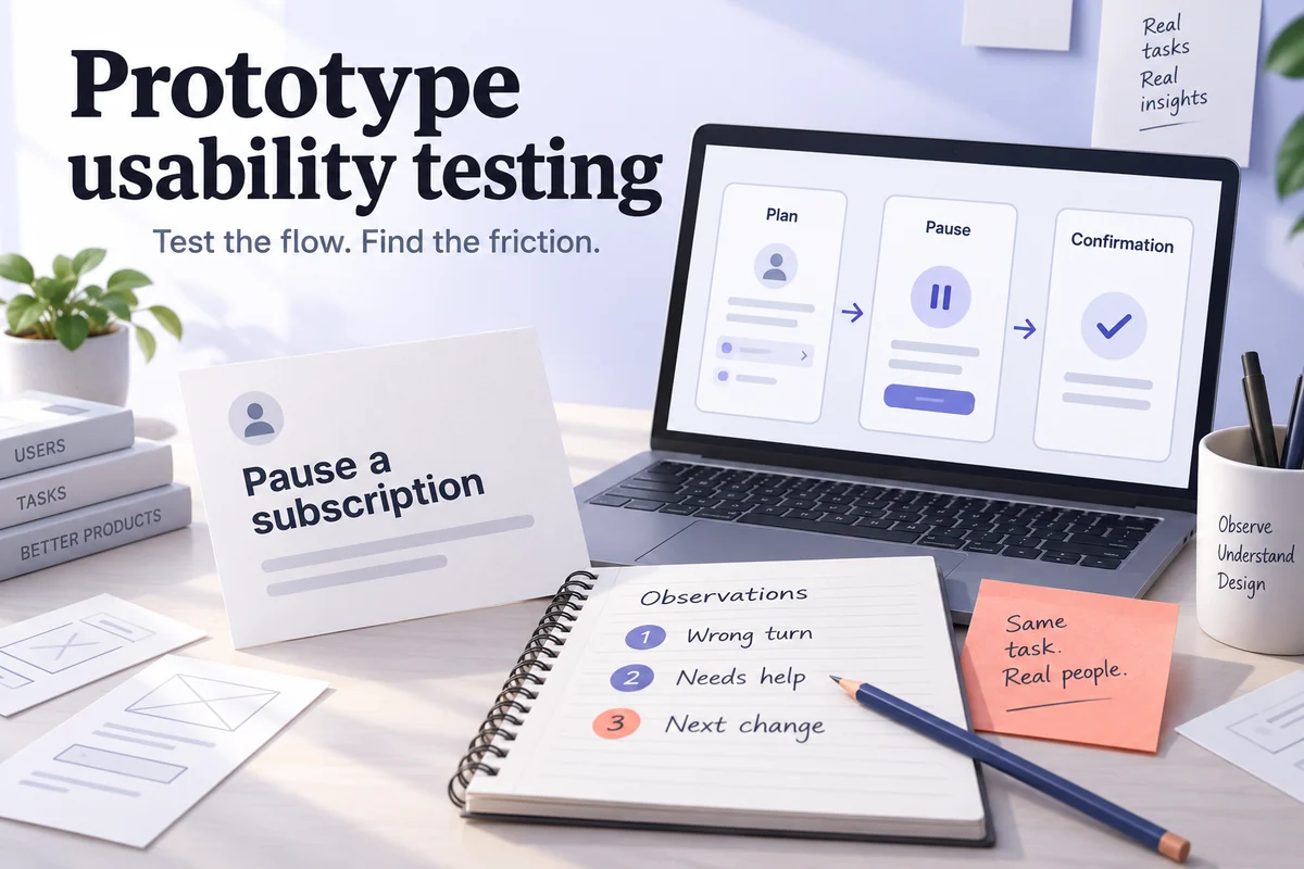
A prototype usability testing plan turns “let’s get feedback” into a study that can change a design decision. It specifies who will participate, the tasks they will attempt, the behavior you will record, and what would make the team revise the flow. The useful output is not a collection of opinions. It is a clear answer to a question such as: can someone pause a subscription without accidentally canceling it?
A prototype usability testing plan turns the intended path into a practical task.
This guide helps you turn a research decision into participant criteria, neutral tasks, a ready-to-test prototype, consistent observations, and a clear next action. The example is a subscription service with a pause option; the scripts and tables are planning materials, not results from a completed study. For the broader choice of research methods, start with the usability testing overview.
1. Start with the decision the study must support
Write the decision before the interview questions. “Decide whether the pause flow is understandable enough for development” gives the team a scope and an owner. “Learn what people think of billing” does not. List the high-impact uncertainties behind that decision: whether people distinguish pausing from canceling, understand when the pause starts, and recognize the final account state.
Choose a small set of risks the prototype can represent. Leave payment processing, permission enforcement, and production response time to the appropriate technical checks. A believable screen can show that the next billing date is understandable; it cannot establish that a payment provider will honor it.
| Plan field | Working decision |
|---|---|
| Research question | Can a current subscriber pause for one month and explain what happens to access and billing? |
| Design risks | Pause is confused with cancellation; the effective date is missed; the confirmation leaves the user uncertain. |
| Prototype boundary | A fixed example account with plan, pause, confirmation, and recovery screens. No real payment or account change. |
| Decision owner | The product manager, with design and research reviewing the evidence. |
| Next action | Revise the identified states, or progress to implementation with explicit open questions. |
2. Recruit for the behavior and context
Describe who encounters the problem, how often, and on what device. A useful profile is “people who manage their own paid digital subscriptions and have considered a temporary pause.” It is more specific than “internet users,” without requiring participants to know your exact interface.
Set an inclusion and exclusion rule. Include people who make the relevant decision themselves; exclude project teammates and people who have already seen this design. Record important differences, such as first-time versus frequent account managers, instead of mixing them into one undifferentiated group. Recruit disabled participants when their needs are part of the intended audience, and arrange the access support they need.
Small qualitative rounds can uncover actionable problems, but they cannot establish a reliable population completion rate. Choose the sample around the user groups and risks you need to learn about. If the decision needs a percentage estimate or a comparison between segments, plan a quantitative study with appropriate sample-size reasoning. Do not treat a convenient handful of sessions as representative evidence.
3. Write outcome-based tasks and explicit stop rules
A task should tell participants what they want to achieve, without teaching the interface. “You will be away next month and want to stop paying temporarily while keeping the option to return” leaves room to observe their interpretation. “Open Billing and click Pause” removes the navigation question you wanted to test. This follows the principle of neutral, believable tasks in the GOV.UK moderated usability testing guidance.
| Task prompt | What counts as independent success? | What to observe |
|---|---|---|
| You will not use the service next month. Find out whether you can take a temporary break without deleting your account. | Finds the pause option and distinguishes it from cancellation without a location hint. | First meaningful action, labels considered, wrong turns, questions. |
| Arrange that break for one month. Before you confirm, explain what you expect to happen to access and billing. | Selects the intended period and explains the displayed effective and return dates accurately. | Whether the participant reads the terms, what they infer, and any mistaken commitment. |
| The page says the change could not be saved. Show what you would do next. | Recognizes that the plan has not changed and finds a sensible recovery route. | Retry behavior, retained input, uncertainty about account state. |
The third task starts from a prepared error state; it does not require a live service failure. Reset the account between independent tasks so one action does not accidentally supply the next answer. Pilot the script with a colleague to find missing states and ambiguous instructions, then exclude that rehearsal from research findings.
Do not prescribe five or seven tasks regardless of complexity. Start with the few tasks that answer the decision and fit the available session time; allow time for introductions, questions, and unexpected behavior. Set a stop rule during the pilot, such as a sustained lack of progress or visible frustration. Any time limit is a study convention, not a universal benchmark for a successful interface.
4. Make the prototype ready for a fair test
Mark each path as simulated, partially simulated, or out of scope. Provide a starting screen, a supported action, and an observable end state for every task. If the pause control looks interactive but has no destination, a participant’s inability to continue is a prototype defect, not evidence that the design is confusing.
For the example, prepare a plan overview, pause options, confirmation, saved state, and failure state. Use consistent account data and dates across those screens. Check how you will return to the starting state between sessions. If you compare two versions, keep task wording and measurement rules consistent and account for learning and order effects in the study design.
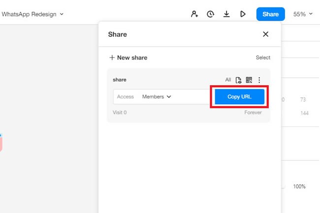
In the Mockitt prototyping workspace, connect the relevant screens, preview each path, and share the test version. Open the participant link in the intended browser and access context before recruiting. An editor link that works for a teammate may still be unsuitable for an external participant.
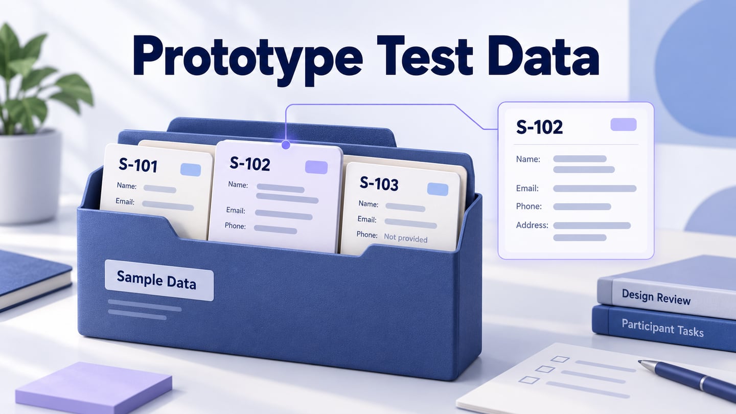
Keep the task script outside the prototype so participants do not see success criteria or moderator notes. Share only synthetic account data unless your research setup is authorized to handle real data. Record the prototype version in the plan so a later edit does not silently change the artifact being tested.
5. Run the session without coaching the participant
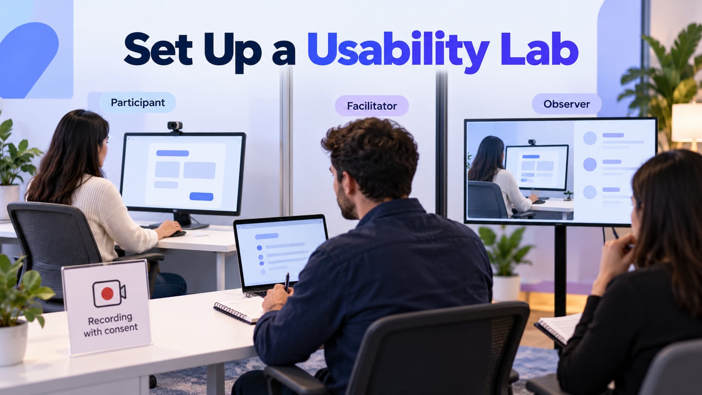
Use the same introduction and core prompts across sessions. Explain that you are testing the design, not the person, and describe recording arrangements before collecting data. A usable opening is: “Some parts are a simulation. Please show what you would normally do; if something does not respond, tell me what you expected.”
Present one task at a time. When someone hesitates, allow space to think. If clarification is needed, ask “What are you looking for?” rather than “Did you notice the link at the bottom?” Record a rescue when you supply information that helps someone complete the task. A neutral repetition of the task and an explicit location hint are different interventions; define how the note-taker will distinguish them.
Think-aloud can help explain behavior, but it also changes pacing. Do not compare those task times directly with silent-use performance benchmarks. At the end, ask about moments you observed rather than requesting general approval of the design.
6. Separate observations, outcome codes, and decisions
Use a short outcome vocabulary consistently: independent completion, assisted completion, not completed, and not evaluated. Reserve the last category for a broken prototype path, interrupted session, or other condition that prevents a fair assessment. Keep those cases visible; do not quietly include or exclude them to improve a completion rate.
| Field | Example entry |
|---|---|
| Participant and task | P03 / temporary break |
| Observed behavior | Opens Cancel, returns to the plan page, then asks whether the account will be deleted. |
| Assistance and outcome | Moderator identifies the Pause location; assisted completion. |
| Interpretation to investigate | The two choices may not communicate their different consequences. |
| Evidence reference | Session timestamp and screen version, recorded during the actual study. |
Pair completion with wrong turns, assistance, first meaningful action, and what the participant believes happened. Keep observations separate from interpretations: “read the confirmation twice” is observable; “does not trust the product” needs further evidence. Confidence ratings may add context, but confident misunderstanding still matters.
Preserve a simple severity scale: a blocker prevents the intended outcome or creates a serious misunderstanding; high severity requires substantial help or an important detour; medium adds recoverable confusion; low affects polish without changing the outcome. Adjust the classification to consequences, not just how often the issue appears.
Set a decision rule before reviewing results. For this example, any misunderstanding that changes the intended financial commitment requires a design review; a recurring navigation obstacle requires revision and another check. A threshold such as “two participants hit the same problem” can trigger a team review, but it is not statistical proof or permission to ignore a severe problem seen once. Record why the team accepts, revises, or defers each risk.
7. Include accessibility and real content
Check keyboard operation and focus order where the prototype supports them, along with labels, meaningful error text, and content at larger text sizes. W3C's focus-order guidance explains the underlying goal: navigation should preserve meaning and operability. A visual sequence can help design that behavior, but a prototype that cannot expose the right semantics cannot validate the implemented experience for assistive technology.
Use realistic content in the test states. A long plan name, an error explaining what remained unchanged, and an unambiguous return date can materially affect comprehension. Capture implementation checks separately for behavior the prototype cannot support, then involve appropriate users and specialists in the working product.
8. Turn findings into a versioned change
Group observations by task and affected outcome. For each finding, retain the evidence, its consequence, the proposed response, and the owner. Avoid turning every quote into a feature request: the participant identifies a difficulty; the team still needs to consider why it happened and what alternative solves it.
A concise readout covers the decision, participant context, tasks, findings, limitations, changes, and remaining questions. In the subscription example, a finding about confusing Pause and Cancel should link to both entry points and the confirmation language. Retest the changed path and any neighboring path that might have been affected. Keep the original notes so you can distinguish a resolved issue from one that has merely moved.
An AI-assisted test-case workflow can help prepare additional scenarios for review. It does not supply the missing user observations. Use those scenarios to improve the protocol, then base research findings on sessions with relevant participants.
Reusable prototype usability testing plan
- Decision and owner: What will the team decide, and who can act on it?
- Users: Relevant behavior, context, inclusion and exclusion rules, access needs.
- Artifact: Prototype link, version, entry point, supported paths, simulated states, reset steps.
- Tasks: Neutral prompt, success condition, stop rule, risk, and starting state.
- Session: Introduction, recording arrangement, moderator prompts, assistance rules.
- Evidence: Outcome codes, observations, questions, severity, timestamp or note reference.
- Decision rule: What evidence triggers revision, further investigation, or progression?
- Follow-up: Accepted change, owner, next check, and technical questions this study leaves open.
Questions teams ask before a prototype study
How many participants do I need?
Base the round on the audience groups and the kind of evidence the decision requires. A focused qualitative round is for finding and understanding problems; population percentages need a different design. Budget for another round after changes rather than treating one small sample as final approval.
Should I test a low- or high-fidelity prototype?
Use the lowest fidelity that preserves the cues the task depends on. A rough screen may answer a navigation question, while billing comprehension needs credible dates, labels, and states. Fidelity should make the question testable, not simply make the prototype attractive.
Can AI testing replace user research?
No. Generated scenarios can expose omissions in your plan, but they do not demonstrate what a target user understood or did. Keep scenario preparation and user evidence distinct in the readout.
When should we retest?
Retest when a change affects the path, labels, information hierarchy, or recovery behavior behind the finding. Use the next round to answer the remaining uncertainty, with a stable prototype and the same outcome definitions.