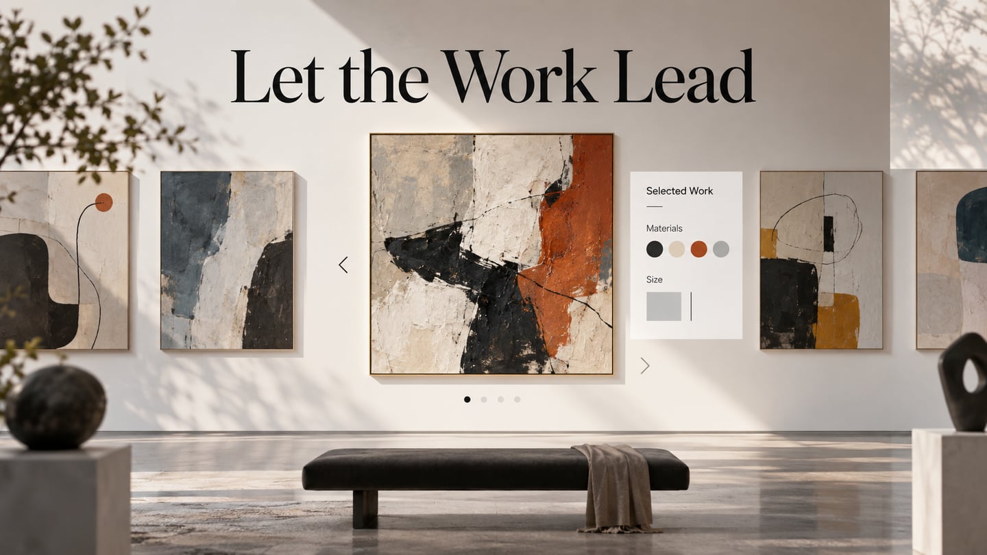
An artist website needs to let the work lead while helping a visitor understand what they are seeing. A strong image is more useful when its title, medium, scale or project context is easy to find. With Mockitt’s design workspace, you can arrange a gallery and work-detail page, then review that relationship before implementing the site.
There is no single visual style for an artist’s site. An illustrator with many posters, a sculptor with several bodies of work and a writer with films and books need different categories. Choose a structure that fits the material rather than assuming that an expressive layout must hide its navigation.
The five retained examples below show different ways to present creative work. Their screenshots are historical design references. They complement broader personal website examples, but the focus here is the work itself: how a visitor discovers it, opens a useful detail and finds an appropriate contact route.
Five Artist Website Examples
Look at the relationship between the artwork, its labels and the surrounding navigation in each example. The question is not whether a design looks more artistic, but whether its presentation helps a viewer understand and explore the work.
#1: Lotta Nieminen
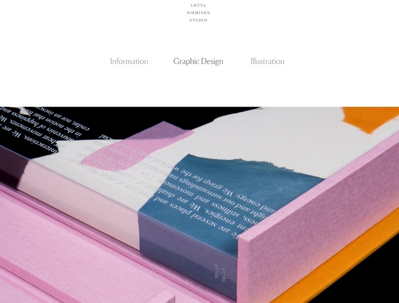
Lotta Nieminen’s studio works across visual identity, art direction, digital and print work, and illustration. The captured page uses a quiet header with Information, Graphic Design and Illustration above a large editorial image. The categories give a visitor a starting point without competing with the work.
The generous space around the image makes the object and its material qualities prominent. When adapting this approach, decide what a visitor should see after selecting a project: a title, a short description and supporting views can add context without turning the page into a dense case study.
Typography and color still matter in a restrained layout. Small navigation labels need to remain readable, and the quiet surrounding treatment should not make the next action difficult to locate.
#2: The Dufala Brothers
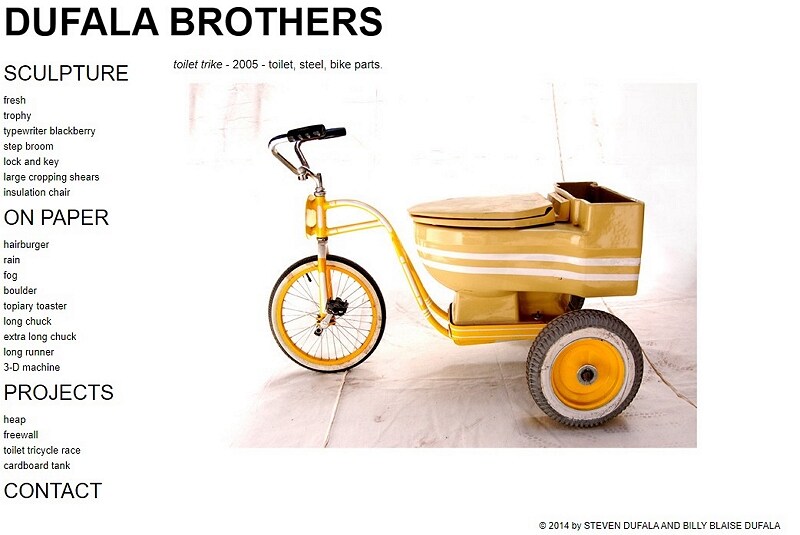
The Dufala Brothers example presents sculpture and works on paper. The Pennsylvania Academy of the Fine Arts describes their art practice. In the screenshot, an extensive text index sits beside the pictured “toilet trike,” with its year and materials stated above the image.
This is a useful model for an artist with a varied inventory: medium-based categories organize the work, while a selected piece receives enough context to be identifiable. Check how a long text index behaves on a phone. It may need a clearer grouping or a compact menu, but it should not lose its useful work titles.
#3: James Turrell
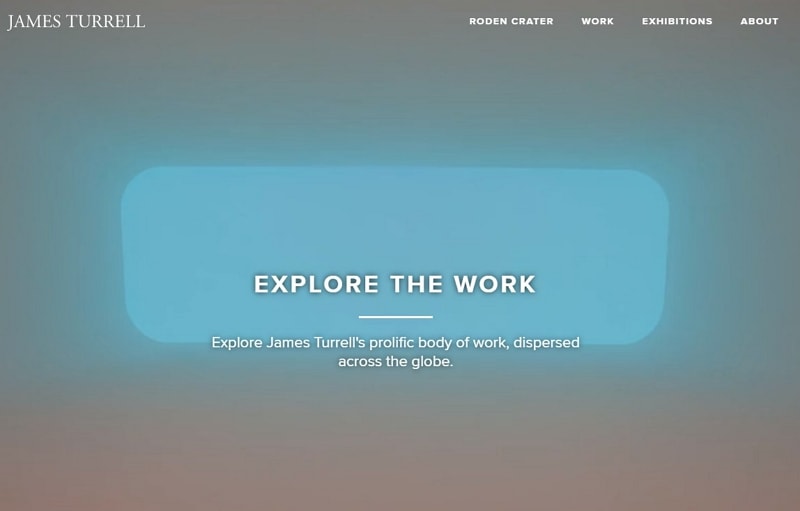
James Turrell is an artist associated with light and space. The retained design uses the atmosphere of an installation behind an “Explore the Work” action, with Roden Crater, Work, Exhibitions and About in the navigation. The official homepage currently differs from this earlier design.
An immersive opening can suit work whose scale and environment are central to its meaning. Keep a clear route to individual works and their context, however. A still screenshot cannot establish speed, automatic video behavior or visitor engagement; those need to be checked in the implemented experience.
#4: Rebecca Miller
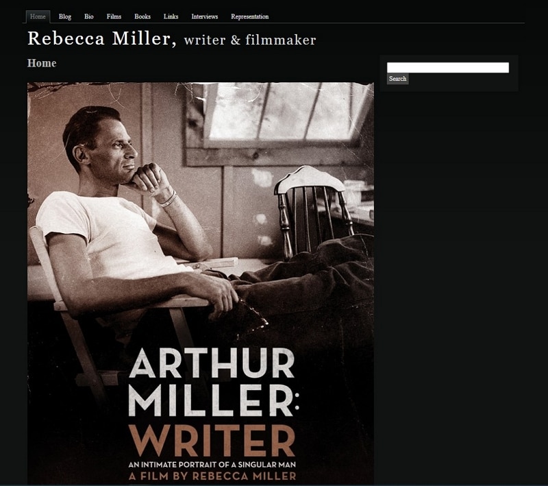
Rebecca Miller’s official site identifies her as a writer and filmmaker. The preserved screenshot also states that role and features the poster for Arthur Miller: Writer. This example belongs to the creative practitioner shown in the capture, not another person with the same name.
Its navigation separates films, books, biography and other information. That structure is valuable when one artist works across media: the reader can find the relevant type of work without sorting everything through a single undifferentiated gallery.
For film or book detail pages, make the title and format explicit and place supporting information near the image. If a trailer is included, provide suitable text context and media controls. Mobile usability and accessibility require inspection; they cannot be inferred from the artist’s audience or a poster.
#5: Brad Albright
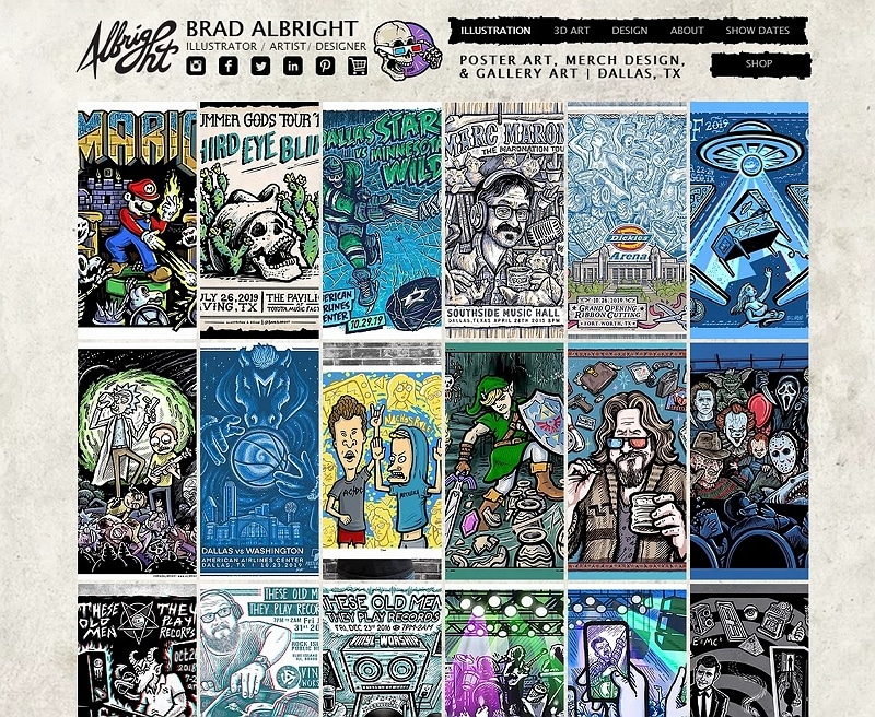
Brad Albright’s portfolio centers illustration, art and design. The captured page uses a dense grid of posters and artwork below a compact header. It communicates range immediately, while the repeated image cells give visually different pieces a consistent frame.
The tradeoff is density. A large collection needs clear selection states and enough detail after a thumbnail is opened. Let a viewer inspect a piece without losing their place in the gallery, and consider whether categories would help them find a particular kind of work.
The portfolio is an example of presenting the artist’s own output, not a source of website templates. Plan image dimensions and loading with the developer, particularly for a large grid, instead of assuming that a rich collection automatically performs well.
Plan an Artist Website Design
Start the prototype with the work you intend to present. Choose several representative pieces and list the information a viewer needs for each one. For a sculptor, that may include title, material, year and dimensions; for an illustrator, it may be the project type and a concise description.

Use a template only where it fits that material. A web design portfolio may emphasize a project’s process and outcome, while an artwork-led gallery may need a quieter detail page with several views. Keep the structure focused on what your audience needs to understand.
Build the collection view and one detailed work page first. In the illustrative example, selecting “Folded Form” opens a clay sculpture detail with its year, dimensions and an Inquiry action. Keeping those facts beside the work makes the purpose of the detail page clear.
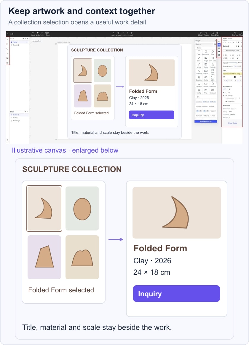
Add images and text to the design canvas, then adjust their size and placement. Use a placeholder with the intended proportions when final photography is unavailable. Do not invent a finished artwork, credit or client relationship to make a prototype look complete.
Share the prototype with a collaborator and ask them to find a particular work, identify its medium and locate the inquiry route. Comments should point to the exact screen or detail that needs attention. A useful review may uncover a missing title or ambiguous category even when the overall visual style is appealing.
If different audiences need different information, make separate prototype variants and label the question each one explores. For example, a curator may need dimensions while a potential client needs a commission contact. Those variants are design comparisons, not automatic geographic targeting of a published website.
For work that includes sound or moving images, specify what the player should show before playback, how the visitor controls it and what text context accompanies it. Confirm the chosen implementation supports the required media rather than treating a design comment as a recording or publishing feature.
A large body of work also needs editorial selection. Group related pieces, remove accidental duplicates and make full-size inspection available where useful. The number of images should follow the story and the performance budget, not an assumption of unlimited product storage.
Before handoff, review a narrow layout, long artwork titles and the path back to the collection. Agree which content the artist will maintain and which details the developer must implement. The prototype should make those responsibilities understandable.
An artist website succeeds as a presentation when the work, its context and the next step fit together. Use visual expression to support that relationship, then verify the actual site’s navigation, media behavior and accessibility during implementation.