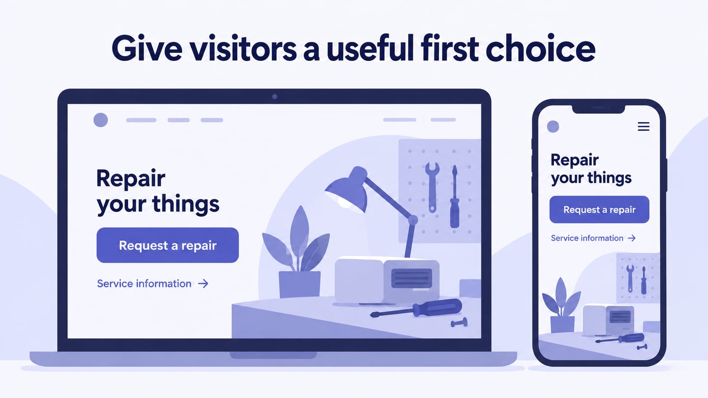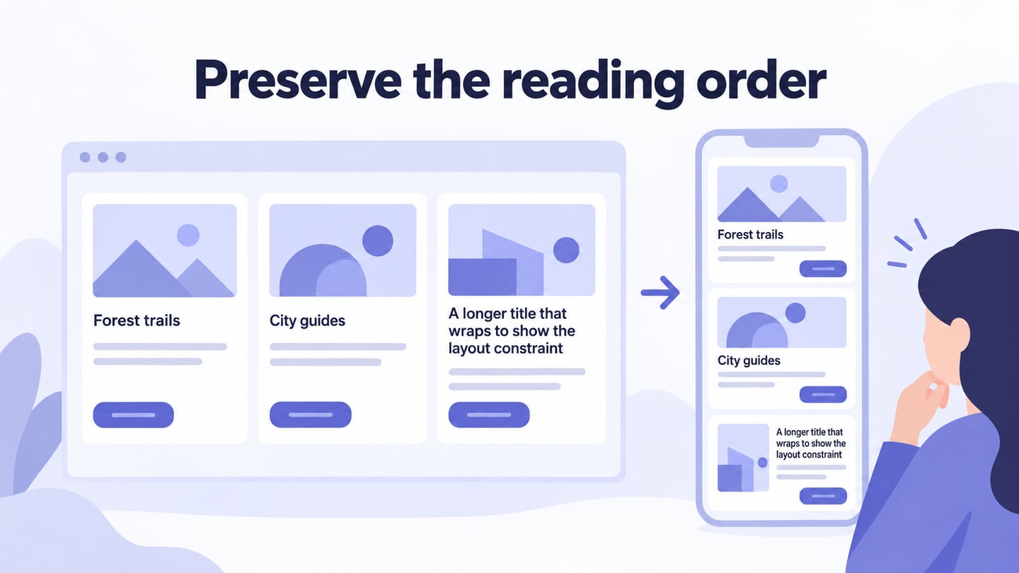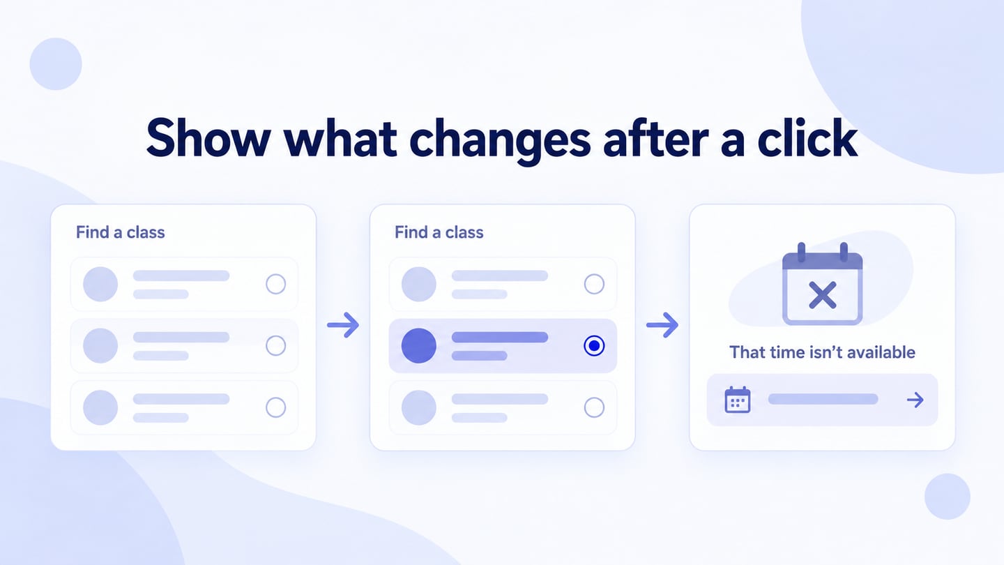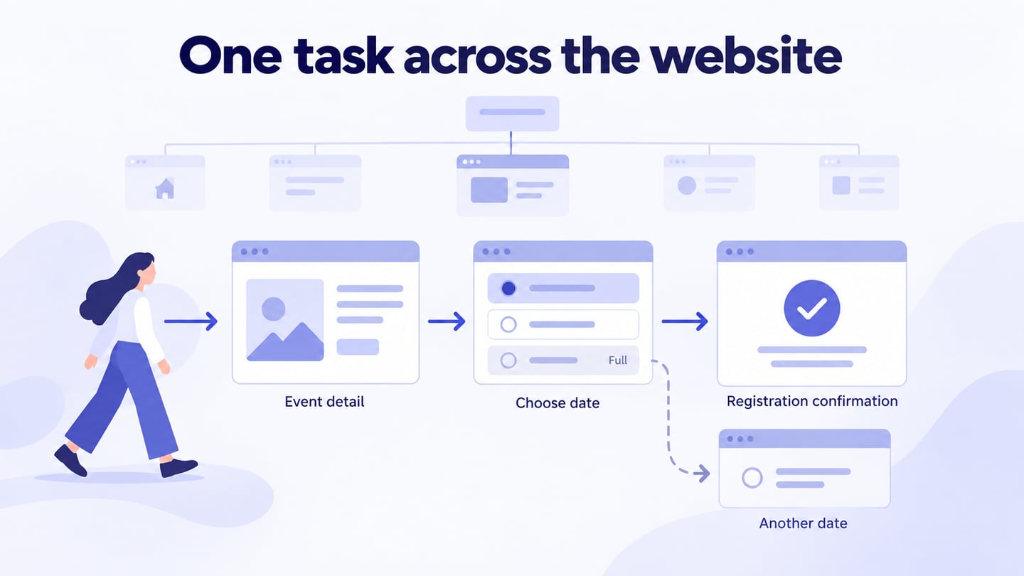
A website interface connects content and actions through navigation, fields, buttons, and feedback. In a website interface design workspace, organize those elements around the user’s task rather than treating appearance as a substitute for useful content.
A clear layout matters, but so do labels, state changes, and recovery from errors. An attractive screen is not enough if a visitor cannot understand what to do next.
Use the Mockitt workflow and website/mobile examples to plan a practical form task and review its controls and feedback.
How to create a web interface design with Mockitt?
Mockitt can help arrange interface screens and reusable elements without implementing the website. Use the prototype to review content and behavior; responsive layout, accessibility, and functional code still need implementation and testing.
Build the Interface Step by Step
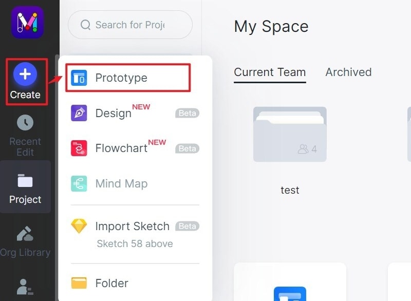
Create New Project
Open the current Mockitt workspace, signing in or creating an account if needed.
Create a project for the web interface you want to review and name it for the task.
Choose a relevant viewport size and plan additional widths if the interface needs to adapt.
Start with a blank canvas or a suitable available template. The original screenshots show an earlier interface, so control names and positions may differ.
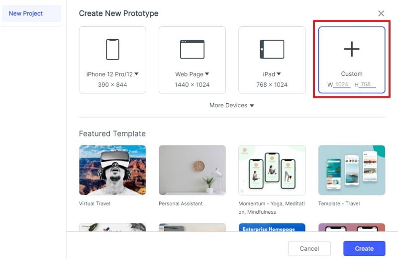
Change interface size
Set the canvas dimensions for the review. Changing the size of a mockup alone does not establish how its elements should reflow on a real website.
Adding Elements
Add the elements required for the task through the current widget controls. Keep related labels, fields, and actions in a clear group.
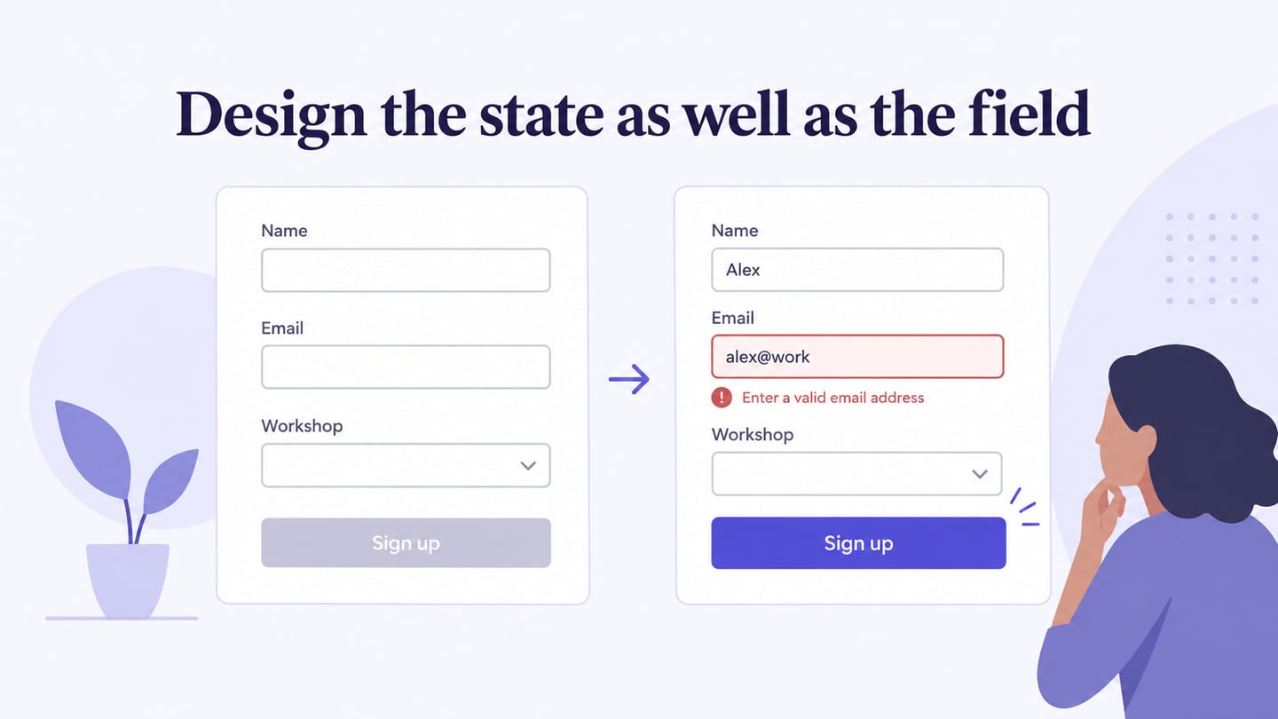
For example, build a workshop signup interface with name and email fields. Give each field a persistent label. Create an invalid-email state that explains what needs correction while preserving the entered name. Then show the corrected form and a separate confirmation state. This lets reviewers evaluate the full task instead of judging an empty form.
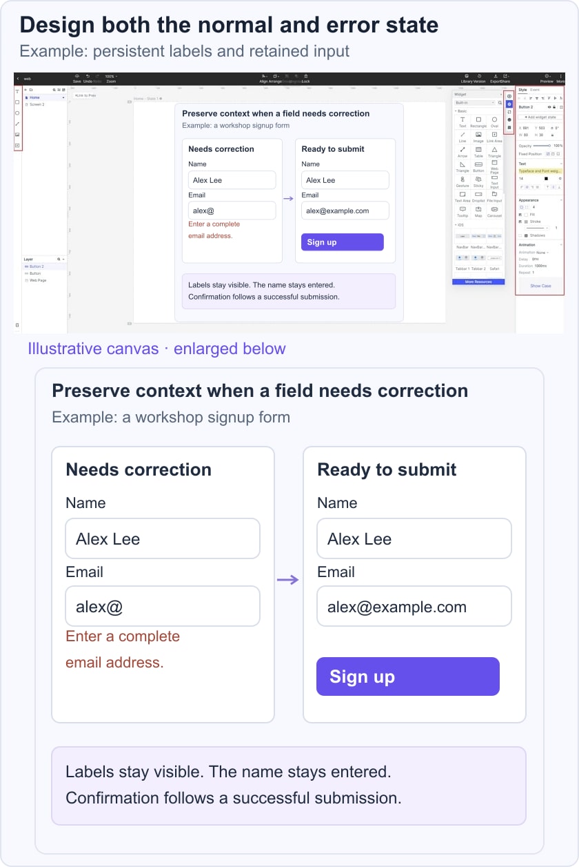
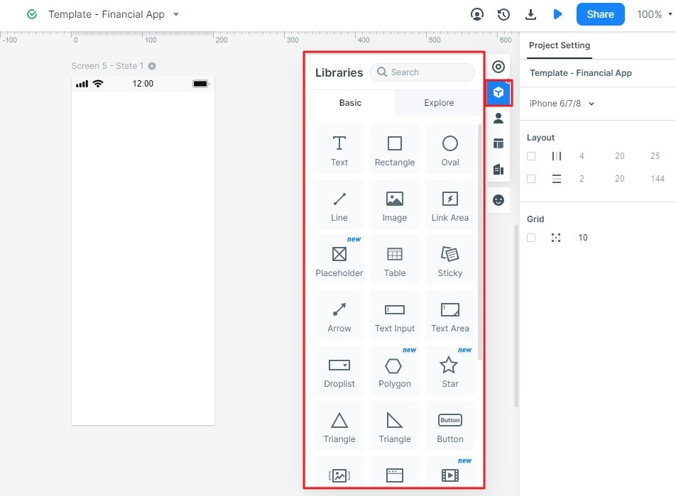
- Insert a widget from the available library.
- Drag it into the intended content group.
- Use supported drawing shortcuts where helpful.
Choose reusable assets and icons that fit the interface. The archived screenshots call these areas Built-in Widgets, My Widgets, and Icons; use their current equivalents.
After placing an element, review its relationship to surrounding content:
- Align labels and controls consistently.
- Leave enough spacing to distinguish separate actions.
Replace generic placeholders with the text a visitor would actually need. For more detail, see the web form design guide.
How to edit the Widgets in Mockitt?
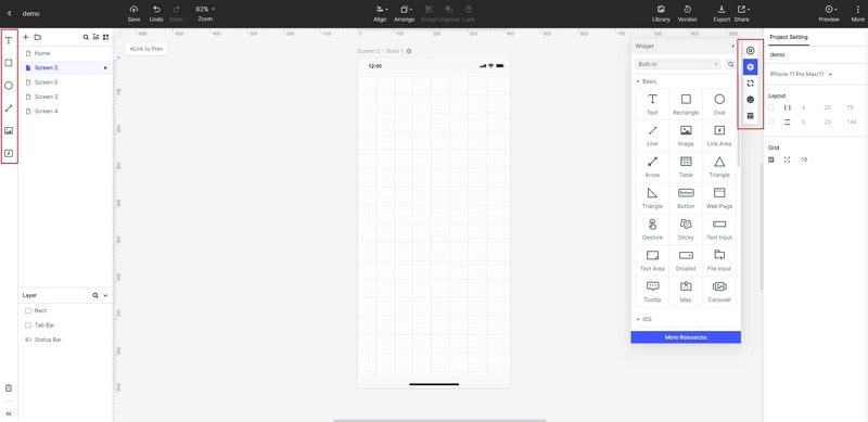
Select the widget and adjust its properties using the available controls.
Review size, spacing, text, and state styling together. A strong color alone does not communicate why a field needs correction.
Keep repeated elements consistent so users do not need to relearn the same action.
Save Widget for future use
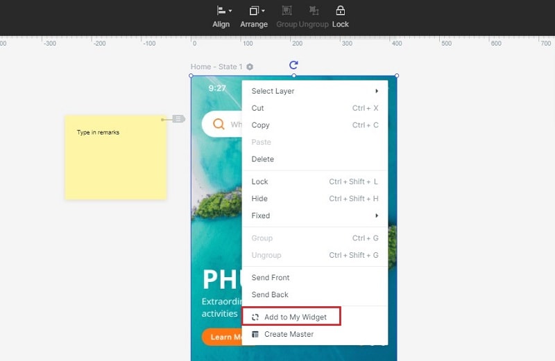
Save or reuse appropriate assets through the current controls. When the shared field or button changes, check its related states as well as its default appearance.
Connect the form, correction, and confirmation states in the prototype, then review the task.
The following original examples illustrate different interface priorities. They are not a ranking or a claim that every current screen has been tested.
Website and Mobile Interface Examples
Use each example to ask a specific design question before adapting its pattern.
#1: Medium
Medium is a reading and publishing platform. Its relevant interface lesson is the relationship between reading content, discovering material, and starting to write. Examine how those tasks are differentiated instead of copying a historical arrangement of navigation labels.
For your own content page, test whether headings, paragraph width, and link styles support reading. A simple appearance does not by itself prove readability for every audience.
#2: Airbnb
Airbnb is useful to examine for a search task involving place, dates, and people. Study how selected criteria remain understandable when moving from search to a listing.
When adapting a similar pattern, specify what happens if dates change, results are unavailable, or the user returns to the results. Do not infer that every visitor has the same booking needs.
#3: Pitch
Pitch is a presentation workspace. Its website offers an example of explaining a product and giving visitors routes to templates, features, and getting started. It should not be described as equivalent to Slack or assumed to have a particular mobile platform solely from the old article.
Study the hierarchy between the product explanation, example output, and next action. Keep your own content accurate rather than borrowing a visual style without its purpose.
For a design review, ask whether a new visitor can describe the offering and choose the relevant next step.
#4: AR Watch App
Mobile interfaces have less space and different input conditions from desktop pages. Preserve the task and adapt the controls instead of simply shrinking the screen.
The AR watch concept on Dribbble is a visual design reference. Treat it as a concept example rather than a verified released product or tested interaction. A visual concept can suggest hierarchy, but it does not prove AR tracking or usability.
Do not infer platform behavior from a picture alone; check the target platform and implementation requirements.
#5: App for Healthy Food Delivery
The original food-delivery concept illustrates product cards and category selection. Evaluate whether the cards communicate the information needed to choose an item.
For a realistic ordering task, specify availability, options, cost, and feedback after selection. Attractive food images do not establish health, hygiene, or delivery performance.
Bring the review back to a concrete task, such as completing the workshop signup and recovering from an invalid email. Observe which label or state causes confusion.
If visitors leave, investigate the possible reasons with evidence. The interface, content, offer, performance, or audience fit may all matter; departure alone does not prove a particular design defect.