Space in a UI helps people see which elements belong together and where their attention should go next. It is part of the structure of the interface, not simply the area left after content is placed.
Filling every available area can make a screen harder to scan. At the other extreme, large gaps can separate instructions from the controls they explain. The useful amount of space depends on the task and content.
White space, also called negative space, can be any background color. It includes space within components as well as the gaps between sections.
A deliberate spacing system can make the layout more predictable. It should work with readable type, clear labels and the actions people need.
Start by identifying relationships, then use space to make those relationships visible.
What is meant by white space?
White space is the area around and between text, icons, images and other content. It does not have to be literally white, and it is not necessarily unused.
The spacing can separate unrelated groups, keep labels close to their values and make a primary action distinguishable from surrounding content.
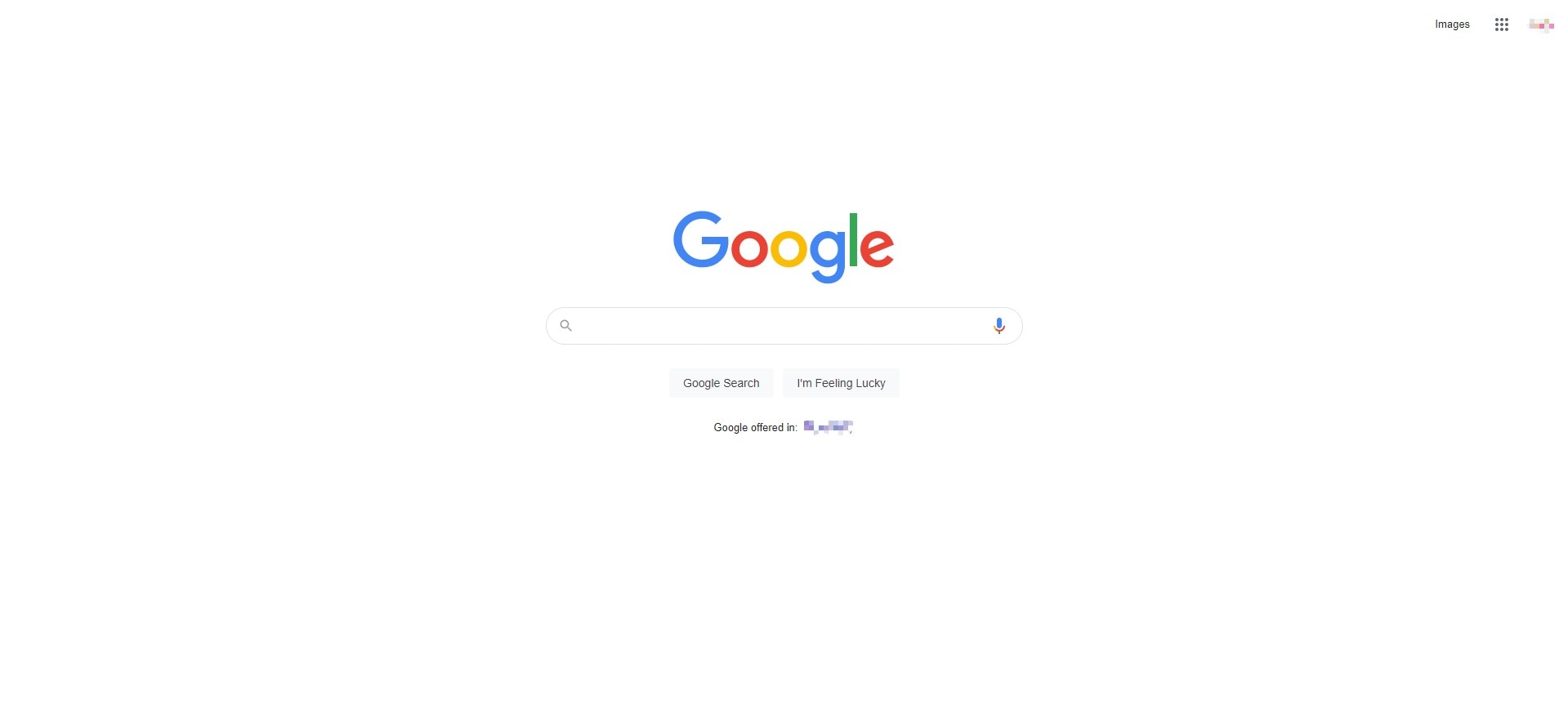
The retained Google homepage screenshot is a historical example of a focused layout. Its sparse content supports one central task; that does not mean every information-rich product should remove content to look similar.
Think of spacing as a way to communicate relationships. A useful question is not “Does the page look empty?” but “Can someone tell what belongs together?”
Types of white space:
The following terms describe different scales and uses of space. They are helpful discussion tools, not a formula for traffic or time on page.
- Micro white space
Micro white space includes gaps between characters, lines, labels and nearby controls. It affects how easily someone can distinguish and read the individual elements.
- Macro white space
Macro white space separates larger groups and surrounds the overall layout. It can clarify section boundaries without adding another border or background panel.
- Active white space
Active white space is deliberately used to establish focus or a reading path. For example, separating a confirmation action from unrelated navigation can make the next step clearer.
- Passive white space
Passive white space refers to the spacing that supports ordinary reading and layout, such as line and paragraph spacing. The categories overlap; the distinction matters less than whether the content remains usable.
Why Spacing Matters in an Interface
Space is limited, especially on a small screen. The task is to make the right information available without hiding relationships or crowding controls.
The original benefits below are useful design goals. None implies that adding more empty space automatically improves an experience.
- Increased legibility
Enough space between characters and lines supports legibility, but excessive spacing can make a paragraph harder to follow. Test the actual typeface, size and content together.
- Visual hierarchy
Larger gaps can distinguish sections, while smaller gaps associate a heading with its content. Hierarchy also depends on type and position; space should reinforce the same order.
- Drives attention and focus
Space around an action can help it stand out, but keep instructions and consequences close enough to be found at the point of use.
- Support Efficient Reading
Organized spacing can make scanning and reading easier. It does not guarantee a lower bounce rate or longer visits, and a longer visit is not always the desired outcome. For a booking task, quick successful completion may be more valuable.
- Defines character and brand image
Spacing contributes to a product’s visual character alongside imagery, color and typography. It should still support the task rather than follow a style at the expense of usability.
A sparse product presentation and a dense operations screen need different balances. Neither luxury nor trust can be inferred from the amount of white space alone.
- Logical grouping in layout
Keep related elements closer together than unrelated ones. The proximity principle explains this grouping effect. Check it again when a desktop layout stacks on mobile, because the apparent relationships can change.
How to Use White Space Effectively
Review spacing at three levels: within text, around actions and between content groups. Use consistent values as a starting point, then adjust when the content requires it.
- Use between text
Balance line height, line length and paragraph separation. Check what happens when someone increases text spacing: W3C’s text-spacing guidance addresses content and controls that clip or overlap under these adjustments.
- Around Actions and Main Elements
Give a primary action enough room to be selected without confusion, while keeping the relevant summary or consequence nearby. A button isolated at the far edge of a large layout can become easy to miss.
- Avoid too much negative space
Too much separation can make a label look unrelated to its value or disconnect an explanation from its action. Reduce gaps that break a meaningful group rather than compressing all spaces equally.
Test a narrow layout and long content before approving the spacing. Alignment should help the task without forcing text into clipped fixed-height boxes.
Historical White-Space Examples
These retained screenshots are historical layout references. They show spacing choices, not current product details, prices or measured usability outcomes.
- Tinker

In the retained Tinker screenshot, the watch image and short text block have room to remain distinct, while the shopping action stays close to the description. The useful observation is the relationship between the message and action, not a claim that the layout proves a luxury experience.
- Apple

The Apple iPhone 12 screenshot separates the product image, headline and supporting information. It is a historical page, including its old promotional text. Study the grouping and hierarchy rather than treat the offer as current.
- Dropbox

The retained Dropbox screenshot uses large content blocks and space to separate the main message from imagery. The groups remain visually clear even with different backgrounds. Check whether the same separation would still make sense when stacked on a narrow screen.
Review Spacing in Mockitt
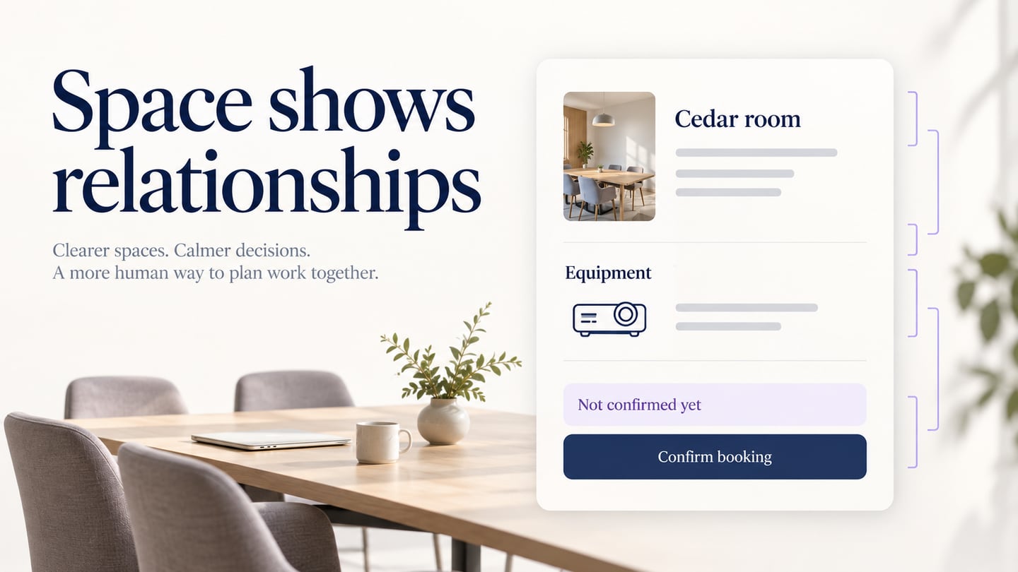
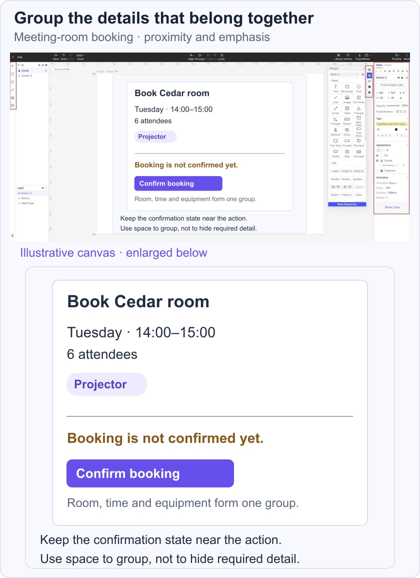
Use Mockitt to compare spacing with the same realistic content. For a meeting-room booking summary, keep the date and time together, group the room and equipment, and place “Booking is not confirmed yet” near Confirm booking. This makes the consequence visible where someone acts.
The original feature-oriented section can be used as a practical review workflow:
- Arrange the Content Before Polishing
Place the essential summary, supporting details and action first. Compare the relationships at the actual target size instead of relying on a zoomed-out canvas.
Ask a reviewer what is booked and whether the booking is already confirmed. If they miss the message, investigate its location and grouping before simply making it brighter.
- Reuse Consistent Components
Use available widgets and reusable elements for labels, values and buttons. Apply consistent internal spacing, while allowing enough room for longer content.
- Keep Variants Comparable
Create a second layout with the same room, time and message. Changing the content at the same time would make it harder to judge which spacing decision caused confusion.
- Review Multiple Screen Sizes
Check the narrow layout and enlarged text. A gap that works on desktop may separate the confirmation message from the button when elements stack.
- Share the Design for Contextual Feedback
Share the design through the options available in your workspace and give reviewers a concrete booking task. Do not treat opinions about an empty-looking page as evidence about task completion.
- Document the Intended Relationships
Explain which elements form a group and how spacing should adapt. Developers still need to verify the actual layout, focus behavior and text resizing in the implemented page.
Conclusion
Useful white space makes information relationships easier to see. Review the small gaps that support reading and the larger gaps that separate sections, then verify that both survive real content and small screens.
There is no universal ratio that guarantees engagement or business results. Let the task, the audience and observed difficulty guide the adjustment.
Revisit the screen by asking whether the labels, values, explanations and actions remain connected. That is a more practical test than whether the page uses as much or as little space as a fashionable example.