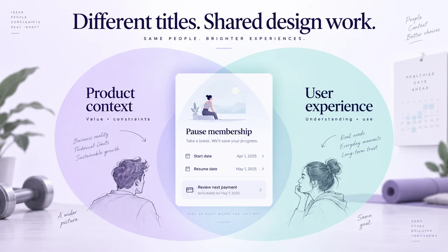
Product design and UX design overlap substantially in digital teams. Both can involve understanding people, developing solutions, prototyping, and evaluating an experience. The useful distinction is the scope a particular organization assigns to the role, not a rule that one designer understands users while the other understands business.
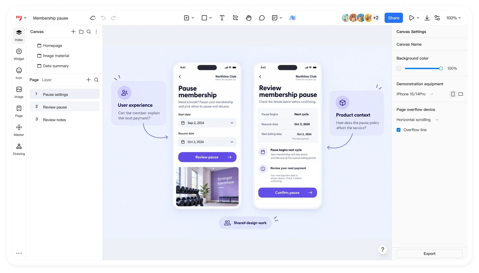
A shared artifact helps make that scope concrete. With Mockitt Design for interface and component review, a team can discuss the same screen while asking different questions about customer needs, policy, layout, and implementation. This guide compares the responsibilities, then preserves a four-step prototyping workflow using a fictional membership-pause example.
How product design and UX design overlap
Definitions help, but titles do not define every responsibility
UX means user experience, not user interface. Nielsen Norman Group's definition covers a person's experience with a company's products and services. Interface design contributes to that experience, but the work can also involve understanding a task, organizing information, evaluating an interaction, and considering what happens outside the screen.
Product design has a broader history that includes physical products. In a digital product team, the title commonly describes work on a product's experience across discovery, design, and continued improvement. That does not mean every product designer owns pricing, commercial strategy, or the entire lifecycle. Their actual responsibilities depend on the team and the role description.
A UX designer may concentrate on interaction design or span research, structure, visual design, and evaluation. A product designer may do much the same work while staying closely involved with a particular product area. Both need to understand users and constraints. Neither should be reduced to making screens attractive or handing off a problem for someone else to solve.
Compare the assignment, not a fixed hierarchy
| Question | What to establish for either role |
|---|---|
| What is the scope? | A product area, a whole service, a particular interaction, or work across several teams? |
| Who gathers evidence? | Does the designer conduct research, partner with a researcher, or work from supplied findings? |
| What must be delivered? | Flows, information structure, interface designs, prototypes, specifications, or a combination? |
| Who makes tradeoffs? | Which decisions belong to design, product management, engineering, or another owner? |
| What happens after release? | Does the designer review behavior, address feedback, and improve the existing experience? |
This is also a better basis for evaluating a job than an assumed salary ordering. Compare location, seniority, responsibility, and the employer's stated compensation range. A senior UX role and an entry-level product-design role are not equivalent samples simply because the titles appear in the same article.
Both roles benefit from research literacy, interaction design, prototyping, communication, and the ability to explain tradeoffs. Some assignments require deep visual design or specialist accessibility expertise; others emphasize research or service complexity. Ask which skills the team already has and where this person is expected to contribute.
One feature, several design questions
Consider a fictional fitness service, Northline Club. Members need to pause a membership while away. The service has a policy: a pause begins at the next billing cycle, and the member chooses a return date. The team has to make those consequences understandable before confirmation.
A designer investigating the experience might ask whether members can find the pause option, distinguish pausing from cancelling, and explain when billing resumes. Another part of the same assignment concerns how the policy is represented: which dates are selectable, what the confirmation promises, and what happens when the chosen return date is invalid.
Those questions are not cleanly divided by the labels “UX designer” and “product designer.” A designer in either role could investigate and propose solutions. Product management must help clarify the intended policy and its value; engineering must explain implementation constraints. NN/G's discussion of the product triad emphasizes the overlap between product, design, and engineering responsibilities.
Suppose the initial screen simply says “Pause now.” A review could reveal that this conflicts with the next-cycle policy. The team can revise the action to make the effective date visible and add a confirmation that states when access and billing resume. This is an illustrative design decision, not a claim that a particular wording has been user-tested.
Before assigning the work, agree who will confirm the policy, who will prepare the prototype, and who will arrange evaluation. Give the designer a question to resolve: “Can members explain the consequences before submitting?” That produces a more useful brief than “Make the pause screen more intuitive.”
Build and review the example in Mockitt
Mockitt's current online prototype maker supports arranging screens, connecting interactions, and sharing a design for review. The workflow below uses those tasks to examine Northline's pause journey. The retained instructional screenshots show an earlier editor, including its Create menu and lightning-bolt connection handle; they explain the underlying operations without promising identical control placement in the current workspace.
Step 1. Create a prototype around the decision
Create a prototype project and choose a canvas suitable for the intended device. In the earlier interface shown below, the route is Create → Prototype. Name the project for the task, such as “Membership pause review,” so reviewers can identify its purpose without opening every screen.
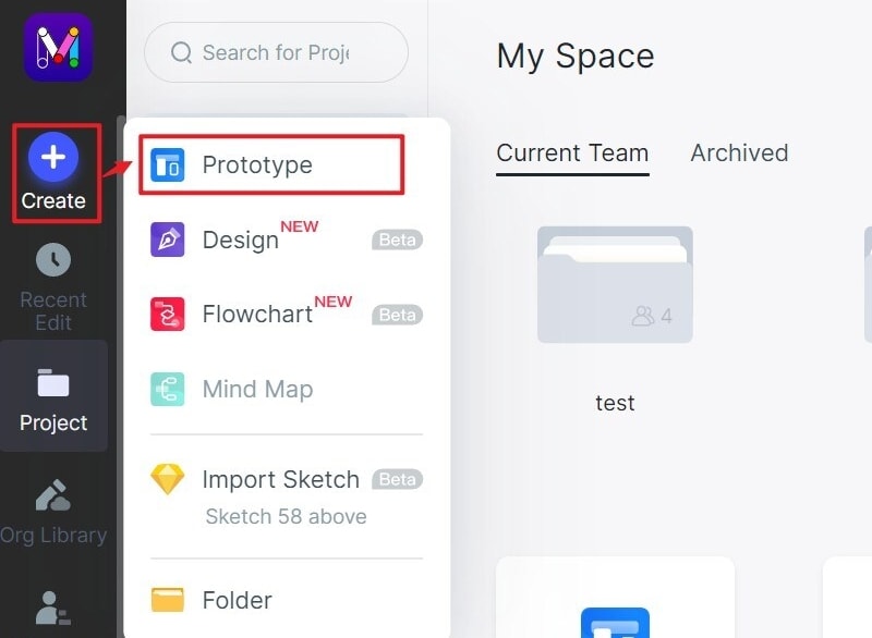
Prepare three screens: membership details, pause settings, and confirmation. Write the question beside the flow: can a member predict the effective pause date and next billing date? Keep the initial scope small enough to evaluate that decision. A large catalogue of unrelated account screens would make the review harder.
Step 2. Design the page and its content
Build the page with text, shapes, fields, and buttons. The old component-library screenshot shows the kinds of elements used for this work. Use a consistent layout, but put the meaningful content in place early: membership name, pause start, return date, and a concise explanation of what the change does.
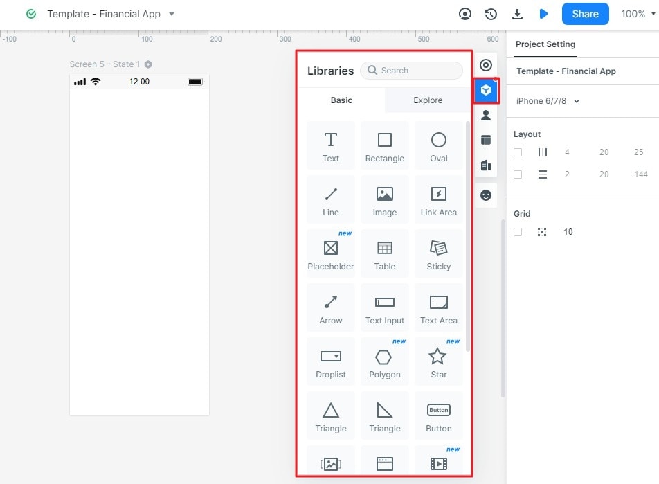
Design a section. Group the date fields with the explanation of the pause. Give the section a heading that identifies its purpose. Do not separate the cost or access consequence from the action that confirms it merely to create a visually balanced layout.
Add an image when it helps. You can place an image component and adjust its size, but the pause flow does not require a decorative photograph. Use the space for a readable membership summary. In a different product page, an image might identify the specific item being changed.
Add navigation and buttons. Reuse appropriate controls and adapt their labels. Keep a clear route back to membership details and distinguish the confirmation action from cancellation. If the existing product has a tab bar, retain its familiar placement rather than inventing a new navigation system for this feature.
Step 3. Add interactions and purposeful feedback
Connect the membership action to pause settings and the final action to confirmation. In the earlier editor, dragging the lightning-bolt handle connects a selected widget to a target screen. The travel example below illustrates that operation; the same design task is to connect the correct origin, action, and destination.
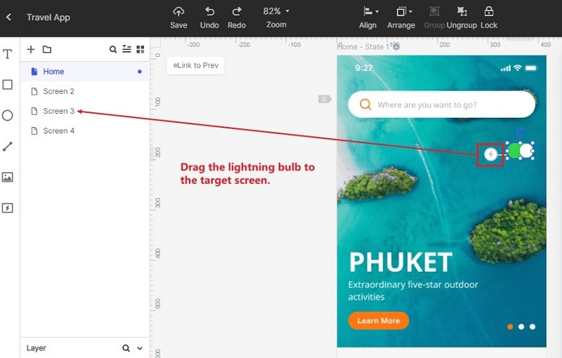
Add an alternative screen or state for an invalid return date, and provide a way back to correct it. Define where the explanation appears and which information remains entered. Those details let a reviewer examine recovery instead of seeing only a successful path.
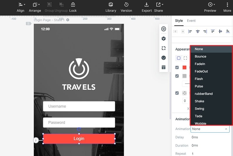
The pause confirmation does not need a bouncing button to be understandable. A stable summary of the chosen dates may communicate more effectively. If motion explains a transition, describe its purpose and reduced-motion expectation in the handoff. Preview effects are design proposals, not proof of accessible production behavior.
Step 4. Preview, share, and prepare the handoff
Preview from membership details and follow both the valid and invalid-date paths. Check the back route as well as the forward journey. The earlier toolbar screenshot highlights the preview entry; after opening the prototype, read the confirmation as a member who has not participated in the design discussion.
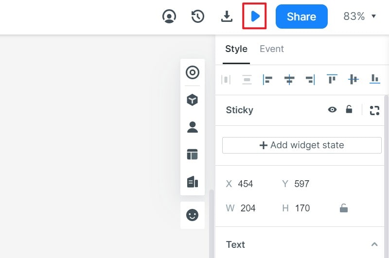
Share the prototype with suitable permissions and ask reviewers to explain the pause start, return date, and next billing date. Record what they understood and what caused uncertainty. A team review can find unclear wording; evaluation with relevant users provides different evidence and should be planned separately.
Include a member who already has a scheduled pause in the review scenarios. Should the page offer an edit, explain the existing request, or prevent a second submission? The answer comes from the agreed service rules, then needs an understandable interface. This small variation tests whether the proposal is a coherent experience rather than a single attractive screen. Keep the question open if the policy owner has not yet decided; a prototype should make that uncertainty visible.
Finally, attach the approved policy, field rules, and interaction notes to the design handoff. Use exports available in your workspace for the required review artifact, without treating a prototype or an exported file as a deployed membership service. Whether the designer's title is product designer or UX designer, the useful result is a coherent proposal whose decisions and remaining questions can be understood by the next person.