Mockitt - Best Free Wireframe Tool
Helpful Tips About Wireframe
- How To Create A Wireframe
- Wireframe Tools You Should Know
- Wireframe Templates for Your Inspiration
- Free-to-use Wireframe Kit
Cognitive Walkthrough: Review a Prototype from a New User’s Perspective
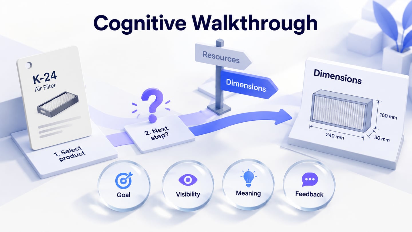
A first-time customer knows the replacement filter code K-24 and needs its dimensions. The product page has a Resources control. Your team knows that the measurement drawing is inside it. The customer does not. Making that control larger might improve its visibility without explaining what it contains.
A cognitive walkthrough examines this kind of first-use problem. Reviewers follow a defined task through an interface and explain what a new user would need to understand at each action. Prepare the relevant screens in an interactive prototype, keep the starting point and version explicit, and inspect the path before deciding what to change.
The filter catalogue below is a fictional worked example. Its product code, dimensions and review judgments demonstrate the method; they are not compatibility advice or findings from customer research.
What a cognitive walkthrough can answer
The method focuses on learnability: could someone with the stated prior knowledge work out how to complete this task? Reviewers reason from the interface and the user's situation. They do not watch participants attempt it, and their predictions must not be reported as observed success rates.
That makes a walkthrough useful when a team can show a concrete path but has not yet established whether its labels and feedback make sense to newcomers. It can expose assumptions worth fixing or investigating before a study. It is less useful when the task, audience or intended behavior is still so vague that reviewers must invent them while inspecting.
A general design review can debate scope, feasibility and alternatives. A cognitive walkthrough is narrower: inspect a particular action sequence from a particular user's perspective. A heuristic evaluation compares an interface with broader usability principles. Participant testing supplies behavioral evidence that neither inspection method can produce by itself.
Define the user, outcome and starting state
Write a compact brief before the meeting. “A new user” is insufficient: new to this website does not necessarily mean unfamiliar with replacement parts, search fields or measurement units. Identify relevant knowledge and unknowns without inventing a detailed persona to make the interface appear easy.
- User perspective
- A first-time catalogue visitor who has the code K-24 from an existing filter. They understand millimetres and want to check size, but do not know this site's navigation labels.
- Task outcome
- Find the dimensions associated with K-24 before deciding whether to investigate the part further. Purchasing and judging technical compatibility are outside this review.
- Starting state
- The catalogue home screen, with a visible search field and no search already entered.
- Reference
- Catalogue R1, containing the search, results, product detail and expanded Resources states.
- Known uncertainty
- The team has not checked whether prospective customers associate Resources with dimensions. Record that as an assumption to investigate.
Use existing research to refine the perspective when it is available. If it is not, label the assumptions and choose a plausible, bounded task. The guidance on user expectations and prior knowledge explains why team familiarity should not stand in for evidence about the audience.
Write the intended action sequence first
The facilitator needs to know how the current design expects the task to be completed. This is a reference path for inspection, not a script to give a participant in a later usability test. In Catalogue R1, it is:
- Enter K-24 in the catalogue search field and submit the search.
- Open the result labelled K-24 replacement filter.
- Select Resources on that product's detail page.
- Read the expanded dimensions panel and confirm that it still identifies K-24.
Keep action boundaries meaningful. Typing a known code and submitting the search can be one review unit here. If suggestions, validation or an ambiguous submission control are the concern, separate those actions. Do not combine an entire form or multi-screen journey into one step merely to make the record shorter.
Define alternative routes separately when they matter. A customer browsing by category may encounter different terminology from someone who already knows the code. Inspecting the search route does not establish that browsing works equally well.
Ask four questions at each action
NN/g's cognitive-walkthrough guidance describes four judgments: whether the user pursues the needed result, notices the available action, connects that action with the result, and recognizes progress after acting. Record a reason for each judgment. A row of unexplained checkmarks hides the assumptions the method should expose.
For this review, use the short labels goal, visibility, meaning and feedback. They keep discussion organized, but they are not four interchangeable ways of saying “easy to use.”
- Goal: Does the next result make sense from the customer's current objective? Finding a part by its known code does; creating an account would need a separate explanation.
- Visibility: Is the relevant action discoverable in the state being shown? Point to the actual field, control or link rather than saying it should be somewhere obvious.
- Meaning: Does its wording and context explain why this is the action to take? A visible Resources label can still fail this judgment.
- Feedback: After acting, can the customer tell what changed and how it advances the task? An expanded panel needs an understandable heading and the correct product identity.
Short, evidence-bearing explanations matter more than the form you use. DePaul's HCI walkthrough assignment similarly asks reviewers to connect the user's knowledge with the required action instead of answering only yes or no.
Work through the K-24 catalogue example
Search and identify the result
For the first action, the goal is plausible because the customer already has the code. The field is labelled Search products and remains visible on the starting screen. Its context supports entering the code; a result heading that repeats K-24 provides progress feedback after submission. These are reasons for a favorable prediction, not evidence that all customers will succeed.
For the second action, the result contains the exact code and a product name. That helps the visitor associate the result with the required part. The detail screen must repeat K-24, so opening the result does not lose the identity needed for the next judgment. A photograph alone would be weaker evidence when several parts look similar.
Inspect the Resources action in detail
The third action is the consequential one. The customer is looking for dimensions; Catalogue R1 requires selecting Resources. A completed record for that action could read:
- Goal judgment
- Finding dimensions is consistent with the customer's stated goal. No additional product knowledge should be needed to want this information.
- Visibility judgment
- Resources is visible below the product summary in the inspected state. The review does not identify a hidden-control problem in this version.
- Meaning judgment
- Predicted problem: the label does not say whether it contains dimensions, maintenance advice or downloadable manuals. The team knows the contents; the stated newcomer does not. No nearby description resolves that uncertainty.
- Feedback judgment
- After the control opens, a Dimensions heading and K-24 identify the relevant information. The value is shown as 240 × 160 × 30 mm. This feedback supports the task once the customer reaches it.
- Finding
- The likely barrier is associating Resources with the desired dimensions, not reading the measurement after opening the panel.
Do not stop the inspection at that predicted failure. Continue with the state reached by the intended action so later feedback problems can also be examined. Record that you assumed the action succeeded for the purpose of inspecting the next step; do not quietly turn that assumption into an overall pass.
For the final action, check the complete information relationship. The measurement must remain attached to K-24, include its units, and use a clear diagram or labels if the order of the measurements matters. Merely seeing three numbers does not establish that someone can interpret them correctly.
Separate the finding from the proposed revision
Finish recording Catalogue R1 before brainstorming alternatives. Otherwise reviewers may evaluate the improved design they have in mind instead of the interface in front of them. A short issue record should retain the affected action, predicted difficulty, supporting interface evidence and the assumption still needing investigation.
For Catalogue R2, the team proposes replacing Resources with Dimensions for this panel and keeping the K-24 identifier visible when it opens. That directly addresses the predicted meaning problem. Making Resources brighter would address salience without necessarily clarifying its contents.
The illustrated revision keeps the Dimensions action, K-24 and 240 × 160 × 30 mm together, while a separate review note records the ambiguity in the earlier Resources label.
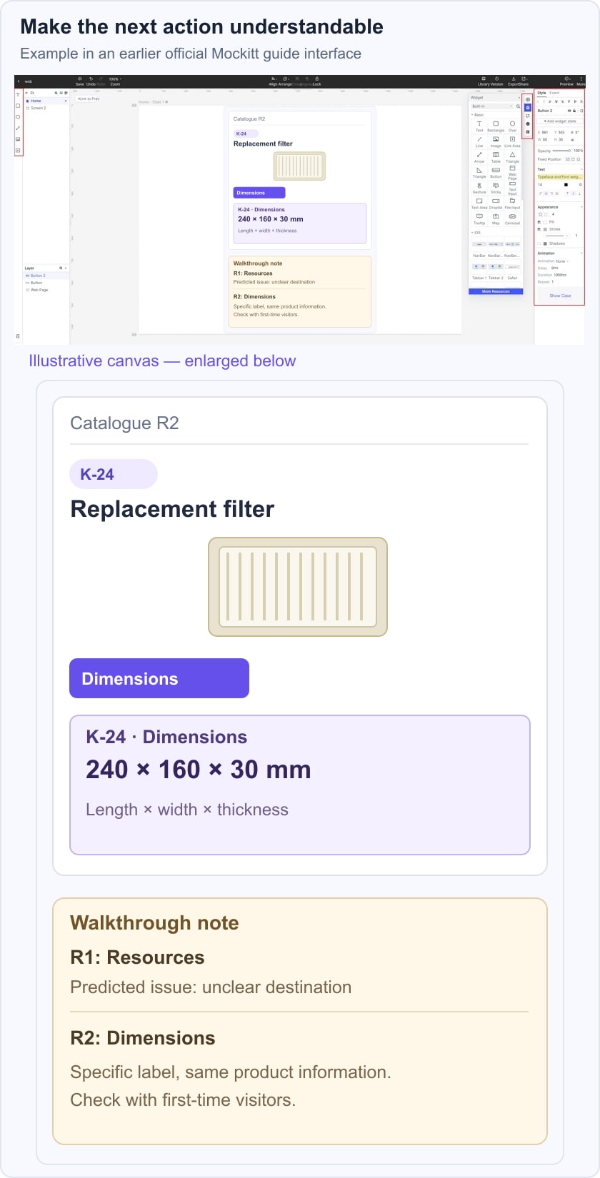
Prepare those states in the prototype and walk the revised path. If Resources also held manuals or care instructions, do not rename the entire mixed-content section Dimensions. Split the destinations or give each a specific label so the revision remains accurate.
The second inspection can show that the proposal now supplies the missing cue according to the review's reasoning. It cannot establish a measured improvement in customer comprehension. Keep the original finding and the revision connected without writing “users now understand” before anyone has observed that.
Turn the prediction into a useful research question
The next question is whether intended customers locate and interpret the dimensions without being taught the path. A neutral task could be: “You have a K-24 filter and want to check its dimensions before deciding what to do next. Use this catalogue to find that information.” Do not tell the person to open Dimensions; that would supply the cue you want to investigate.
Use a prototype usability-testing plan to define participants, observation and recording. Note where people look, which labels they consider, whether they find the correct model, and how they explain the dimensions. Keep observed behavior separate from your interpretation of why it happened.
Close the walkthrough with a small, usable package: the audience assumptions, task and version, action sequence, reasoned findings, proposed changes and unresolved questions. The purpose is not a reassuring score. It is to make an otherwise invisible leap—from Resources to “this is where I find dimensions”—explicit enough to improve and investigate.