Mockitt - Best Free Wireframe Tool
Helpful Tips About Wireframe
- How To Create A Wireframe
- Wireframe Tools You Should Know
- Wireframe Templates for Your Inspiration
- Free-to-use Wireframe Kit
First-Click Testing: Check Whether Users Start on the Right Path
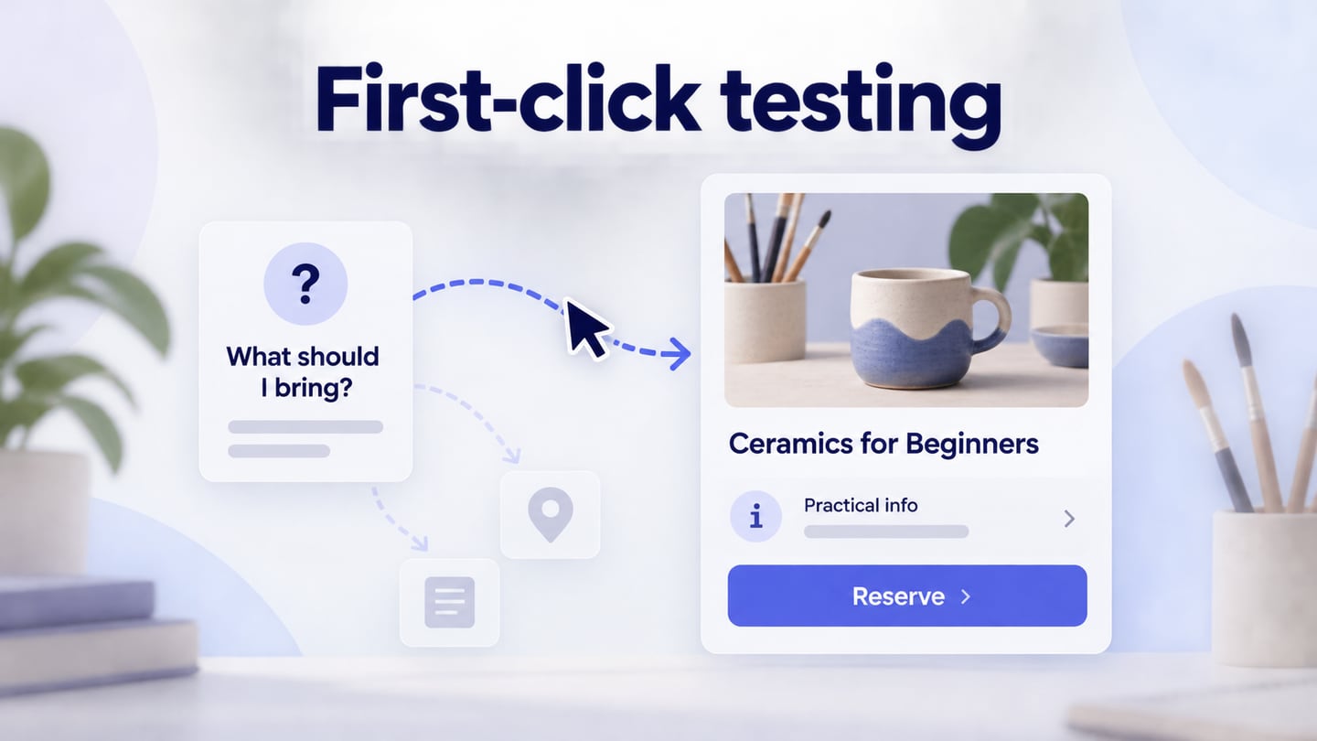
First-click testing asks whether someone can identify a useful starting point for a specific task. Show a realistic starting screen, give a goal without naming the interface control, and record the first selection. The result helps you decide whether to change an entry point, its label, or its position before investigating the rest of the journey.
Use it as a focused part of usability testing for a real user task. A promising first click does not prove that someone can finish the task, understand the next page, or recover from an error. This guide follows a fictional community arts center preparing a study about finding course requirements. The screen and research records are teaching examples, not participant findings.
Choose the design decision the study can answer
Riverside Arts runs drawing, printmaking, and ceramics classes. Its course page has a date selector, a prominent Reserve a place button, and smaller sections for practical information. Before enrolling, a visitor may want to know whether they need to bring materials. The team needs to learn whether the starting screen gives that visitor a plausible route to the answer.
That is a narrower question than whether the entire booking experience works. Write the decision in advance: if visitors overlook practical information, should the team rename the entry, move it, or expose the answer directly? A first-click study can locate the initial ambiguity. A later task session can investigate what happens after the chosen entry.
The Lyssna click-test documentation describes one common setup: provide instructions, display a design image, collect a click, and optionally ask follow-up questions. Choose a research setup appropriate to the question. A static-image test is useful for visual entry choices; it cannot reproduce scrolling menus, keyboard operation, or the complete behavior of an interactive screen.
If the team is still deciding the underlying category names without a visual layout, consider testing the navigation hierarchy separately. Conversely, if the unresolved issue is whether an open menu hides the next action, use an interactive task. Select the method from the uncertainty rather than forcing every navigation question into one screenshot.
Prepare the exact screen a visitor would see
Build the course page and its alternative information placements in Mockitt's interactive prototype workspace. Keep the heading, course summary, date controls, and competing actions realistic. The prototype helps the team prepare and review the material; collect study responses with a suitable research tool or moderated recording process.
The Riverside example puts course details, practical information, and booking controls in the same starting view so the team can examine which entry communicates the materials question.
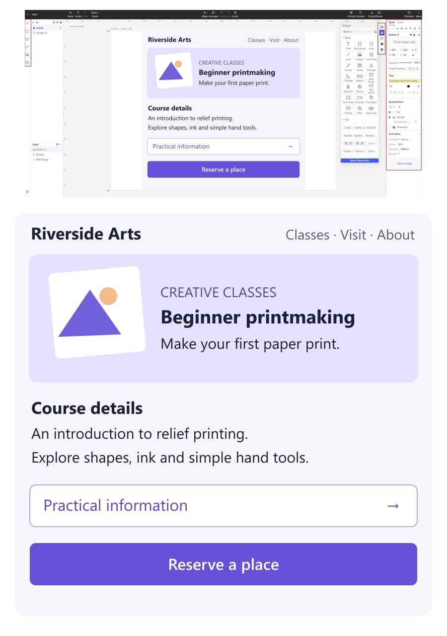
Decide what the participant sees before the clock or observation starts. Are they on a course page reached from a search result, or on the arts center homepage? Those are different starting conditions. Do not crop away a menu because it competes with the preferred entry; the competition may be the issue the study should expose.
For mobile, use a genuine narrow layout rather than shrinking the desktop screenshot. If practical information begins below the fold, a single image of the first screen may conceal an available route. Either define the study as a first-screen investigation or use a setup that permits the relevant interaction. Record that choice with the material.
Remove editor handles, annotations, cursor highlights, and any researcher labels that reveal the target. Ensure the image is sharp enough to read ordinary text at the displayed size. Pilot the link and device behavior before recruiting: a participant should not need to solve the testing tool to understand the course page.
Write a goal that does not reveal the control
A useful task gives the visitor a reason to act without copying the answer from the screen. For Riverside, try: "You are considering the beginner printmaking class. Before choosing a date, you want to know whether you need to bring any materials. Where would you start?" The instruction supplies the information need, not the label or location.
| Task wording | Why it changes the study |
|---|---|
| Click Practical information to check what to bring. | Names the intended entry and tests following an instruction. |
| Find out more about the class. | Leaves the goal open; several unrelated first clicks could be reasonable. |
| Before choosing a date, find out whether you need to bring materials. | Gives a concrete question while leaving the starting route open. |
Use vocabulary that prospective visitors understand. A phrase such as "consumables provision" might match the center's internal administration but introduce a reading problem unrelated to navigation. Ask someone unfamiliar with the design to explain the task back to you during the pilot, without first showing them the intended path.
Avoid asking the same person to repeat an almost identical task on a revised version immediately afterward. Once they have discovered where information lives, their next click carries that knowledge. If you compare alternatives, plan participant allocation and order deliberately, and document any repeated exposure when interpreting the results.
Define plausible routes before seeing responses
Agree on what counts as a useful start. For the course page, Practical information may lead directly to the materials answer. A Course details link could also be valid if that destination clearly leads to the same information. The researcher should inspect both paths before marking only the designer's preferred button as correct.
Keep separate labels for a valid entry, an understandable but unhelpful entry, and an ambiguous selection. A click on Reserve a place might reflect an expectation that booking reveals preparation requirements. That explanation would not make it the intended route, but it would provide a more useful design clue than a bare failure label.
Define clickable regions consistently, including icons and the surrounding hit area. If a person clicks the chevron next to a label that acts as one control, count the whole control according to the agreed rule. Avoid expanding only the desired region after seeing nearby clicks. Store the region map and material version with the study so another reviewer can reproduce the coding.
For a screenshot, a click on plain text can reveal an expectation that it should be interactive. Record it rather than silently moving the point to the nearest real button. For an interactive study, distinguish a pointer press from a completed action if the tool records both.
Collect the choice before discussing it
Recruit people who resemble the intended visitors in relevant ways, such as first-time course buyers rather than staff who already know the center's labels. Let each person see the same task and starting condition. A colleague who has watched the design evolve is useful for a pilot, but is not an interchangeable substitute for an unfamiliar visitor.
Record the first choice before offering hints or asking leading questions. Afterward, a question such as "What did you expect to find there?" can help distinguish a label problem from a layout problem. "Did the small link confuse you?" supplies an explanation that the participant may not have considered.
Decide how to handle no selection, accidental taps, or a technical failure before the study. A dropped connection is not evidence that the page is confusing. Equally, do not discard hesitation simply because it makes the preferred layout look weaker. Keep the original observation and the exclusion reason separate.
Record material version, task, device or viewport, participant identifier, first region, and relevant explanation. Keep personal details and recordings in the research system approved for your team; the design board can hold a de-identified observation summary.
Turn click locations into a design explanation
Begin with the distribution of first choices for each task and starting condition. Report the number of usable responses alongside any proportion. Separate excluded technical failures from people who could not decide. If mobile and desktop provide different controls, do not combine them into one tidy percentage that hides the difference.
Timing can indicate where to investigate, but a long pause has several possible causes. A visitor may be reading the task, checking course details, using assistive technology, or hesitating between entries. There is no need to declare every click slower than an arbitrary cutoff a failure. Interpret the timing alongside the setup and the person's explanation.
For Riverside, imagine the next study produces clicks around the preparation-related text rather than its expandable entry. That would justify examining whether the text appears interactive or whether the accordion label communicates the wrong scope. This is a hypothetical interpretation, not a reported result. The design action should depend on the observed evidence, not on a heatmap drawn in advance.
A compact decision record can connect the evidence to a revision:
| Record | What to capture |
|---|---|
| Starting condition | Course page version and device layout shown. |
| Observation | Actual first region and the visitor's stated expectation. |
| Possible explanation | Label scope, visual prominence, competing action, or unclear task. |
| Next revision | One change tied to the evidence, with the next question to examine. |
Check the rest of the path after improving the entry
Revise the course page only where the evidence supports a change. If visitors understand the entry but overlook it, position or hierarchy may be the useful variable. If they notice it but expect different content, test the label and destination. Changing the label, placement, content, and booking flow together makes the next result harder to explain.
Then follow the materials question through to an answer. Can the visitor tell what is supplied, what to bring, and whether the information applies to the selected course? A clear starting point followed by incomplete content still leaves the task unfinished. Use a prototype usability test plan when that full journey is the next uncertainty.
The useful deliverable is a traceable choice about the interface: what people were trying to do, where they started, what that suggests, and what the team will investigate next. That gives a first-click study a clear role without asking one click to prove the quality of the whole product.