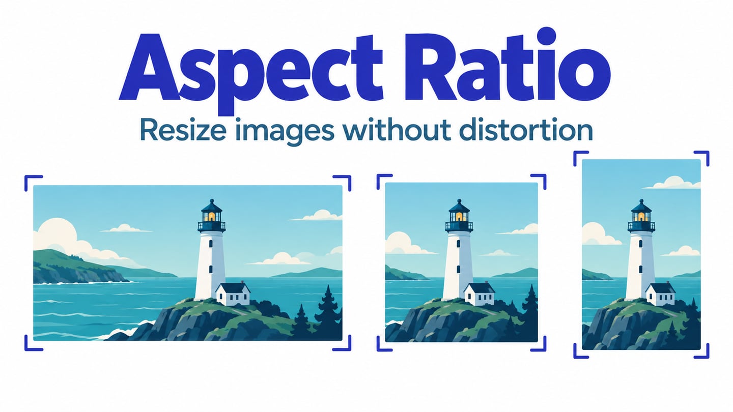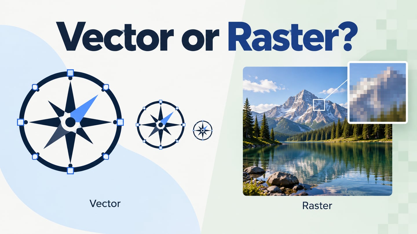
A pixel is a picture element, but the word can refer to an image sample, a physical display element or a CSS layout unit. Those are related, not interchangeable. Understanding the distinction helps you choose image assets and set up interface layouts without assuming that one number of pixels has a fixed physical size.
What Is a Pixel?
In a raster image, a pixel is one sample in a rectangular grid. It has a position and a color value; together, the samples represent the picture. Zooming in with a suitable viewer can reveal this grid. A physical screen also has addressable picture elements, but the browser can map one image pixel across several screen pixels or resample several image pixels into one.
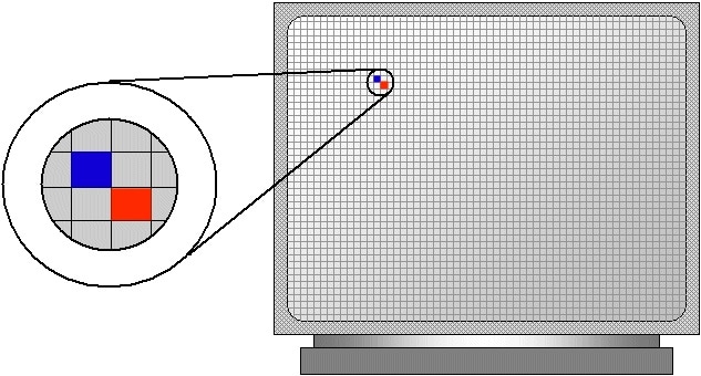
Source: StackOverflow
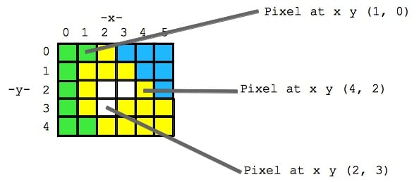
Pixel coordinates locate samples in the image grid. In a common zero-based convention, the top-left sample is (0, 0), x increases to the right, and y increases downwards. An image 1024 pixels wide therefore has x positions 0 through 1023. The coordinate example above shows selected locations; color values at each location supply the visual information.
Pixel Count, Physical Size, Color and Density
Keep the measurement next to the number. “160 pixels wide” is ambiguous until you specify whether it describes an image file, a CSS layout or a device’s physical pixels.
How Do You Calculate the Pixel Count?
Multiply width by height. A 1024 × 768-pixel image contains 786,432 pixels. This describes its sample count, not its compressed file size or physical width. Two files with those dimensions can have different compression, color depth and visible detail. A larger sample count also does not prove that the image was sharply captured.
How Big Is a Pixel?
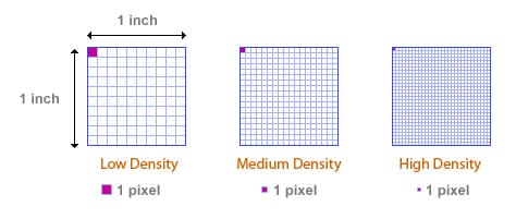
A physical display pixel has no universal millimeter size: it depends on the screen’s pixel density. At 100 pixels per inch, one pixel spans 1/100 inch; at 200 PPI it spans half that distance. A CSS pixel is a layout unit whose mapping to physical pixels depends on the device and viewing conditions. MDN distinguishes device pixels from CSS pixels; treating either as always 0.26 mm leads to incorrect sizing assumptions.
How Do Pixels Represent Color?
Image pixels commonly store red, green and blue channel values; some formats also store an alpha value for transparency. The bit depth controls the number of representable channel levels, while the color space helps define what those values mean. Coordinates say where a sample belongs and color values say what it contributes. Neither increasing bit depth nor changing a color profile creates more spatial detail.
Source: Stanford Edu
What is Pixel Density?
Pixel density is a count per physical distance, commonly pixels per inch (PPI). It is different from total pixel dimensions. A display can fit more physical pixels into the same area by using a higher density. Print workflows also use PPI for image samples per printed inch, while a printer’s dots per inch (DPI) describes its marking process; the two are not interchangeable.
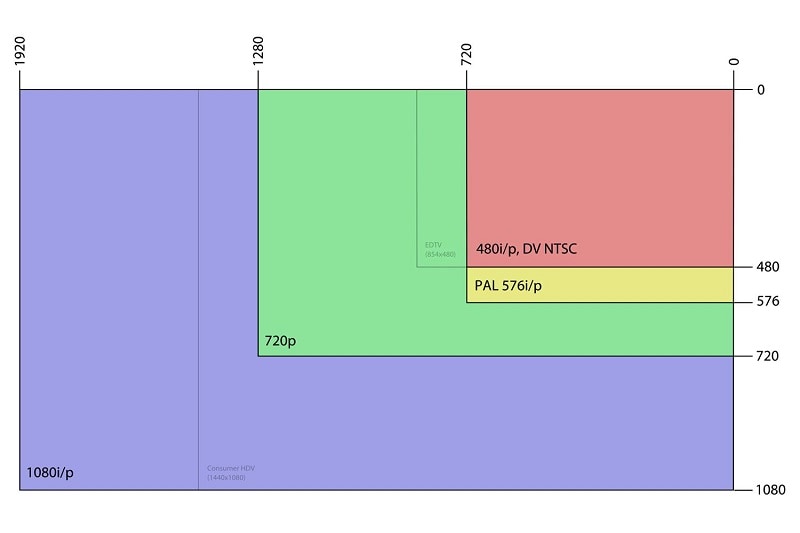
A 1280 × 720-pixel image contains the same number of samples whether it is shown on a phone or a monitor. Enlarging it to cover more display pixels asks the renderer to interpolate between those samples. Depending on the source and scaling method, the result may look soft or blocky. Pixelation is a visible symptom of insufficient or deliberately coarse detail, not a change to the original file’s pixel count.
Source: Lifewire
How to Apply Pixel Measurements to a UI
These three checks connect image dimensions to the interface where an asset will actually appear. Check the final browser or app as well as the design canvas.
Tip 1: Know the relationship between pixel density and image size
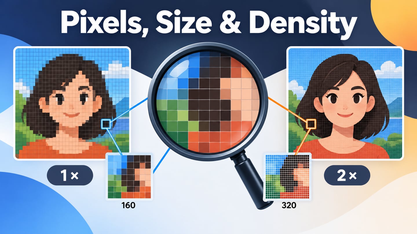
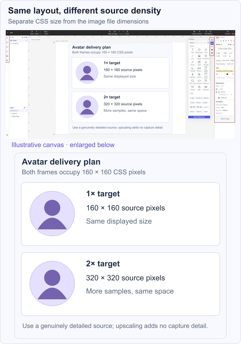
Start with the displayed size and density target, then choose an adequately detailed source. An avatar displayed at 160 × 160 CSS pixels needs approximately 160 × 160 source pixels for a 1× mapping and 320 × 320 for a 2× mapping. Both occupy the same layout space. A 320-pixel file made by enlarging a blurry 160-pixel original does not contain the detail of a genuinely higher-resolution source.
The device pixel ratio describes the ratio of physical pixels to CSS pixels. Browser zoom and rendering choices can affect the mapping. Use the avatar comparison as a planning example, then inspect the delivered image at the actual display size.
Tip 2: If you are designing for a single device
For a known target device, record the layout viewport, intended orientation and density as separate values. Place the interface in the expected viewport, then test asset quality, text scaling and any safe areas. A device preset is a useful starting point; it does not remove the need to test longer content or accessibility settings.
Source: Reality on Web
Tip 3: Pay Attention to Responsive Design
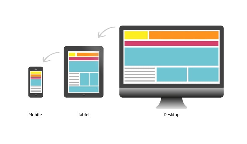
A responsive layout adapts to available space through implemented layout rules. It does not automatically create higher-detail images. Check the largest rendered width, provide appropriate image variants, and preserve the intended crop. The same photo may need different crops as a wide desktop banner and a compact mobile card; keep its focal subject visible in both.
Source: Verve
In Mockitt, compare two avatar cards with the same 160-pixel layout size and labels for their 160-pixel and 320-pixel sources. This separates the visible layout decision from the image delivery decision. Preview the surrounding text and card spacing, and pass the source dimensions and density assumptions to implementation. The historical editor image below illustrates the design workspace, not an automatic image-quality guarantee.
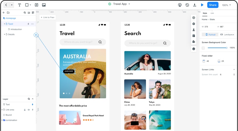 Historical Mockitt editor capture; interface details may differ from the current product.
Pixel count describes a grid, PPI describes density over distance, and CSS pixels describe layout size. Write down which measurement you mean before selecting an asset. That small distinction makes image handoff clearer and helps you avoid both unnecessarily large downloads and visibly undersized sources.