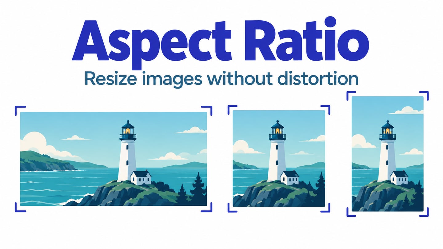
Aspect ratio describes width relative to height. A 1200 × 800 image has a 3:2 ratio; a square has a 1:1 ratio. The same idea applies to screens, image containers and video frames, but these do not have to share one ratio. In a responsive-layout prototype in Mockitt, compare the image’s natural shape with the space available at desktop and mobile widths before deciding how to fit it.
A 16:9 ratio can also be written as approximately 1.78:1. Neither notation requires the height to be 1; whole-number ratios are simply convenient. To calculate an image’s ratio, divide its width by its height or reduce both dimensions by their greatest common divisor. For example, 1200 ÷ 800 = 1.5, which is the same relationship as 3 ÷ 2.
An image can appear within a screen whose ratio is different. The important choice is how it fits its own container: preserve the whole image with empty space, crop part of it to fill the space, or change the container. Stretching width and height independently distorts the image. A circular object becoming oval is an easy warning sign.
How Does Aspect Ratio Relate to Web Design?
A website may be viewed in a narrow browser window, a wide monitor or a phone in either orientation. Plan how the layout responds to available space instead of treating a device’s physical screen ratio as the page’s fixed shape. The following checks help keep media proportionate as the surrounding content changes.
1. Desktop vs Mobile
A desktop layout may place an image beside text, while a mobile layout stacks the same elements. This changes the image container even when the source file remains identical. In Mockitt, compare those screen arrangements and mark the intended crop for each. A prototype communicates the decision; it does not guarantee the final website will implement it automatically.
Review more than two polished screenshots. Include an intermediate width, a long heading and realistic body text. If the image becomes a very short strip or pushes the call to action far below the message, adjust the container or layout rather than stretching the source.
2. Designing for the Broad Market
Ratios such as 3:2, 4:3, 16:9 and 1:1 are useful starting points for media, not a list that guarantees coverage of all devices. Choose ratios that suit the content: a landscape scene, a portrait and a detailed product screenshot have different cropping needs. Let the layout adapt across widths, with breakpoints where the content needs them.
3. How to Alter an Image's Aspect Ratio
Cropping changes which part of an image is visible; proportional resizing changes its size without changing its shape. Use cropping when the container must keep a particular ratio and there is expendable space around the subject. Use the whole image when clipping would remove essential information, such as the labels in an interface screenshot.
Do not wait until an image falls outside the entire artboard to consider cropping. A small card can require a crop even though it fits comfortably inside the page. Decide at the component level, then check the image’s relationship to nearby text, borders and padding.
4. Getting the Aspect Ratio Right
Before choosing a ratio for a hero, card or video frame, answer these questions about its content and layout:
- At which container widths and orientations will this image appear?
- Does the same source keep its meaning when cropped, or does mobile need a different composition?
- Should the container preserve a ratio, follow the image’s natural height, or change at a breakpoint?
Start with the reader’s task. A destination card needs a recognizable place; a tutorial screenshot may need every control label visible. The best fit is therefore not always the one that fills every pixel. Compare the whole image and a proposed crop at the smallest intended size before selecting a rule.
Note: Responsive design involves layout rules that adapt to available space, including flexible dimensions, wrapping and breakpoints. Extra whitespace alone does not make a design responsive. In the design handoff, specify which parts can resize, which can crop and which must stay visible. The implementation can then be checked against those intentions in a real browser.
The Effective Use of Aspect Ratio in Web Design Projects
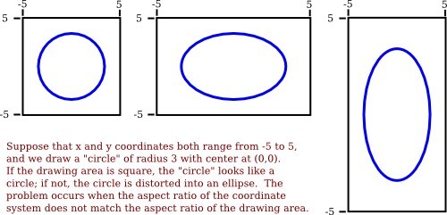
Pixel aspect ratio describes the shape represented by an individual pixel, which matters in some older video formats. It is different from the width-to-height ratio of a complete image and from device pixel ratio. For ordinary web image layout, focus first on the image’s dimensions, its CSS container and proportional scaling. The retained coordinate illustration below shows how changing the horizontal and vertical scale differently turns a circle into an ellipse.
source
Keep the following distinctions separate when reviewing image quality:
Aspect Ratio and Resolution Are Different
Aspect ratio describes shape; pixel dimensions describe how much raster image data is available. A 300 × 200 image and a 1200 × 800 image both have a 3:2 ratio, but enlarging the smaller one may reveal blur or pixelation. More pixels will not fix a stretched image, and the right ratio will not restore missing detail.
Cropping Considerations
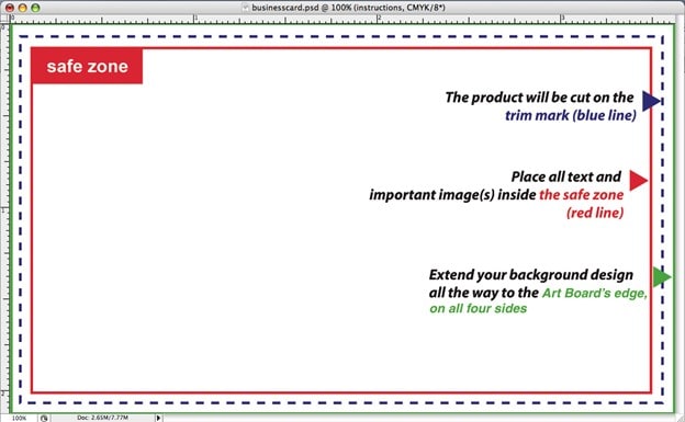
Cropping can cut off faces, products or text. Identify the focal point and test the actual crop, including mobile; the subject does not have to be centered. The retained print diagram below illustrates a safe area and trim boundaries. It is a useful analogy for keeping important content away from crop edges, not a rule that websites need print bleed.
source
CSS Properties for Image Fit
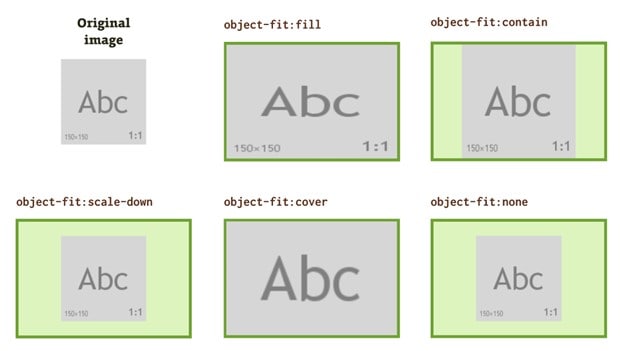
CSS uses properties, not tags, to control image fitting. MDN’s object-fit reference explains the distinction: cover preserves the image’s proportions while filling the container, so some content may be cropped; contain preserves the whole image and may leave empty space. fill can distort the image when the ratios differ. object-position controls the alignment of the fitted image within its box.
The aspect-ratio property can establish a preferred ratio for a box when at least one dimension is automatic. It does not, by itself, choose how the image inside is cropped. Separate the container rule from the fit rule when explaining the behavior to a developer.
For a travel destination card, compare a wide landscape container with a taller mobile card. Keep the landmark recognizable in both. A cover example can crop unimportant sky; a contain example can retain the full scene with padding. Show the alternatives side by side in the prototype and label the intended behavior instead of relying on the reviewer to infer it.
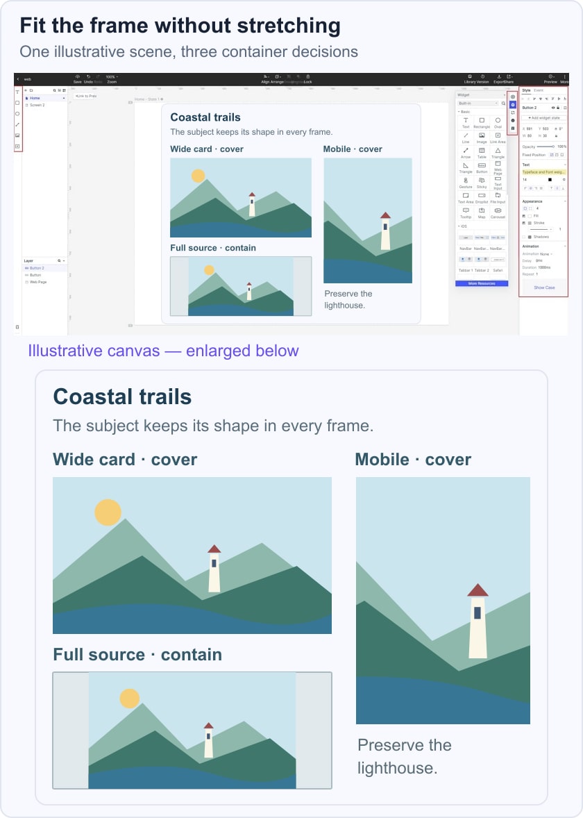
For an ordinary inline image that should remain fully visible, a responsive width with automatic height is often enough. For a fixed card shape, document the ratio, crop position and fallback if a future photo has a different focal point. The hero-image guide covers how that crop supports the page’s message and first action.
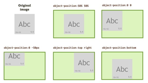
source
Conclusion:
Aspect ratio is one part of a responsive media decision. Preserve the source’s proportions, decide whether cropping is acceptable, and test the component at realistic widths. Use Mockitt to communicate the intended states, then inspect the implementation for distortion, missing focal points and excessive file sizes.