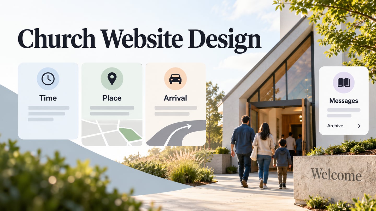
A church website serves people with different questions: a first-time visitor may need the location and what to expect, while a returning visitor may want a message, event or group. Start the design with those tasks. A Mockitt interface design can make the proposed routes visible before the pages are built.
A welcoming photograph or introduction should lead naturally to practical information. Make the service location, arrival details and online options easy to find without requiring a video to be watched first. The retained screenshots below are historical design references; their value is in the visible hierarchy, wording and navigation. They are not current service schedules or evidence of tested performance.
Plan a Church Website Design
Use Mockitt to arrange the content and review how a visitor moves between screens. Decide which information belongs on the homepage, what needs its own page and which actions should stay easy to find. The prototype supports that design discussion before implementation.

Four Useful Parts of the Prototype Workflow
A review should give someone a realistic task, such as preparing for a first visit or finding the latest message. Use representative headings and details so the reviewer can judge the content, rather than only commenting on colors or imagery.
1. Arrange and reuse the core elements
Add available widgets, text and icons to represent the pages. Reuse the same header and recurring information blocks where appropriate, while letting each page answer its own question. Check the assets available in your workspace rather than assuming a particular library or plan includes every item.
2. Connect meaningful interface actions
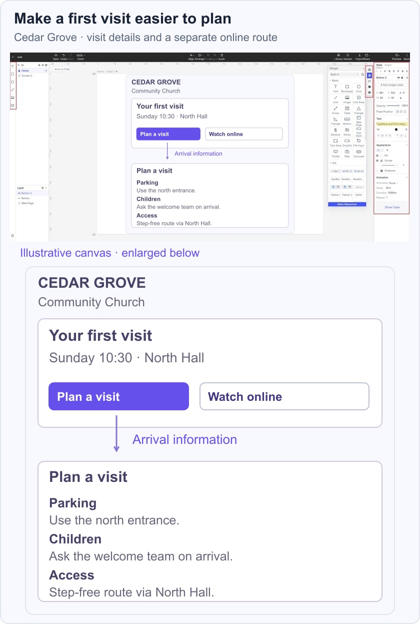
Connect Plan a visit to arrival information and Watch online to the intended viewing screen. Keep the controls explicit: a generic Learn more button repeated throughout the page can hide the difference between visiting, joining a group and reading a message.
In the fictional Cedar Grove Community Church example, a visit card shows Sunday 10:30 and North Hall. Opening Plan a visit reveals parking, children and access information, while Watch online remains a separate route. These sample details let reviewers check whether the design answers practical arrival questions without confusing them with the online option.
3. Share a focused preview
Share the prototype with appropriate access and ask someone unfamiliar with the layout to find a specific piece of information. Review the route at a narrow width as well as on desktop. A visual preview can expose unclear labels or missing content; the built website still needs its own keyboard, media and form checks.
4. Adapt a suitable starting layout
A general website template can be a useful starting point if its structure fits the content. Choose based on the visitor's task rather than decorative similarity, then replace placeholder material with the actual information the church will maintain.
A church-specific template is not required to review these decisions. If the implementation will use WordPress, compare the relevant church theme options after the information structure is clear. Prototype layout, theme selection and production content management are separate steps.
9 Church Website Design Examples
These examples emphasize different ways to introduce a community, organize information and offer a next step. Compare each idea with the task your site needs to support; a strong first impression is useful only when people can continue to the information they came for.
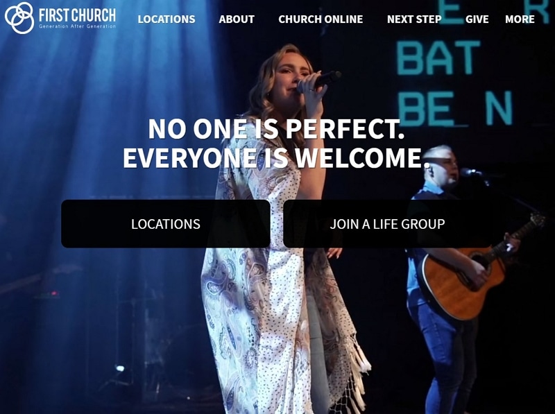
1. First Church
First Church's retained hero combines a concise welcome statement with two prominent actions: Locations and Join a life group. Its top navigation also exposes Church online, Next step and Give. The hierarchy separates a broad welcome from specific destinations, rather than leaving the photograph to carry the whole message.
For a first-visit design, carry that clarity into the destination page. Provide the location, time and relevant arrival information where the visitor expects it. Details about children or access should be easy to discover when applicable. A welcome message becomes more useful when the next screen helps someone prepare.
2. The Village Church
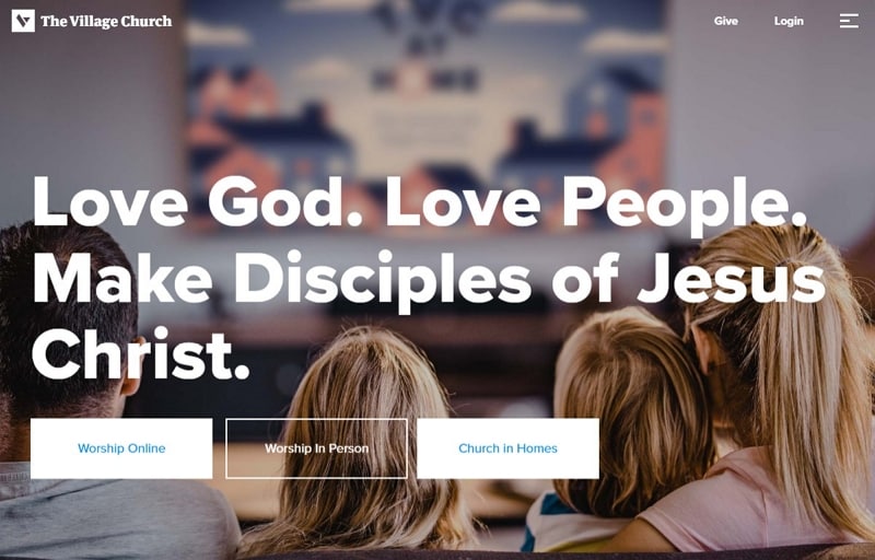
The Village Church screenshot uses a family photograph, large statement and three clearly worded choices: Worship online, Worship in person and Church in homes. Those labels identify different ways to participate without asking visitors to interpret a set of unfamiliar icons. Give and Login sit in a quieter top area beside the menu. The lesson is to distinguish the most common visitor intentions before refining the visual style.
3. Remnant Church
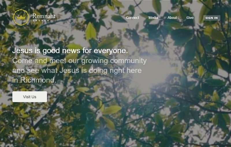
Remnant's capture introduces its Richmond community in a short text block and makes Visit Us the main action. Connect, Media, About and Give remain available in the navigation. The background adds atmosphere while the wording identifies the place and invitation. For a similar page, keep the primary action readable over the image and explain what information the visit route provides.
The visible Sign In control is a separate route from Visit Us. Preserve that distinction between an existing member's account task and a new visitor's information task. Do not make a visitor create an account just to discover where to go or what to expect.
4. Fuel Church
Fuel Church's earlier “Carry the fire” theme shows how a memorable message can frame an introduction. On its current official site, the practical choices include I'm New Here and Watch a Sermon, followed by visit information and other ways to connect. The transferable idea is to pair a strong theme with clear destinations. A visitor should be able to reach the information they need even when they skip promotional media.
5. Hope Centre
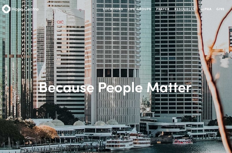
Hope Centre's retained design places a short statement over an urban image and exposes Locations, Lifegroups, Prayer and Resources in the header. For an organization with several gathering places, location choice is an important navigation task. The official location directory is the appropriate source for current places; a historical count should not drive the interface or the article.
After a visitor selects a location, show the details that belong to that place. Keep location names consistent across navigation, contact information and any visit page. A shared visual style can connect the locations while leaving their practical information distinct.
6. Rockville Church of Christ
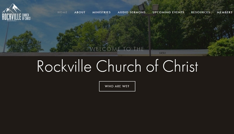
Rockville Church of Christ uses direct section names in the retained header: About, Ministries, Audio sermons, Upcoming events, Resources and Members. Its official website also exposes gathering information, address and directions. This illustrates the value of a straightforward information structure for a local organization. Keep the recurring facts easy to maintain, and make the distinction between an upcoming event and a regular gathering clear.
7. Trinity Church Aldgate
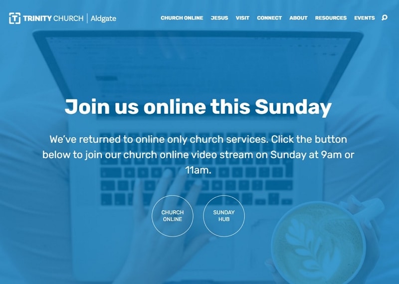
The retained screenshot is branded Trinity Church Aldgate and gives Church online and Sunday hub their own actions within a time-specific announcement. The official site confirms that Trinity Hills is its former name. The design lesson is to make a temporary change understandable and provide a clear destination for the current information. Review and retire dated notices deliberately so a prominent old announcement does not compete with the normal visit route.
8. The Summit Church
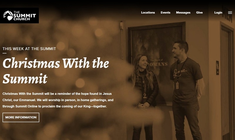
The Summit Church capture gives a Christmas programme its own headline and More information action. Locations, Events and Messages remain visible above it. This balances a timely feature with the stable routes returning visitors may need. Keep the main website navigation useful even when the homepage feature changes.
If supporting topics are arranged in a grid, give each card a distinct destination and a label that describes it. The seasonal feature should not force every visitor through the same route. Check long event titles and the reading order when cards stack on a phone.
9. Radiant Church
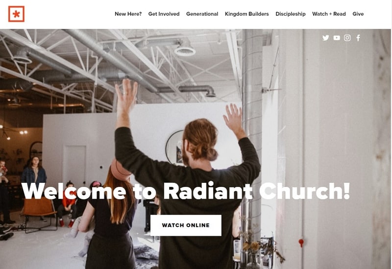
Radiant's retained homepage pairs a large worship photograph with a clear welcome and Watch online action. The header includes New Here, Get Involved, Discipleship and Watch + Read. The image establishes context, while the labels describe what visitors can do next.
For a message archive, make the title and browsing route understandable without relying on a hero image. For first-time visitors, keep the introduction separate from the archive and participation routes. Review these tasks with realistic content and then test the implemented navigation, media controls and small-screen layout before release.