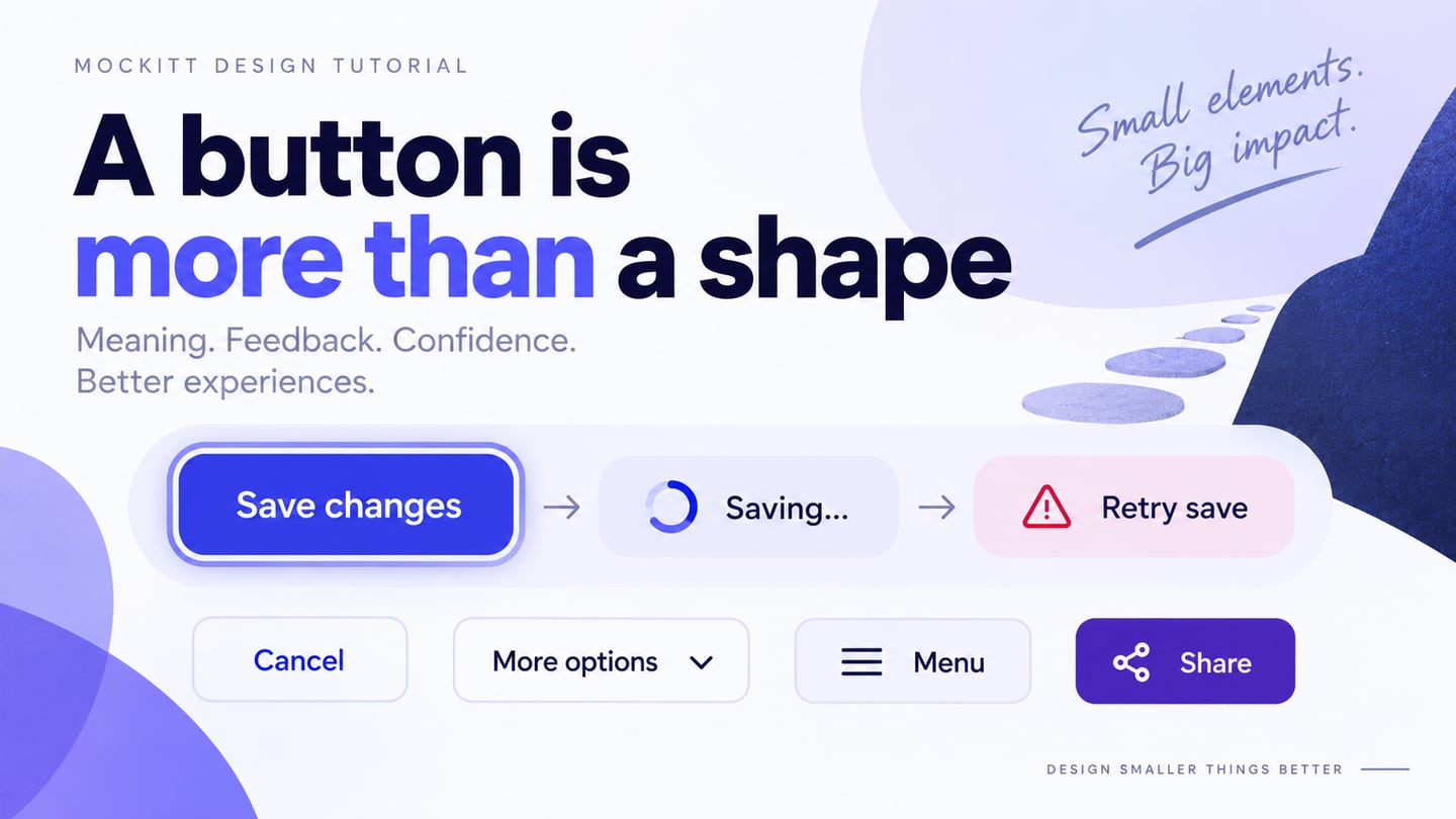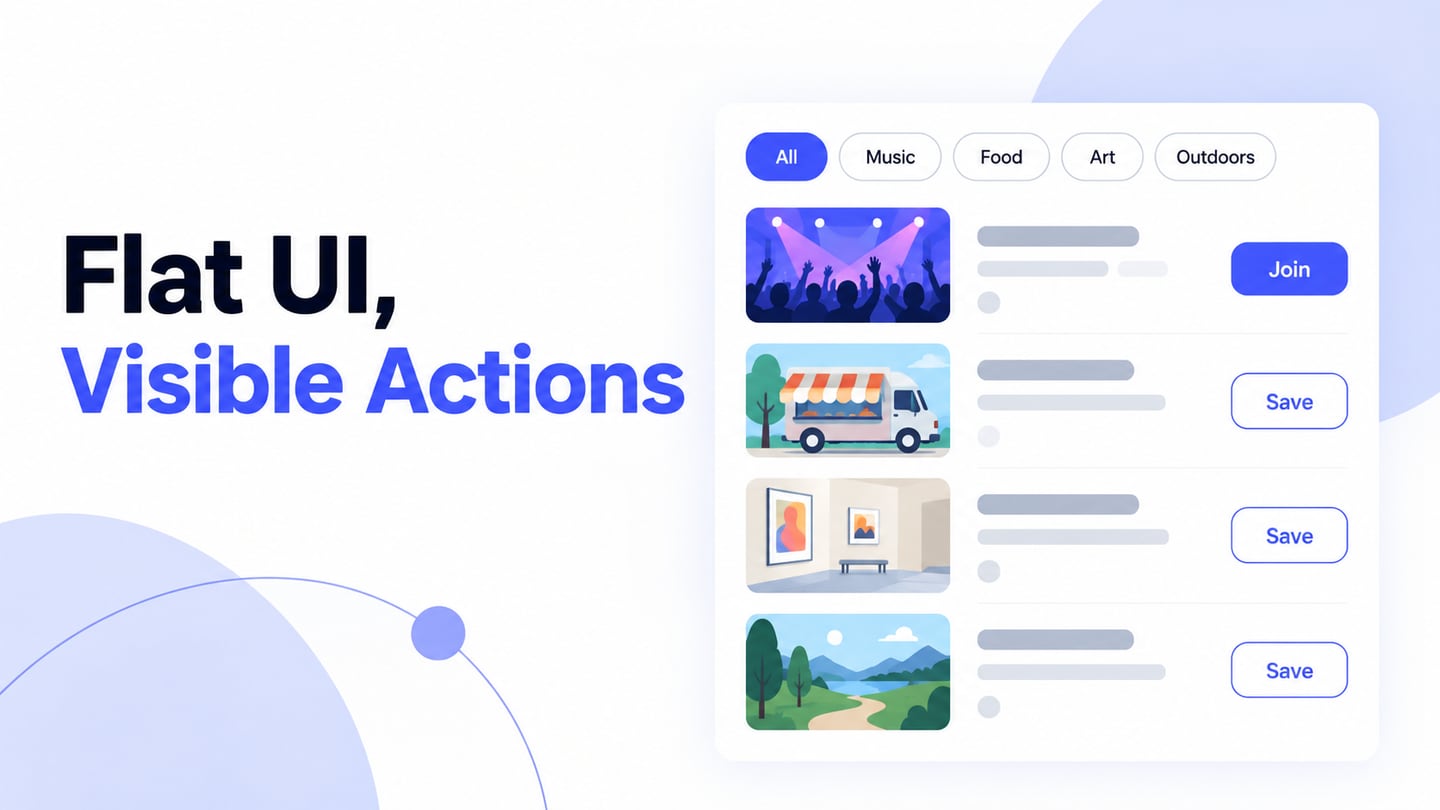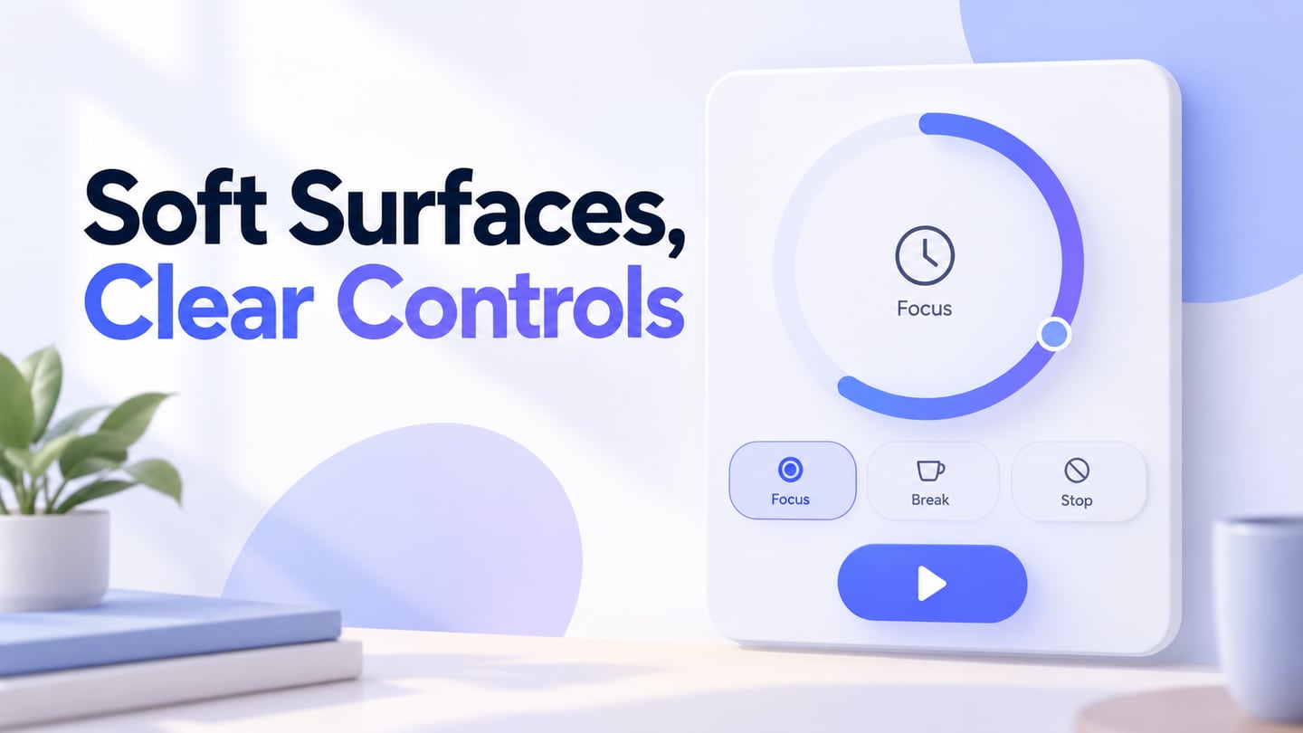
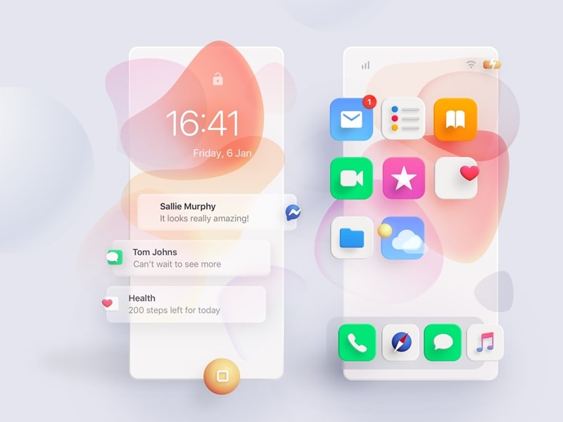
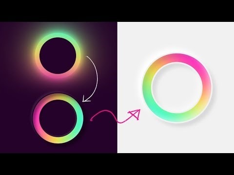
How people perceive an interface affects whether they notice its controls and understand what to do next. A new visual style can attract attention, but novelty alone does not make an interface usable. Neumorphism uses soft highlights and shadows to make controls appear raised from, or pressed into, a surface of a similar color. It is a visual treatment, not a synonym for icons or a separate interaction model.
Designers share ideas across websites, apps, and platforms, which helps visual styles spread. Before adopting one, ask whether it supports your own content and actions. You can use Mockitt’s UI design workspace to compare a soft-surface concept with a more clearly outlined alternative. The five tips below cover color, depth, animation, dropdowns, and consistency across screens, with checks for the controls people actually need to use.
Top 5 Useful Tips to Design Neumorphism
A website consists of many components that contribute to its appearance and usability. Buttons, inputs, labels, and containers need to work together, rather than compete for attention. A decorative treatment that looks appealing in a static image can become difficult to use when a label is longer, a control receives keyboard focus, or a user cannot distinguish a subtle shadow.
Various factors affect the interface, including shape, spacing, text, and color. For neumorphic UI, the relationship between the background and the light and dark edges is particularly noticeable. A square or circular shape may suggest a different control, but its label and behavior still need to explain the action. Keep the five considerations below connected to a real task instead of styling every element the same way.
1. Color and Contrast
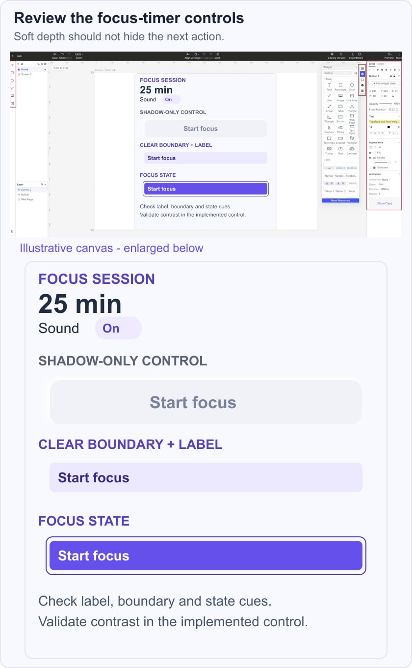
Colors should work together, but essential information must remain distinguishable. Neumorphic surfaces often use close shades of one base color to suggest a continuous material. That can be suitable for decorative depth; it can also make an input or button disappear into the background. Keep text readable and give important controls a visible shape or boundary. W3C’s non-text contrast guidance addresses the visual information needed to identify controls and their states. It does not require every decorative shadow to meet the same test.
For a focus-timer screen, give Session length a visible label and show the current value, such as 25 minutes. Compare a shadow-only Start focus button with an outlined or solid button. Check the default, focused, and pressed states against the actual background. The pressed state should not be the only way to discover that the control exists.
Source
2. Use Depth to Support the Control
A flat screen can suggest depth through highlights, shadows, and overlapping surfaces. The effect does not turn the interface into a three-dimensional model. Choose one apparent light direction and apply it consistently so that raised and inset elements have a coherent relationship. A pale highlight on one side and a darker shadow on the other can suggest a raised surface.
In a coded interface, CSS shadows can produce this effect; in a design composition, they describe the intended appearance. Use depth to support a control’s meaning rather than to decorate every text box. A raised button and an inset input may be visually different, but users also need labels, boundaries, and feedback. Inspect the design with the shadows reduced or absent: the main action should still be understandable.
3. Animation
Animation can help communicate a state change, but it is not a required part of neumorphism. A short transition between an unpressed and pressed appearance may make feedback easier to follow. Avoid movement that delays the action or distracts from reading. Provide a clear static state as well, and consider reduced-motion preferences in the implementation. For broader behavior decisions, review microinteraction triggers and feedback before choosing an effect.
4. Keep Dropdowns and Progress Clear
When someone opens a dropdown, they need to understand which options are available, which one is selected, and how to close the list. A soft shadow can separate the menu from the page, but it cannot replace those signals. Use readable labels and visible selection and focus states. For a progress indicator, name the activity and provide meaningful status text; a decorative moving surface does not explain whether work is complete.
5. Innovative cross-platform designs
People access the same website on phones, tablets, and larger screens. Keep labels, control meanings, and selected states consistent while adapting the layout to the available space. Do not simply shrink a desktop composition until small controls become hard to use. Check the actual content at each target width, including long labels and enlarged text. A familiar visual relationship should survive the layout change even when shadows are reduced.
Source
Explore a Neumorphic Interface in Mockitt
A design tool helps you compare the choices above in context. Start with one small task and the content needed to complete it. For the focus timer, that means choosing a session length, checking whether sound is on, and starting the session. This is more useful than evaluating an isolated decorative button with no surrounding information.
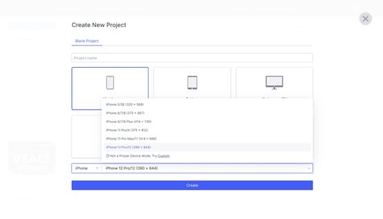
Mockitt lets you arrange interface elements, connect screens, and share a prototype for review. Keep a soft-surface option beside a clearer outlined option using the same labels and spacing. The comparison then concerns the treatment of the controls, rather than a completely different layout. The historical editor images below illustrate project setup and visual editing; available controls and their positions may differ in the current workspace.
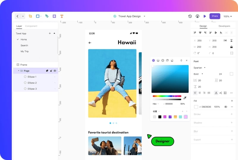
A prototype gives reviewers something concrete to inspect. Ask them to find the session-length control and start a focus session without explaining the interface first. Notice whether they mistake decorative surfaces for controls or overlook the main action. Record the problem and revise that element. A visual prototype does not establish keyboard semantics, screen-reader support, or accessibility conformance in the final code.
Share the intended states with the person implementing the interface: default, focus, pressed, disabled, and any error state that the task needs. Pair the design with brief behavior notes so a shadow is not interpreted as the only state signal. If you are comparing visual styles, glass-inspired interfaces raise a different problem—content seen through translucent layers—while neumorphism mainly concerns surfaces and depth cues.
Conclusion
A useful neumorphic interface balances the visual style with clear actions. Keep the five checks together: readable color relationships, consistent depth, purposeful motion, understandable menus, and layouts that adapt without hiding controls. Use contrast checks and a task-based review to decide where the style works. Choose a plainer treatment where the soft effect makes essential information harder to find.