To test a responsive prototype, run the same task at narrow, intermediate, and wide viewports, then repeat it with long content and failure states. Check where the layout changes, not just a phone and desktop preset. Keep selections, navigation, and recovery available at every size. First establish whether the prototype actually reflows or merely scales a fixed canvas; those behaviors require different tests.
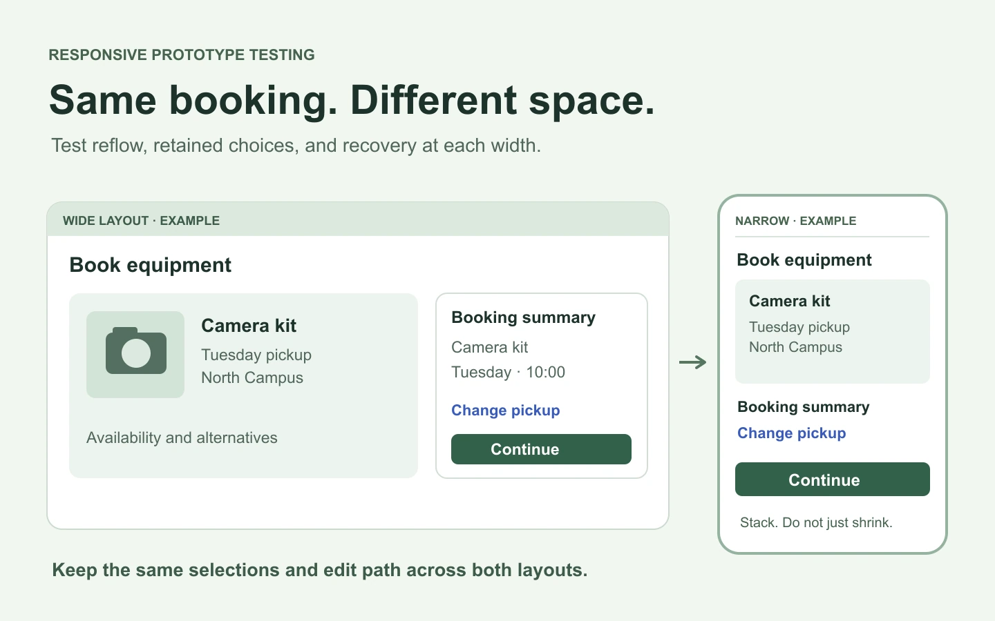
Use Mockitt to build connected prototype screens for the layouts and states you need to review. A useful test goes beyond checking that every screen fits inside a preview window: it asks whether a person can still finish the task and understand the result.
This guide follows an equipment-booking example: choose a camera, select Tuesday pickup, review the booking, and recover if the chosen model is unavailable. The resulting test matrix can be reused for a checkout, application form, or dashboard flow.
Separate a scaled preview from a responsive layout
A fixed-width artboard shown at “fit to screen” can shrink until every element is visible. That does not show how a real page would wrap text, stack columns, or move navigation. It can even make touch targets look smaller while hiding the overflow that would occur in the implementation.
Before testing, identify what the artifact supports:
- Separate mobile and desktop screens: review the proposed layouts and flow at each size. Record behavior between them as an implementation requirement.
- A prototype with flexible layout behavior: resize the actual content viewport and observe wrapping, spacing, and state changes. Check which behaviors are real and which are simulated.
- A coded prototype: test the browser layout, zoom, keyboard behavior, and supported devices directly. It still needs realistic content and error cases.
Use a true-size preview where available, and record the viewport separately from any preview zoom. A screenshot labeled “mobile” is not enough evidence if a 1440-pixel canvas was scaled to fit a narrow browser window.
Build a small, purposeful viewport matrix
Choose sizes from the audience's devices and the design's layout changes. If analytics are unavailable, a starting matrix such as 360, 768, and 1280 CSS pixels is a practical design exercise, not a universal breakpoint standard. Add a narrower stress case and test around every point where navigation, columns, or fixed controls change.
| Test condition | Equipment-booking task | What to inspect |
|---|---|---|
| Narrow phone, for example 360 CSS px | Choose a camera and pickup date. | Labels remain readable, filters are reachable, and the main action does not cover the last result. |
| Intermediate width, for example 768 CSS px | Compare cameras, then open details. | The layout does not squeeze a desktop sidebar beside an unusably narrow result list. |
| Wide window, for example 1280 CSS px | Review the booking and edit the pickup date. | Reading order is clear; the edit path returns to the correct review state. |
| Just below and above a layout change | Open filters, change width, then return to results. | Selections and navigation survive the transition without duplicate controls or hidden content. |
| Narrow content area with long text | Read an unavailable-camera message and choose an alternative. | The explanation and recovery action wrap without clipping. |
A breakpoint deserves attention on both sides. If a sidebar becomes a drawer at a planned width of 768 pixels, inspect 767 and 769 as well as the breakpoint itself in a responsive implementation. In a fixed-screen prototype, create the intended before-and-after states and explicitly record that intermediate reflow is still untested.
Test height too. A landscape phone or a browser window with limited vertical space can hide content behind a sticky action bar even when the width looks correct. The on-screen keyboard is another reduction in usable space that a desktop screenshot will not reveal.
Run the same booking task at each size
Use one task statement throughout: “Book a camera for Tuesday pickup, then change the pickup location before confirming.” Do not simplify the mobile task so much that it stops testing the same outcome.
- Start from the entry screen. Open the catalog without assuming that a filter, account, or selection is already set.
- Make a selection. Choose a camera and date. Check that the selected state remains obvious after a drawer or dialog closes.
- Review and edit. Change the pickup location from the review step. Keep the camera selection and update the dependent details.
- Introduce a failure. Show the chosen model as unavailable. Offer a meaningful alternative without forcing the person to start over.
- Finish the task. Show the final camera, pickup details, and confirmation together, including any change made during recovery.
At each transition, compare the information and choices across layouts. Mobile can use a different arrangement, but it should not quietly lose a required option or a useful explanation. Watch for a common failure: the wide layout has an “Edit” control that disappears entirely when the summary becomes a compact card.
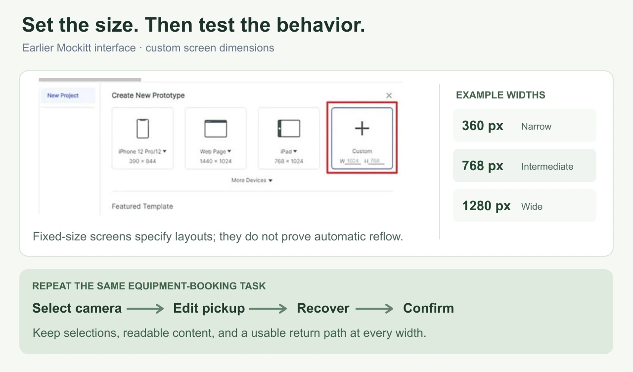
Use content that can break the layout
Responsive problems often come from the content inside a component. Replace ideal labels with realistic extremes before approving the layout. For the booking example, try “North Campus Media Equipment and Production Services” as a pickup location and a camera name that takes three lines.
- Long labels and values: test a lengthy location, an email address, and a date range. Decide whether each value should wrap, truncate with an accessible way to read it, or use a different layout.
- Errors: add a useful two- or three-sentence recovery message. Check that it does not push an action beneath a fixed footer.
- Empty and large result sets: test no available cameras and enough results to require scrolling. Confirm that filters remain understandable in both cases.
- Missing media: use a camera without a thumbnail. Its card should still have a name, availability, and usable action.
- Localization when in scope: use actual translated strings and their formatting. Do not treat extra spaces around English text as a localization test.
Choose handling by meaning. A decorative description may be shortened; a pickup location or critical error should not be cut off simply to keep all cards the same height. A table may need its own horizontal scrolling area, but that should not force ordinary page text to scroll sideways.
For flexible web layouts, web.dev's responsive-design guidance explains how viewport configuration and fluid content sizing affect the result. In a design prototype, specify the intended wrapping and resizing rules so the implementation does not rely on guesswork.
Check touch, keyboard, zoom, and orientation
Screen width does not tell you the input method. A wide touchscreen and a narrow desktop window are both possible. Make essential actions available without hover, and check whether compact controls are too close together to use comfortably.
For a mobile filter drawer, specify what opens it, how it closes, where the current selections appear, and where keyboard focus returns. In the implementation, tab through the controls, activate them without a mouse, and check visible focus. If the prototype cannot reproduce those semantics, mark them as requirements to test later rather than recording a keyboard pass.
Check portrait and landscape when both are supported, including a short viewport and the on-screen keyboard. Look for a calendar, dialog, or sticky footer that occupies nearly all the usable height. A layout that technically fits can still make the action difficult to reach.
For ordinary vertically scrolling web content, WCAG's reflow criterion uses a width equivalent to 320 CSS pixels, with exceptions for content that requires a two-dimensional layout. This is also equivalent to a 1280-pixel-wide viewport at 400% zoom. Review those conditions in the actual web implementation; shrinking an image of the prototype does not test text reflow.
Prepare a reproducible review in Mockitt
Organize the initial, review, unavailable, and confirmation screens by the layout being tested. Use the same example values so reviewers can spot accidental changes. Connect the forward path and the return path: choosing a different camera must lead to a review screen that reflects the replacement.
Add concise notes about the intended layout behavior. Useful notes say “At the narrow layout, filters open in a drawer; applied filters remain visible above results” or “The bottom action must not cover the final form field.” Notes such as “responsive” or “mobile checked” cannot be reproduced.
For a coded prototype, open Chrome DevTools' device mode, enter the viewport dimensions, and test the transitions at those sizes. Device mode approximates a mobile experience; it does not run the page on a real phone. Follow with the supported devices and browsers, especially for keyboard, viewport-height, and touch behavior.
Record an issue someone else can reproduce
Use one row per failure: viewport and preview mode, starting state, action, expected result, observed result, and evidence. Keep proposed fixes separate from observations so the team can choose the best solution.
| Field | Example issue record |
|---|---|
| Condition | 360 × 740 CSS px, true-size view, long pickup-location name. |
| Action | Open the booking review, then expand pickup details. |
| Expected | Read the full location and reach “Change location.” |
| Observed | Example defect: the expanded details extend behind the fixed confirmation bar. |
| Next test | Revise spacing or the fixed-control behavior, then repeat with the same content and viewport. |
Finish when the core flow and recovery path are usable at the chosen conditions, and every remaining limitation has a clear test owner. Keep “layout reviewed,” “interaction reviewed,” and “implementation tested” distinct. That prevents a polished prototype preview from being mistaken for evidence that the production experience already works.