Choose a loading state by asking what is happening, how much progress is known, and whether people can keep working. Use a skeleton for a predictable content layout, an inline indicator for a local action, a progress bar for measurable work, and a background-job status for a task that can continue after the person leaves. Optimistic feedback fits only actions whose failure can be clearly recovered.
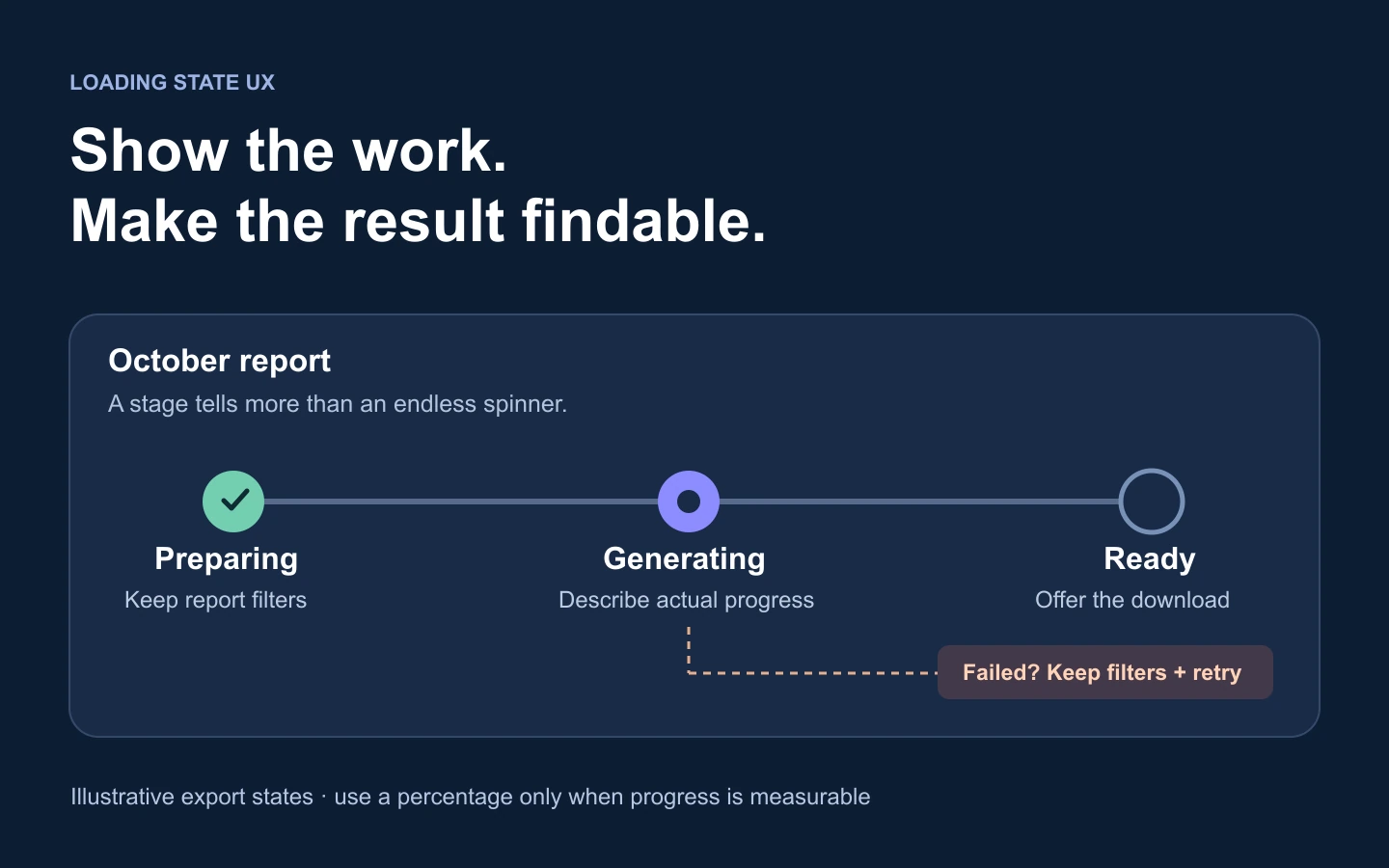
Loading state UX covers the period between an action and a known result. It is more than a spinner: controls, existing content, cancellation, and failure all need to behave consistently. In Mockitt, you can lay out those UI states before connecting them into a prototype for review.
A report-export flow makes the choices concrete. Someone selects a date range, filters a report, and chooses “Export report.” The page may load rows quickly while the file takes longer to generate. Those two operations should not automatically use the same loading treatment.
Choose the pattern and the area it affects
Identify the smallest part of the interface that depends on the operation. Fetching one chart should not disable the navigation. Submitting a booking may need to prevent a repeated submission, but that does not necessarily mean covering the page with a full-screen overlay.
| Situation | Useful pattern | Design detail that matters |
|---|---|---|
| First load of a known list or card layout | Skeleton | Reserve the shape of the final content; do not turn working controls into placeholders. |
| A small action with an unknown completion time | Inline activity indicator and text | Keep the feedback next to the initiating control and prevent accidental repeated actions when necessary. |
| Work with a meaningful total | Determinate progress | Explain the unit, such as files uploaded out of the total, and handle a separate finishing stage. |
| A long task that does not need the current page | Background job with a persistent status location | Make the result findable after navigation, refresh, or a later visit. |
| A low-risk, reversible change | Optimistic update | Show how a failed change is rolled back or retried without silently losing the person's intent. |
| A dependent step must wait for confirmation | Blocking state for that step | Explain what is pending and provide a safe exit or recovery route where possible. |
These choices can coexist. The report table might use a skeleton on its first load, retain existing rows during a filter refresh, and show export progress elsewhere. The pattern should follow the operation, not a rule that every request uses the same animation.
Use skeletons for content, not every empty space
A skeleton gives a rough preview of a layout while its content arrives. It works well for repeated cards, table rows, or a profile section with predictable proportions. Match the expected shape closely enough to reserve space, then replace the placeholders in the same region. A wall of unrelated gray rectangles does little to orient the reader.
Carbon's loading guidance distinguishes skeleton content from action controls. For a report page, the title, filters, and export control may already be available even while rows load. Keep usable elements usable rather than replacing the whole page with a skeleton.
On a refresh, consider keeping the last result visible. Show that new results are loading, and make the status of the old data clear. If someone changes the date range, do not present old rows as if they already match the new range. Either label them as previous results during the transition or replace just the dependent data area.
Keep layout movement under control. Reserve space for charts and images, and avoid inserting a new loading banner that pushes an active control away as someone clicks it. In a prototype, compare the loading and loaded layouts at the same viewport; in the implementation, check what happens during real network delays.
Show progress only when it means something
A spinner communicates activity, not how much work remains. A percentage implies a measurable total. “Uploading 3 of 8 files” is useful when those counts reflect the operation; an invented percentage that advances on a timer is not evidence of progress.
Define what 100% means. Uploading bytes can finish before the server validates or processes a file. In that case, label the transfer and processing stages separately: “Upload complete” followed by “Processing file.” Do not announce that the task is complete while a required stage is still running. Equally, a brief finalizing stage is not automatically a defect; the problem is leaving users at an unexplained 99% with no meaningful state change.
When the remaining work is unknown, use an indeterminate indicator and a specific status such as “Preparing your export.” Only show an estimated completion time when the system can support it. If the operation takes longer than expected, update the explanation and offer a useful option instead of repeating the same animation indefinitely.
A very fast action may not need a visible spinner. Test whether introducing one creates an unnecessary flash. A short delay before showing an indicator can reduce flicker for quick requests, but acknowledge the action immediately and never delay a completed result just to make an animation look smooth. Choose timing from the product's observed behavior, not a universal number copied into every component.
Work through a report export from click to download
For the example report, the export should capture the selected date range and filters when it starts. If the person later changes the on-screen report, the downloadable file should still have an unambiguous name and scope.
- Accept the action. Change the export control to a clear pending state and show which report is being prepared. Decide whether another export is allowed; do not create repeated jobs accidentally.
- Show preparation. Display a meaningful status such as “Preparing the October report.” Keep the selected filters visible. Until the service confirms that the job was accepted and its status will remain retrievable, do not say that it will continue after the person leaves.
- Show generation. Use actual stages or progress information if available. Otherwise keep an honest activity message and tell people whether they can leave this page.
- Make the result findable. When ready, show “Download October report” with the filter summary. For a background job, also put the result in the agreed export-history location.
- Handle failure without restarting the task. Keep the filters and report name. Explain whether retry creates a new export or resumes an existing operation.
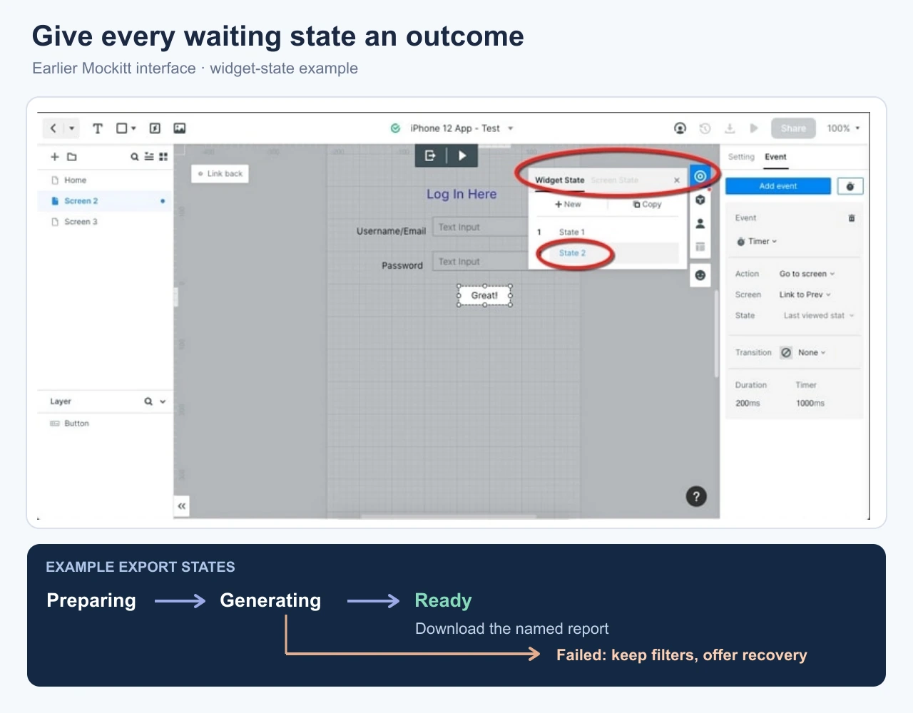
The prototype should include at least two routes after “Generating”: a ready file and a failure. Add cancellation and return-later screens if those behaviors are supported. A sequence that only animates from a spinner to success leaves the most difficult decisions unresolved.
Use optimistic feedback only when failure is manageable
An optimistic update shows a change before the service confirms it. Marking a report as a favorite is a plausible candidate: the interface can show the selected star, then explain and reverse the change if saving fails. A booking confirmation or money transfer is different; showing success before the result is known can mislead someone into acting on an event that has not happened.
Decide what the person sees after failure. “Couldn't save this favorite. Try again” preserves intent better than silently unchecking the star several seconds later. If they make a second change before the first returns, the application also needs a way to avoid applying an old response over the latest choice.
For the report-export example, clicking the button can immediately acknowledge the request, but “Your report is ready” must wait for the actual ready state. Immediate feedback and premature success are not the same thing.
Plan slow requests, cancellation, and uncertain results
A timeout means the client stopped waiting; it does not necessarily mean the server stopped working. Before offering “Start again,” determine whether the product can check the job's status. Otherwise a retry can generate duplicate exports or repeat a more consequential operation.
Make cancellation specific. Closing a status panel may simply hide it; canceling a job should request that work stop. If cancellation takes time, show that intermediate state. If the result completes before the cancellation is accepted, show the actual outcome instead of claiming the job was canceled.
Navigation needs the same clarity. For a background export, the person should know where to return for the file. For a task that stops when the page closes, explain that consequence before they leave when possible. Do not add “You can close this page” unless the operation and its result really persist.
Finally, distinguish an error from a legitimate empty result. An export with no matching rows may be a valid outcome that calls for changing filters. An endless spinner, or “Try again” after every empty result, hides that distinction.
Make loading feedback understandable without animation
Pair the visual treatment with useful status text. A rotating icon alone cannot explain which operation is pending or what will happen next. For updates that do not move focus, the implementation should expose appropriate status information to assistive technology; WCAG's status-message guidance describes this requirement.
Keep focus stable during background work. Do not move it to every progress update or announce every minor increment. When content finishes loading, make the result and the next action discoverable without unexpectedly placing the keyboard elsewhere. Test the actual components with a keyboard and screen reader; prototype notes only specify the intended behavior.
Motion should support the status rather than carry its entire meaning. Review reduced-motion behavior, readable text, sufficient contrast, and whether status messages wrap at narrow widths. The operation should remain understandable if shimmer or rotation is removed.
Test the transitions that a perfect demo leaves out
In the prototype, prepare a fast success, a visibly slower response, a confirmed failure, and an uncertain result. Walk through them from the same starting report. Confirm that the person can identify what is still loading, what remains usable, and where the result will appear.
Then try changing a filter, pressing the action twice, leaving and returning, and canceling just before completion. Record the expected outcome for each transition and the service event that supports it. This gives developers a useful specification while keeping performance claims separate from a simulated design.