Mockitt - Best Free Wireframe Tool
Helpful Tips About Wireframe
- How To Create A Wireframe
- Wireframe Tools You Should Know
- Wireframe Templates for Your Inspiration
- Free-to-use Wireframe Kit

File Upload UX: Progress, Cancellation, and Retry
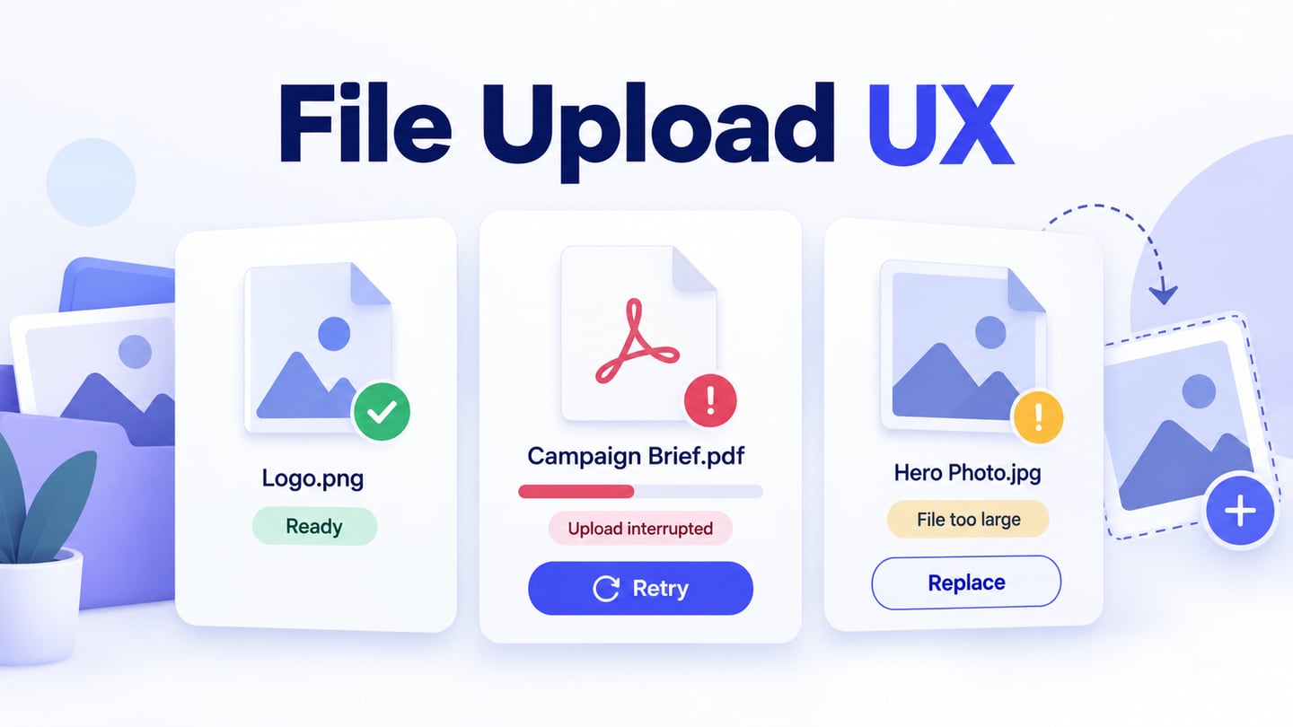
Design file upload UX with clear per-file progress, honest completion states, specific errors, and recovery that preserves files already uploaded.
“Upload complete” is a promise. It can mean that bytes reached a server, that a file passed the service’s checks, or that an attachment is now available to other people. Those are different events. File upload UX works when the interface explains which event has happened and gives a useful next action when a file cannot finish.
This guide follows three campaign assets for the fictional Northline studio through a multi-file uploader: a small logo, a PDF brief whose transfer is interrupted, and an image that exceeds the example’s size limit. Use an online prototyping tool to connect those prepared states before engineering implements the transfer. The result is a reviewable file-handling experience, not a working upload service.
Separate selection, transfer, processing, and readiness
Selecting a file does not necessarily upload it. Some interfaces begin transferring immediately; others let the person review selected files and explicitly start the upload. Choose one model and make its controls match. A button labeled “Add files” should not imply that an application or submission is complete.
Visa’s file-upload pattern distinguishes manual and automatic flows, file selection, individual file cards, and recovery actions. Use those distinctions to agree on the behavior of your own uploader. They are more useful than borrowing a drop-zone appearance without deciding what dropping a file does.
In our example, files start transferring after selection. Once transfer finishes, the service may still need to process them before they become usable campaign assets. The interface therefore has separate Uploading, Processing, and Ready states. If your product does not have a processing stage, do not add one just to make the flow look more sophisticated.
An importer goes further: it reads file contents, maps fields, and commits records. Keep that later task distinct from transfer. A CSV import flow needs its own mapping and row-error decisions; an uploaded CSV is not automatically an imported customer list.
State the actual constraints before file selection
Put accepted file types, size limits, and file-count limits next to the selection control. In this illustrative asset library, the agreed limit is 20 MB per file, with PNG, JPEG, and PDF accepted. These are example requirements, not Mockitt upload limits or a recommended limit for every application.
Say what the limit applies to. “20 MB per file” and “20 MB total” lead to different choices. If the service restricts image dimensions or document page counts, explain those requirements where users can act on them. Avoid revealing a predictable restriction only after a long transfer.
Keep a visible file-picker button even when drag and drop is available. The picker is essential on many mobile and keyboard workflows. A large drop zone is an optional convenience, not the only entrance. Use a label that fits the task, such as “Choose campaign files,” rather than relying on a cloud icon alone.
Selection feedback should identify the actual files. Keep the filename and extension understandable, including for long names and similarly named versions. If the layout shortens a filename, provide an accessible way to inspect the full name; hover alone is not enough for every input method.
Design the queue around individual outcomes
Our three files deliberately reach different states. The logo completes, the brief loses its connection, and the oversized image is rejected before transfer. A single red “Upload failed” message would hide the successful asset and make the next step unclear.
| File | Visible state | Useful next action |
|---|---|---|
| campaign-logo.png · 2 MB | Ready | Open or remove the asset if permitted |
| launch-brief.pdf · 8 MB | Upload interrupted | Retry this file after the connection is available |
| hero-photo.jpg · 24 MB | Too large: 20 MB per file allowed | Choose a smaller file |
Each row needs a stable identity, a text status, and the action appropriate to that status. Do not make users remember which of three anonymous progress bars belonged to the brief. Retain successful files while they correct the others.
The campaign queue keeps the ready logo, interrupted brief, and oversized image visible together, with a different recovery action for each problem.
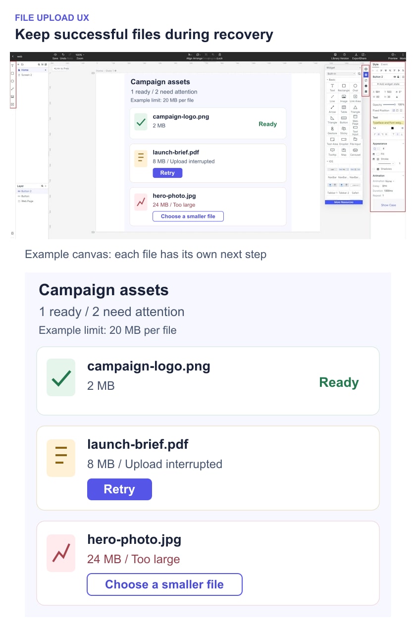
An overall summary can say “1 file ready; 2 need attention.” Do not label the oversized image as waiting to upload if it cannot proceed in its current form. Distinguish a retryable transfer failure from a file that must be changed or replaced.
For large queues, provide a way to find unfinished or failed items while keeping the overall count visible. If the product supports a batch action such as retrying failed uploads, its scope should name only the affected files. It should not send the ready logo again.
Make progress describe something the service can measure
Use a determinate progress bar when the implementation can measure the relevant work. Explain whether the percentage refers to bytes transferred or another stage. A bar that reaches 100% and then silently waits for processing makes completion feel unreliable.
After transfer, switch to an explicit processing state when more work remains: “Upload received. Preparing preview.” If the duration is unknown, an indeterminate indicator and a useful status are more honest than an invented percentage. Keep the filename visible so the message remains attached to the correct asset.
A time estimate should be based on information the service can support and should account for uncertainty. An unstable “1 second remaining” label can be less helpful than “Uploading 6 of 8 MB.” Do not animate a fixed timer and present it as measured transfer progress.
The overall progress calculation also needs a definition. Two small files finishing does not mean a large third file is nearly done. If an aggregate bar is based on bytes, make that consistent with the per-file bars. A count such as “2 of 3 files uploaded” describes completed items, not the percentage of bytes transferred.
Write recovery messages by cause
An error message should tell the person what happened to this file and what they can do next. “Something went wrong” may be unavoidable when the cause is genuinely unknown, but it should not replace a known explanation such as a size limit or unsupported file type.
- File too large: “hero-photo.jpg is 24 MB. Choose a file of 20 MB or less.” Show the relevant limit and retain the other files.
- Unsupported format: name the accepted formats. Do not suggest that renaming an extension converts the file.
- Transfer interrupted: keep the affected filename and offer the supported retry action. Avoid claiming that the file is safely stored until the service confirms it.
- Processing failed: distinguish a received file from a usable asset. Explain whether the person can retry processing, replace the file, or get help.
- Permission or storage restriction: offer an available resolution route. Repeatedly retrying the same request will not fix an account limit that has not changed.
Carbon’s file-uploader guidance distinguishes errors on an individual file from problems affecting the uploader as a whole. Apply that distinction to placement: a failed brief belongs beside the brief; a loss of upload permission may need a message for the whole queue.
Keep the recovery action close to the reason. A toast that disappears while the file row remains red forces the user to guess. Color can reinforce the state, but the filename, explanation, and action must communicate it without color.
Use cancel, remove, retry, and resume deliberately
These labels describe different operations. Cancel stops an in-progress attempt when the service supports stopping it. Remove takes a selected or stored file out of the relevant place. Retry starts another attempt. Resume continues an interrupted transfer from an agreed checkpoint. Do not offer all four just because they appear in another uploader.
For Northline’s campaign example, Retry begins the interrupted PDF transfer again. The interface must not say Resume unless the implementation actually supports continuation. If the browser no longer has access to the selected file, explain why the person needs to choose it again.
Cancellation needs a result state. A click on Cancel may race with a completed transfer. Agree with engineering how the service reports the final outcome and whether the uploaded file remains stored. Closing the upload panel is not necessarily the same as cancelling its transfers, so keep those actions visually and verbally distinct.
Removal after completion needs its own scope. Removing a local selection, detaching a file from a draft, and deleting a shared asset have different consequences. Use a more specific label or confirmation when the action would affect other users. Do not claim that canceling a transfer automatically deletes every server-side copy.
Keep the task usable on mobile and with a keyboard
On a narrow screen, prioritize the picker, constraints, filenames, status, and recovery actions. A decorative drop zone should not push the only useful controls below a long empty area. Check the browser’s actual file-selection behavior on relevant devices rather than assuming the desktop interaction carries over.
Specify where focus returns after the file picker closes and after a file is removed. Keyboard users should be able to identify the chosen files, retry a failure, and continue the task without jumping through unrelated controls. Follow the same clear labeling principles used in accessible web forms.
Status changes also need to be available to assistive technology. The W3C guidance on status messages explains how users can receive status information without a forced change of focus. Agree which meaningful changes should be announced; every small progress increment should not interrupt the person’s work.
A visual prototype can show text, order, and intended focus decisions. Test the implemented uploader with keyboard and assistive technology to verify actual behavior. The GOV.UK file-upload component is a useful implementation reference when examining file selection and error feedback.
Prototype the failed file all the way to resolution
Create prepared Mockitt screens for an empty queue, three selected files, mixed results, retrying the brief, and the resolved queue. Reuse the same filenames and sizes. Connect Retry only to the interrupted brief’s next state, and connect the oversized image to a replacement-file state. Keep the ready logo unchanged throughout.
Start the review with a concrete task: “Add these campaign files, then make the brief available to your teammate.” After the mixed result appears, observe whether the participant can explain which file is ready and choose the correct fix for each remaining file. If they remove everything and start again, investigate whether the queue made the individual outcomes clear.
Test closing and reopening the panel, trying the same file twice, leaving the page during transfer, and returning after a lost connection. Include only behavior the product intends to support. If transfers stop when the page closes, communicate that at the relevant decision; do not promise background uploading without implementation evidence.
For handoff, record when transfer starts, what each progress indicator measures, when a file becomes available, and what each recovery action does. Give each test a starting state, action, and observable result using the site’s prototype acceptance criteria. A useful uploader is one in which a person can tell what arrived, what remains unfinished, and how to finish without losing the files that already succeeded.