A useful error state tells people what failed, what happened to their work, and how to continue. Use an inline message for a value they can fix, a persistent banner for a problem affecting the current task, and a full-page state when the destination itself is unavailable. Preserve valid input, avoid blaming the user, and offer a recovery action that matches what the system actually knows.
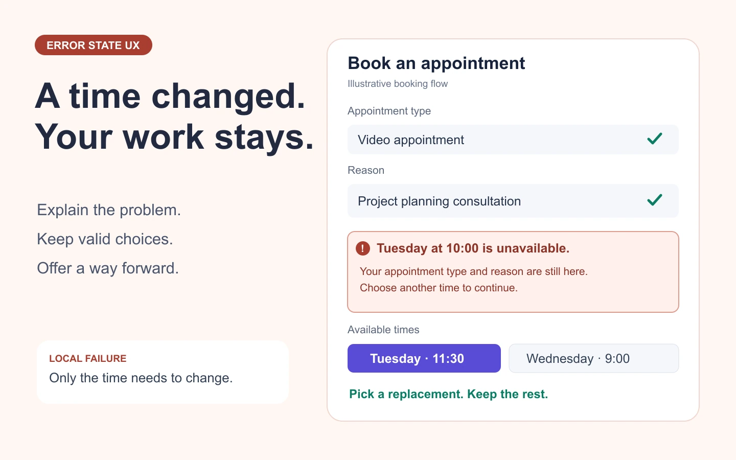
Error state UX includes the message, its placement, preserved data, and the transition back to work. A friendly sentence cannot repair a form that clears every field. Before implementation, you can use Mockitt to design the error and recovery screens, then connect the paths for review.
Consider an appointment-booking flow: someone selects Tuesday at 10:00, enters a reason, and chooses a video appointment. The examples below follow that person through a missing field, an unavailable time, and a request with an uncertain result.
Classify the failure before writing the message
Start with the operation that failed. A missing field, a rejected permission, a timed-out request, and a service outage need different recovery paths. If every problem says “Something went wrong,” people cannot decide whether to edit, retry, wait, or contact support.
| Failure | What is known | Useful response |
|---|---|---|
| Input does not meet a rule | A specific value is missing or invalid. | Identify the field, explain the correction, and preserve other values. |
| The account lacks access | This account cannot perform the action. | Offer the applicable access request, account change, or return path. |
| A choice is no longer available | The selected time or resource cannot be used now. | Explain what changed and show alternatives without discarding unrelated input. |
| A request timed out | The browser did not receive a result; the operation may still have completed. | Check the outcome before asking the person to submit again. |
| The service confirms the operation was not applied | No appointment was created. | Offer a supported retry, another route, or a way to return later. |
A normal empty result is different. “No appointments are available on Tuesday” may be a valid search result, with an action to change the date. Calling it a system error suggests that refreshing will fix something that is working as designed.
Separate technical diagnosis from the user-facing message. A server error response alone does not prove that the operation had no effect. Developers may need a request ID and a failure code; the person booking needs to know whether an appointment exists. A small “Copy error details” action can support troubleshooting without making internal codes the main explanation.
Preserve work and state what is safe
Keep valid choices visible after an error. If only the appointment time became unavailable, retain the reason, appointment type, and contact details. If a field must be cleared for security or because it is no longer valid, explain that specific change.
Be precise about the difference between failed and unknown. “No appointment was created” is useful only when the service can confirm it. After a timeout, a safer message is “We couldn’t confirm your appointment. Check your bookings before trying again.” The corresponding action should open that booking status, not immediately send a second request.
The design and engineering teams need to agree on what makes retry safe. For a read-only search, trying again is usually straightforward. A booking, payment, or invitation can create a second item if the first operation succeeded without returning a response. Specify whether the application checks an existing operation, reuses the same request, or genuinely starts a new one. The interface should not promise duplicate protection that the implementation does not provide.
Also decide what happens if the person leaves. A local error should not silently erase a draft when they navigate back. Conversely, do not promise that a draft is saved unless there is a storage mechanism for it. “Your selections are still on this page” and “Your draft has been saved” are different claims.
Map the appointment flow, including recovery
The table below is an example specification. Each row connects the trigger, visible message, and action to the state that must survive.
| Trigger | Message example | Action and preserved state |
|---|---|---|
| The reason is required but blank | “Enter a reason for your appointment.” | Move to the reason field; keep Tuesday at 10:00 and the video selection. |
| The time was taken before confirmation | “Tuesday at 10:00 is no longer available. Choose another time.” | Show available times; keep the reason and appointment type. |
| The result of submission is unknown | “We couldn’t confirm your appointment yet.” | Check booking status; keep all inputs and prevent an accidental second submission while checking. |
| This account cannot book a video appointment | “Video appointments aren’t available for this account.” | Show an applicable appointment type, or an access-request route if one actually exists. |
| The service confirms a failed submission | “Your appointment wasn’t booked. Your selections are still here.” | Offer retry when supported, or return to the appointment list. |
Follow each error to a clear ending. After choosing another time, the review screen must show the new time. After a successful retry, display one confirmation and its booking reference. After returning from a status check, remove a stale error if the appointment has been confirmed. An error that remains after recovery makes the new result ambiguous.
Choose inline, page-level, or full-page placement
Use an inline error for a specific input. Keep it close to the field and explain the rule in words. For example, “Choose a date after today” is more useful than “Invalid date.” Keep the field label visible; an error message is not a replacement for the label or ordinary instructions.
Use a summary when errors are difficult to find. On a long form, list the problems above the form and link each item to the affected input. Keep the inline messages too. The GOV.UK error-summary pattern is a concrete example of a summary working alongside field errors. Its rules are specific to that design system; choose the pattern that fits your own form and interaction model.
Use a persistent banner for an operation-level problem. “We couldn’t load available appointments” belongs near the availability area, not beside an unrelated field. Leave unaffected parts of the page usable. If only one section fails, replacing the whole page with an error needlessly removes working information.
Use a full-page state when the destination cannot be used. A missing page or inaccessible resource needs a meaningful way back, such as the appointment list. Avoid routing every error to the homepage, where the person's context disappears.
A transient toast is a poor sole location for a message that requires correction: it can disappear while the person is still reading. Reserve a modal for a decision that truly needs to interrupt the flow. On mobile, check that the on-screen keyboard and sticky controls do not cover the error or its recovery action.
Write the message around the next useful action
Good error copy is specific without exposing unnecessary implementation detail. Lead with the problem, add the consequence when it matters, then name the next step. Do not repeat a vague heading and button such as “Error” and “OK” when neither helps recovery.
- Instead of “Invalid input”: “Enter an email address in the format name@example.com.”
- Instead of “You entered an unavailable date”: “There are no appointments on Tuesday. Choose another day.”
- Instead of “Failed to fetch”: “We couldn’t load available times. Try again.” Use this when retrying only reloads availability.
- Instead of “Please contact support” for every failure: offer the specific correction first. Provide support when the user cannot resolve the problem, along with useful non-sensitive reference details.
Validate at a helpful moment. Showing a required-field error before someone has had a chance to type creates noise. On submission, make all relevant problems discoverable; after a correction, remove a stale error when the value can actually be validated. When verification requires the server, distinguish local formatting feedback from the later service result.
Make error states perceivable and recoverable
Use text as well as styling to identify the problem. WCAG 3.3.1, Error Identification, addresses identifying automatically detected input errors and describing them in text. WCAG 3.3.3, Error Suggestion, separately covers providing a known correction when doing so does not compromise security or the purpose of the content.
In the implemented form, associate the message with the control so assistive technology can expose the relationship. Define where focus goes after a failed submission and after recovery. A summary can receive focus, while its links take the person to individual fields; a background status may need an announcement without moving focus. Do not use an urgent announcement for every minor update.
Review contrast, text wrapping, keyboard reachability, and the reading order as well. A visual prototype can communicate the intended behavior, but screen-reader announcements, semantic relationships, and keyboard behavior must also be tested in the implementation. A drawn focus ring alone does not establish accessibility.
Prototype the complete recovery path in Mockitt
Create the appointment form, the review screen, and the confirmation first. Then add the failure screens using the same selected values. This makes it easy to see when an error accidentally removes information.
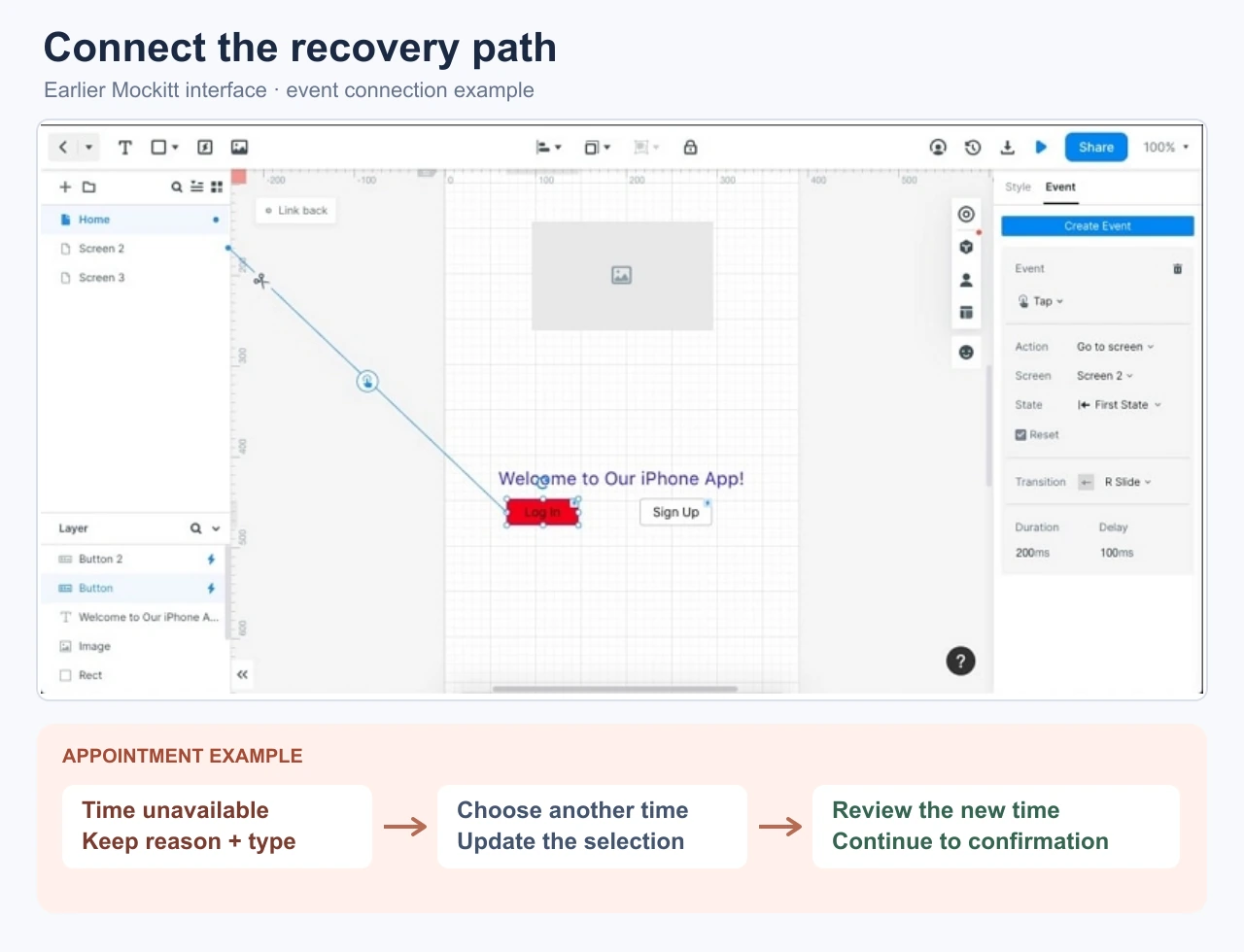
- Connect the missing-field route. From the form, show the missing reason, then return to a corrected version with the original time intact.
- Connect the unavailable-time route. Offer alternatives and show the selected replacement on the review screen.
- Model the uncertain-result route. Include the status-check action and both possible outcomes: already booked, or safe to try again.
- Walk through the flow without explaining it. Ask a reviewer what happened and what they would do next. If they cannot tell whether the booking exists, revise the state or wording.
Record the service responses needed for each branch beside the prototype. The useful deliverable is a flow in which a person can recognize the failure, retain their work, recover without an accidental duplicate, and recognize a successful outcome.