Mockitt - Best Free Wireframe Tool
Helpful Tips About Wireframe
- How To Create A Wireframe
- Wireframe Tools You Should Know
- Wireframe Templates for Your Inspiration
- Free-to-use Wireframe Kit

Drag-and-Drop Reordering UX: Clear Positions, Alternatives, and Undo
A row moves when someone drags it, but what did the product actually change? Its place in a personal view, its priority for the whole team, or the order customers will see? Drag-and-drop reordering UX starts with that question. The handle and animation come later.
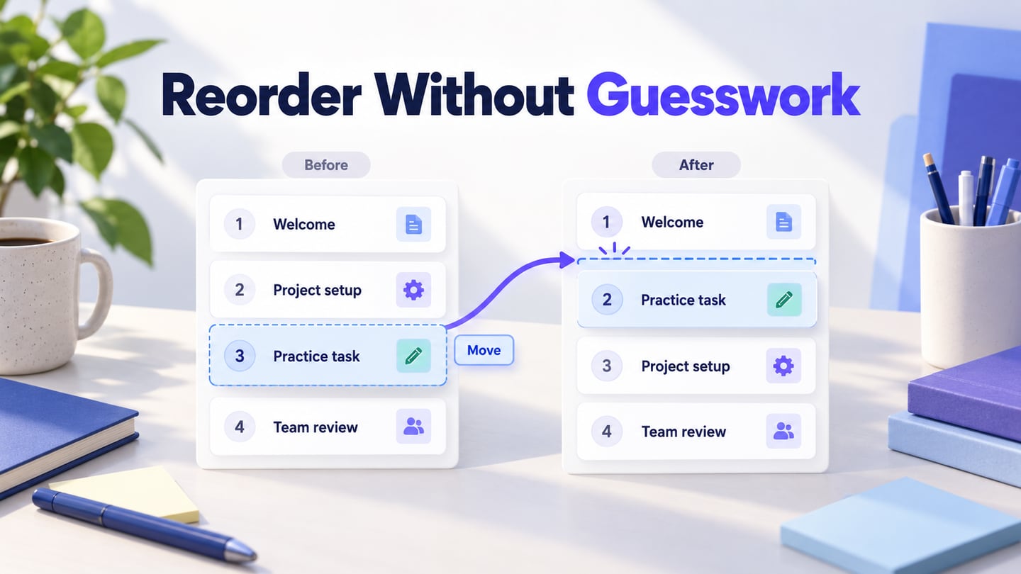
This guide follows a fictional training outline with four modules: Welcome, Project setup, Practice task, and Team review. The author wants Practice task to appear second. We will define the resulting order, provide another way to make the same move, and handle a change that cannot be saved. Use Mockitt to connect the ordering states so a team can review the proposed behavior before implementation.
Decide what the order belongs to
Manual order is data chosen by a person. Sorting is a rule applied to a view, such as alphabetical order or most recently updated first. They can coexist, but they should not pretend to be the same operation. Dragging a row in an alphabetically sorted view is confusing if the next refresh immediately puts it back.
For the training outline, the example policy is simple: the sequence belongs to the course, and learners see it after the author publishes the course. Reordering the draft does not publish it. All four modules are visible in the manual-order view. These are design decisions for this example, not Mockitt course-publishing features.
Name the current view. “Course order” is clearer than an unlabeled list that sometimes sorts itself. If the interface offers “Name: A–Z,” explain why manual movement is unavailable there and provide a route back to course order. The broader table design guide covers comparison and sorting; do not use a drag handle to conceal a conflict between those tasks.
A filtered list needs another rule. Does moving a visible item change its position among all modules, or only within the filtered subset? Hidden rows make that difficult to infer. A defensible first design is to require the complete manual-order view for movement, with an explanation and a “Show all modules” action. A product that supports filtered reordering needs to make the resulting full sequence inspectable.
Trace one move from intention to result
The author starts with Welcome, Project setup, Practice task, Team review. Moving Practice task from position 3 to position 2 must produce Welcome, Practice task, Project setup, Team review. Nothing is duplicated or removed. The item’s identity stays the same even though its position changes.
Show a destination before the person releases the item. An insertion line between Welcome and Project setup is more precise than a vaguely tinted row. Keep the moving item recognizable and distinguish the original position from the proposed destination. If dropping is unavailable in a region, do not show the same visual cue as a valid target.
| Moment | What the author sees | What it means |
|---|---|---|
| Before movement | Practice task · position 3 of 4 | The current saved draft order |
| Destination preview | An insertion marker before Project setup | A proposed move, not yet a saved result |
| After release or Move | Practice task · position 2 of 4; Saving order | The change has been requested |
| Save confirmed | Course order saved; Undo | The service confirmed the new draft sequence |
| Save rejected | Order not saved; previous order restored | The example returns to the known saved sequence |
The feedback must match the actual save model. An optimistic interface may show the proposed order while the request is pending; another design may wait for confirmation before moving the row. Either needs a deliberate failure state. Do not present a settled success message merely because an animation ended.
Provide a move action that does not require dragging
A drag gesture combines holding, movement, and a sufficiently precise release. It can be inconvenient on a small screen and inaccessible to people who cannot perform that gesture reliably. A visible Move action gives the same task a different entrance; it should not be hidden behind an undocumented keyboard shortcut.
The W3C explanation of dragging movements makes an important distinction: keyboard operation and a non-drag pointer alternative are separate requirements. Keyboard shortcuts alone do not provide an alternative for someone who uses clicks or taps but cannot hold and drag. A button or menu that works with both a pointer and a keyboard can support both needs.
For our four-module outline, each row has a clearly named Move action. Activating it opens a choice of destination positions. Choosing “Position 2 — after Welcome” makes the same change as dropping before Project setup. The positional number and neighboring item provide complementary context; do not ask users to remember what an unexplained “2” represents.
The move menu names Practice task and its destination, while the saved state shows the same module in position 2 with an Undo action.
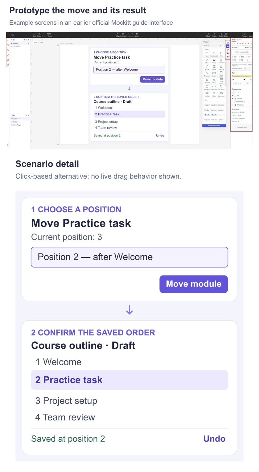
For a short list, “Move earlier” and “Move later” buttons may be sufficient. For a long outline, repeated one-step movement is laborious; a destination choice or “Move to beginning” can be more appropriate. Choose the available outcomes around the task rather than exposing every possible movement command.
Atlassian’s drag-and-drop accessibility guidance describes outcome-based buttons and menus, feedback, and returning users to a useful place for the next action. Its examples are helpful references, not a requirement to copy its exact control design. Keep one understandable action entry for the row rather than separate menus that appear to do the same thing.
Keep the person with the item they moved
After a successful move, keyboard focus should remain meaningfully associated with Practice task, such as on its Move control in the new position. Sending focus to the top of the page makes consecutive adjustments unnecessarily difficult. If the item disappears because the view changes, define a sensible fallback instead of leaving focus on a removed element.
Use feedback that identifies the item and the result: “Practice task moved to position 2 of 4.” If saving is still pending, communicate that separately. A change of background color alone does not tell someone what happened, and a generic “Done” is weak when several operations are possible.
The W3C’s rearrangeable listbox example demonstrates focus continuity and announced changes in one particular pattern. It is an illustrative implementation, not a reason to make every sortable card collection a listbox. Agree the appropriate semantics with the implementation team and test actual assistive-technology behavior.
Write messages for useful milestones, not every pixel of movement. Announcing every small pointer update can make the interface noisy. The planned status feedback should help users distinguish a proposed move, a confirmed save, and a failure without interrupting unrelated work.
Make failure and Undo preserve the right work
In this example, a failed save restores the previous known order and keeps Practice task visible. The message explains the result: “Order not saved. Practice task is still in position 3. Try again.” Offer retry only when retrying is appropriate; a lost permission requires a different explanation.
A product could instead retain the unsaved arrangement and offer Save again. That is a different policy. If you choose it, keep an explicit unsaved state so someone does not leave believing the order is persistent. The important point is to decide which sequence is authoritative and make the screen agree with it.
Unknown completion is also different from a confirmed failure. If the client loses contact after sending the move, it may not know whether the service saved it. Check the current order before inviting a second action that could move the item again. A prepared screen can communicate this distinction without exposing technical request details to the user.
Undo should reverse the relevant move, not restore an old snapshot over everyone else’s work. If another author changes the outline, a blind rollback can erase that later change. Define the supported reversal with engineering, including conflicts and permissions. When reversal is unavailable, say so and show the current order; do not leave a reassuring Undo control that silently does nothing.
Review the awkward cases before polishing motion
On touch screens, dragging a row and scrolling the list can compete. Make the intended handle discoverable and keep the non-drag Move action reachable. Review the long-list case, where the destination begins outside the viewport, rather than testing only four rows that already fit on screen.
- First and last items: avoid offering a move beyond the list boundary. Keep the reason for an unavailable outcome understandable.
- Long or similar names: retain enough identity to distinguish two modules while moving them. A truncated label and identical thumbnail may be insufficient.
- Locked positions: explain any rule that prevents movement, such as a required opening module. Do not imply that every row is freely movable.
- Another author’s change: make a refreshed or conflicting order visible before the person acts on stale positions.
- Leaving the page: match navigation behavior to the actual persistence policy, including any unfinished save.
Animation can maintain a sense of continuity, but it cannot explain an unclear order rule. Keep the resulting layout legible with reduced motion and without relying on a transition to identify the moved item.
Review the order with prepared Mockitt states
Create screens for the initial outline, the open Move menu, the proposed sequence, the saved sequence, and the failed-save result. Keep all four module names consistent. Connect the Position 2 choice to the reordered screen and connect Undo to the appropriate prepared result.
This review does not depend on a native drag simulation. It uses click-linked states to inspect the destination, message, and recovery decisions. Pointer dragging, keyboard behavior, live announcements, and server persistence still need implementation and testing in the working product.
Give a reviewer the task “Place Practice task immediately after Welcome.” First ask them to use the non-drag control. After the save result, ask where the module now appears and whether learners already see the change. Then show the failure state and ask what happened to the order. These questions expose different misunderstandings without coaching someone through the interface.
Record the same starting list, action, and expected visible sequence in the prototype acceptance criteria. A useful handoff states whose order changes, which views permit reordering, how an alternative move works, and what happens when saving or reversal cannot finish. Those decisions make the eventual drag interaction understandable rather than merely smooth.