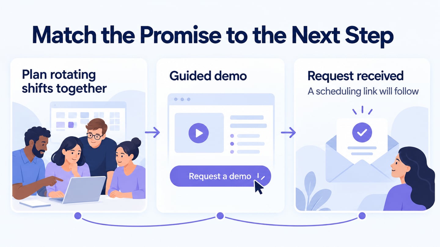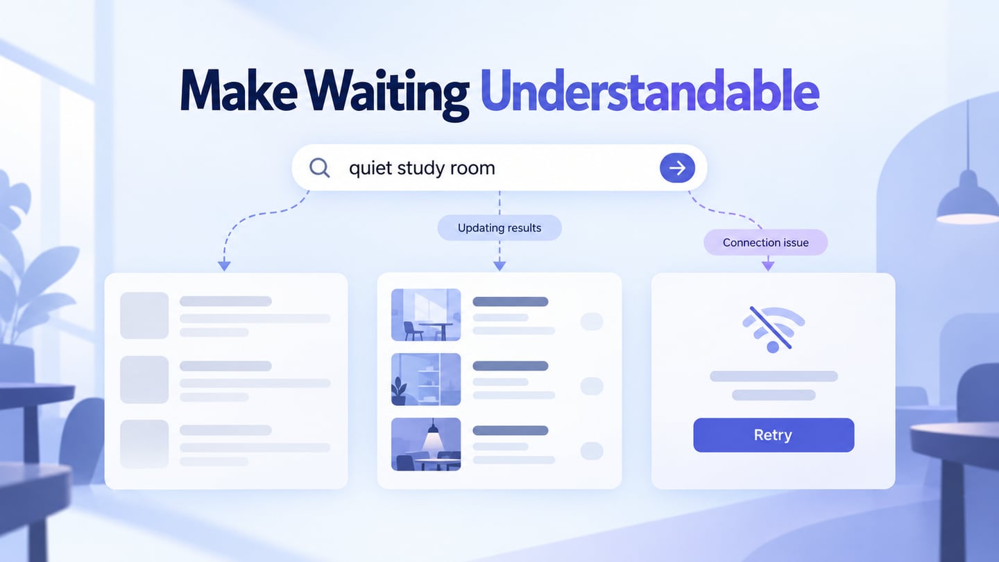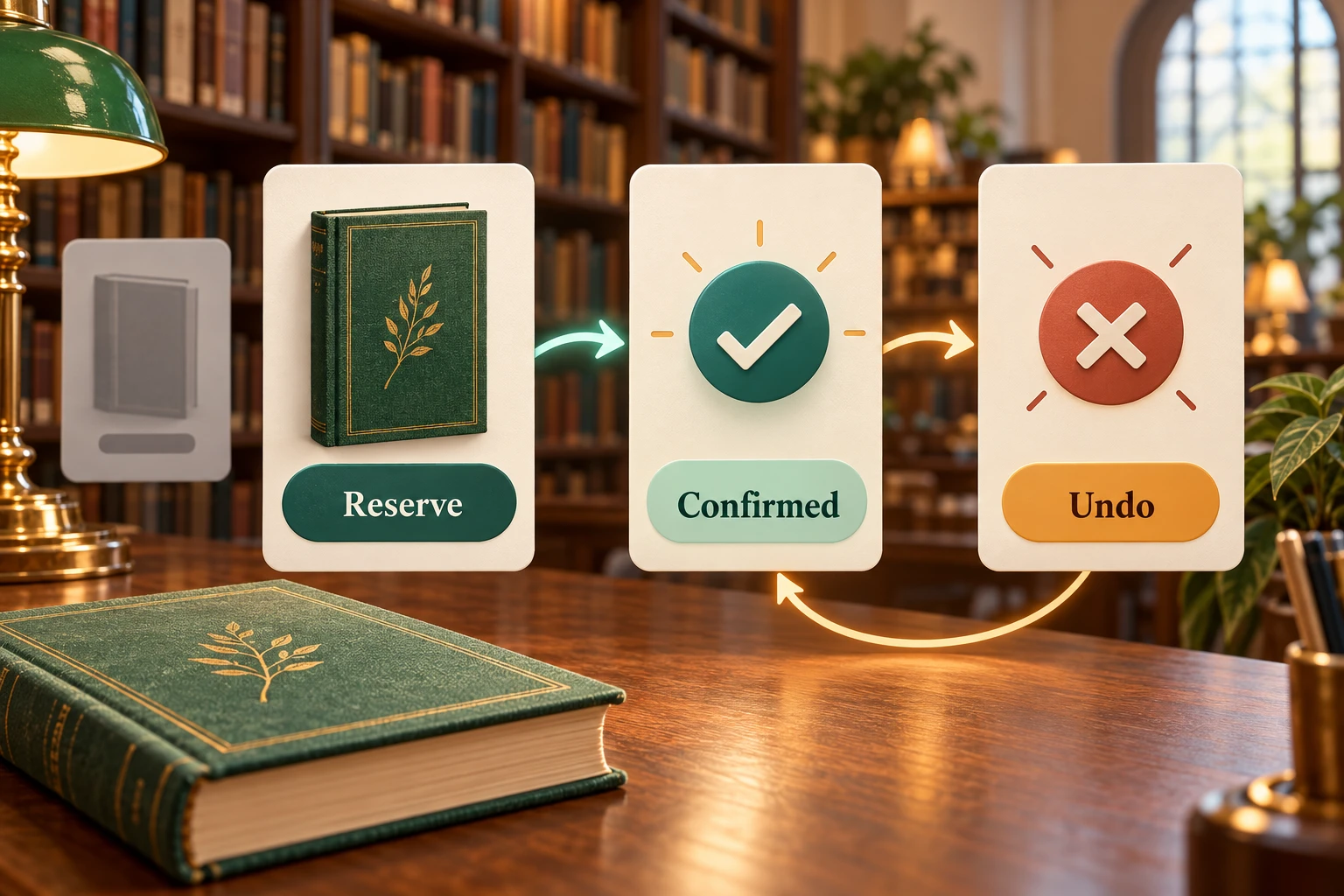
Interaction design defines what happens when someone uses a product: the actions available, the feedback they receive, and how they recover when something goes wrong. A reservation button is only the beginning. People also need to know whether the request succeeded, where to collect the item, and how to change their mind.
For a digital product, you can explore these decisions in Mockitt's interactive prototype editor before implementing the service. Start with one task and connect its important states. This article explains the five dimensions of interaction design, practical principles, everyday applications, and its relationship with UX.
What Is Interaction Design? A Brief Introduction
In the simplest terms, interaction design is the design of the exchange between a user and a system. It is commonly abbreviated as IxD. It covers how people initiate actions and how the product responds, including changes over time. Layout matters, but a visually attractive screen can still leave people unsure whether their action worked.
The five dimensions of interaction design offer a useful way to examine that exchange:
- Words (1D) include labels, instructions, and feedback. “Reserve for pickup” explains an outcome more clearly than “Continue” when the next action creates a reservation.
- Visual representations (2D) include typography, images, and icons. A selected pickup branch should remain recognizable without relying on color alone.
- Physical objects and space (3D) include the devices and surroundings through which people interact. A phone used one-handed needs different consideration from a desktop controlled with a keyboard and mouse.
- Time (4D) includes changes over time, such as feedback, motion, and waiting. Decide what people see while a reservation request is being processed.
- Behavior (5D) connects the other dimensions to actions and responses. Define what a second press does and what happens after cancellation.

Use the following ten practical principles to turn those dimensions into decisions about your product.
- Match the user's goal
The service offered by the design should match the task the user expects to complete. For a library reservation, show the book, pickup branch, and availability before asking for confirmation. A polished animation cannot compensate for an unclear pickup location.
- Consistent design
Use consistent names and behavior so people do not have to relearn each screen. If “Cancel reservation” removes a hold, do not use the same label for simply closing a dialog. Keep familiar navigation and keyboard behavior wherever possible.
- Simple functionality
Make the main task straightforward without removing necessary choices. Put the reservation action beside its relevant details; reveal uncommon options when needed. Simplicity means reducing unnecessary effort, not hiding every secondary action.
- Lower cognitive load
Reduce the information people must remember between screens. Carry the selected book and branch into the confirmation view. A user should not need to return to the previous page just to check what they selected.
- Meaningful engagement
Use feedback to help people understand progress. A brief state change can acknowledge a press; repeated decorative motion can distract from the task. Explain the result in text rather than leaving a success animation to communicate everything.
- User control
Let people review a choice, go back, or cancel when the service permits it. Be clear about irreversible actions. If an Undo action is offered, define what it restores and what happens when the opportunity has expired.
- Discoverable actions
Important interactions should be perceptible. An unlabelled icon or a gesture with no visible alternative may conceal an essential action. Give the reservation a recognizable button and the cancellation option a clear name.
- Learnability
Help someone understand the interaction on first use and recognize it later. Keep instructions near the unfamiliar decision. Do not require a lengthy tutorial for a short task that clear controls could explain.
- Error prevention and recovery
Anticipate missing choices and failed requests. Preserve valid input, explain the problem, and offer a next action. “Choose a pickup branch” is more useful than an unexplained disabled button or a generic failure message.
- Feasible, dependable behavior
Balance the intended experience with implementation and service constraints. Check whether a cancellation really can be reversed before drawing an Undo control. Discuss unsupported states with the development team instead of promising behavior that the service cannot deliver.
These concerns also appear in Nielsen Norman Group's usability heuristics. Use the principles to find a concrete problem, then observe whether people can complete the affected task.
An Example of Everyday Interaction Design
Shopping on Amazon or Flipkart and practicing a lesson in Duolingo involve different goals, but each requires understandable actions and responses. Consider a fictional library service where a reader reserves a book for collection.
Suppose a reader wants to reserve the sample book River Stories at Central Library. Design the following states:
- Choose. Show the book details and the selected branch. The primary action says “Reserve for pickup.” Changing the branch updates the visible choice before submission.
- Submit. Show “Requesting reservation…” and prevent an accidental second request while the first is pending. The reader should not need to guess whether the press registered.
- Confirm. Show “Reservation confirmed,” the book, Central Library, and the collection instructions. Keep the result available after a temporary notification disappears.
- Cancel and recover. Offer a clearly named cancellation action. For this proposed service, an immediate Undo returns to the confirmed state while reversal remains available. Define a separate explanation when reversal is no longer possible.
- Handle unavailability. If the copy becomes unavailable before confirmation, keep the book details and explain that no reservation was created. Offer “Choose another branch” instead of sending the reader back to a blank start screen.
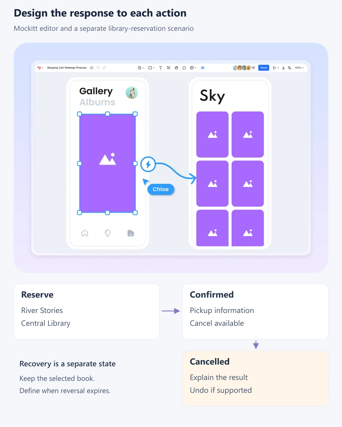
In Mockitt, arrange a screen for each important state and connect the relevant controls to their next screen. Preview the normal route and the unavailable route separately. These linked screens can simulate the proposed service; they do not reserve a real book or prove that a backend handles concurrent requests.
Ask a reviewer to reserve the book, identify the collection location, and then cancel the hold. Observe whether they can explain the outcome without coaching. Record the screen, action, unexpected response, and proposed change. For example: “After cancellation, the confirmation remains visible; replace it with the cancelled state and an explicit recovery option.”
For implementation, specify how assistive technology receives feedback. W3C's guidance on status messages explains how relevant updates can be announced without moving focus. A clickable visual prototype helps discuss the message, but the implemented behavior still needs accessibility testing.
Common Uses for Interaction Design
Understanding the target user's requirements is key to designing an interactive product. The same principles apply across familiar contexts, with a different question to resolve in each:
- Learning portals: Can a learner resume a lesson and tell which work has been saved?
- Gaming: Does an action produce understandable feedback, and can someone pause or leave safely?
- Online shopping: Can a customer change a selection and see the revised order before committing?
- Food delivery: Does a change of address reveal any effect on availability before the order is placed?
- Reviews and feedback: Is a submitted response acknowledged, and can an accidental submission be corrected where appropriate?
- Entertainment: Can viewers find, start, pause, and resume content without losing their place?
- Reading and writing: Are saving, publishing, and discarding clearly different actions?
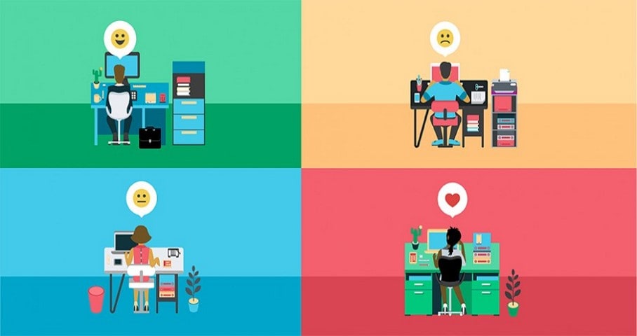
The Relationship Between Interaction Design and UX
Interaction design is a specialization within the broader user experience. It concentrates on the moment-by-moment exchange with a product. UX also considers whether the service meets the person's need across the wider journey.
- Both disciplines are concerned with usability and understanding the user's context.
- Interaction design turns a task into actions, states, feedback, and recovery paths.
- Interface design supplies the controls and information people use to understand those actions.
- Broader UX work may reveal a problem outside the screen. A clear reservation flow still disappoints if collection instructions are wrong or the library cannot fulfill the hold.
For the library example, review the screen behavior and the service assumptions separately. The prototype can reveal an unclear cancellation message. Confirming opening hours and collection policy requires evidence from the service itself.
Conclusion
Interaction design goes beyond a product's appearance. It makes the exchange between a person and a system understandable: what can be done, what happened, and what can be done next. Begin with one meaningful task, define its success and recovery states, and use a prototype to find where that exchange breaks down.