Interface design organizes the controls and information people use to complete a task. It includes labels, layout, navigation, input fields, feedback, and the relationships between them. A useful interface lets someone understand what is available, enter the right information, and recognize the result without unnecessary effort.
For an app or website, Mockitt's UI design tools can help you arrange those elements and explore consistent screen layouts. This guide covers the main interface types, everyday uses, and the relationship between UI and UX, with a practical registration-form example.
What Is Interface Design? A Brief Introduction
A user interface is the point of interaction between a person and a product or system. Interface design determines how that point works and how it is presented. In software, it includes the visual and functional details of screens; in other products, it may involve physical controls or voice input.
A successful interface is understandable, efficient, and appropriate to its context. An application does not become usable simply by adding attractive colors or removing controls. People still need clear choices, sufficient information, and a way to correct mistakes.
Common interface formats include the following. They can overlap: a mobile form can be graphical, touch-operated, and organized through menus at the same time.
- Graphical user interfaces (GUIs): Visual elements such as windows, icons, buttons, and text present information and controls. People may use a keyboard, mouse, touch input, or assistive technology to operate them.
- Voice-controlled interfaces: Spoken commands provide input, as in voice assistants. Design prompts and confirmation carefully, including what happens when speech is misunderstood or speaking aloud is impractical.
- Gesture-based interfaces: Movements such as a swipe, pinch, or tracked hand motion control an action. Give important functions a discoverable alternative when a gesture is difficult to learn or perform.
- Form-based interfaces: Fields, selections, and instructions collect structured information. Examples include surveys, feedback forms, and registration pages.
- Menu-driven interfaces: A sequence of available choices guides the user toward an action. An ATM is a familiar example. Clear labels and a route back matter at every level.
- Touch interfaces: People directly operate elements on a touchscreen. Design for contact, spacing, and readable content rather than assuming mouse precision or hover feedback.

Most screen-based interfaces combine several kinds of elements:
- Input controls: Text fields, buttons, checkboxes, radio buttons, and switches accept different kinds of input. Choose the control that matches the decision.
- Navigation: Menus, links, tabs, breadcrumbs, and search help people find information and understand their location.
- Information components: Progress indicators, status messages, and error messages explain what is happening.
- Calls to action: A button or link offers a meaningful next step. Its label should make the consequence clear.
- Containers: Groups, cards, panels, and accordions organize related content. Grouping should reflect the task rather than merely fill the available space.
Make a small component inventory before drawing every screen. For a registration form, that inventory might contain a session summary, labeled text field, optional checkbox, primary action, inline error, and confirmation panel. Define the normal, focused, filled, and error appearances needed for those elements.
An Example of Everyday Interface Design
Shopping sites, food-ordering apps, reading platforms, and shared-file services all need a usable interface. A customer choosing an item on Amazon, ordering with Zomato, reading on Medium, or finding a file in Dropbox should be able to recognize the relevant information and action. The layout needs differ, even when familiar controls recur.
Consider a fictional community workshop called Introduction to Pottery. A visitor wants one place for Saturday 14 November, from 10:00 to 12:00. The design task is to let them understand the session, supply contact details, and review the registration before sending it.
- Put the decision above the form. Show the workshop name, date, time, location, and price or free-entry status together. For this example, mark the workshop “Free.” Do not make people enter personal details to discover that essential information.
- Group the required information. Use a short “Attendee details” section with Name and Email labels. Keep one attendee as the stated scope. Do not introduce a group-booking selector that the proposed service does not support.
- Keep labels visible. Put the Email label beside its field, not only inside a placeholder that disappears while typing. An example address can explain the format without replacing the label.
- Separate optional choices. Place an unchecked “Send me future workshop updates” checkbox below the required fields and make its optional purpose explicit. It should not look like another mandatory registration step.
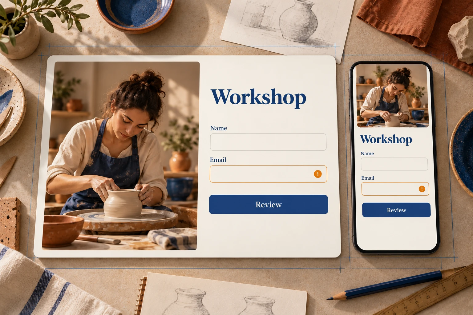
- Show a useful error state. If the address is missing its domain, retain the name and explain the correction near Email. Do not erase the whole form or communicate the problem only through a red border. The form validation UX guide explains when to show errors and how to clear them after a correction.
- Review before sending. Use “Review registration” to open a summary showing the session and attendee details. Provide an Edit details action and a final “Confirm registration” button. Label the first step accurately; it has not submitted the registration yet.
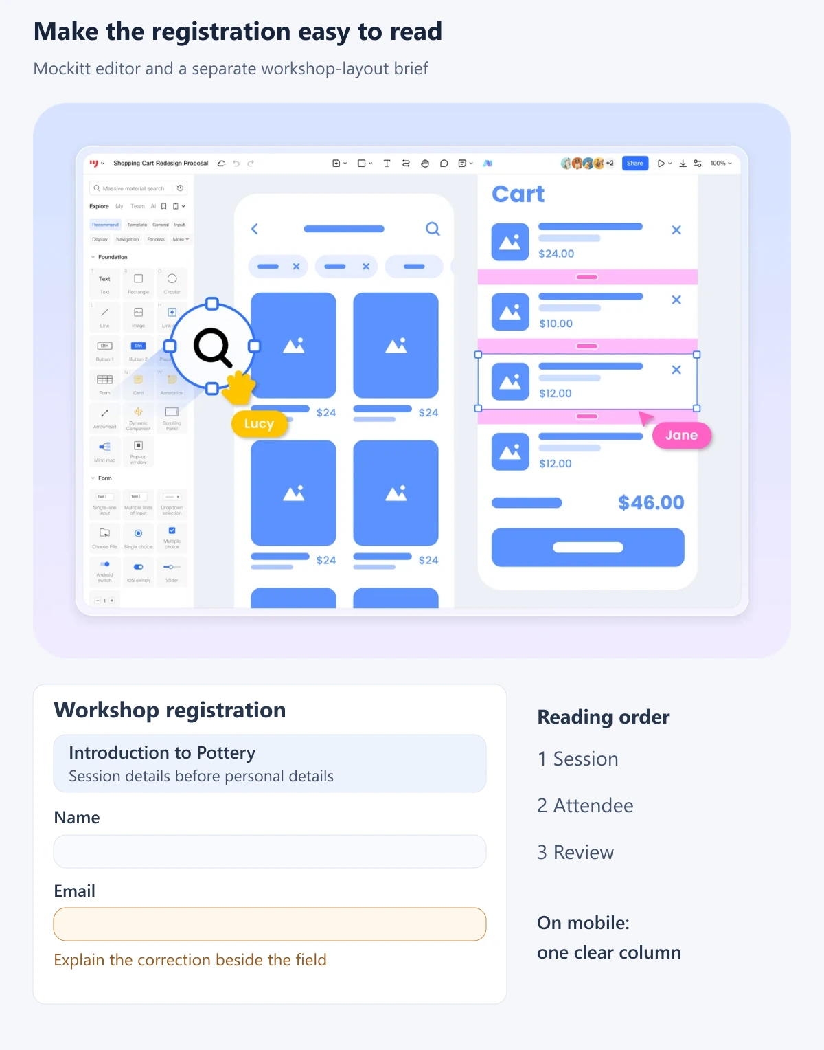
In Mockitt, start with the session summary and field components, then duplicate the layout to represent the filled, error, review, and confirmation states. Keep repeated labels and spacing consistent, and connect the screens so a reviewer can follow the proposed registration from entry to confirmation.
For a narrow screen, use a single reading column: session details, attendee fields, optional choice, and action. Let long labels and error messages wrap. Keep any supporting image secondary so it does not push the workshop details out of reach. At larger widths, a summary panel can sit beside the form, but the reading order should still make sense when the columns stack.
Review the design with concrete tasks: identify the session time, correct the invalid email without losing the name, return from the review screen, and explain whether the registration has been submitted. Record the exact label or grouping that caused confusion. This gives the team a specific revision to make instead of the vague instruction “make it more intuitive.”
For implementation, follow W3C's guidance on labeling controls: the label must be associated with its control, not merely placed nearby visually. Its error-identification guidance also calls for identifying a detected input error in text. Check keyboard order, focus visibility, label announcements, correction behavior, and actual submission in the implemented form.
Common Uses for Interface Design
The fundamentals apply across app and web interfaces. Keep the design clear and consistent, organize content around the person's task, and use the brand's visual language without letting decoration obscure meaning.
- Learning applications: Group lesson content, progress, practice tasks, and navigation so learners can tell where they are and what comes next.
- Retail shopping: Bring product options, availability, price, and the purchasing action together. Keep the order summary understandable as selections change.
- Games and immersive experiences: Explain the current state and available controls within the context of play. Menu and pause interfaces still need clear navigation.
- Feedback collection: Use appropriate fields and labels, distinguish required questions, and acknowledge a completed submission.
- Worklists and everyday tracking: Make the current item, its status, and the next action easy to distinguish. Responsive layouts should preserve that priority across devices.
For each application, produce a small set of representative screens rather than only an ideal empty form or a perfectly populated dashboard. Include realistic long content, a missing value, a mistaken entry, and the result of a completed action. Those variations expose weaknesses in grouping and information hierarchy.
The Relationship Between Interface Design and UX
UI and UX are closely connected, but they do not divide neatly into “art” and “function.” Nielsen Norman Group's definition of user experience includes the person's broader relationship with a product, service, and company. The interface is an important part of that experience.
- Interface design determines how the workshop's information, fields, choices, and feedback are presented and operated.
- Interaction design defines the actions and responses between those states. The interaction-design guide explains that behavior through a reservation example.
- Broader UX work considers whether the workshop meets the person's needs, whether the location and schedule are suitable, and whether the organizer delivers the promised experience.
A clear registration form cannot fix an inaccurate workshop description or an inaccessible venue. Equally, a useful workshop can be difficult to join if the form has confusing labels. Discuss both the interface decisions and the service assumptions so the team knows which problem it is solving.

Conclusion
Interface design makes a product's information and actions usable. Begin with the task, select suitable controls, keep labels and states consistent, and examine realistic content on both wide and narrow screens. The result should let a person understand the choice, complete the action, and recognize what happened.