Mockitt - Best Free Wireframe Tool
Helpful Tips About Wireframe
- How To Create A Wireframe
- Wireframe Tools You Should Know
- Wireframe Templates for Your Inspiration
- Free-to-use Wireframe Kit
Tooltip UX: Choose Helpful Hints Without Hiding Essential Information
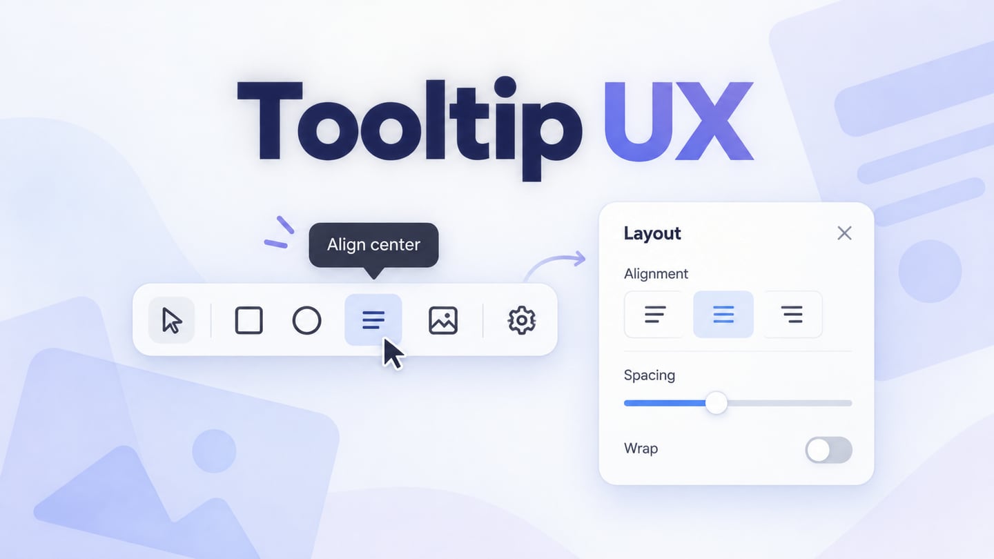
A tooltip should answer a small question about a control without making the interface depend on hidden text. Use one for a short, optional explanation. Keep instructions that people need to finish a task visible, and choose a different surface when the explanation needs links, buttons, or several steps.
The difficult part of tooltip UX is deciding what belongs outside the tooltip. A UI design with explicit component states lets a team compare the control, its hint, and the surrounding text together before handing the behavior to developers. The result should still make sense when no hint is open.
Consider Larkspur, an illustrative shared asset library. Its compact toolbar includes a pin-shaped control, and its sharing settings include a field called Workspace visibility. The pin may benefit from a short hint. The consequences of changing visibility deserve an explanation beside the field. Treating both as tooltips would hide the more important decision.
Decide whether the information can stay hidden
Start with the sentence you want to show, then ask what happens if someone never sees it. If they can still identify the control and complete the task safely, a tooltip may be suitable. If they would miss a requirement, misunderstand access, or lose work, give the sentence a visible place.
In Larkspur, the pin button has the accessible name Pin item. Its tooltip says, “Keep this item at the top of your library.” The sentence adds a useful consequence to an already identifiable action. It does not carry the only name of the button.
Beside Workspace visibility, the design instead shows, “Everyone in this workspace can view this collection.” That is part of the decision itself. It should remain readable before and after a person changes the setting. A question-mark icon would make a consequential explanation easier to miss.
A tooltip is also a poor container for an action such as Manage access. That action needs a surface people can deliberately open and operate. Depending on the task, use an inline disclosure, a separate settings section, or another appropriate interactive panel. Do not turn a brief hover hint into a tiny menu.
Explain the useful difference in one short thought
A helpful hint answers the uncertainty left by the visible control. For Pin item, repeating “Pin item” adds little for a person who can already see a text label. Explaining where the item will appear gives the hint a purpose. For an icon-only button, the hint can also expose a label visually, while the underlying button still needs its own accessible name.
Keep the wording specific to the actual outcome. “Organize your content more efficiently” describes an aspiration; “Keep this item at the top of your library” describes the result. Avoid a tooltip that begins with an instruction to hover, since it is already being displayed and might have been opened by keyboard focus.
When the action changes, the text should change with it. After pinning, Larkspur's control becomes Unpin item and the hint becomes “Remove this item from the top of your library.” The designer should include both states in the handoff. An outdated hint is particularly confusing when the icon itself changes only slightly.
Use the same action vocabulary in the hint, the button label, and any confirmation that follows. If you need a paragraph to explain the control, reconsider the control or move the explanation into the page.
Specify opening and closing as part of the design
“Show on hover” leaves several important questions unanswered. What happens when the control receives keyboard focus? Can a person move the pointer over the hint? How can they dismiss it when it covers something? What happens when they activate the button?
For additional content triggered by hover or focus, WCAG's guidance on content on hover or focus addresses three conditions: dismissibility, hoverability, and persistence, with defined exceptions. In a typical custom tooltip, that means providing a way to dismiss it without moving focus, allowing the pointer to reach it, and keeping it available while the relevant hover or focus remains.
Larkspur's design specifies that the hint appears for pointer hover and keyboard focus. Escape closes the hint without activating Pin item, and the focus remains on the button. Activating the button performs the pin action; opening or closing the hint does not. Moving from the button onto the hint does not immediately make it disappear.
Record these transitions beside the visual state. A static screenshot cannot explain them, and a tooltip drawn on a prototype canvas does not prove that the implemented control manages keyboard focus correctly. The interface review and the implementation check serve different purposes.
Keep the task usable without hover
A phone user should not have to discover an unfamiliar gesture just to understand the toolbar. In Larkspur's narrow layout, the pin action keeps a visible text label. A longer explanation about organizing the library can live in an accessible help location, but pinning an item must remain understandable without visiting it.
Apply the same reasoning to keyboard use. Each action needs a meaningful name when focus reaches it. A tooltip may supplement that name; it should not repair an otherwise unnamed control. Instructions for a setting should stay associated with that setting even when the hint is closed.
For handoff, accessibility annotations can state the control's name, supplementary description, opening triggers, and dismissal behavior. Developers can then choose the appropriate implementation and verify it with keyboard and assistive technology. Avoid treating a visual tooltip state as that verification.
Check the edges, not just the centered example
A tooltip that looks tidy beside a central icon may fail near the viewport edge. Review the same hint on the first and last toolbar controls, in a narrow window, and beside nearby controls. It should be clear which control the hint describes without covering the action a person needs next.
Give the text room to wrap. A fixed one-line box can clip longer wording or push it off-screen. In a UI localization review, inspect the actual translated hint rather than assuming that the English width will work for every language. Also check the layout at larger text sizes.
Do not solve a cramped layout by shrinking the hint text until it fits. Shorten genuinely redundant wording, allow wrapping, or move essential information into a less constrained surface. The underlying toolbar must remain understandable while the hint is closed.
Review the control and the visible explanation together
The Larkspur example pairs a Pin item hint with a permanently visible explanation of Workspace visibility, so the review can compare optional help with information required for a decision.
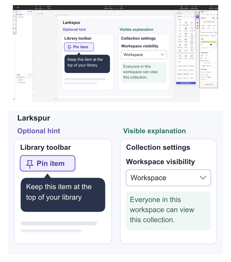
Walk through the example in a concrete order. First, inspect the library with all hints closed and identify the pin action. Next, show the hint, pin the item, and inspect the Unpin item state. Then open the sharing settings and explain who can view the collection without opening any hidden help.
That sequence reveals a useful distinction: a well-written hint can still be placed on the wrong surface. If a reviewer cannot explain the visibility choice without hovering, the solution is to expose the information, not to polish the tooltip.
Hand off the two action states, the final hint text, the visible settings explanation, and the opening and dismissal rules together. A small amount of explicit behavior makes the design easier to implement and gives reviewers a clear basis for deciding whether the tooltip helps.