Mockitt - Best Free Wireframe Tool
Helpful Tips About Wireframe
- How To Create A Wireframe
- Wireframe Tools You Should Know
- Wireframe Templates for Your Inspiration
- Free-to-use Wireframe Kit

Access-Denied UX: Account Choice, Requests, and Recovery
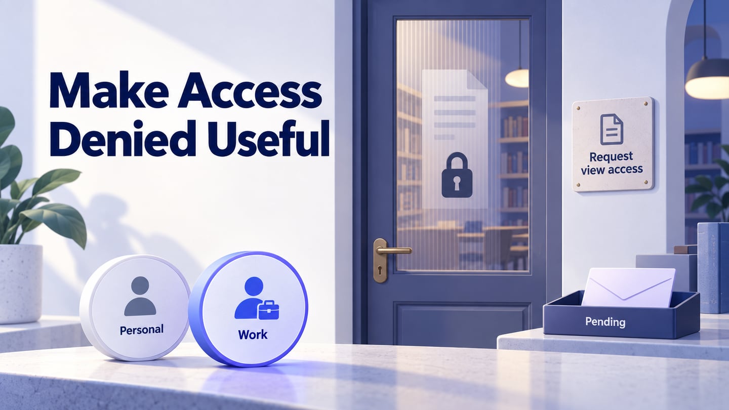
A colleague shares a useful document. You open it, see “Access denied,” sign in again, and arrive at exactly the same message. The page has identified a boundary, but it has not helped you understand whether you are using the wrong account, missing a permission, or following a link that is no longer available.
Access-denied UX should explain the next action a person can actually take without exposing information they are not allowed to see. For product teams, the useful design unit is the whole recovery journey: the blocked resource, account choice, an access request where permitted, and a clear result. Use an interactive prototype to review that recovery journey before treating the error screen as finished.
This guide follows a fictional editorial workspace called Fieldnotes. A contributor needs to read a Spring issue brief. The example illustrates interface decisions; its permission and disclosure rules are defined here, rather than presented as rules for every collaboration product.
Identify the access boundary before writing the message
“You cannot open this” covers several different situations. Sending everyone to a login page collapses those situations into one unhelpful instruction. Authentication establishes an identity; authorization determines what that identity may do. The OWASP authorization guidance treats those as separate concerns and calls for permission checks on requests. A hidden button or convincing prototype cannot perform those checks.
| What the product knows | Useful next step | Misleading response to avoid |
|---|---|---|
| No valid session | Offer sign-in, retaining an authorized return destination. | Ask for a permission request without identifying the requester. |
| A different account may have access | Show the current account and offer account choice. | Silently switch identity or send the person through the same login loop. |
| The current account lacks permission and requests are allowed | Explain the required access and offer a request. | Claim a request grants access immediately. |
| Organizational policy prevents access or requests | Explain the allowed route, if one exists. | Display a request button that can never produce a valid result. |
| The resource cannot safely be disclosed | Use a neutral unavailable message and a safe navigation option. | Reveal its private title, owner, membership or contents. |
These are product decisions, not a prescription to expose internal authorization errors. The system may intentionally give the same neutral response for a missing resource and a private one. Decide that disclosure policy with the appropriate product and security owners, then write the permitted explanation. Do not use a detailed error merely because it would make the screen more informative.
Make account choice visible without turning it into another login tutorial
Fieldnotes has personal and work accounts. In this example, a person opening a work link under a personal account sees “This item is not available to this account,” followed by the current account and a Switch account action. They do not see the document title, a list of its readers, or the owner's contact details.
After choosing their Fieldnotes work account, the person returns to the same intended resource. The product checks access again. Account choice is a recovery attempt, not proof of permission. If that work account still lacks view access, the screen should say so instead of returning to the account chooser.
The existing login UI design guide covers authentication forms and session recovery. Here, keep the focus on the handoff after identity has been established: retain the intended destination, show which account is active, and make the new access result understandable.
A recognizable account name is useful when users have several identities. In a real product, test whether an address, workspace name or avatar actually distinguishes them. Do not expose other accounts that the person has not authenticated, and do not let an arbitrary return URL send them to an untrusted destination.
Ask for the access needed for this task
Fieldnotes permits verified members of its editorial workspace to see the existence and title of this brief, even when they cannot read its contents. That explicit policy is why the work-account screen may now display “Spring issue brief.” A product with a different policy would keep the title hidden.
The contributor only needs to read. The action is therefore Request view access, not “Join,” “Become an editor,” or the vague “Fix permissions.” The screen names the active work account so the request is not sent under an unintended identity. An optional note can explain the purpose: “I am preparing the image captions for this issue.”
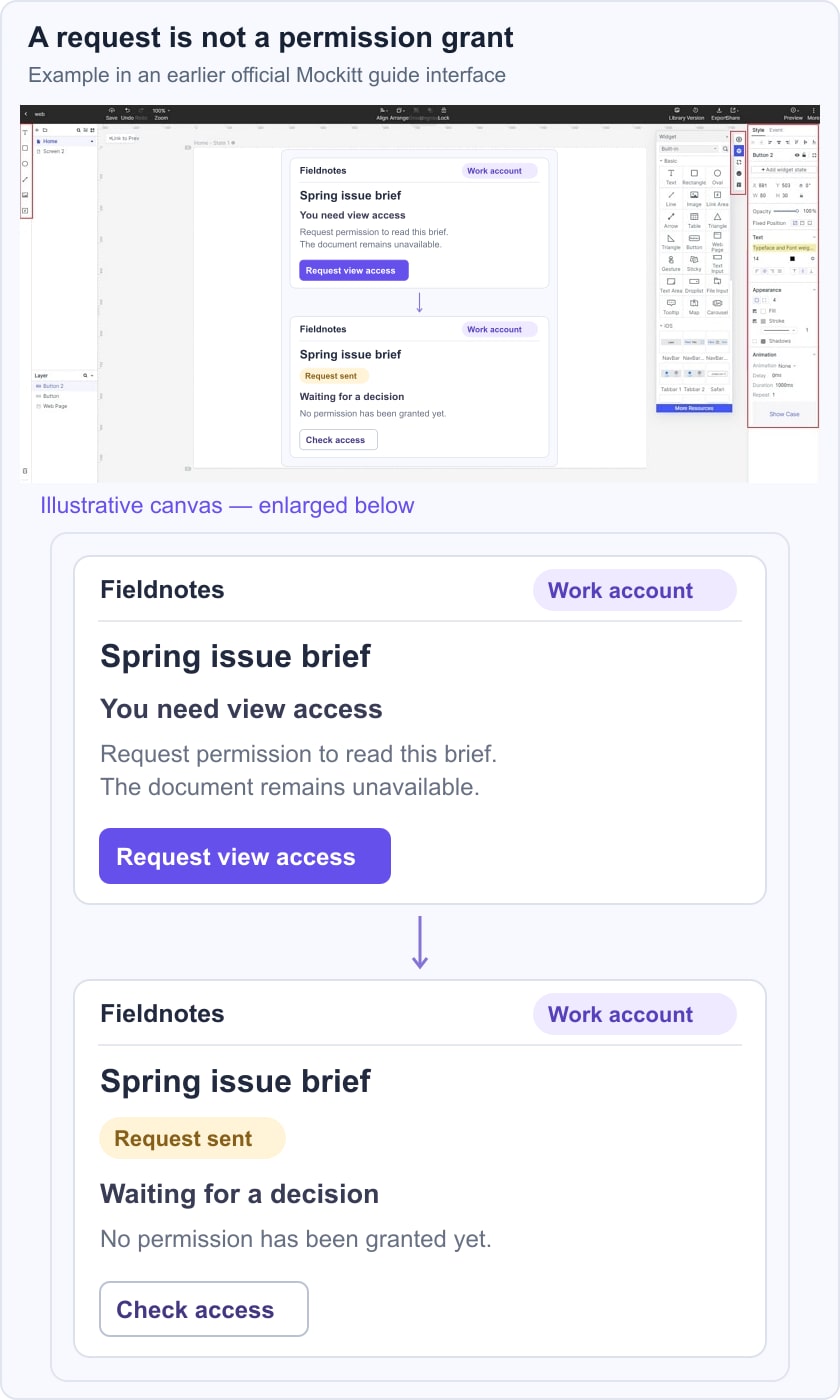
The example screen pairs Request view access with its resulting Request sent state, keeping the same work account and Spring issue brief throughout.
Keep the note optional unless a real decision requires it. Do not ask for personal information simply to make the form feel complete. Explain who receives the request at the level the product can safely disclose, and use a specific recipient only when that information is permitted and reliable.
Google Drive's access guidance provides a useful real-world example: account choice, access levels and requesting access are distinct parts of opening a restricted file. Its notification behavior also shows why an absent email is not enough to infer that access was granted or refused. Your product must define its own request and notification contract.
This is different from a team invitation and acceptance flow. An invitation is initiated by someone with authority to offer participation; this reader is asking for permission they do not yet have. Reusing invitation language can make a pending request look like an offer of access.
Keep “request sent” separate from “access granted”
After the request succeeds, Fieldnotes shows “Request sent” and “Waiting for a decision.” The brief remains unavailable. The screen offers Check access and a route back to the workspace. It does not show a success message that suggests the reader can now open the document.
The request button should not remain an easy way to send duplicates. On a later visit, show the existing pending request when that state is available. If the product permits another request after a refusal, define the condition: a changed reason, a changed access policy, or an explicit new request. Avoid creating a repeated-request loop that merely burdens the owner.
Use distinct messages for results the system can actually establish:
- Request sent: the service accepted this request. The permission has not changed.
- Still waiting: the latest request state is pending. Do not invent an expected response time.
- Request not approved: the decision is known. Show an explanation or alternative only when it is permitted and useful.
- You now have view access: a fresh permission check succeeded. Offer to open the original brief.
- We could not check access: the check failed or timed out. Preserve the current account and allow a retry without declaring a refusal.
A grant notification may be useful, but the opened page still needs a current access check. Permission can change after a notification is sent. Likewise, a failed network response after pressing Request should not automatically prompt another submission: first establish whether a request already exists, where the application supports that check.
Help the reader leave or continue with confidence
A full-page access boundary needs a clear heading and a safe way out. The original document body should not appear briefly while the page decides whether to hide it. Avoid showing a private preview, attachment filename or collaborator list behind a decorative lock overlay.
For Fieldnotes, “Back to workspace” is more useful than an unexplained browser-history action: the person may have arrived directly from an email. It provides a destination the product controls. The access page also keeps a visible account-switch option, because a person can still realize they chose the wrong identity.
In-place changes need to be perceptible beyond color. When Request sent replaces the form, use meaningful status text. The W3C guidance on status messages explains how relevant updates can be exposed to assistive technology without taking focus. A full page transition is a different interaction; do not apply a live announcement indiscriminately to every change.
Check keyboard order, visible focus and zoomed layouts in the implementation. The current account and request result should remain understandable when the message wraps on a phone. A small lock icon may support the message, but it should not be the only explanation of what happened.
Review the journey from a real link, not just an error-screen thumbnail
In Mockitt, prepare the specific screens needed to explain the Fieldnotes journey: a neutral personal-account block, the work-account view-access request, a pending result, and the outcome of checking access. Link the visible actions between those prepared states. Add a note wherever the intended result depends on a real permission service rather than the prototype.
Start the review by giving a participant the Spring issue brief link and the task of reading it to prepare captions. Observe whether they notice the current account, choose the work identity, understand that requesting access does not grant it, and know what to do while waiting. Then show a denied result and ask what they believe has happened. Their explanation is more useful than asking whether the error message looks clear.
Give developers the disclosure policy alongside the screens: which identities may see the title, which access level can be requested, how duplicate requests are handled, and what a fresh check must establish. Test those rules independently of the visual design. The intended outcome is a boundary that stays secure while giving an authorized person a comprehensible route forward.