Login UI Design: Prototype the Flow and Learn from Five Examples
A login interface helps returning users access an account when authentication is needed. It should make the available sign-in method and recovery options clear. Requiring login for every activity is not automatically useful or secure; decide which tasks require an account, then design the path into them and the recovery paths when something goes wrong.
Use a Prototype to Review the Login Flow
Mockitt can help you represent login screens and linked states before implementation. Use the prototype to review the instructions, hierarchy and next steps. A design tool does not implement authentication or prove that an account system is secure.
What to Represent in the Prototype
- Use widgets and reusable assets for labels, inputs, buttons and status messages. Keep the same field behavior consistent across related screens.
- Arrange elements on the canvas so the primary action and recovery links remain easy to find.
- Connect the sign-in action to the intended next screen and to relevant failure or recovery states. Use transitions only when they clarify the change.
- Share the design through the workspace options available to your team. Check permissions and plan limits; do not put real passwords or sensitive account data in a prototype.
- Review the flow with design, engineering and the people responsible for identity and security. Note which behavior is a visual proposal and which must be enforced by the actual service.
How to Create a Login UI
Follow these four steps from project setup to review. The screenshots show earlier Mockitt controls; current locations may differ. W3C’s accessible-authentication guidance also calls attention to support such as password managers and copy-and-paste, which should be verified in the implemented experience.
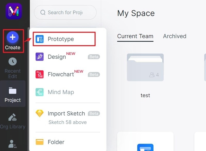
Step 1: Create a new project
- Create a project and name it for the specific sign-in task.
- Choose an appropriate canvas size and include the narrow layout your audience will use.
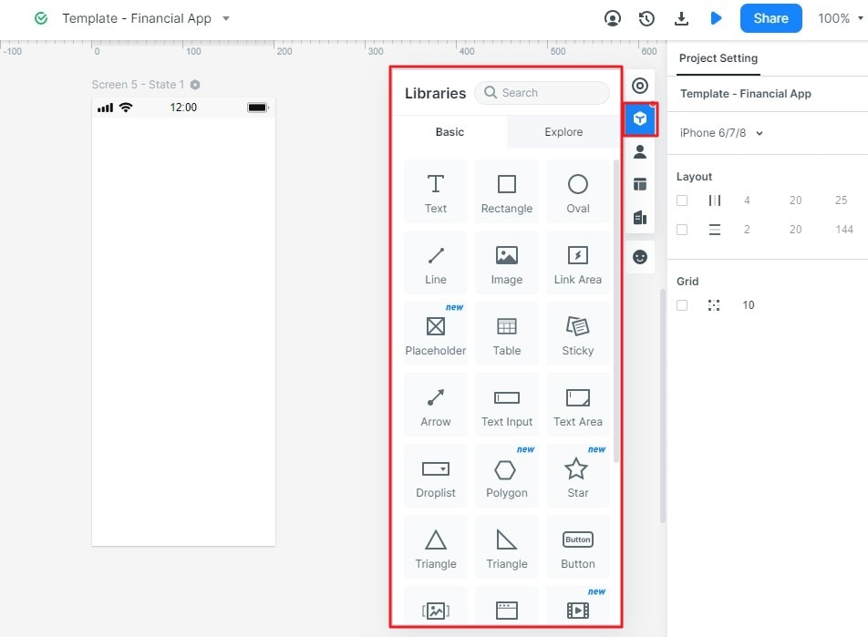
Step 2: Design Your Login UI
- Add labeled inputs, a primary sign-in button and an account-recovery link using the available widgets. Do not rely on disappearing placeholders as the only labels.
- Place the elements in a clear reading order. Check longer messages and text enlargement before assuming the layout fits.
- Reuse consistent field and button components across sign-in and recovery screens.
Connect the Entry and Recovery Paths
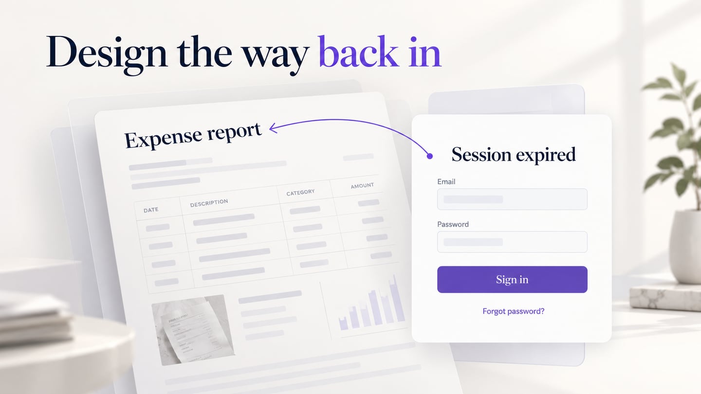
For a team expense portal, show a session-expiry message that explains the user will return to expense report ER-108 after signing in. Connect the successful sign-in state to that report rather than an unrelated homepage. Also include a Forgot password path and a way to return from recovery. The example is a proposed flow, not a working authentication service.
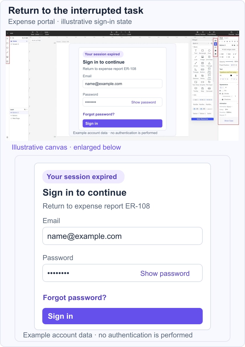
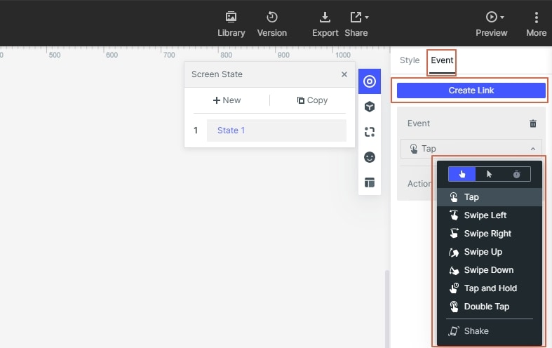
- Use the interaction controls to connect each action to the appropriate screen or state. Make the destination clear in the design notes.
- Include a failed sign-in response and a pending state. Agree with the security team on which account details an error may disclose; do not reveal whether an address exists merely to make a message more specific.
Document Rules That a Screenshot Cannot Show
- Note session handling, return destinations, supported sign-in methods and any unresolved security requirements. Separate these implementation rules from visual specifications.
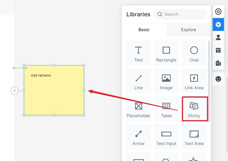
Represent the Necessary States
- Show default, focused, pending and error states consistently. A password-visibility control should have a clear label and state.
- Use additional screens or widget states to demonstrate behavior. Do not add animation to an error if it distracts from understanding or correcting the problem.
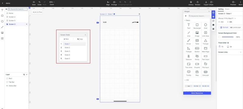
Step 3: Preview your UI design
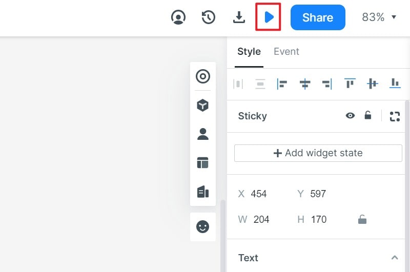
- Preview the sign-in and recovery paths at the target sizes. Ask someone to resume the interrupted report without explaining where to click, then review what happens when sign-in fails.
Step 4: Share your UI design
- Share the prototype and the open questions with developers. Inspecting layout and styling helps handoff, but identity integration, rate limiting and secure session behavior need separate implementation and testing.
- Before release, test the real form with keyboard navigation, password managers and assistive technology. A successful prototype review does not replace these checks.
Five Login Examples and the Decisions They Illustrate
These five familiar services illustrate different sign-in decisions. Their public sign-in interfaces can change by device, region and account context, so focus on the decision each illustrates. The observations below are from public pages and official help, not a completed account-login test.
- PayPal: The public sign-in page begins with an email or mobile number and offers recovery or alternative options. A staged approach can reduce the first screen’s complexity, but it must keep the account identity and the way back clear.
- LinkedIn: Its sign-in page exposes the account fields, password visibility and recovery alongside alternative methods. The useful lesson is to distinguish the primary task from alternatives without hiding recovery. Available methods can vary by context.
- Uber: The public authentication entry asks for a phone number or email and provides another sign-in method. Decide which identifier your own service supports and explain any verification step before it surprises the user.
- Spotify: The public login page presents an email entry and external-provider options. This illustrates a choice of paths rather than a universally optimal color scheme. Make it clear that a provider option must correspond to the account the person intends to access.
- Dropbox: Official sign-in instructions describe email and password, Google and Apple options. Keep account switching and the distinction between signing in and creating an account understandable.
Use these examples to examine identity entry, alternative methods and recovery, then adapt the decisions to your own service. A recognizable form is only the beginning: the full login flow also includes errors, session expiry and the task the user was trying to complete.