Mockitt - Best Free Wireframe Tool
Helpful Tips About Wireframe
- How To Create A Wireframe
- Wireframe Tools You Should Know
- Wireframe Templates for Your Inspiration
- Free-to-use Wireframe Kit

Tree Testing: Write Findability Tasks and Turn Wrong Paths into Better Labels
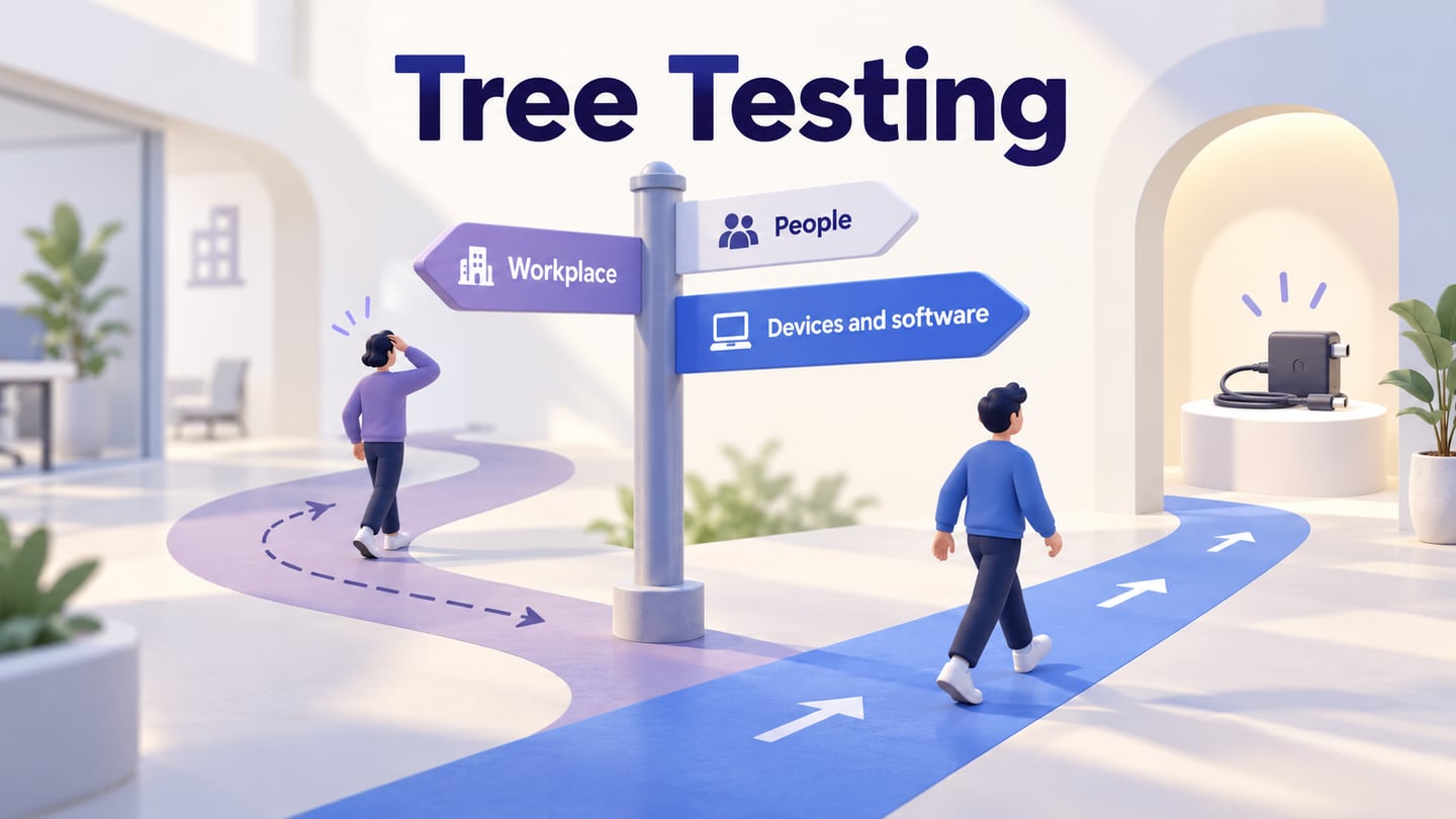
A help center can have an attractive menu and still send people to the wrong category. Before changing the menu's colors or layout, test the labels and hierarchy themselves. A tree test asks people where they would look for something in a simplified content structure, without the surrounding page design supplying the answer.
Use it after you have a proposed information architecture and specific findability questions. The useful result is a clearer account of which destinations people choose, how they get there, and what the team should investigate or revise. This guide works through a fictional employee-help center; its tree, tasks and route records are teaching examples, not findings from a completed study.
Choose a hierarchy question that a tree test can answer
A tree test evaluates a proposed category structure. It can help answer whether people expect equipment help under Devices and software or Workplace, or whether a label suggests the wrong destination. It cannot establish whether the final page contains a useful answer, a search engine returns relevant results, or a mobile menu is easy to operate.
NN/g's tree-testing method guide describes the deliberately simplified setup: a hierarchy plus tasks. Removing visual cues isolates the structure, but also removes assistance that a real site may provide. Keep that boundary in the research question rather than interpreting the result as a score for the complete product.
Choose the method from the decision. If you do not yet know how people group the content, exploratory grouping work may be more useful first. If you have candidate categories and want to evaluate where people look, tree testing fits. If the question concerns a menu's presentation, wording in its surrounding page or touch behavior, review the complete interface instead.
For the employee-help example, the decision is narrow: whether the proposed hierarchy gives staff a clear route to common equipment, remote-access and leave guidance. The study will not evaluate submitting an IT request or receiving a replacement charger.
Build a complete enough tree, with real competing choices
Extract the relevant categories and destinations from the current content inventory. Use stable node IDs in the research record so a later label change does not erase which destination was selected. Participants see understandable labels; researchers keep the IDs and destination mapping separately.
The illustrative tree has three main branches:
- Devices and software
- Accessories → Replace a charger
- Network access → Connect from home
- Software → Request an application
- Workplace
- Office access → Replace an entry pass
- Workspaces → Book a meeting room
- People
- Time away → Request annual leave
- Team information → Staff directory
Assign the three task destinations IDs such as D-12 for Replace a charger, D-21 for Connect from home and P-11 for Request annual leave. The IDs do not belong in the task prompts. Include plausible competing branches; a tree with only the correct route makes finding the answer artificially easy.
Do not stop at broad categories if the task requires choosing a particular resource. Conversely, do not invent a page for every phrase in a task. If the inventory has no guidance that resolves the need, that is a content gap to handle before claiming the hierarchy has a correct answer.
Where the same content legitimately has more than one location, record all acceptable destinations before the study. Keep the underlying content identity clear so that two routes to one maintained article are not mistaken for two separate pieces of guidance.
Write neutral tasks and define the answer privately
Give participants a believable need, not instructions for traversing your categories. “Open Devices and software, then choose Accessories” measures instruction following. The example below leaves the location open while making the need understandable.
- Charger task: “Your laptop charger no longer works. Where would you look to obtain another one?” Accepted destination: D-12, Replace a charger.
- Remote-access task: “You are working away from the office and cannot open an internal company service. Where would you look for instructions?” Accepted destination: D-21, Connect from home.
- Time-away task: “You want to arrange several days away next month. Where would you look to start that process?” Accepted destination: P-11, Request annual leave.
These are planning records. The participant receives only the prompt, not its destination ID or the accepted answer. During the pilot, check whether “internal company service” is too vague for the intended staff audience or whether the time-away scenario could reasonably mean a different kind of absence. Fix an ambiguous task before attributing every unexpected selection to the tree.
Some task words will naturally appear in destination labels. The concern is giving away the category or teaching the intended path. Preserve realistic user language instead of replacing familiar words with obscure synonyms just to avoid every textual match.
Define the endpoint clearly: participants select the location where they would expect to find the information, then indicate that they have finished. A click on a parent category is not automatically success if the actual study requires a leaf destination. Set that rule before reviewing responses.
Pilot the task flow before collecting evidence
Recruit people whose role and experience fit the content. Existing staff may know an internal label that a new starter would not. Keep those contexts visible instead of combining them into an unexplained average. Check that participants can operate the research interface with their required input and assistive technology.
Choose whether the round is primarily qualitative or quantitative. A moderated qualitative round can explore why a label was considered, but a small convenience sample does not establish a population success rate. A quantitative comparison needs an appropriate sample and consistent measurement rules. Do not choose a universal participant count merely because another project used it.
Rehearse opening categories, going back, making a final selection and starting the next task. Return to the agreed start state between tasks. Check whether earlier tasks expose labels that make later tasks easier; plan ordering or counterbalancing where that matters to the study.
A specialized research service can record routes automatically. A manually observed rehearsal can use a simplified clickable structure, but its notes and timing need a consistent procedure. Do not label an ordinary prototype as a built-in tree-testing system. The broader usability study plan provides useful guidance for participant context, neutral prompts and assistance rules.
For a moderated session, record an intervention when the moderator explains a category or supplies a location hint. That assistance changes the interpretation of completion. A task repetition and a correct-path hint are different events. Decide how you will distinguish them before the first session.
Read the route, not only the final answer
Destination success asks whether the participant finished at an accepted node. Directness asks whether the route involved backtracking or detours under the study's stated rule. A participant can arrive at the right place indirectly, or go directly to a wrong destination.
Consider these invented route records for the charger task. They illustrate coding; they are not a three-person research result:
- Example A — direct success: Devices and software → Accessories → Replace a charger, selected as the final answer.
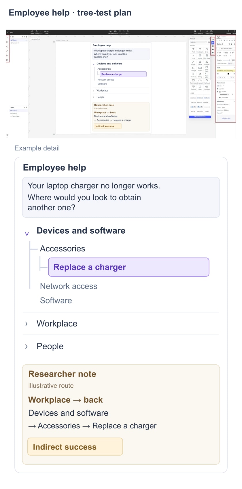
- Example B — indirect success: Workplace → back → Devices and software → Accessories → Replace a charger, selected as the final answer.
- Example C — direct failure: Workplace → Office access → Replace an entry pass, selected as the final answer.
All three records answer different questions. A reaches the intended destination without a detour. B reaches it after reconsidering the main category. C ends at a different resource without backtracking. Calling C “confident” would go beyond the route evidence unless the study also collected information supporting that interpretation.
The illustrated planning canvas separates the employee's charger task from a researcher note showing an invented indirect route to the intended destination.
NN/g's guidance on interpreting tree-test results explains why success and route effort should be examined together. Keep the calculation rules attached to the report: which destinations count, how directness is defined, and which sessions were assisted, interrupted or not evaluable. Do not quietly remove awkward cases to improve the result.
When real data is available, inspect first choices, final destinations and recurring return points for each task. Timing can add context, but a long time does not identify a cause by itself. Think-aloud, distractions, unfamiliar tools and the depth of a branch can affect it. Avoid treating a tool's overall score as an explanation.
Decide what to change, and what still needs investigation
A wrong route can have several causes. The category may be misleading, the content may live in an unexpected place, the task may be unclear, or the participant may be looking for information the tree does not contain. Separate these possibilities before renaming half the navigation.
For the fictional charger detour, a useful follow-up question is whether Workplace suggests all equipment used at work. If real observations and follow-up comments support that interpretation, one proposal could be to rename that branch Office and facilities, while keeping charger guidance under Devices and software. That is a hypothesis to evaluate, not a demonstrated improvement from the invented route log.
Record the decision in a short, traceable form:
- Evidence: the actual task, tree version, route pattern and relevant participant explanation.
- Interpretation: what the pattern may mean, with competing explanations retained.
- Proposal: the precise label or location change, including affected sibling content.
- Next check: how the team will test whether the revised structure supports the intended tasks without breaking neighboring ones.
If a change moves an entire branch, inspect every destination it contains. Solving the charger task at the expense of software requests is not a complete improvement. When comparing versions, retain equivalent tasks and study conditions and account for learning from seeing the first structure.
Card sorting and tree testing serve different purposes. Unexpected groupings may justify further exploratory research; another tree test evaluates a particular proposed revision. Neither method requires pretending that a single category arrangement is universally correct.
Restore the full interface before finalizing navigation
Once the structure has a defensible direction, put it back into its real context. Build the relevant navigation screens in a Mockitt prototype, with page headings, useful content and the intended return routes. This stage explores the complete interface; it is no longer an isolated tree test.
For the employee-help example, show the proposed main categories, the Accessories list and the Replace a charger page. The destination should confirm the task and provide the actual next step. Add the routes people will really have, such as search or a relevant link from a device page, rather than forcing everyone through the home page.
Use the navigation design guidance to review presentation, keyboard behavior and narrow-screen access. Then test representative complete tasks. A clear tree can still be undermined by a hidden menu, inaccurate page content or an inaccessible control.
Keep the final research record practical: the question, tree version, tasks and accepted nodes, participant context, method, route findings, limitations, proposed changes and follow-up owner. That gives the team a reason for its category decisions and a way to revisit them as the content grows.