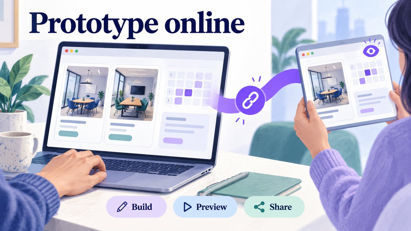
Creating a prototype online lets you arrange screens, connect a user journey, and share a browser preview for feedback. The useful output is a task someone can try. This walkthrough follows a meeting-room reservation: a colleague chooses a room, selects a time, checks a summary, and returns to change the choice. It covers project creation and the access checks needed before sending the link.
You can start with a blank project or adapt a suitable template. Decide which screens the reviewer needs before choosing visual details. For the product’s capabilities and access options, see the Mockitt online prototyping tool; this article focuses on the workflow from an empty project to a usable review link.
Set Up a Browser-based Prototype Workspace
Mockitt provides a browser workspace for building interface screens and connecting them into a prototype. You can use it for a website or an app concept without implementing the underlying service. In the room-booking exercise, the prototype shows selection and confirmation; it does not reserve a real room or connect to an office calendar.
Keep the working file and the review version easy to identify. Name the project “Room booking — review draft” and agree who can edit it. Reviewers should know whether they are commenting on the current design or on a version whose decisions are already approved. Collaboration is useful when feedback refers to the same screen and task, not merely when several people can open a file.
Choose canvas dimensions that match the device you intend to review. A desktop booking form and a phone booking form need different layouts, even if they describe the same task. A device preset sets the design area; it does not prove compatibility with every browser, operating system, or production screen size.
Use editable text, buttons, fields, and reusable widgets to build the first route. Keep real room names and booking data out of a public example unless you are authorized to share them. Fictional rooms such as Cedar and Maple are enough to evaluate whether the selection is understandable.
Create and Connect the Booking Prototype
Build one complete route before expanding the file. For this exercise, use three screens: Rooms, Choose a time, and Booking summary. Add one alternate state for an unavailable time slot. The screenshots below show an earlier Mockitt interface, so current control positions may differ; follow the sequence of project creation, sizing, widgets, and preview.
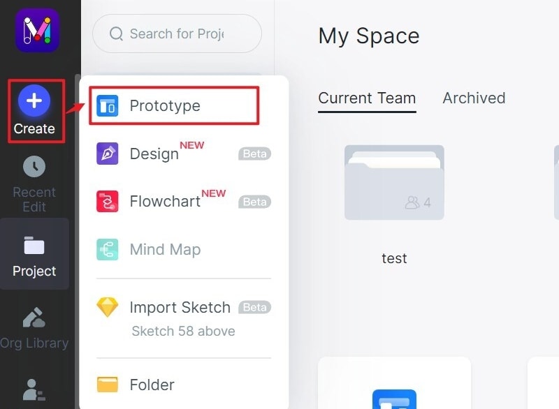
Step 1: Open Your Workspace
- Open Mockitt from its current website and sign in or create an account. Confirm which personal or team workspace owns the draft. This matters later: the file’s sharing permissions can affect whether an outside reviewer can open it.
Step 2: Create and Name the Project
- Create a prototype project and give it the room-booking name. Use a blank project for this exercise so every screen has a clear purpose. If you start from a template, remove unrelated sample navigation before the review rather than leaving attractive but nonfunctional controls in the path.
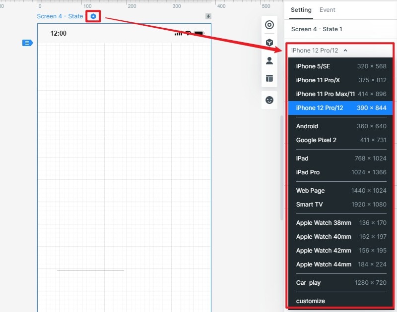
Step 3: Choose the Review Viewport
- Choose the device type or canvas size for the first review. A desktop layout could show the room list and details side by side; a phone layout should show the selected room and next action in a narrower sequence. Use realistic labels, including a long room name, to reveal wrapping problems early.
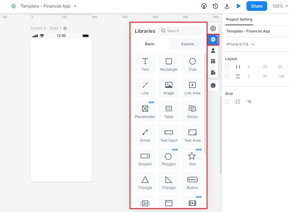
Step 4: Add Content and Link the Screens
- On Rooms, add two room cards with capacity and equipment details. Use a clear action such as “Choose Cedar.” On Choose a time, show the selected room and several time slots. Booking summary should repeat the room, date, and time so the participant can check the result without remembering the prior screen.
- Edit widget properties to make labels readable and controls consistent. Keep the room title, selected time, and confirmation action visually distinct. If a label wraps, adjust the layout rather than shrinking all text to fit.
- Drag the widgets you need onto the canvas and reuse the same button treatment across the route. Mark an unavailable slot with text as well as a visual state. Do not make color alone carry the difference between available and unavailable.
- Connect Choose Cedar to Choose a time, and connect a selected available slot to Booking summary. Add “Change time” on the summary and link it back to the selection screen. Model the unavailable slot as an explicit state with a way to choose another time. To demonstrate two available times without data logic, make two summary variants and connect each slot to the matching one. These page connections are interactions; wireframing alone does not make the screens clickable.
Step 5: Preview, Set Access, and Share
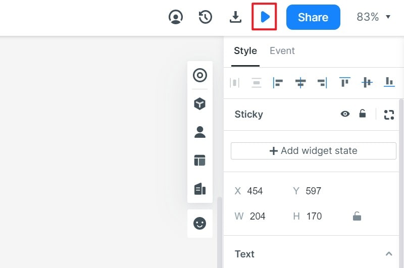
- Preview from Rooms and follow the full route before sharing. Then open Share, choose the appropriate audience, and copy the review link. Use the available presentation view when you want someone to try the interactions. A QR code is another way to open that link on a phone; it does not change the file permissions.
Check the Link as a Recipient
Open the copied URL in a separate browser session using the access level your reviewer will have. A link that works for the owner can still fail for someone outside the team. Check that it opens the intended screen, contains the intended screens only, and allows the expected viewing or commenting action. If it fails, verify the current share link, file location, and audience settings before asking the reviewer to try again.
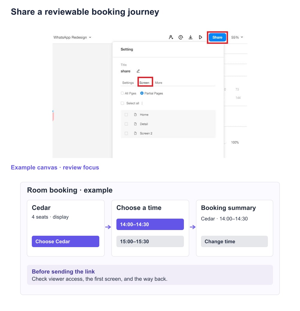
Keep the review invitation short and specific: “Choose a room for four people, select an available afternoon slot, then change that slot before finishing. Tell us where you expected a different result.” Include the draft name and the decision you need. A general request to “take a look” rarely produces feedback you can act on.
| Review check | Expected result | Record after trying it |
|---|---|---|
| Open the link as the invited reviewer | Rooms is visible at the intended access level. | Browser/session, starting screen, and any access message. |
| Choose Cedar and a time | The summary names the same room and time. | Any mismatch or ambiguous selected state. |
| Choose an unavailable slot | The state explains the issue and offers an available choice. | The participant’s next action and any point where they are stuck. |
| Change the selection | The participant returns to time selection and can complete the route again. | Whether the resulting summary reflects the revised choice. |
This is an example review record to complete, not a claim that the flow has been user-tested. Save the observations with the screen name and the draft identifier. If the design changes during review, note what changed before interpreting another person’s feedback.
Make the Online Review Useful
The shared file should make it easy to answer the question you started with: can a colleague select a suitable room and recover from a changed choice? The following refinements keep the review focused.
Keep one route recognizable.
Use consistent screen names and action labels from the list through the summary. The participant should be able to explain which room they selected and what remains to be done. Add context where the task needs it; a short route is not useful if the choices are unclear.
When two controls look similar, make their outcomes explicit. “Change room” and “Change time” should return to different choices. For deeper checks of triggers and local states, use the clickable prototype testing walkthrough.
Make feedback specific.
Show the selected room and time before the final action. On the unavailable state, explain why the choice cannot continue and what the participant can do instead. Do not hide important confirmation information merely to remove a click.
Use motion when it explains a change.
A modest transition can show that a details panel opened or that the user moved to the summary. It should not delay the next action or distract from a validation message. First verify that the route works without relying on motion.
Low-fidelity prototypes can still contain interactions; fidelity describes the level of detail, not whether a button can be clicked. Add only the visual detail needed for the current review question, then improve the design after you understand the feedback.
Hand Over a Clear Review Task
An online prototype is ready for review when the recipient can open it, follow the intended task, and describe a problem against a specific screen. Keep the route small enough to revise, use the same test after each meaningful change, and summarize what the team decided. The next iteration should answer an unresolved question rather than simply add more screens.