A functional prototype demonstrates how part of a product behaves. Someone can make a choice, see a response, and complete a task instead of looking at a set of disconnected screens. For a digital product, that might mean selecting a seat, changing the selection, and reaching a reservation summary. It does not have to process a real booking to answer a useful design question.
The important choice is which behavior must work. Use Mockitt's interactive prototyping tools when you need to explore screens, controls, and transitions. Use a working technical implementation when the unanswered question depends on real data, device hardware, or service performance. This guide follows a seat-reservation example from a simple task statement to a testable flow.
What Does a Functional Prototype Need to Do?
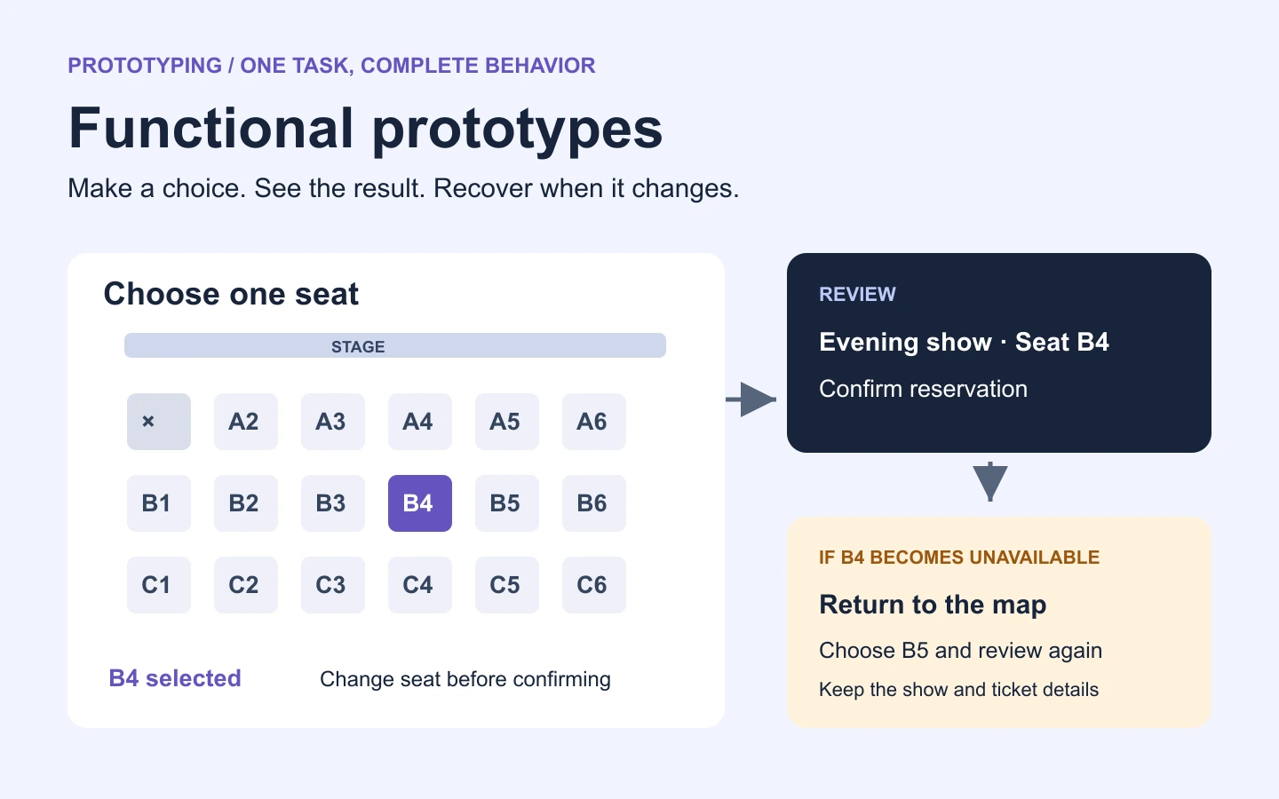
A functional prototype needs enough behavior to investigate its intended question. A seat-selection prototype might let a person choose seat B4, see it in a summary, change to B5, and confirm. A separate branch can show what happens if a seat becomes unavailable. These interactions reveal whether the selection and recovery are understandable; they do not establish that a booking service can prevent two people from buying the same seat.
Agree on the scope before building. “Make the reservation flow work” is too vague. “Let a person select one available seat, change it before confirmation, and recover when that seat is unavailable” gives the team a clear boundary. Payment processing, account creation, and live inventory can stay outside that boundary unless they affect the decision.
Functional and high fidelity describe different qualities. A plain mid-fidelity prototype can demonstrate a complete task, while a polished screen may have no working interactions. The word “functional” also appears in hardware development, where the model may contain working physical components. Here, the focus is a digital interface and its behavior.
Choose How Much of the System to Build
Match the model to the uncertainty. There is little benefit in building a database to find out whether people can distinguish available and unavailable seats. Conversely, a sequence of linked screens cannot tell an engineer whether concurrent reservations will be handled correctly.
| Question | Useful prototype | What it can show |
|---|---|---|
| Can people select a seat and change their choice? | Linked screens and local states | Labels, navigation, selected state, and recovery |
| Does the interface respond sensibly to different reservation outcomes? | A prototype with deliberately modeled success, unavailable, and retry branches | The proposed response to each outcome |
| Can two requests reserve the same seat? | A technical prototype connected to a test reservation service | Actual concurrency behavior under the tested conditions |
| Can customers complete real bookings reliably? | A tested implementation with the required operational controls | End-to-end behavior beyond a design prototype |
A proof of concept usually investigates feasibility; a functional design prototype investigates selected behavior; an MVP delivers a limited product to real users. The boundaries can overlap, but the evidence is different. Decide whether you need to learn about the interface, the technology, or actual use before choosing the artifact.
How to Build a Functional Prototype: A Seat-Reservation Example
1. Define the task and the sample data
Use this task: “Reserve one available seat for the evening show. Check the selection before confirming, and choose another seat if the first one is unavailable.” Create a small seat map with rows A–C and seats 1–6. Mark B4 and B5 as available, A1 as unavailable, and use one fixed ticket price throughout the example.
Write down the rule for a single selection: choosing B5 replaces B4 rather than adding a second ticket. Also decide when the selection becomes a reservation. If the summary is only a review step, label its action “Confirm reservation,” not “Done.” These details make the example coherent enough to test.
2. Prepare the screens and states
Create a seat map, a reservation summary, a confirmation, and an unavailable-seat state. Use names that describe the result, such as “Seat map — B4 selected” and “Summary — B4.” Matching names help you inspect destinations when several screens look similar.
| State | What the person sees | Available next action |
|---|---|---|
| No seat selected | Seat map, availability key, and selection instruction | Select B4 or B5 |
| B4 selected | B4 identified in both the map and selection summary | Choose B5, continue, or clear the selection |
| Review selection | Show, seat, and total displayed together | Confirm or change the seat |
| Seat unavailable | “Seat B4 is no longer available. Choose another seat.” | Return to the map with B4 unavailable |
| Reservation confirmed | The chosen seat and a sample reference number | Return to the start for another test |
A local state is useful when the person remains on the same screen, such as selecting a seat or opening its details. A new screen is useful for a different stage, such as reviewing the reservation. Use whichever representation keeps the behavior clear; duplicating an entire screen for every small visual change quickly becomes difficult to maintain.
3. Make the controls and content consistent
Build the map from editable controls and labels. Identify unavailable seats with a symbol or text as well as color. Make the selected seat unmistakable and repeat its name in the summary, so the participant does not have to infer the selection from color alone.
Use the same show, seat number, and price on every connected screen. A summary that suddenly changes B4 to C2 creates an artificial usability problem. Add useful detail where a decision depends on it: if the seats have different prices or obstructed views, the prototype needs that information before confirmation.
Keep the visual treatment restrained until the route works. Typography and spacing should make the content readable, but a background illustration will not help you discover a missing change-seat action.
4. Connect each action to its result
In Mockitt, select the control that starts an interaction and connect it to its destination. The public interaction guide describes page transitions, screen states, and widget states, including the lightning-handle connection method. Start by linking the selected-seat screen to its matching summary; then add the return and unavailable-seat branches.

For the seat example, wire “Change seat” back to the map, not to the beginning of the entire booking flow. Model the unavailable outcome as a separate test branch. This lets you ask a participant to recover from the problem without depending on a live inventory service. Note which branch to use in the test setup so every session starts with the same conditions.
The editor image illustrates an earlier Mockitt interface. Its useful relationship is the control, connection, and target screen; the travel content is not the seat-reservation exercise. Keep the actual seat states and expected results in the prototype you build.
5. Preview the whole task before sharing
Start from the empty seat map. Select B4, open the summary, change to B5, and confirm. Then restart and run the unavailable-seat branch. Check that the summary always reflects the selected seat and that the error leads to a usable map rather than a dead end.
Inspect the shared preview separately from the editor. A connection may be correct while the shared link opens at the wrong screen. Confirm the starting point, access settings, and reset route before inviting someone to try the task. Use a link and sample data intended for review, rather than asking participants to enter their real account or payment information.
Test the Behavior, Then Decide What to Change
Give the participant the goal, not a sequence of button names: “You want one seat for the evening show. Find a seat you would choose and reserve it.” Watch the first selection, the review step, and the response to the unavailable-seat message. Ask what they think happened when they reach confirmation.
A useful record connects an observation to a design decision. For example, if someone selects B4 and then B5 but believes both are selected, inspect how the first selection clears. If they return to the map after the error and repeatedly choose B4, make its new unavailable state clearer. These are possible findings to look for, not results from a completed study.
| Observation | Question to investigate | Likely design area |
|---|---|---|
| The participant searches for a price after selecting a seat | Was the price visible at the moment of choice? | Seat detail and summary hierarchy |
| The participant confirms the wrong seat | Did the selected state and summary agree? | Selection feedback and content consistency |
| The participant cannot continue after an unavailable-seat message | Does the message offer a clear return to the map? | Error copy and recovery interaction |
| A button does nothing | Is the design unclear, or is the prototype connection missing? | Separate prototype defects from usability findings |
Repair broken links before interpreting the session. A participant's difficulty with a missing hotspot tells you little about the intended design. After a change, repeat the same task and keep the earlier observation so you can explain why the design changed.
What to Hand Off to Development
Share the editable prototype, its starting point, the state table, and a short list of unresolved rules. For this example, engineering still needs to decide how long a seat is held, what happens when availability changes during review, and how a confirmed reservation is stored. Link those rules to the affected screen rather than leaving them in a general comment.
Mark the modeled outcomes clearly: B4 unavailable is a scripted example; the reference number is sample content; the production service must decide the real result. A design handoff checklist helps keep screen behavior, content, and implementation dependencies together. This preserves the prototype's value after the design review.
Common Questions
Does a functional prototype require code?
No. Linked screens and states can be sufficient for a navigation or comprehension question. Code becomes useful when the behavior you need to investigate depends on real calculations, input processing, device behavior, or a service integration.
How is it different from a clickable prototype?
“Clickable” describes how someone interacts with the model. “Functional” emphasizes the behavior it demonstrates. A clickable prototype can be functional for a defined task, but a set of links alone does not guarantee that all the important states are represented.
Is a function prototype the same thing?
No. A function prototype in a programming language is a declaration used in code. It is a different topic from a functional product prototype. For digital product design, start with the user task and build only the behavior needed to investigate it.