How to Create Carousel in HTML and CSS
Website carousels or "sliders" are a popular element in modern web design. Shifting banners all occupying the top real estate of your homepage layout conveys a sense of dynamism, diverse imagery, and an opportunity for multiple different clicks to actions. Users can scroll through each image or video by swiping on mobile devices or clicking the left-right arrows on desktop. Carousels have gained immense popularity and it is almost imperative for any web designer to be able to design a carousel in html.
- Part 1. How to Create Carousel in HTML and CSS
- Part 2. The Best Tool to Create Carousel and Generate HTML Code [Recommend]
Here is a specific video guide for creating carousel in HTML and CSS with
How to Create Carousel in HTML and CSS
Following is a step by step guide to create carousel HTML CSS -
1. Define a parent
2. Let us now add CSS to ensure that the slide’s full height and width fits the space
3. To animate the slides in and out, namespace this as a separate class 'slide-in', which you will need to add to slides that you want to animate in.
4. To activate a slide as the current slide you need to add id's to all of your slide items. These id's can then be targeted via the hash url
5. So now you should be able to add #item1 to your url and see the item change. Next we need to add some controls so you don't need to type the url
6. By clicking a control, it will change the hash url to an id, which will target the correct CSS and show the slide. Add some styling to the controls so they align to the bottom and center of the carousel
You can also achieve the carousel effect, by using bootstrap. The Carousel plugin is a component for cycling through elements.
The Best Tool to Create Carousel and Generate HTML Code
Designers love to focus on creative ideas and experiments. Rarely do you find a designer who loves to play with HTML and CSS tags. It is also extremely complex to manually write carousel HTML CSS. However, at the same time it is imperative to provide a seamless handoff to your development team.
If you are wondering how to make carousel in HTML quickly, Wondershare Mockitt should be your obvious choice. It is an extremely powerful design tool that comes with a wide variety of easy-to-use design resources.

Main Features of Mockitt:
- Comprises a library of 500+ icons, components, screens, and templates with constant updates and refreshes from the user community.
- Comes with a carousel widget enables to complete a prototype in under 10 minutes and does not require any learning curve for beginners.
- Team members can freely synchronize progress and collaboratively view and edit the same project.
- The handoff feature, enables a seamless handoff of html and css specifications to developers. You can go back and forth with your design.
- Helps maintain up to 10 records of the same project and you can revert to any of your previous versions easily.
Here is a step-by-step guide to create carousel with HTML and CSS:
Step 1. Create a Project
Visit the official website of Mockitt and sign up or sign in as appropriate.
Create a new project by clicking "Create" > "Prototype" button and choose a layout (say Webpages). A new canvas is launched for you.
Step 2. Add a Carousel
Click the "Built-in" icon to open the widgets toolbar. You will find a "Carousel" widget.
Drag out the carousel component from the built-in component (shortcut key 1). A picture placeholder automatically appears on the right setting panel. You can choose to upload from "local upload" or "material library" by hovering on it.
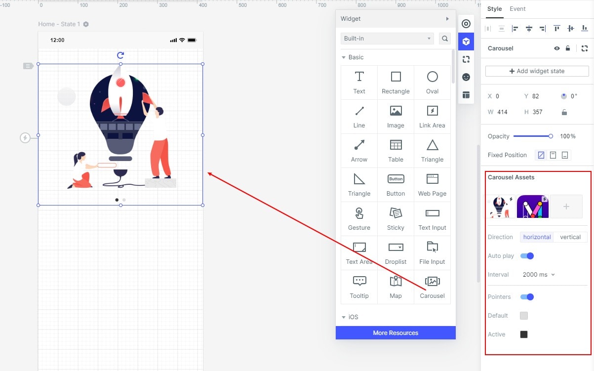
- You can adjust the order of the carousel pictures by dragging and dropping pictures directly on the thumbnail.
- You can set the carousel scroll to horizontal or vertical based on your preference and design requirement. The indicator point will automatically be assigned to the appropriate position.
- The "Carousel" widget also provides an option to set the carousel rotation. You can choose to set the interval between the rotations to auto-rotate. You can also choose to click the carousel and mandate a click on the carousel to jump to other pages.
- The indicator point is also fully customizable. You can choose whether to display the indicator point or get rid of it. You can also color it as per your design.
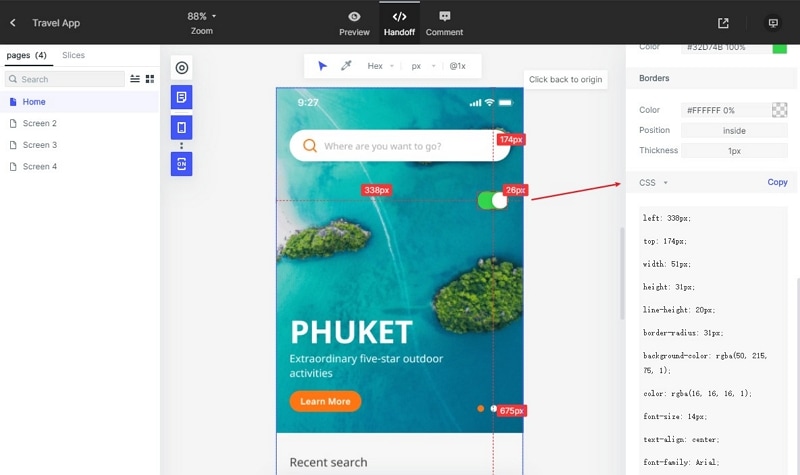
Step 3. Generate HTML and CSS for the Carousel
Once your carousel design is complete, it is likely that you will need to handoff the design and associated specifications to your development team. You can use the "Handoff" tab to grab all the specifications. The right panel will display the CSS specifications. Click on "Copy" and share the styling with your developers.
That's it! Indeed, it is that simple to create carousel with HTML and CSS in Mockitt.
