A web banner is a promotional unit that communicates a message and gives the reader a next step. It may appear within your own site or in an advertising placement with its own delivery rules. Start with the message, audience and available space. Unlike a page’s hero image, a banner often has to make sense in a compact slot beside other content. Its design should explain the offer without promising a particular click or sales result.
How to Design a Web Banner
Use Mockitt’s design workspace to arrange the banner’s image, text and action, then compare how that hierarchy works at the intended sizes. Components and reusable styles can keep related versions consistent. A visual prototype is useful for review, while the final image, HTML creative or advertising package must meet the requirements of the publishing destination.

Before opening a template, write a small brief: what is being promoted, what the reader needs to know and what the action leads to. For a Community Book Fair banner, the essential content is the event name, its day and opening hours, and a route to the programme. Use the following workflow to turn that brief into a reviewable design.
- Choose the working space. Create the project where the appropriate collaborators can review it. Name the banner set for the campaign or event so it is not confused with the destination page.
- Create the placement variants. Start from a suitable template or blank canvas. Record the required dimensions or aspect ratios from the publisher’s brief; do not assume that one familiar banner size applies everywhere.
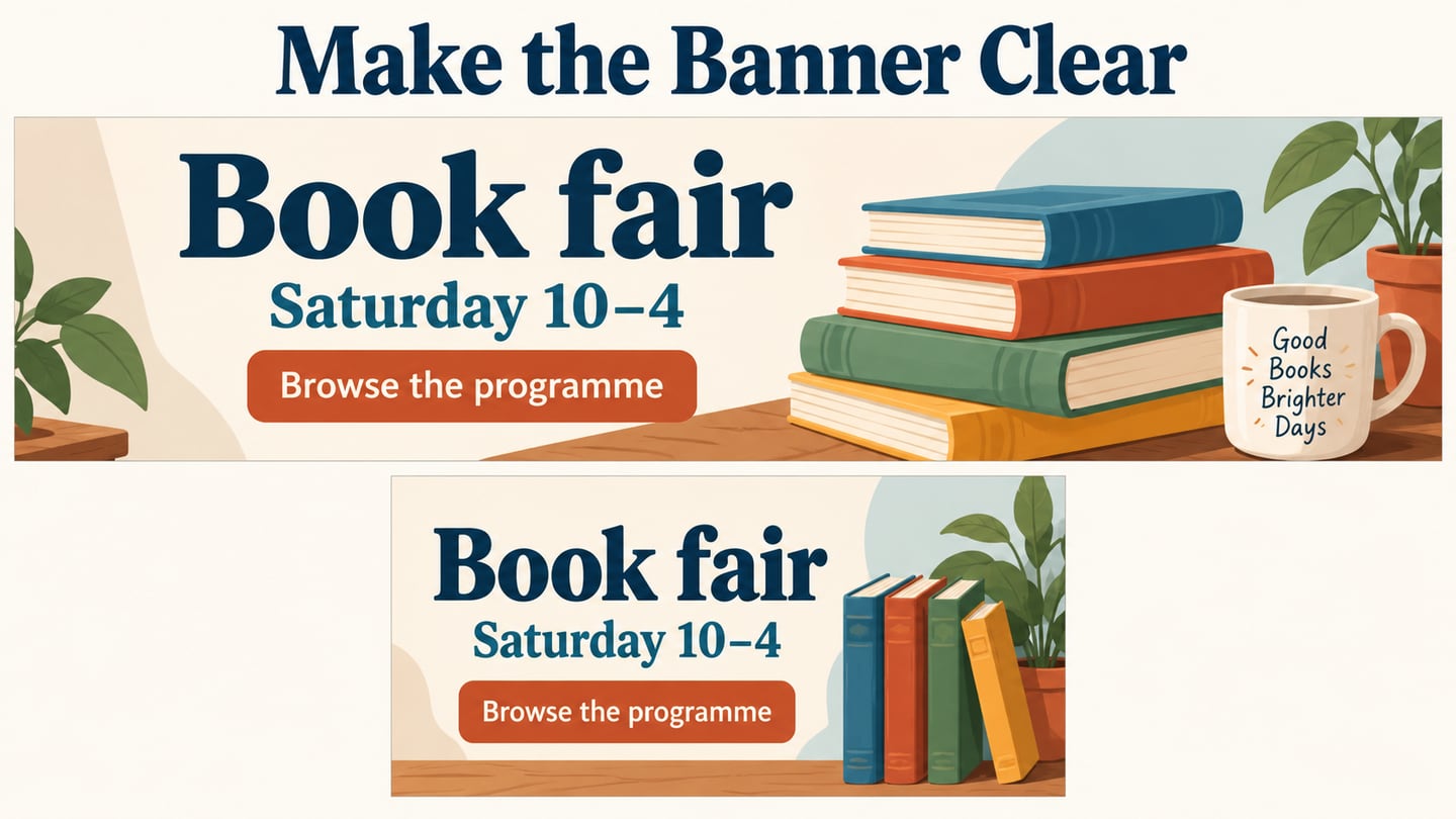
- Arrange the message. Put the main proposition, essential detail and action into each version. A wide slot may place them beside one another, while a compact rectangle may need a short vertical sequence.
- Add the image and supporting elements. Use a relevant image or simple illustration. Bring in an icon only when it adds meaning, and leave enough space that it does not compete with the message.
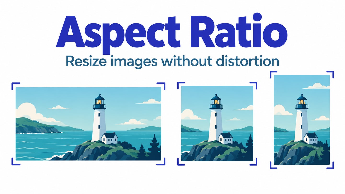
- Adjust the composition. Set dimensions deliberately, then refine type size, spacing, color and image crop. Recompose for each placement instead of stretching the entire design, which can distort imagery and make text hard to read.
- Plan any motion. If animation helps explain the offer, storyboard its sequence and decide what remains understandable without it. Include a static presentation where needed and check the destination’s format rules.
- Ask for specific feedback. Have a reviewer identify the offer and intended next step. Attach comments to the relevant composition, then resolve unclear wording or hierarchy. Connecting a comment to a preview control does not create banner behavior.
- Preview and hand off. Inspect each variant at its intended display size. Check that the action matches the destination and that required text remains readable. For an HTML creative, the separate implementation work can be done in a tool such as Google Web Designer; verify the exported result in its delivery environment.
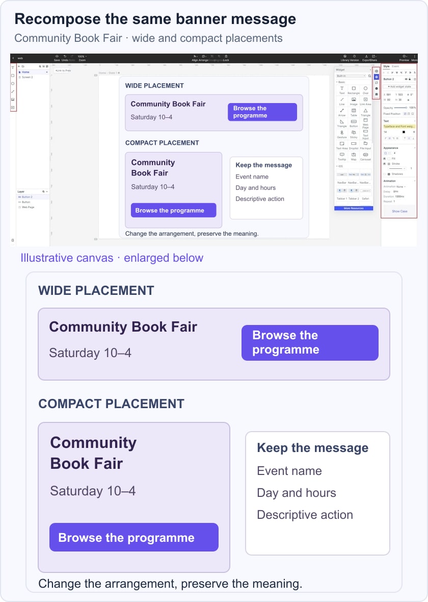
In the illustrative Book Fair pair, the wide version places the event title, “Saturday 10–4” and “Browse the programme” across the available space. The compact version stacks the same content. The message is preserved while its layout changes, giving reviewers a clear comparison rather than two unrelated designs.
5 Web Banner Design Principles
These five principles help you review the composition against its purpose. Use them together: simpler content still needs readable typography, and an attractive color combination still needs a clear action.
1. Keep the Message Simple and Clear
Choose one main message for the banner. A book fair promotion does not need the event’s full history, all exhibitors and every logistical detail in the smallest slot. Keep the title, necessary timing and a descriptive action, then let the destination page provide the rest. Simplicity means prioritizing information, not stripping away context. If a reader cannot tell what the event is or what the button does, the composition is too vague even if it looks minimal.
2. Give Animation a Purpose
Motion can reveal a sequence or draw attention to a change, but it does not guarantee more clicks. Do not hide the only useful message in a frame that disappears too quickly. W3C’s Pause, Stop, Hide guidance addresses automatically moving content that lasts more than five seconds alongside other content, subject to its stated conditions. Consider user controls, a clear resting frame and the destination’s animation rules before choosing an effect.
3. Make the Typography Work at Display Size
The headline, supporting detail and action have different jobs. Establish that order through size, weight and spacing rather than using a new typeface for every line. Read the actual words at the smallest intended placement: a short event title may fit while a translated title or date range does not.
Choose a typeface with clear forms at the required size and use a small, consistent set of styles. If a line becomes too small, simplify the wording or change the layout before compressing the type. Keep essential conditions close to the message they qualify.
4. Let Imagery Support the Offer
A relevant photograph or illustration can explain the subject quickly. For a book fair, a simple arrangement of books supports the event message; a busy unrelated lifestyle photograph may consume space without adding useful information. Keep the focal point clear and reserve enough quiet area for the words.
Image crop is part of the composition. A wide crop and a compact crop may need different framing to preserve the same subject. Check that text does not cross a face, an important product detail or a high-contrast edge. Decorative texture can set a tone, but it should not make the offer harder to read.
5. Use Color for Hierarchy and Readability
Choose colors that fit the identity and separate the important elements. The action should be distinguishable from surrounding content without depending on a claim that a particular hue always converts better.
Text contrast depends on the actual foreground and background, including any image beneath the text. Check ordinary text against the 4.5:1 criterion and large text against 3:1 where that criterion applies. Red, blue or another hue does not produce the same emotion for every audience or context.
A monochromatic scheme can leave the image prominent while using lighter and darker values to organize the message. Review the action, supporting detail and background together. The IAB Tech Lab’s ad portfolio uses aspect ratios and size ranges for flexible formats; always reconcile the design with the actual publisher’s brief rather than treating a mockup dimension as a universal specification.