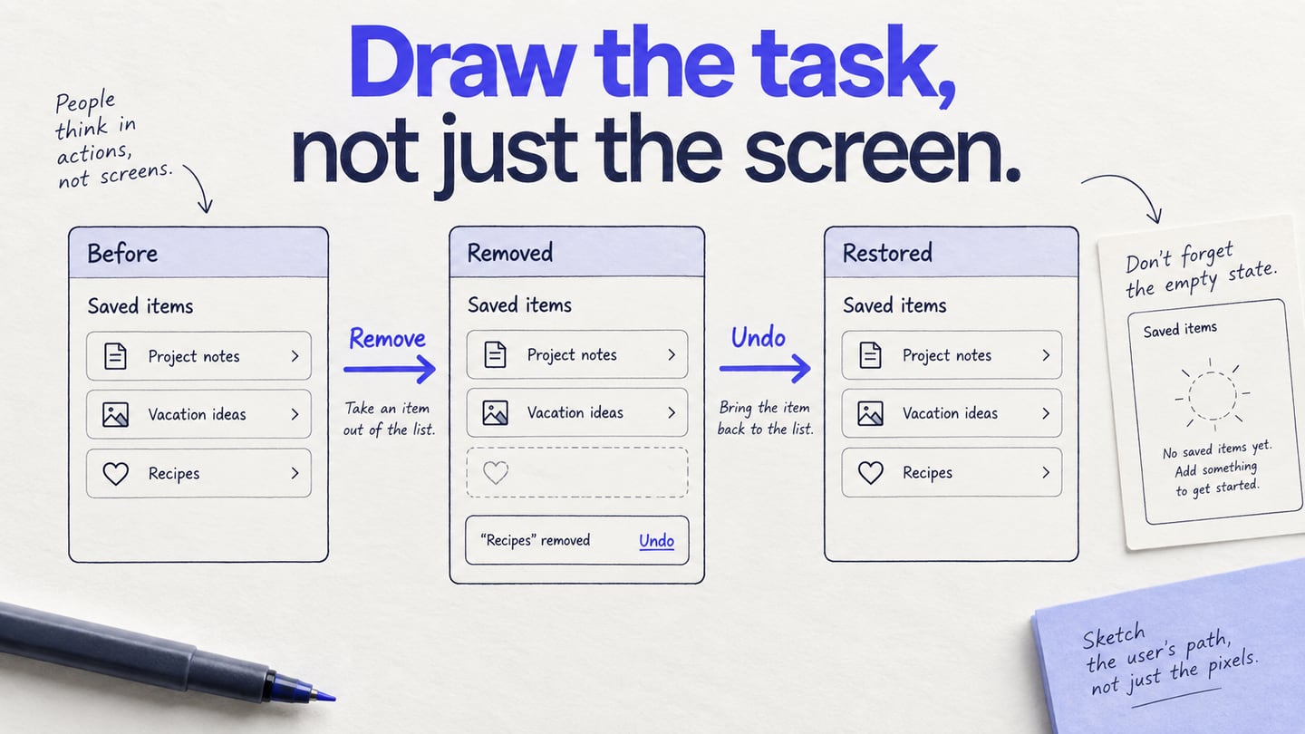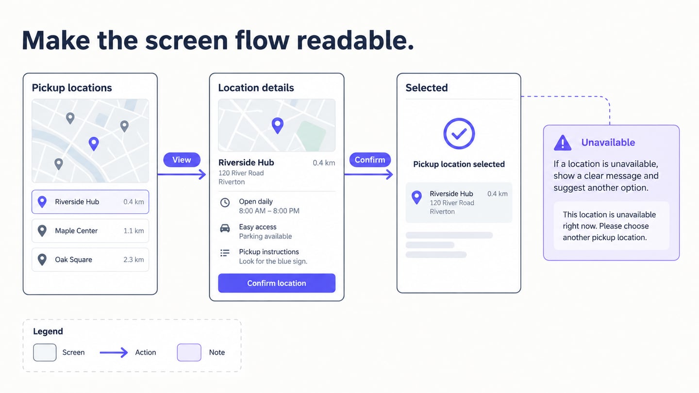
A wireframe diagram shows the structure of an interface: where content, navigation, and actions belong, and sometimes how screens connect. It helps people discuss a proposed experience before the visual design is complete. You can draw it on paper or use a wireframe editor to keep the screens editable and connect a reviewable path. The important result is a shared explanation of layout and behavior, not a polished picture.
What is Wireframe Diagram
A wireframe usually uses restrained shapes and labels to describe content hierarchy and interface controls. It does not have to be strictly black and white, but visual detail should not distract from the decisions being discussed. A diagram can add screen names, action arrows, and notes around these layouts. Unlike a flowchart, it shows where people encounter an action on the screen, not only the order of process steps.
Read the diagram as layout plus behavior
Use three different visual elements deliberately. The screen box represents what the user sees. A labeled arrow represents an action and its destination. An annotation records a condition that is not obvious from the drawing. If all three look like interface content, reviewers may misunderstand the proposed product.
| Element | Pickup-location example | Question it answers |
|---|---|---|
| Screen layout | Two location cards with addresses | What information helps someone choose? |
| Action arrow | View location → Location details | Where does the action lead? |
| State | Location selected | How does the user know the choice was recorded? |
| Annotation | Unavailable location keeps the previous choice | What happens outside the normal path? |
For a simpler first draft, start with a paper wireframe. If the problem is understanding the route rather than the arrangement of a screen, use a user-flow diagram alongside it.
Use a Tool to Build the Diagram
Mockitt can help arrange screens, reuse interface elements, and demonstrate selected interactions. Start from the task you need to explain and add only the states needed to review it. Check that changes have synchronized in the current workspace before closing it; cloud storage should not be treated as a reason to skip checking the saved result.
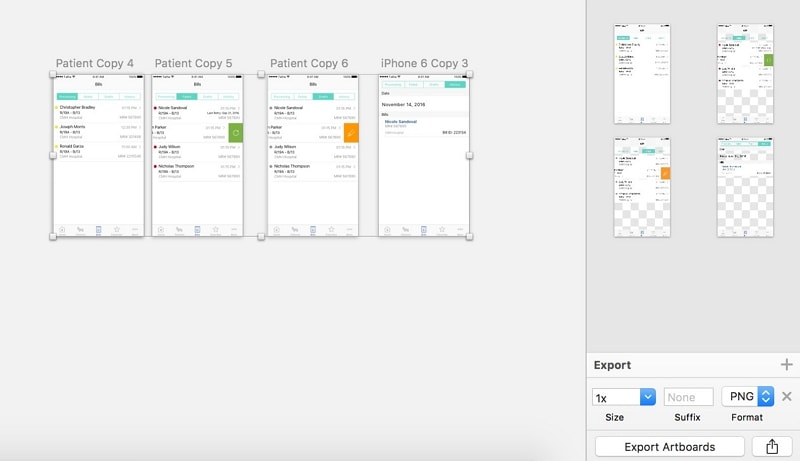
Share the diagram with reviewers who understand the task and ask them to trace a path through it. Notes and comments can capture uncertainty, but the team still needs an owner for the resulting decisions. The retained images below are historical interface examples, not evidence that every control is unchanged in the current editor.
Steps to Create Wireframe Diagram
Use the following six steps to build an annotated wireframe diagram. In the example, someone selects a pickup location, reviews its details, and confirms the choice. The map and availability are prepared examples, not a live location service.
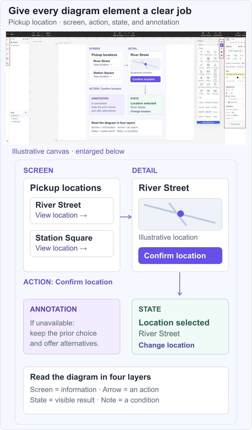
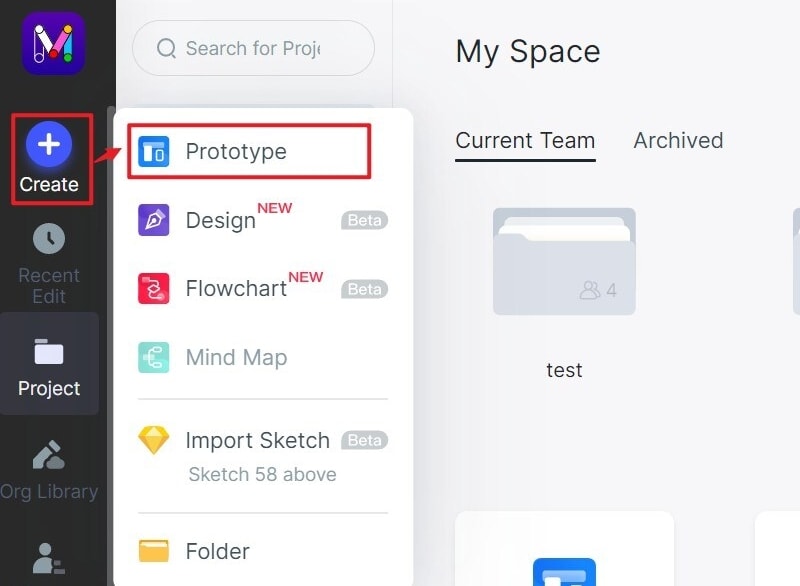
Step 1: Create a Project
Create a prototype project with a target canvas size suited to the review. Name the first screen “Pickup locations” so it is easy to reference from the diagram and the written requirements. A relevant template can help, but remove controls that are outside the task.
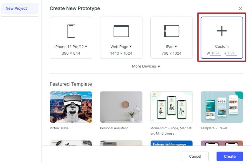
Step 2: Custom Project for the Wireframe Diagram
Set the screen dimensions and check them before duplicating the layout. Use consistent sizes for the main path; create a separate narrow layout when the information needs to reorganize. The historical setup screenshot illustrates a custom-size option rather than a universal device recommendation.
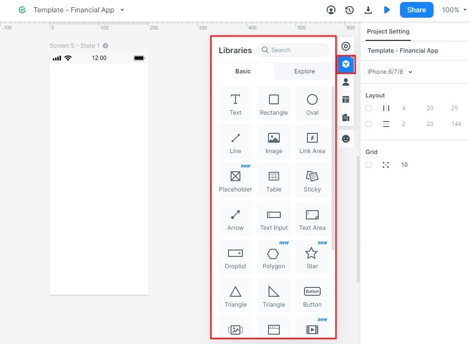
Step 3: Add Widgets to Wireframe Diagram
Add the basic elements for the location list: a heading, two location cards, an address, and a selection action. Use the widget library controls in your current editor, such as:
- Dragging a suitable widget onto the canvas.
- Selecting or double-clicking an available widget where that interaction is supported.
Use text, shapes, and icons consistently. Reuse the same location-card pattern so differences in the content remain easy to compare. An icon should support the label, not replace essential information such as an address.
Adjust the properties of each widget and check its alignment. Give the two locations distinct, realistic example names so a reviewer can explain which one they selected.
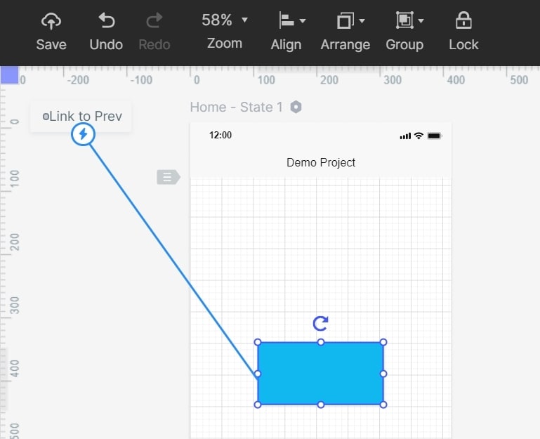
Step 4: Add Links to the Wireframe Diagram
Connect a location card to its detail screen, then connect the confirmation action to a chosen-location state. Label the action on each diagram arrow. The prototype link demonstrates the prepared transition; it does not check real-time capacity or reserve a location.
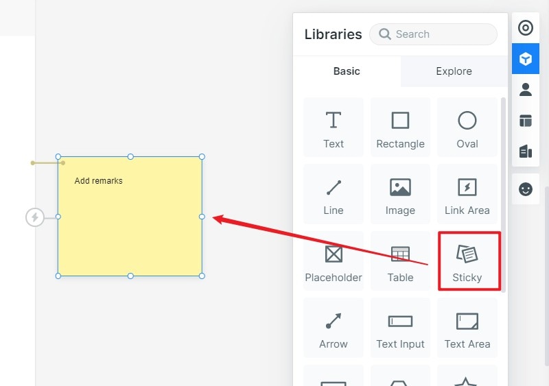
Step 5: Add Notes to the Wireframe Diagram
Add a note beside any part of the diagram that needs an implementation decision. For example, explain whether choosing a new pickup location clears the previous selection.
Keep annotations outside the interface or clearly styled as notes. Write the condition and expected result, such as “If this location is unavailable, keep the previous choice and offer another location.” Avoid notes that merely repeat the visible button label.
Step 6: Review States and Transitions
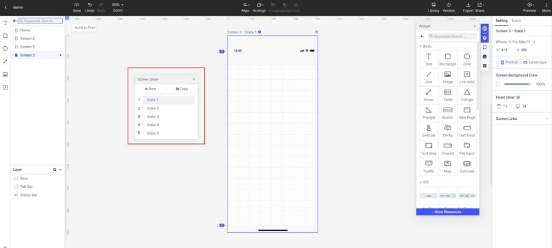
Add a transition or screen state where it clarifies what changes after an action. Include both the confirmed location and the route back to edit the choice. Use simple motion where needed; animation is not the reason to create a wireframe diagram.
Tips to Create Wireframe Diagram with Mockitt
Save Widgets to Use in Future
When a component appears on several screens, save or reuse it through the current editor’s component or widget controls. The historical guide used the “My Widget” library; the practical goal is to keep repeated elements consistent as the diagram evolves.
- Reuse the same location-card structure on the list and comparison screens.
- Review linked instances after changing a shared element so an update does not introduce inconsistent labels.
Reuse Shared Components Carefully
A shared component can make repeated edits easier, but changes may affect more than one screen. Name the component by its purpose and check its instances after editing. Historical controls such as “Create Master” illustrate this idea; use the corresponding controls available in your current workspace.
Screen templates to use
Use a screen template when its structure supports the actual task. For the pickup example, a generic card list can provide a starting point, but its sample actions and labels need to be checked.
Do not retain unrelated template screens simply because they were included. Each screen in the diagram should help explain a user action, a decision, or an important state.
Save only the reusable components you expect to maintain. A smaller, named set is easier to review than a library full of nearly identical variations.
Manage library of the assets
Organize the images and interface assets by their role. Keep location illustrations separate from interface icons, and label prepared data as illustrative. A static map image should not imply that the prototype can determine a user’s real location.
Before sharing, check that each screen has a clear name, each arrow describes an action, and every important action has a destination or explanatory note. Verify the links and access permissions in the actual review artifact, not only in the editor.