Whimsical wireframes combine device frames, editable components, states, and connectors on a collaborative board. They are useful for discussing a layout and the decisions between screens without polishing every visual detail. This guide explains that workflow, then shows how a linked wireframe in Mockitt can support a screen-by-screen review when that is the next deliverable.
Whimsical supports links within boards and text. A connector that describes a flow, a board link, and a configured interaction in a prototype serve different purposes. Decide whether the audience needs to understand the relationship between screens or try a particular transition. Neither output is a finished application.
How to Create a Wireframe with Whimsical
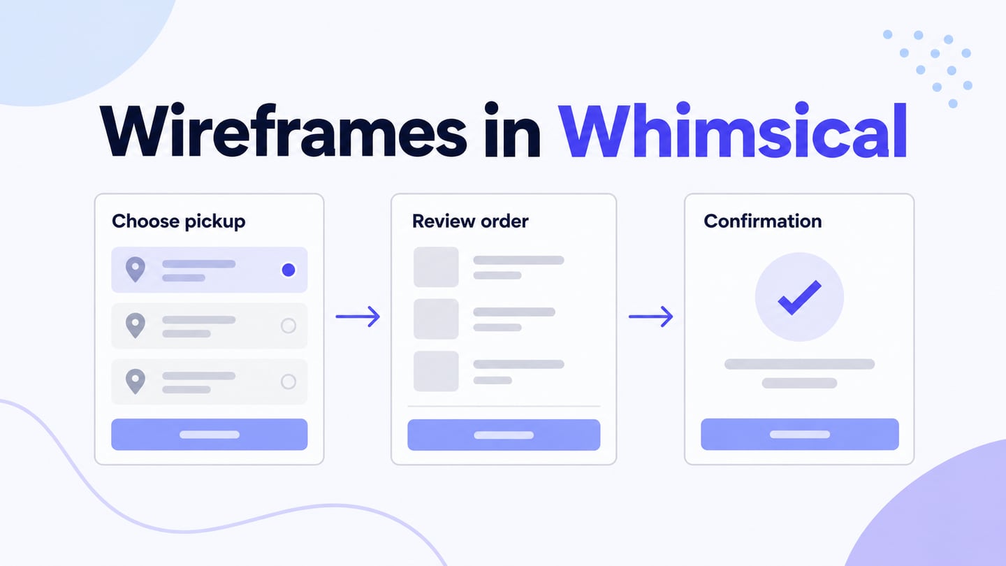
In Whimsical’s wireframe mode, the tools focus on frames, components, and icons. You can search for an item instead of browsing the full library. Begin with a single task such as selecting a café pickup time, reviewing the order, and seeing a confirmation. The screenshots in this guide are historical interface examples; use the current controls where their labels differ.
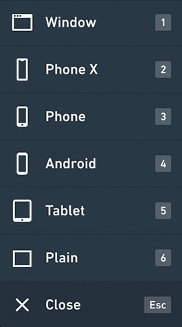
- When you open a board, enter wireframe mode from the toolbar or use W. Add a frame with F and choose the device context for the layout. Position the frame on the board and name the state it represents, such as “Choose pickup time.” Keep a consistent frame size for screens that belong to the same flow.
- Add components with E or the relevant toolbar control. Place text fields, buttons, separators, and other elements inside the frame, then edit their labels and dimensions. Use meaningful content early: “Pickup at 10:30” reveals more about the task than several identical placeholder labels.

- Add icons where their meaning helps the task. Duplicate an existing element when that preserves a consistent size and position, then change the icon or label for its new purpose. Include a text label for an unfamiliar symbol rather than relying on an icon alone.
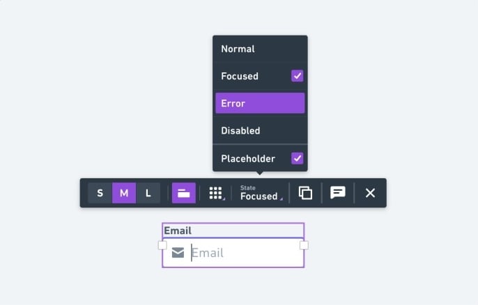
- Use a component’s contextual toolbar to show supported states such as focused, disabled, error, or placeholder. Duplicate a frame when you need to compare the before and after states side by side. For the pickup-time example, keep an unavailable time visibly different from a selected time and explain why it cannot be chosen.
- Use connectors to show how one frame leads to another. Label a branch with the decision that causes it, rather than adding an unexplained arrow. Annotations can describe validation or behavior that is not visible on the board. A connector labeled “Confirm time” communicates intent; it does not submit a real order.
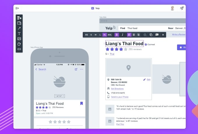
Share the board with the appropriate access settings so another person can review it. Check the view from their perspective, especially when they are outside your workspace. If you export an image or document, verify what it includes; a static export should not be expected to preserve board interactions.
How to Create Wireframe with a Whimsical Alternative
Mockitt is another option when the review requires a sequence of editable screens and configured interactions. Keep the structure of the wireframe simple, then connect actions to their intended destinations. Transitions and widget states can demonstrate selected behavior without claiming to reproduce the final application’s logic.

You can continue from a simple wireframe to more detailed design when the layout is approved. Add transitions or animation where they help explain what happens after a button is activated or an option is selected. Keep the review focused on the particular interaction being demonstrated.
Mockitt provides widgets, reusable assets, and prototype interactions that can help the team discuss a flow. Invite collaborators early, record open questions, and distinguish a visible design decision from functionality that still needs to be built. A browser preview is useful evidence of what the prototype demonstrates, not proof that the production workflow works.
Create a Linked Wireframe in Mockitt
Step 1: Create a new project and assign a name. Select the device type and model you're designing the wireframe for, and create your first screen.
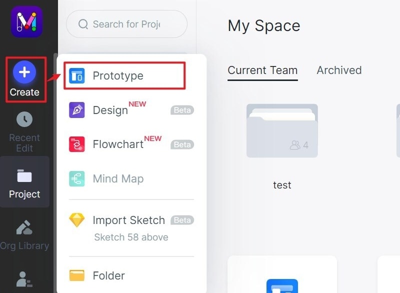
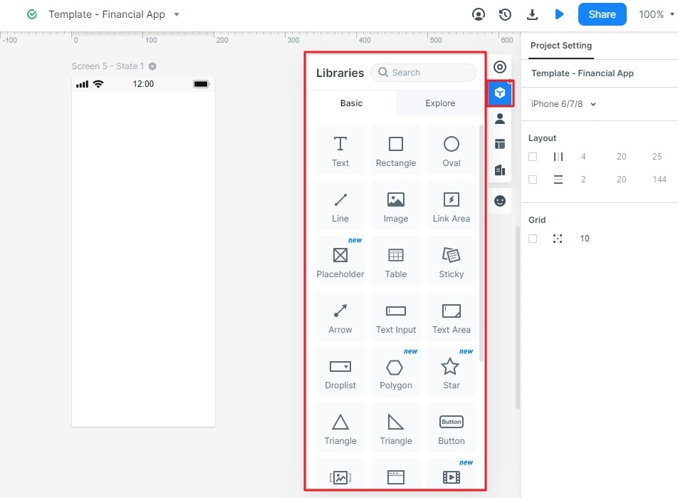
Step 2: To add elements and icons, use the widget sections on the left or right. Simply double-click or drag them in place. You can edit them in the comprehensive properties bar on the right side.
Step 3: In this case, connectors are interactive links that you can drag from one element (using the link icon to the left of each widget or component) and drop to a target page. The links can then be edited to add animation, gestures, transitions, or another type of effect. You can also add links by clicking the New Link option on the right side.
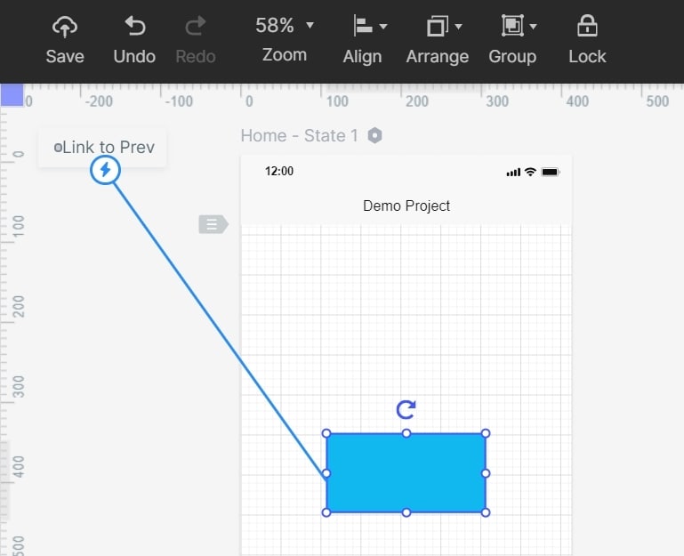
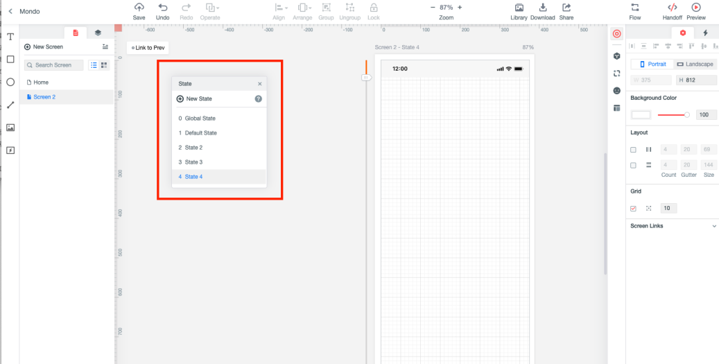
Step 4: Use page or widget states when the screen needs to show a change without navigating elsewhere. Keep a default state and a clearly defined changed state, then configure the supported trigger. Test the return to the default state as well as the initial change.
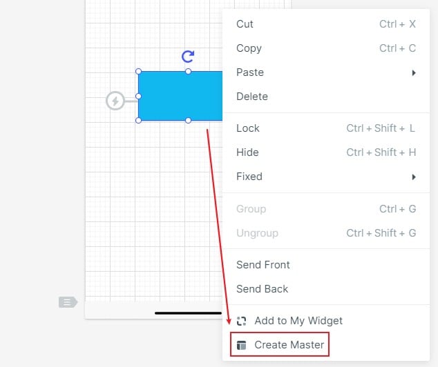
Step 5: You can also add widgets to your personal asset library or assign a Master status to a widget so editing it on one screen changed it on all the screens where you've used that widget.
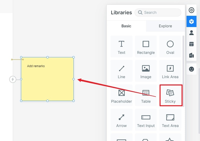
Step 6: Notes can be added using the "Sticky" widget, and your wireframe can be shared using a URL or QR code so other stakeholders can comment and provide feedback.
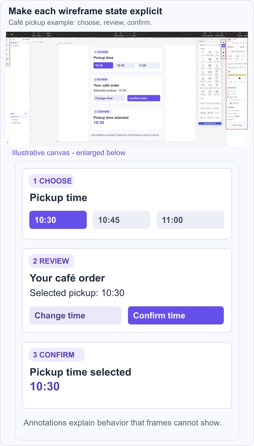
For the café example, build three screens: choose pickup time, review order, and confirmation. Link the first two actions and include a way to change the time from the review screen. Ask a reviewer to tell you which time is selected before confirming. This checks whether the choice remains visible through the flow; the prototype does not place an order or verify availability.
Tips for Creating Whimsical Wireframes
No matter what wireframing tool you use, whether it's Whimsical or a Whimsical alternative like Mockitt, there are certain best practices you can follow to work faster and more efficiently. For example:
- Plan ahead - Before you start adding elements, you can create multiple frames based on how many pages and states you need to show in the final wireframe.
- Do your homework - Get familiar with the element, icon, and connector options so you can work faster when deadlines are tight.
- Keep it simple: Concentrate on content, hierarchy, and behavior before visual styling. Use color only when it communicates a state or another decision that needs review. A wireframe can be low fidelity and still have precise labels and a coherent path.
Choose Whimsical when a shared board with frames, component states, and annotations fits the discussion. Choose a connected prototype when reviewers need to follow actions between screens. For a different component-pack workflow, see the MockFlow wireframe tutorial.
The broader wireframe tool comparison focuses on choosing a tool for the output, rather than assuming that every board and prototype has the same interaction model.