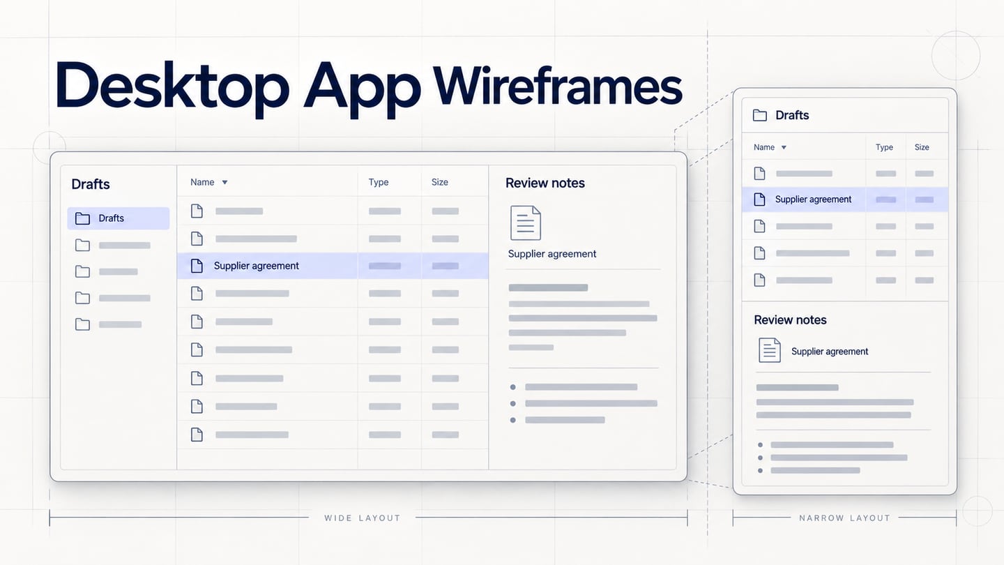
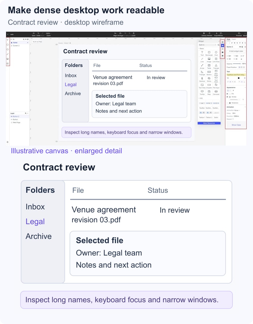
A desktop app wireframe plans the content, controls and task flow of an application used in a desktop window. It may share ideas with a web app, but window resizing, keyboard use and dense information views deserve explicit decisions. The seven-step workflow below uses a fictional document-review application with a folder sidebar, file list and detail panel.
A Workspace for Desktop Wireframes
Use Mockitt to build the screens and connect the route you need to discuss. Start by deciding what the application should help someone accomplish. In this example, a reviewer locates a draft contract, checks its status and opens its review notes. The retained images are from an earlier editor and illustrate the basic operations, not the current position of every control.
Capabilities to Use for This Task
- Reusable widgets and icons help keep folder rows, file rows and action controls consistent. Edit repeated elements deliberately so that a selected row is distinguishable from an unselected row.
- Share the prototype with the people making the design decision and confirm recipient access. Record which version they reviewed; collaboration alone does not establish security or agreement.
- Use screen links and relevant state changes to demonstrate opening a file, returning to the list and switching folders. Motion is optional when a simple state change communicates the result.
- Comments can connect a reviewer’s observation to a specific screen. Ask for task-based feedback such as whether the file’s review status is clear, rather than only an overall preference.
- Choose a review or handoff format that supports the discussion. A linked prototype, static image and implementation specification serve different purposes; verify available exports rather than relying on the old article’s IPA and HTML claims.
- If you export an image, inspect its text at the intended viewing size. A static image can communicate layout but cannot demonstrate keyboard behavior, native file access or an executable desktop application.
Seven Steps to Make a Desktop App Wireframe
Keep the first version focused on locating a document and reviewing its status. You do not need to design every setting or menu before discussing this route. Define what the reviewer will see, what changes after selection and how they can recover their place.
Step 1: Create a Project
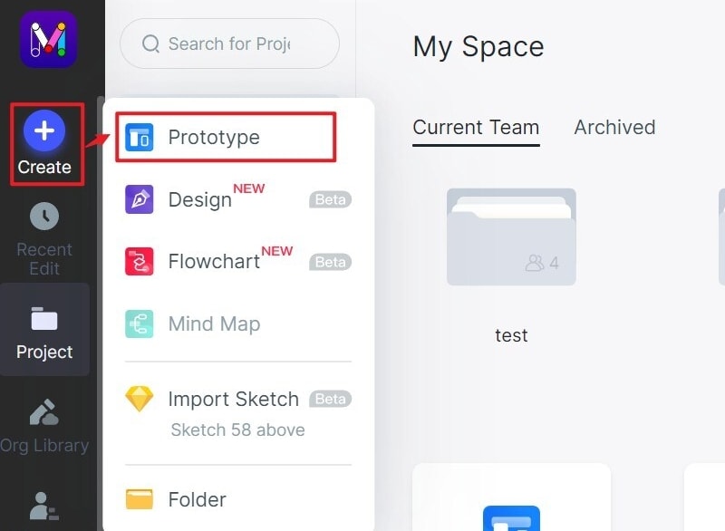
Create a prototype project in the workspace. Prepare a main window and a document-detail state. For the example, the main window contains a folder sidebar, a file table and a preview area; this is a proposed design, not a connection to local files.
Step 2: Rename Your Project
Name the project “Contract review desktop” and label the screens by their purpose, such as “Drafts folder,” “Selected contract” and “No matching documents.” Clear names help reviewers identify which state a comment describes.
Step 3: Set the Window Sizes to Review
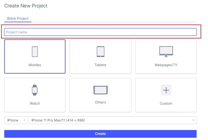
Choose a desktop-sized canvas and a narrower window for comparison. The canvas represents the application window, not the computer used to create it. Decide which areas keep their width, which expand and when the preview moves below the table. Record these as design rules for implementation.
Step 4: Adapt a Relevant Starting Template
If an available template has a useful sidebar-and-list structure, use it as a starting point. Replace its content with the document-review task and remove irrelevant modules. Otherwise, create a simple layout from shapes and text; the template should serve the task rather than determine it.
Step 5: Add the Widgets and Icons for Desktop Wireframe
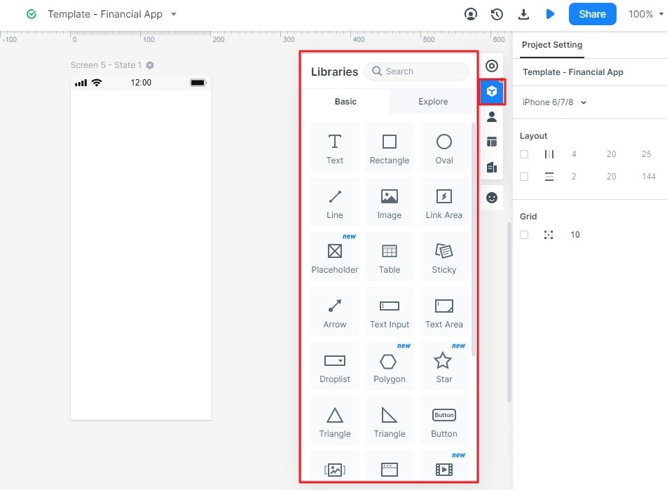
Add the folder names, file rows and review controls. Use realistic sample names such as “Supplier agreement — draft 2” and columns for Owner, Status and Last edited. Show the selected row and a detail heading that matches the selected document.
Adjust the properties of the elements so labels align and repeated rows have consistent spacing. Include a long file name and an empty folder to expose layout assumptions. In the narrow version, prioritize the name and status before secondary metadata.
Step 6: Reuse Components and Add Behavior Notes
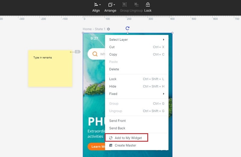
Reuse the same row, button and status-label elements across the screens. Add notes for intended focus order, selection behavior and what happens when a file is unavailable. The archived “My Widget” illustration shows an earlier reuse workflow; use the corresponding current workspace capability rather than assuming every menu is unchanged.
Step 7: Preview and Share Your Wireframe Project
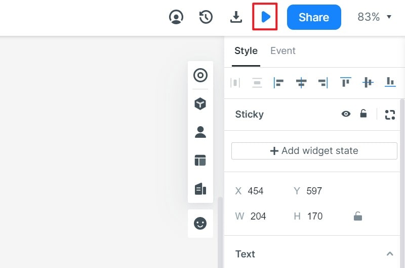
Preview the route from Drafts to a selected contract and back to the list. Ask a reviewer to find an item awaiting review, identify its owner and open its notes. Then show the no-matches state and ask how they would recover. Share the same starting view and record where the reviewer’s expectations differ from the proposed behavior.
Checks That Matter for Desktop Wireframes
A useful desktop wireframe makes relationships and state changes visible. Review these details before adding visual polish:
- Sketch the main regions first if it helps compare alternatives. A paper sketch is optional; the important decision is how folders, rows and details relate to the task.
- Keep spacing, row heights and control labels consistent across states, while allowing the layout to adapt to different window widths.
- Use restrained color while reviewing structure. Selection, errors and status should also have text or shape cues rather than depending on color alone.
- Request early feedback on a concrete task, and capture the selected file, path taken and point of confusion. Do not treat stakeholder approval as proof of usability.
- Replace placeholder text where wording affects a decision. A long file name, an unfamiliar status and a missing owner are more informative test content than repeated lorem ipsum.
- Reuse components where their role and behavior match. A toolbar action and a row-level action may require different labels and emphasis even if both use a button.
- Annotate keyboard order, window-resizing rules and unavailable-data behavior. Check keyboard access and relevant reflow requirements in the implemented interface. A prototype can describe those expectations but does not verify native shortcuts, file permissions or assistive-technology behavior.