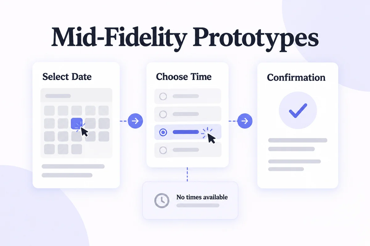
A mid-fidelity prototype, also called a medium-fidelity prototype, combines readable content, recognizable controls and enough structure and interaction to try a task. It is more detailed than a rough sketch but leaves final colors, imagery and visual polish open. Use it to test navigation and task order before completing the interface design.
For an appointment-booking flow, that means someone can choose a date, inspect available times, review the booking, and go back to change it. The prototype may also show “No times available.” It does not need the final brand treatment to reveal whether those steps make sense.
What is a mid-fidelity prototype?
“Mid fidelity” is a practical description, not a universal technical standard. A prototype can have realistic wording and low-detail visuals, or convincing interactions with sample data. Describe which dimensions are realistic instead of relying on the label alone.
Compared with a rough sketch, a medium-fidelity prototype usually provides clearer layout, content hierarchy, and navigation. Compared with a polished high-fidelity prototype, it leaves more design decisions open. A series of linked wireframes is one common form, but the number of screens or presence of color does not determine fidelity by itself.
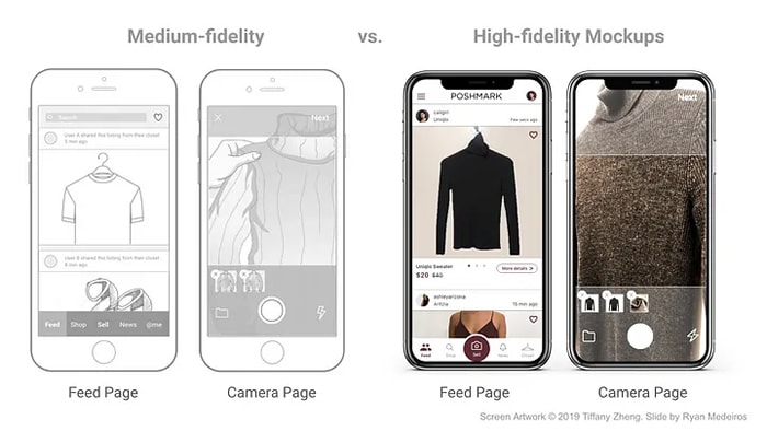
For a broader decision framework, compare low, mid, and high prototype fidelity. In this guide, the medium-fidelity target is a usable task flow with realistic labels and deliberately simplified styling.
Advantages and disadvantages
What it helps you learn
Mid-fidelity work lets a team investigate execution before investing in every visual detail. Participants can reveal confusing labels, missing navigation, unexpected sequences, or insufficient information. Because the interface is still visibly unfinished, designers can discuss alternative structures without needing to rebuild an elaborate visual system.
In the booking example, a participant may choose the correct date but overlook a time-zone label. That is a specific finding the team can address. A preference for blue rather than gray is a different kind of feedback and may not be relevant to this iteration's question.
What it cannot establish
You can test only the behavior you have represented. A clickable confirmation does not prove that a reservation is stored, a reminder will arrive, or two people cannot book the same slot. Final contrast, screen-reader behavior, keyboard interactions, performance, and responsive implementation require appropriate design and implementation checks.
The additional structure takes more effort than a sketch. If the team is still deciding whether users need appointments at all, a detailed booking flow is premature. Conversely, if the question concerns precise drag behavior or motion, a mid-fidelity click-through may not be realistic enough.
When should you use it?
Use a mid-fidelity prototype when the overall direction is plausible but the arrangement of content and actions is still uncertain. It works particularly well for comparing navigation, validating task order, and identifying missing states before detailed visual design.
- Concept is understood, flow is not. People recognize the service but do not know how to reach a useful outcome.
- Content drives the decision. Labels, prices, dates, and consequences need to be readable rather than replaced by placeholder lines.
- The team needs a shared reference. Product, design, and engineering can point to the same state and discuss the intended behavior.
You can also lower the fidelity of an existing polished design to isolate a structural question. Fidelity is not a one-way staircase. The NN/G comparison of prototype fidelity explains why the test purpose matters more than making every part look finished.
How to create a mid-fidelity prototype in Mockitt
Mockitt's online prototyping tool supports pages, widgets, and interaction events. The workflow below follows one appointment example. The retained screenshots illustrate the relevant operations in an earlier editor; the current controls are described in the linked help documentation where labels have changed.
Step 1: Create the project and its screens
Start a prototype project and choose a canvas appropriate to the device you will test. Create a small set of named screens: Appointment list, Select date, Select time, Review, and Confirmation. Add a separate no-availability state so the model does not imply that every choice succeeds.
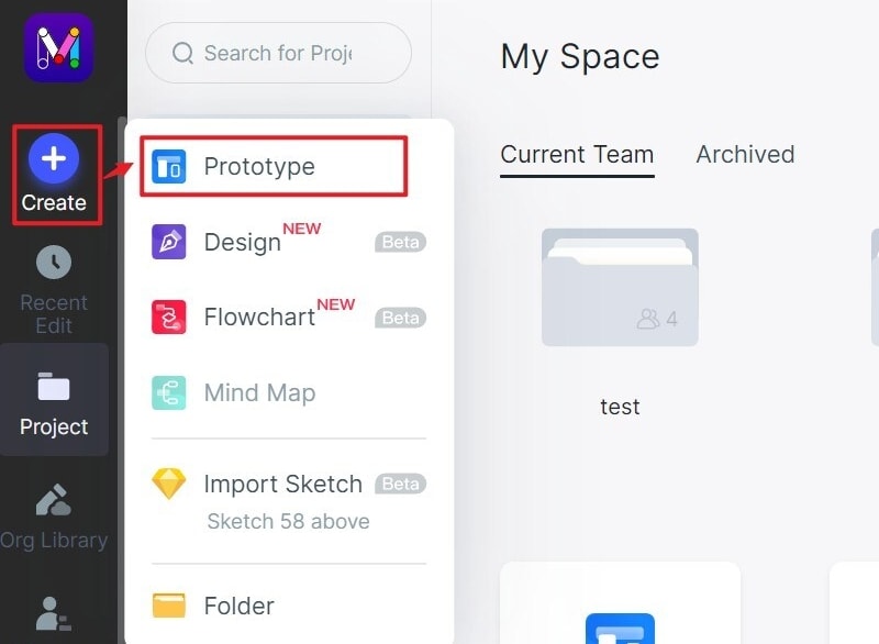
Use meaningful names from the start. “Select time — no availability” is easier to review than “Screen 6 copy.” Keep unsupported parts, such as payment or account settings, outside the task rather than making them look usable.
Step 2: Add widgets and realistic content
Use rectangles, text, buttons, and placeholders to establish hierarchy. Mockitt's widget-management guide documents the built-in controls. For this example, write actual dates and time labels, a selected-state treatment, and a clear appointment summary.
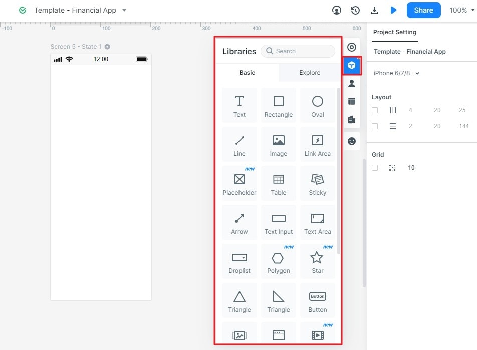
Keep type sizes and spacing readable on the target device. Simplified styling should not make labels harder to read. If content affects the choice, such as a cancellation deadline, include the actual example wording rather than “Lorem ipsum.”
Step 3: Connect actions to the right result
Select the control that should respond. Add an interaction through the Interactions panel or drag its lightning handle to the destination page. Configure the intended trigger and action, then check the result in preview. Mockitt's interaction guide shows page links and state changes.
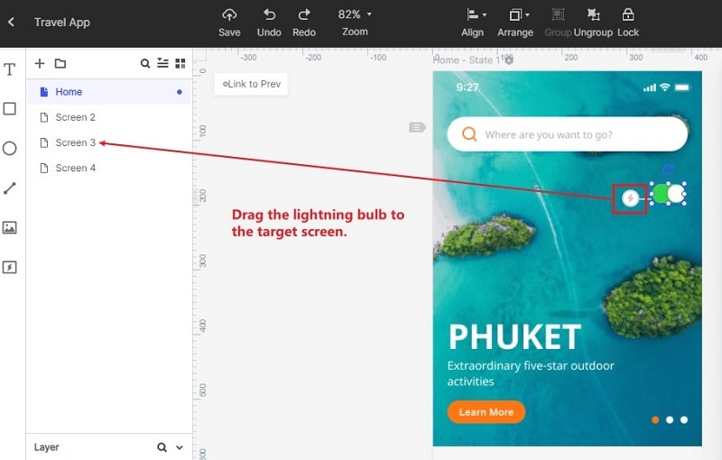
Connect “Continue” to Review only after the represented selection. Include “Change time” and a back route. If validation is simulated through separate screens, document that behavior for reviewers instead of implying live data validation.
Step 4: Preview the whole task
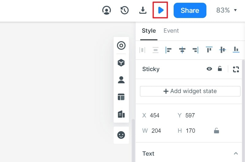
Run through the flow from the intended start screen, including the unavailable state and return path. Check for dead controls, misleading hotspots, and a destination that loses the selected date. Test the shared preview at the device size participants will use.
Step 5: Share a specific task and use the feedback
Share the current project's preview using its available access settings. Check the actual link from a separate session before sending it. Ask a goal-based question such as “Book a suitable appointment next Tuesday,” rather than explaining the desired click path.
Record where participants hesitate, what they expect, and whether they can recover. Use a usability testing plan to keep the task and observation criteria consistent. Change the unclear part, retain a record of the previous version, and rerun the task. Move to greater fidelity when visual or interaction detail becomes necessary to answer the next question.