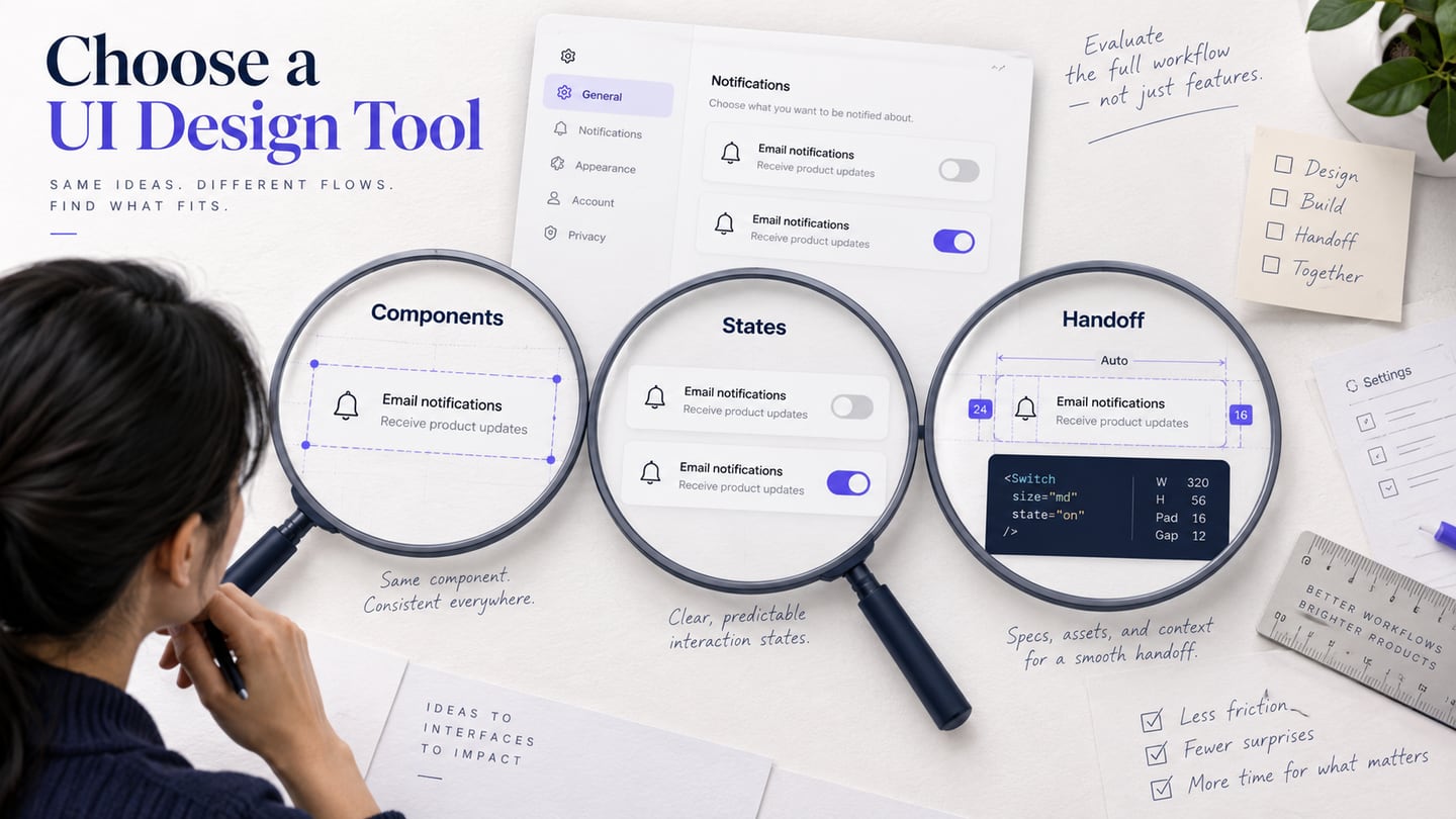
A UI design tool should help you maintain interface decisions as screens, content, and team needs change. This comparison focuses on reusable components, layout behavior, interaction states, and handoff. It is distinct from choosing a broader UX workflow toolset for research and review. The tools below serve different deliverables, so there is no single winner or assumption that every option is free.
10 UI design tools and the work they support
1. Mockitt
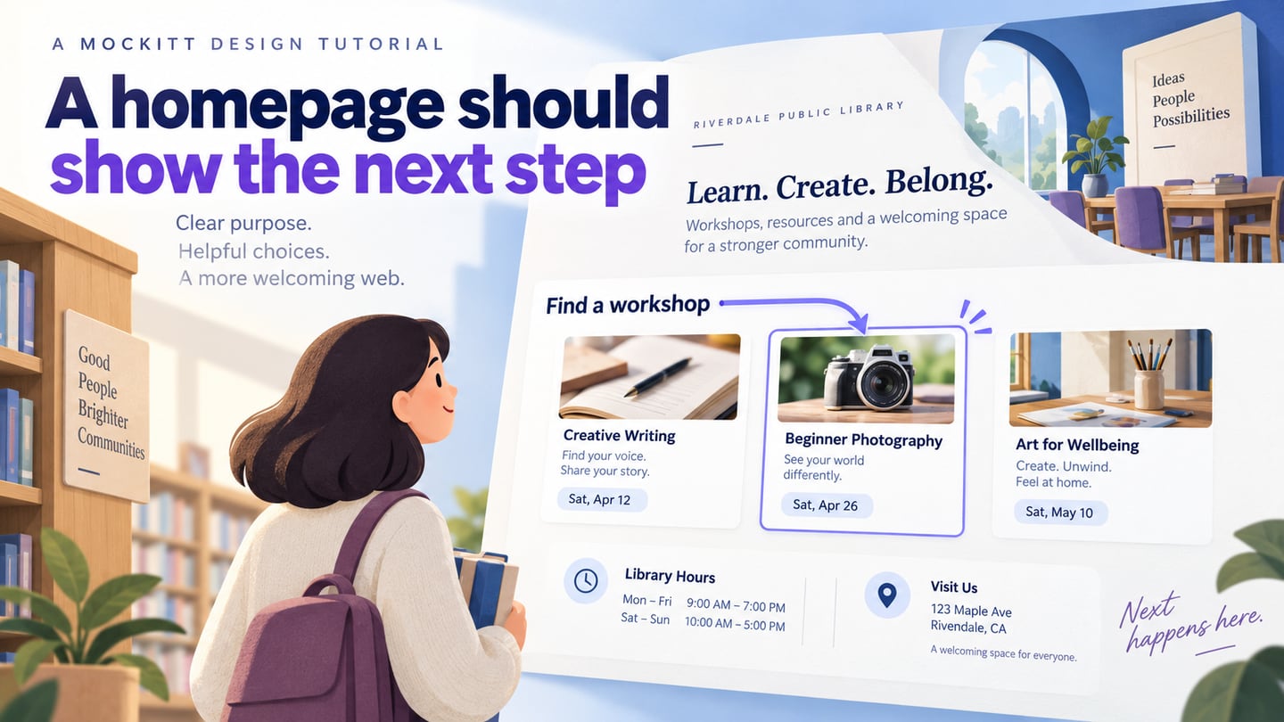
Mockitt supports creating and sharing editable interface prototypes. It is relevant when the immediate task is arranging screens, connecting a flow, and reviewing states with a team. Evaluate how the available components, editing controls, and sharing permissions fit your project. A prototype makes the proposed behavior visible; it does not establish that application logic, accessibility semantics, or backend services have been implemented.
Features
- Reusable elements: use suitable controls and assets to keep repeated interface decisions consistent.
- Starting points: adapt available templates to the actual content and task. Do not assume an old template count or industry list is current.
- Layout: arrange the interface and check realistic labels, messages, and content lengths before sharing it.
- Review: give the intended reviewers access to the source design instead of sending disconnected image copies.
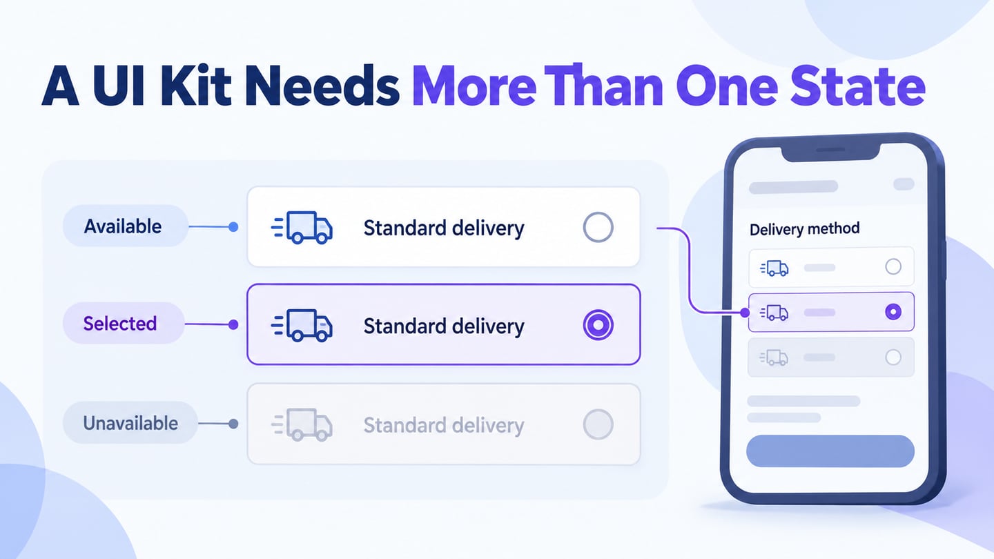
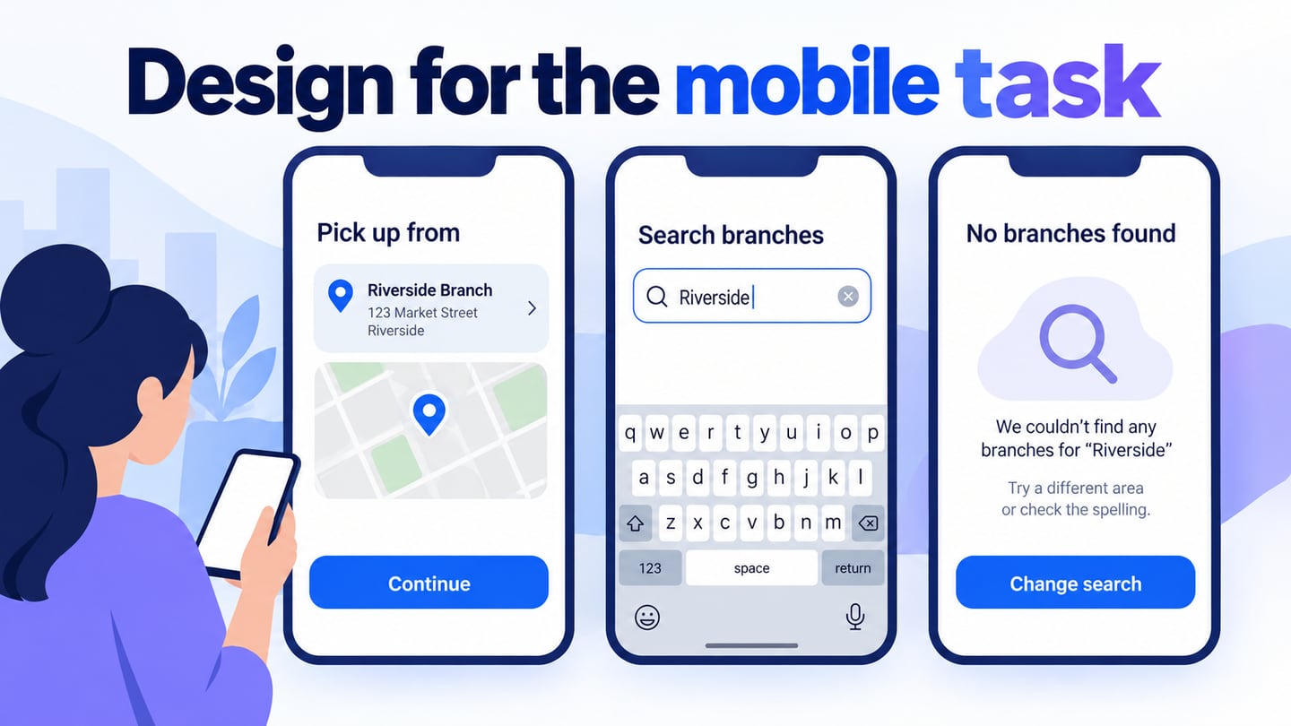
- States: show the selected, loading, error, and success states relevant to the task.
- Team decisions: connect comments and approved changes to the relevant requirement or handoff note.
What to check before choosing
- Whether the editing model fits your team’s experience and the level of detail required.
- Whether the intended editors and reviewers can use the browser workspace and access the project.
- Which collaboration, AI, history, and export needs are covered by the current plan.
- Whether the documentation and support resources cover the workflow you intend to use.
- What the prototype simulates and what development must still implement and verify.
2. Sketch
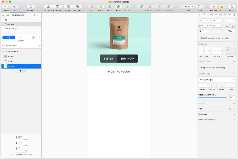
Sketch offers interface design, reusable symbols and styles, prototyping, and handoff. Its design app runs on macOS, with browser tools for collaboration. Consider it when the team’s design libraries and editing workflow already fit that environment. Test a component update across several screens and confirm that non-Mac colleagues can complete their required review or handoff tasks.
3. Pixso
Pixso combines interface design, reusable design resources, prototyping, and collaboration. It is a candidate for teams comparing shared UI workspaces. Evaluate component maintenance and layout behavior with your actual content, and confirm the supported file formats and permissions before moving a library. An import that looks similar is not proof that every component relationship remains editable.
4. Axure RP
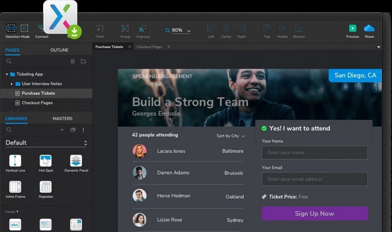
Axure RP is particularly relevant when an interface proposal depends on conditional behavior and detailed interaction states. A form with branching questions or data-dependent results may need more than screen-to-screen links. Balance that modeling power against the time required to build and maintain the prototype. Simulated data and conditions still need implementation and testing.
5. Penpot
Penpot is an open-source design platform with interface design and team collaboration capabilities. It is worth evaluating when open-source tooling and design-to-development alignment are selection criteria. Compare its current component, layout, and handoff workflow with the team’s actual needs. If considering self-hosting, assess the operational work separately from the design features.
6. Balsamiq
Balsamiq focuses on early wireframes and prototypes. Choose this category when the team needs to discuss content priority and actions without committing to detailed visual styling. It is not the same deliverable as a production design system. Check whether the level of interaction and sharing available is enough for the question you need to answer.
7. Figma
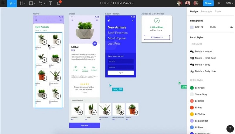
Figma Design supports collaborative interface work, reusable components, layouts, and prototypes. It is not itself a React Native application framework. Evaluate how shared libraries, component states, and developer access fit the team’s process. Confirm the current plan’s editing and handoff permissions rather than interpreting “free” as unlimited access for every role.
8. Framer
Framer now serves a website design and publishing workflow; the older “Framer X” description is not an accurate guide to selecting its current product. Consider it when the deliverable is a published website with responsive pages and content. Evaluate CMS, hosting, forms, accessibility, and ongoing maintenance in addition to visual editing. A published site has responsibilities that a shared design prototype does not.
9. Proto.io
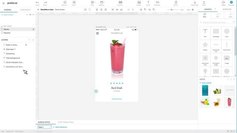
Proto.io is a commercial prototyping platform, not an open-source UI framework. It supports building and sharing interactive prototypes. Use the same interaction task to evaluate its states, transitions, and review workflow, and verify any required integration in current documentation. Do not infer live application behavior from a prototype preview.
10. Webflow
Webflow is a visual website platform with design, content, and publishing capabilities. It is relevant when you need to implement a website rather than only specify its appearance. Check responsive structure, semantic content, CMS requirements, and maintenance ownership. Visual editing does not remove the need to understand how the resulting site behaves or to test it.
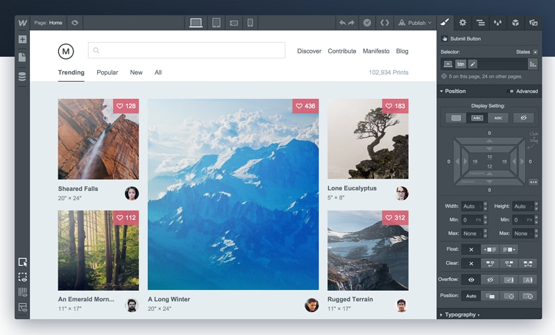 Retained editor examples show earlier interfaces. Use current official documentation to verify controls and plan features.
Evaluate one component before choosing
Build one subscription-settings component in each shortlisted tool: a plan selector, billing email, validation message, and save action. Use the same sample content and review task. This is a suggested evaluation exercise, not a benchmark we claim to have performed.
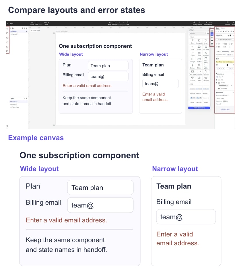
Components: reuse the card on two screens, change a shared label or style, and inspect what updates. Try a local exception and check whether it breaks the relationship you need. Record how a teammate identifies the source component and understands its intended states.
Layouts: use long plan names, a multi-line error, and a narrow viewport. Check alignment, wrapping, spacing, and content priority. A design that only works with short placeholder text is not a reliable basis for choosing a tool. Distinguish manually resizing a mockup from defining rules the implementation must follow.
Interactions: show saving, success, invalid email, and a failed save. Ask a reviewer to explain whether the new value was stored and what they can do next. Choose the amount of simulation required by the task; do not reward a complicated animation if a clear state change answers the question.
Handoff: ask a developer to locate the component, approved state, content rules, and responsive intent. Confirm the required access and export options. Design specifications can support implementation, but they are not a substitute for the data handling, semantics, and tests in the real product.
Compare current costs only after these checks, including reviewer and developer roles, library access, and ongoing maintenance. Keep the evaluation notes so a later decision reflects your workflow rather than a generic “best tool” claim.
When Mockitt fits the UI task
Mockitt is a relevant option when the task centers on editable screens, a connected prototype, and shared review. Start with a small representative component and its states, then check that the team can review and hand it off. If the deliverable is a hosted content website, a specialist website platform may be more appropriate. If it requires complex conditional simulation, evaluate that need directly rather than assuming every design tool handles it equally well.